almoamen.net
Applying color to UI
Color is applied to UI elements and components in consistent and meaningful ways.
Usage
These guidelines describe a variety of UI components and elements where color application is important.
Principles
Consistent
Color should be applied throughout a UI consistently and be compatible with the brand it represents.
Distinct
Color should create distinction between elements, with sufficient contrast between them.
Intentional
Color should be applied purposefully as it can convey meaning in multiple ways, such as relationships between elements and degrees of hierarchy.
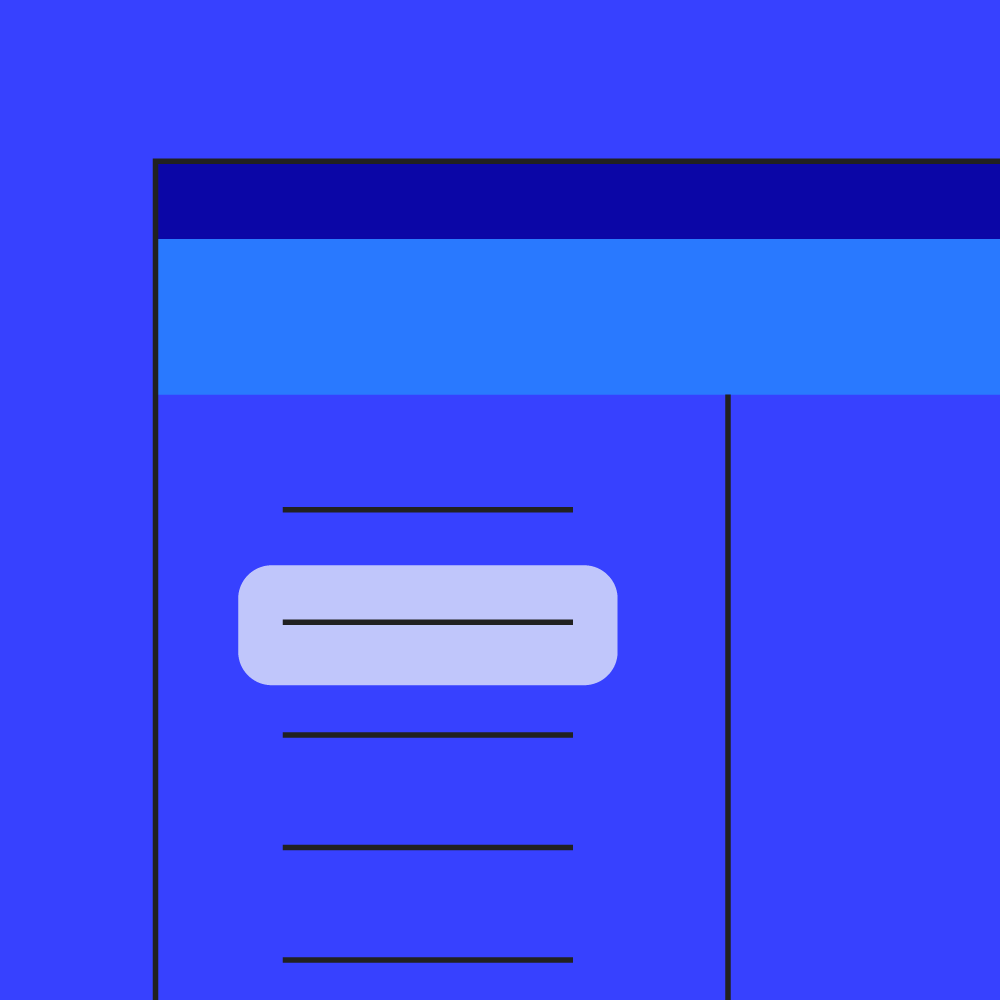
Top and bottom app bars
The way color is applied to top and bottom app bars helps users identify them and understand their relationship to surrounding UI elements.
Identifying app bars
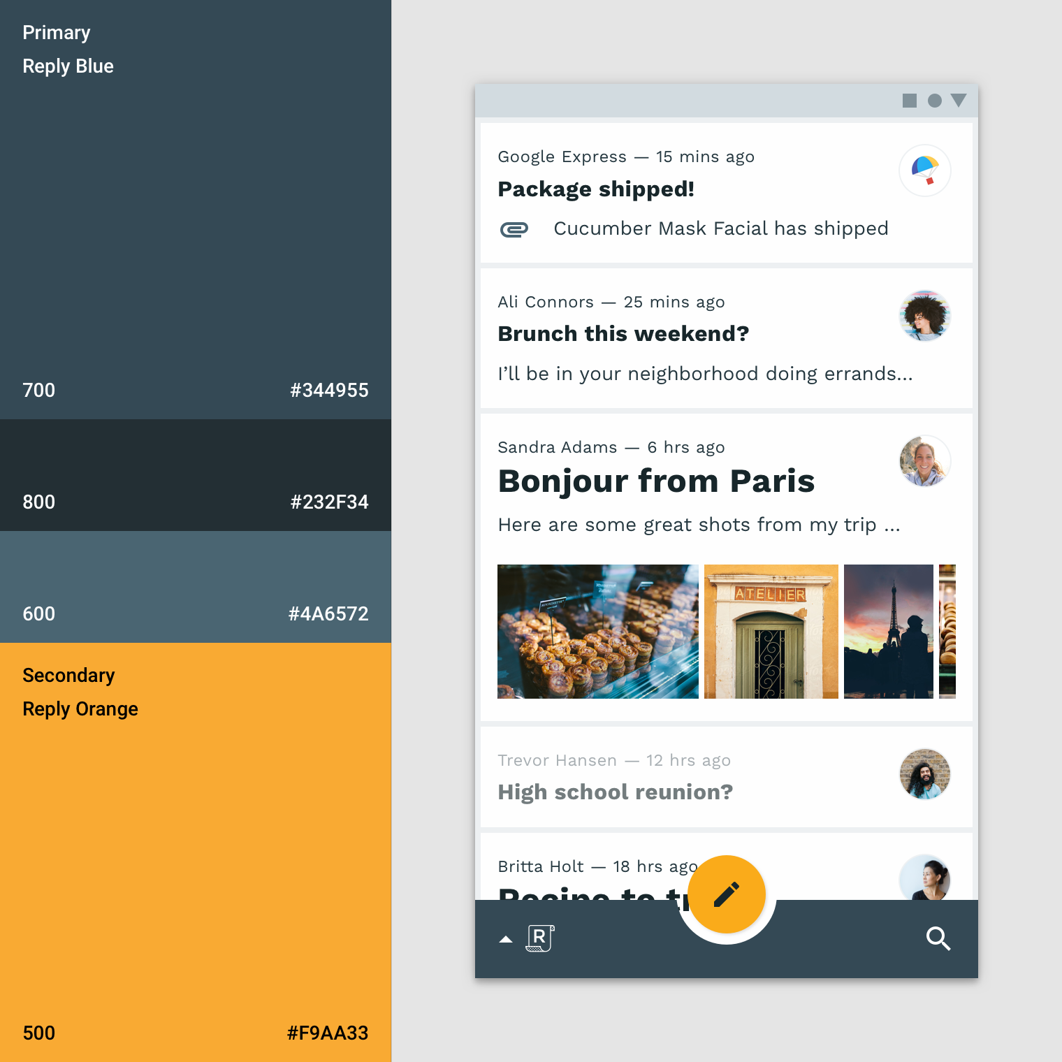
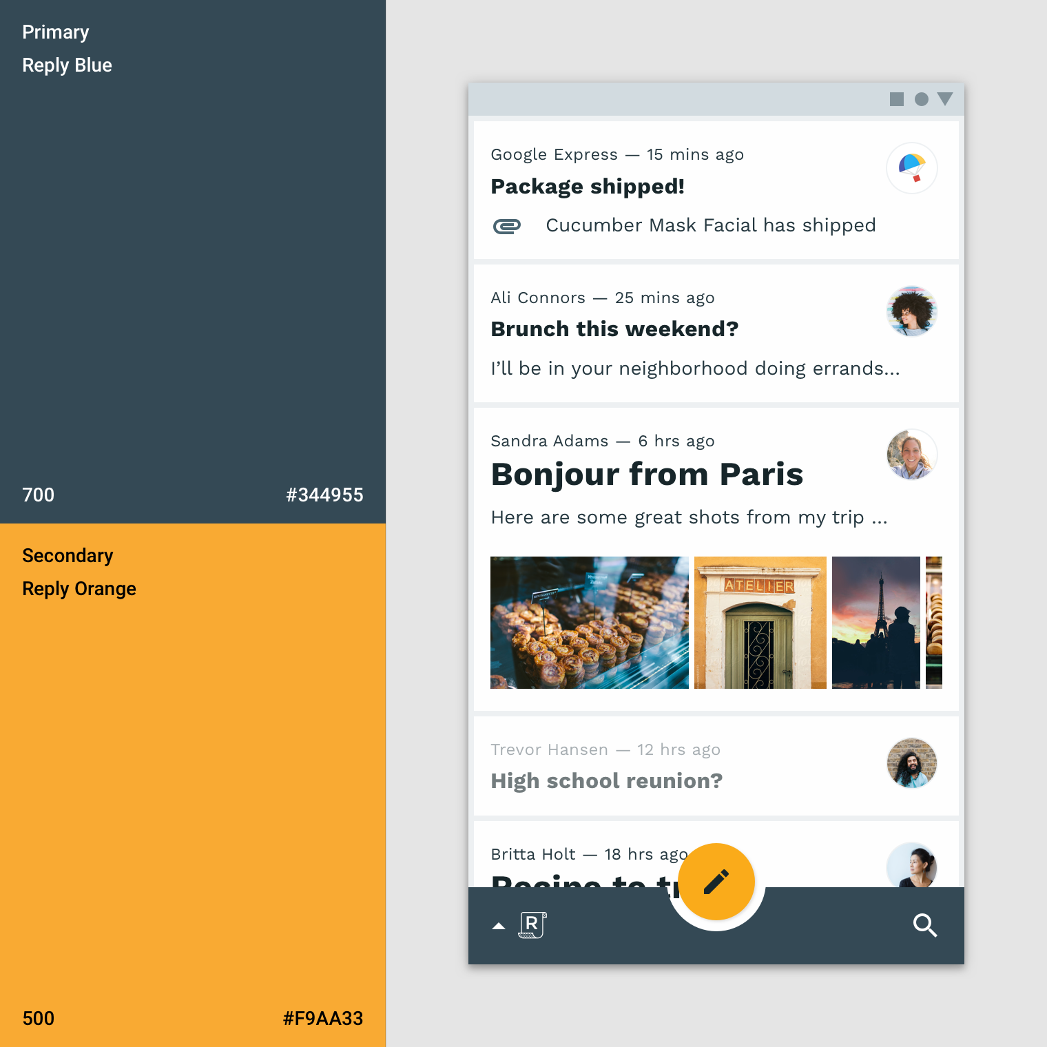
Top and bottom app bars use an app’s primary color. System bars can use a dark or light variant of the primary color to separate system content from top app bar content.
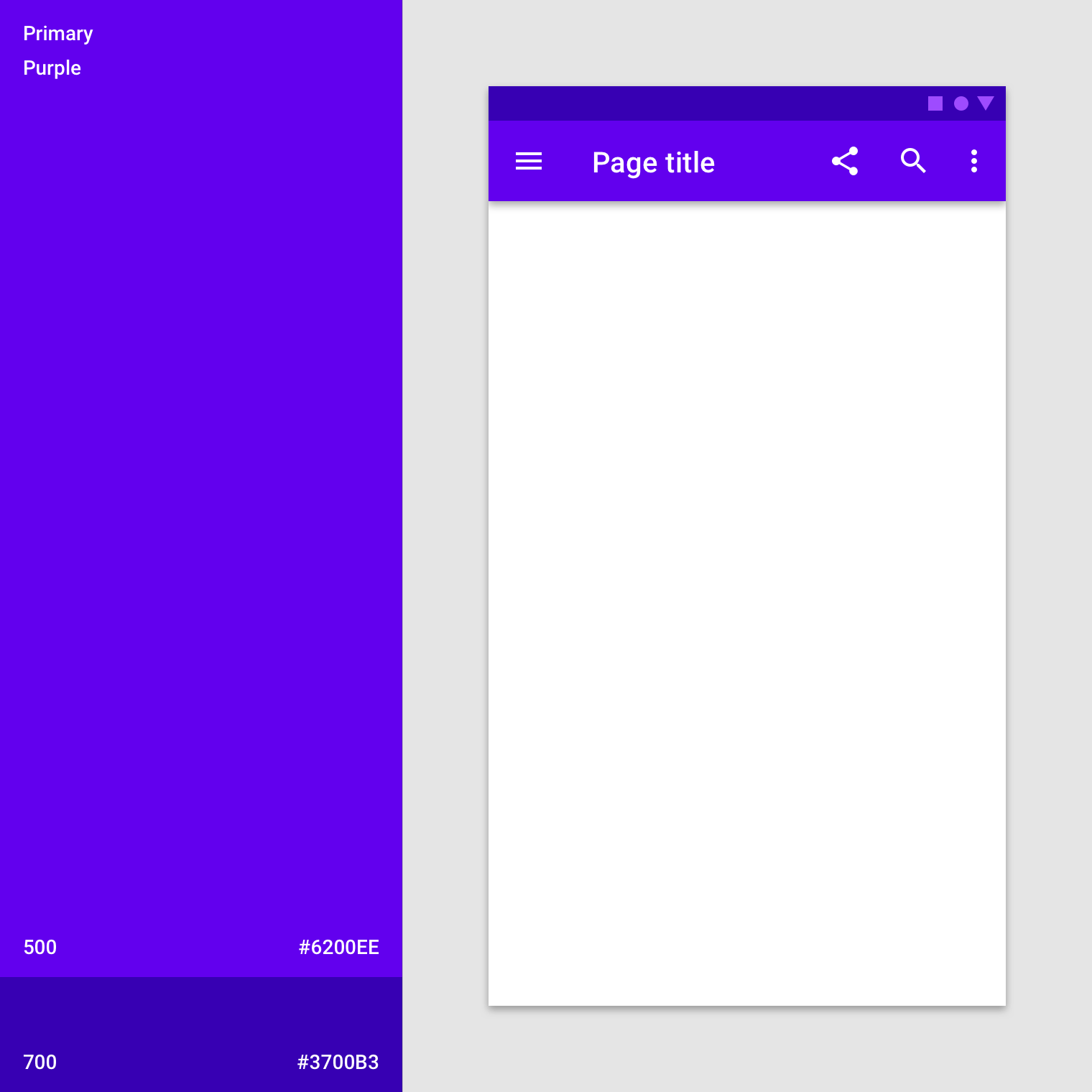
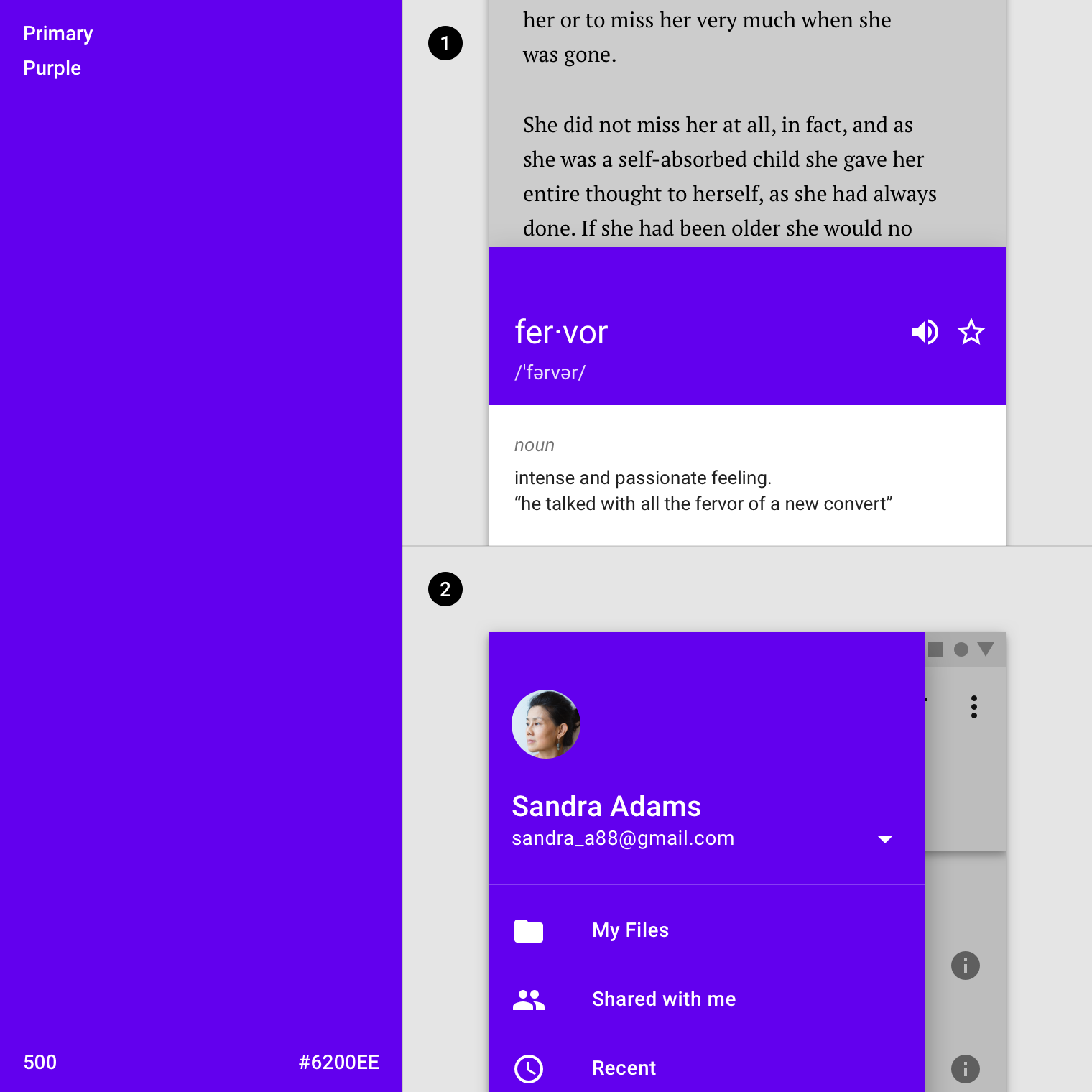
The primary color (purple 500) is used on this top app bar, and a dark primary variant (purple 700) is used on the system bar.
To emphasize the difference between app bars and other surfaces, use a secondary color on nearby components such as the FAB.
The primary color (blue 700) is used on this bottom app bar, and the secondary color (orange 500) is used on the floating action button.
If the bottom app bar and floating action button are the same color, use shadow or alternate means to create enough distinction between them.
Blending an app bar with the background
When an app’s top or bottom app bar color is the same color as the background color, they blend together, placing emphasis on an app’s content instead of its structure.
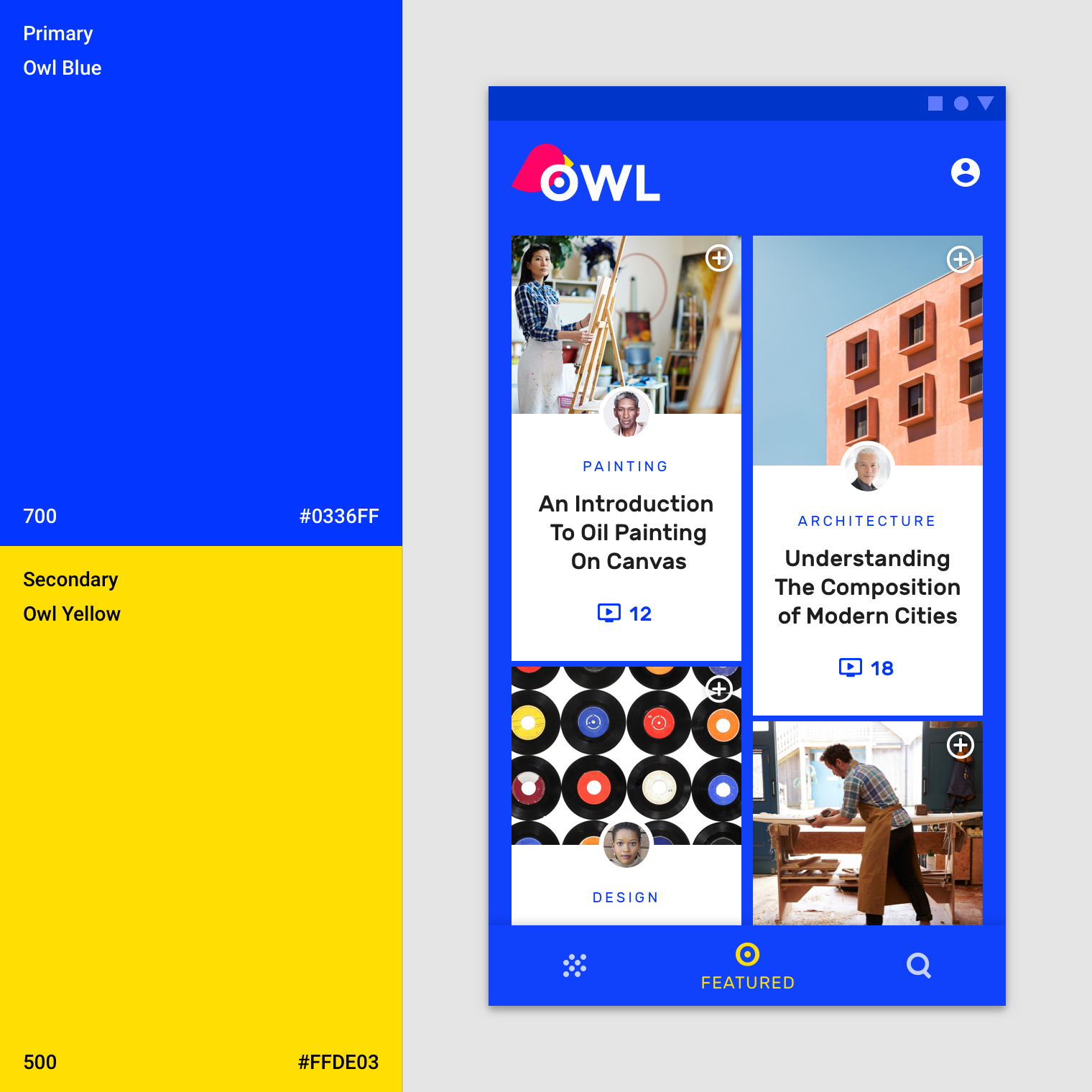
This app’s bright, seamless layout uses it’s primary blue (blue 700) color for app bars, bottom navigation, and the background color, so individual elements stand out less, and content stands out more. The activation state uses the secondary yellow. It includes a shadow on the bottom navigation to show the elevation division between surfaces.
Backdrop
A backdrop has a front and back layer. To distinguish between these two layers, the baseline back layer color is your primary color and the baseline front layer is white.
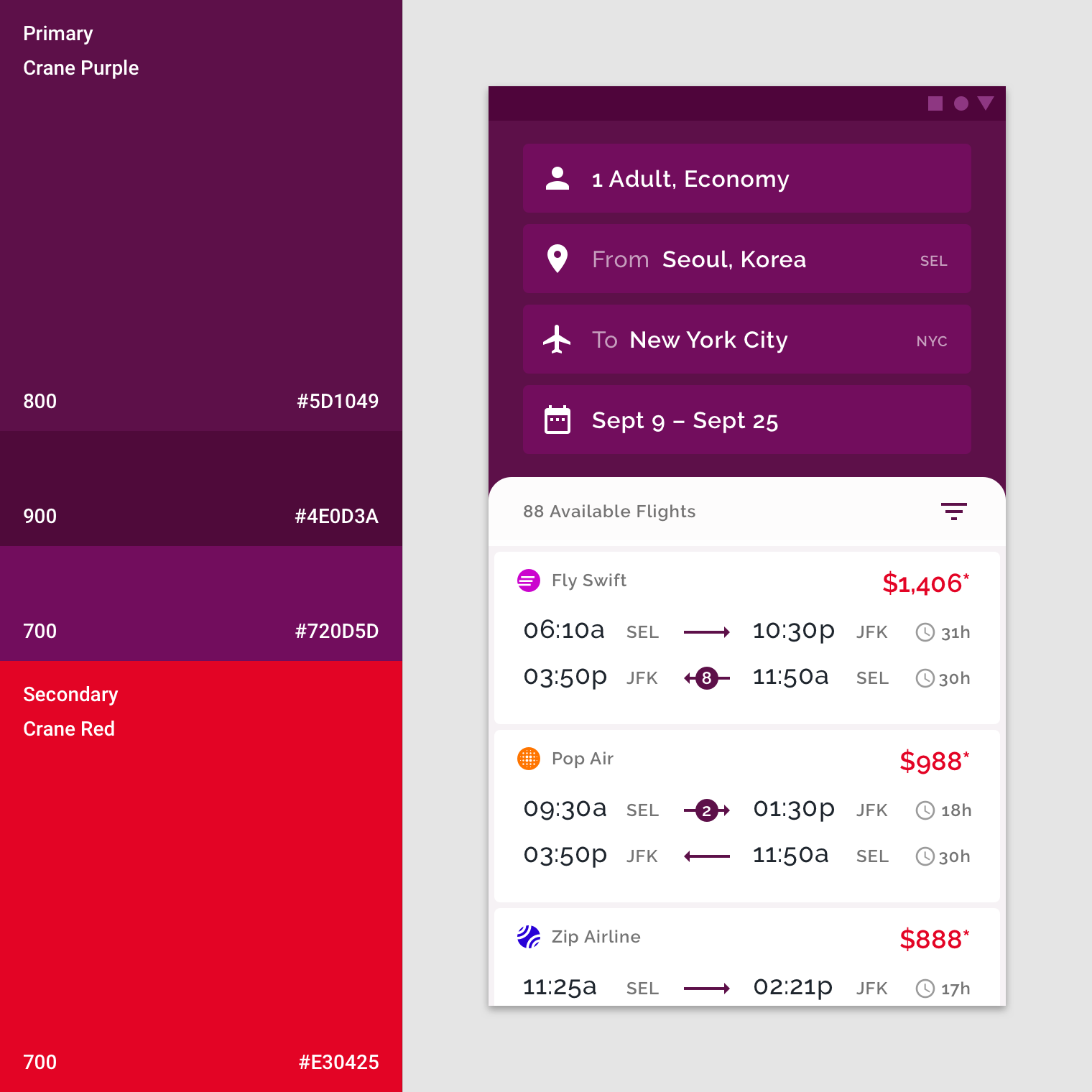
This app uses its primary color (purple 800) on the backdrop’s back layer. The text fields are a light primary variant (purple 700). A secondary color (red 700) is applied as an accent to the flight fares.
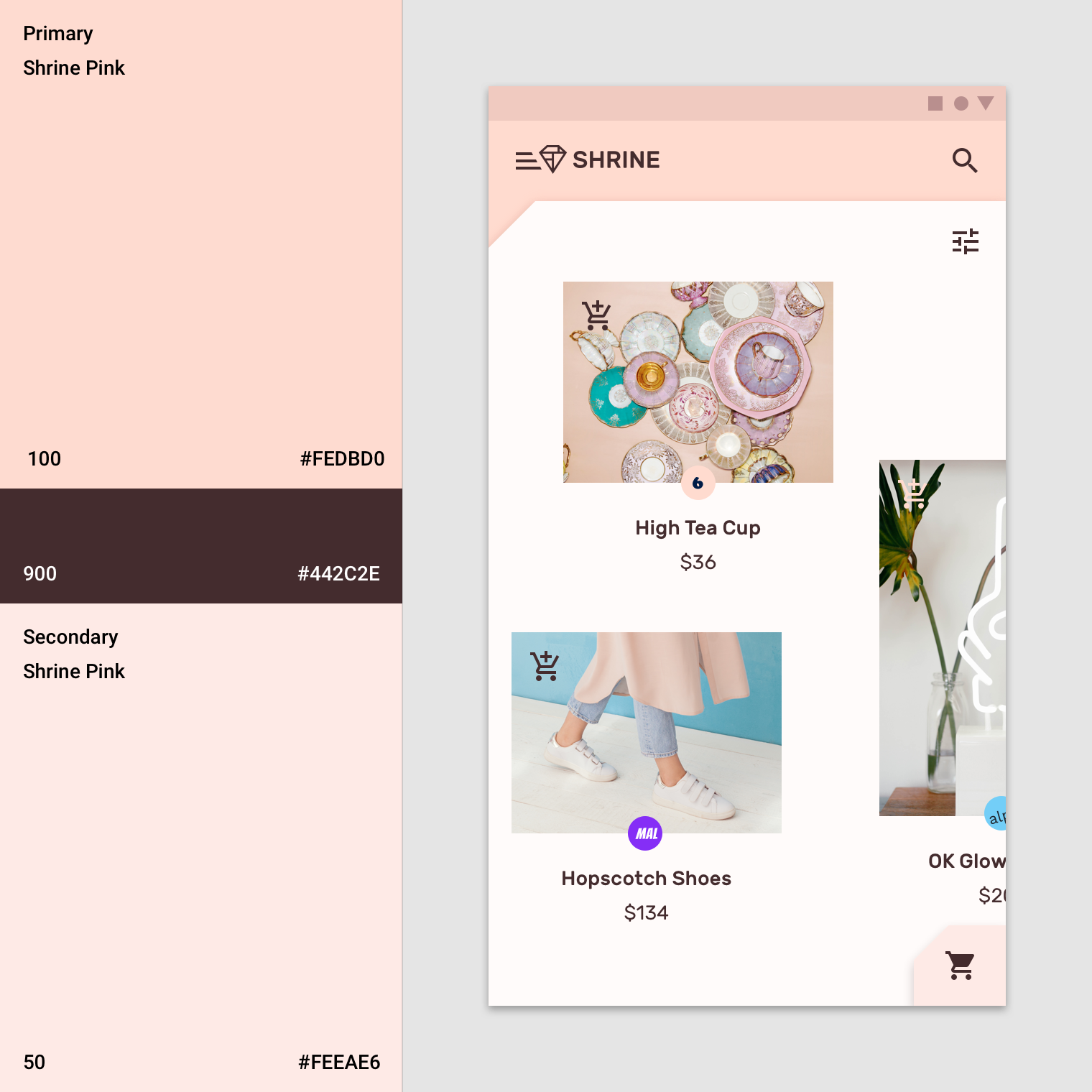
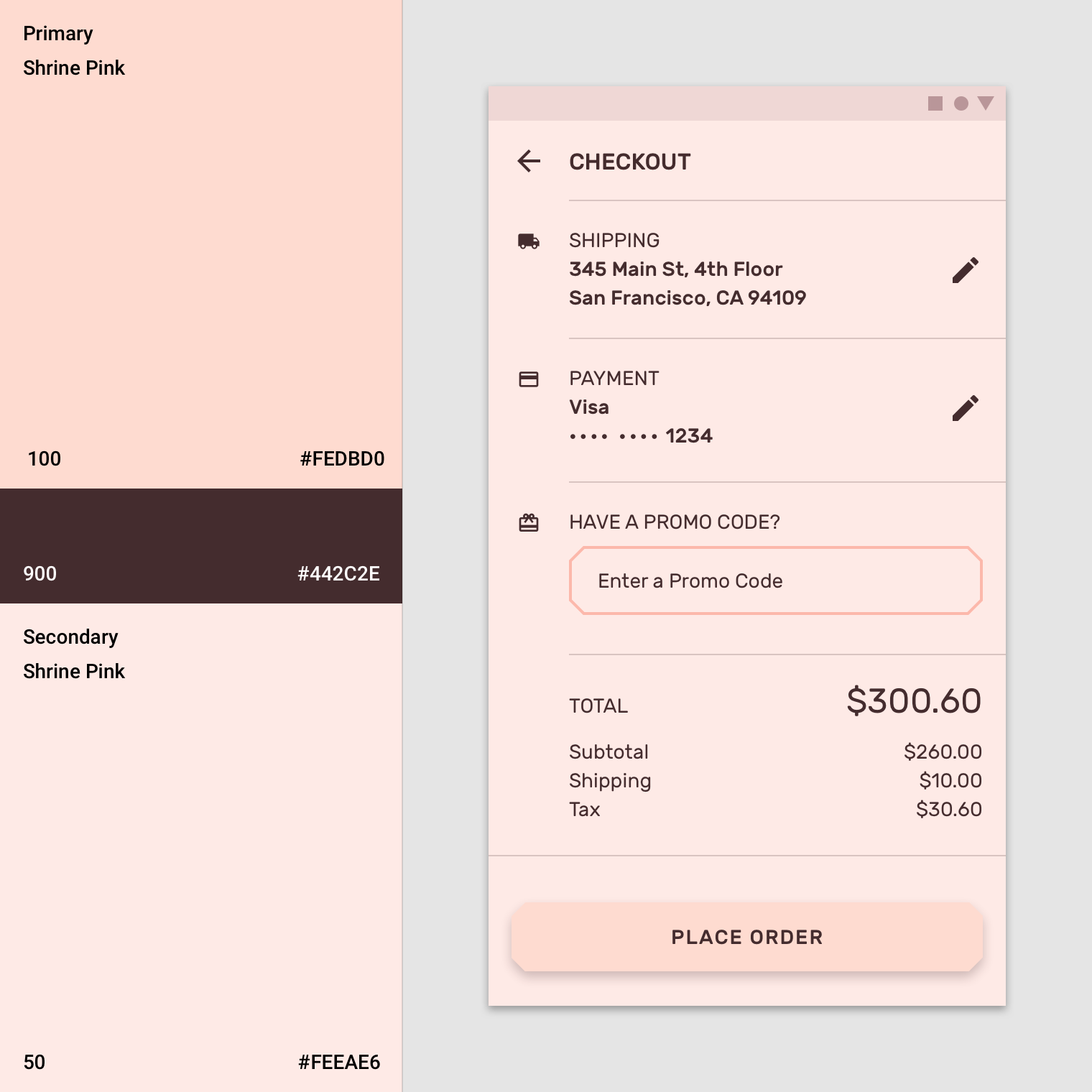
This app uses the primary color (pink 100) for the backdrop’s back layer and the primary dark primary variant (pink 900) for typography and iconography. Additionally, the secondary color (pink 50) is used for the expanding sheet on the front layer.
Sheets and surfaces
The baseline color for sheets and surfaces, such as bottom sheets, navigation drawers, menus, dialogs, and cards is white. These components can incorporate color to create contrast between other surfaces. Contrast can make surface edges apparent, indicating elevation differences when surfaces overlap.
This product has changed the default white to a primary color in a bottom sheet and the navigation drawer.
- This product uses a primary color (purple 500) in part of the bottom sheet instead of the baseline white.
- This product’s navigation drawer uses its primary color (purple 500) instead of the baseline white.
Modal sheets
Use contrasting colors on surfaces that appear on-screen temporarily, such as navigation drawers and bottom sheets. Usually these surfaces are white, but you can use your app’s primary or secondary color.
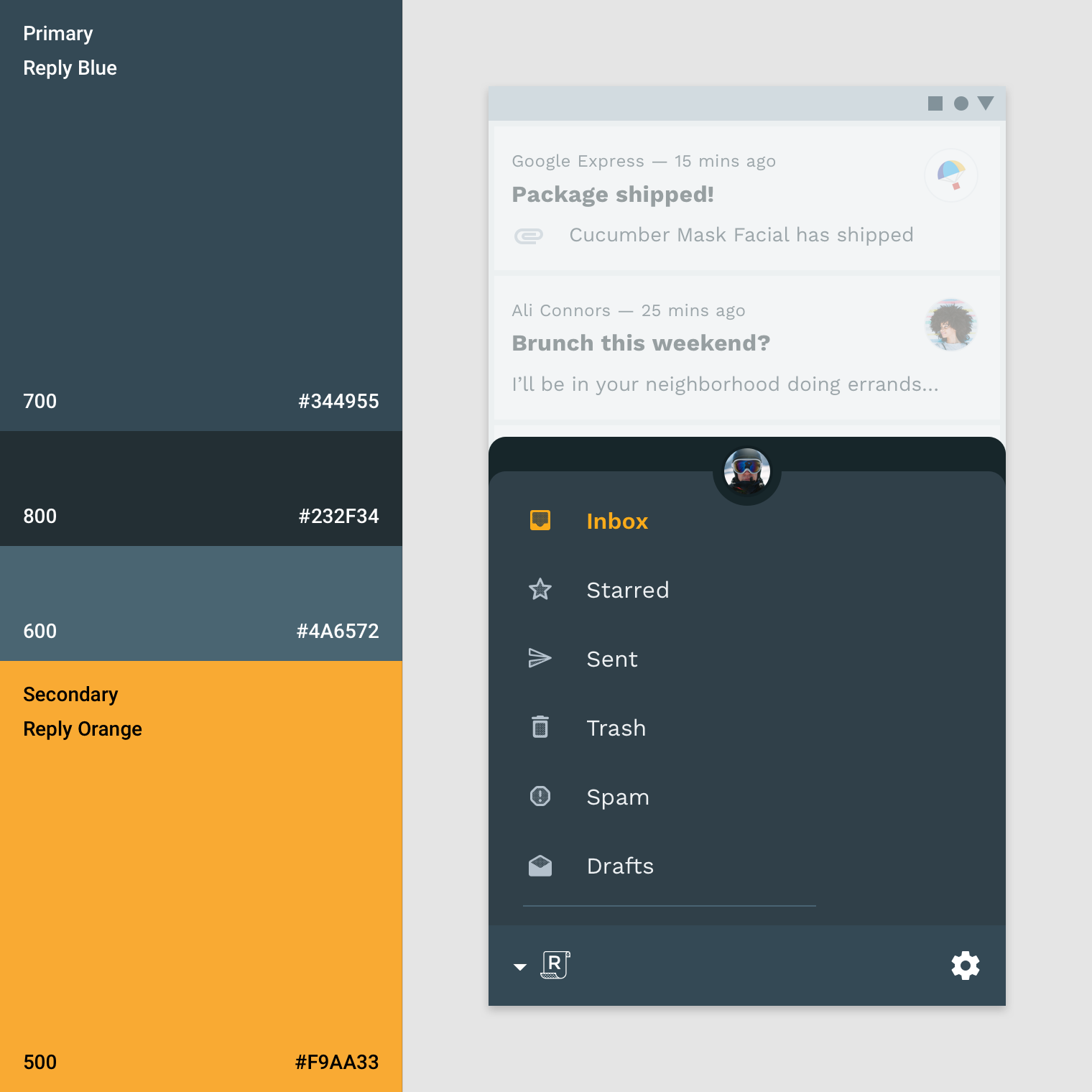
This app uses its primary color blue (blue 700) on the bottom navigation drawer, a primary dark variant (blue 800) for the account switcher, and a secondary color (orange 500) for selection.
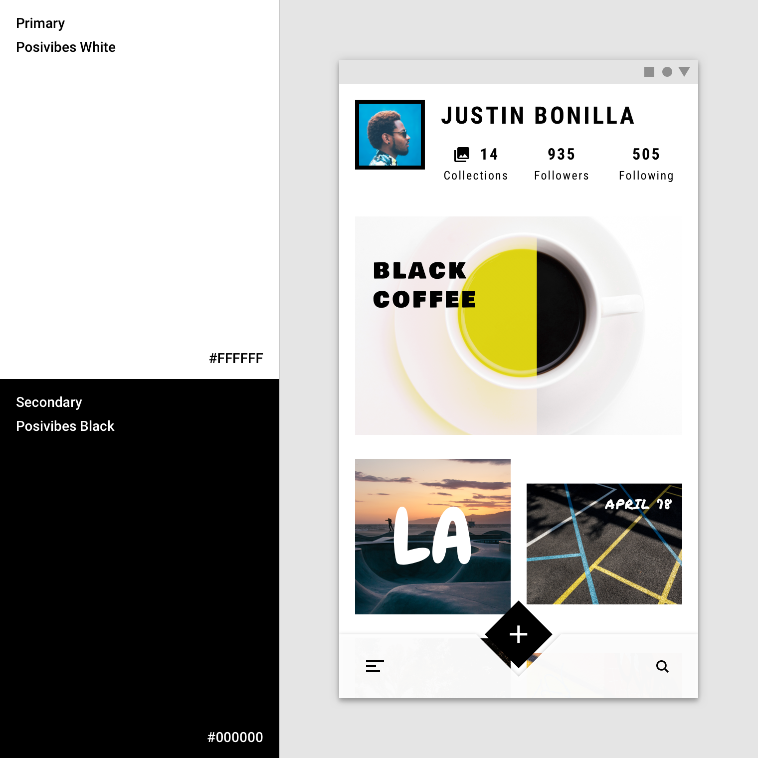
This app uses its primary color (white) for its modal navigation drawer, creating the maximum contrast between the dark typography and the navigation. A white scrim is used to make content behind it less noticeable, as the navigation drawer is the same color as the background.
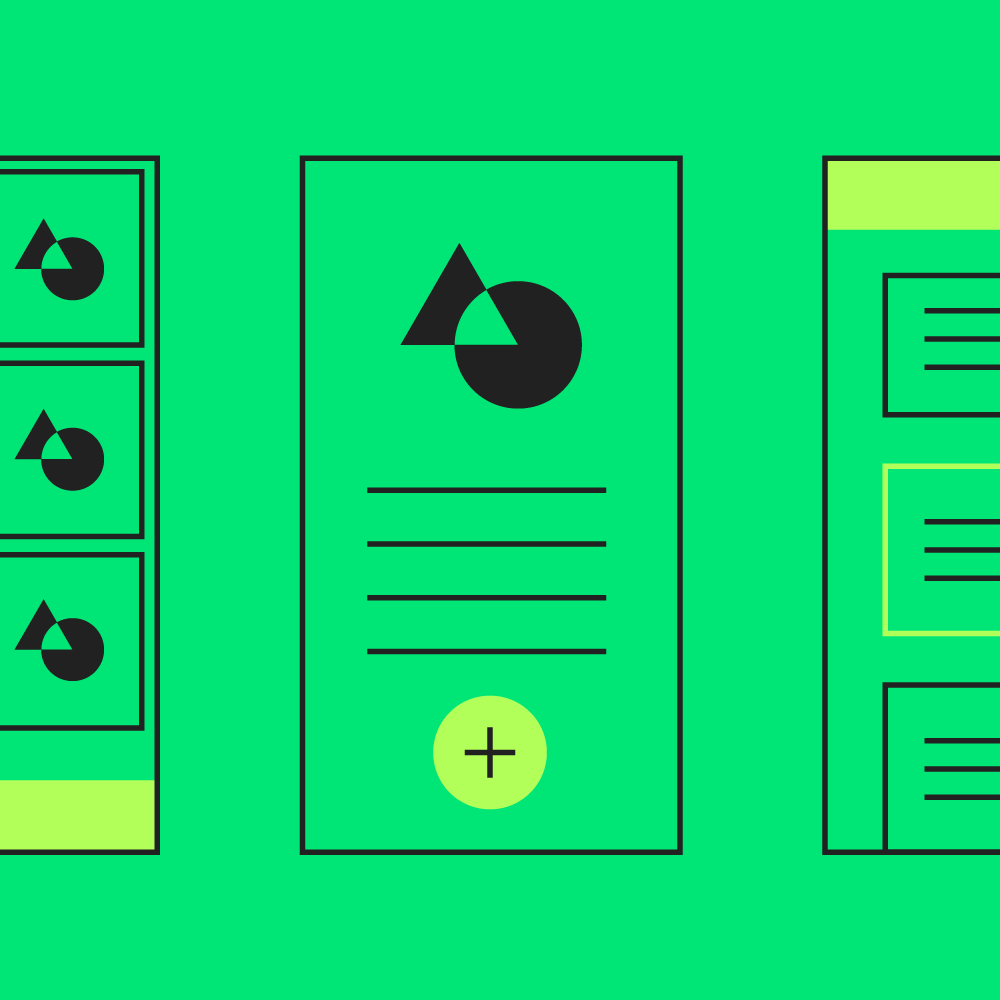
Cards
The baseline color for cards is white. This color can be customized to express brand or to improve legibility. Card text and icons can also use the color theme to improve legibility.
The surfaces of these cards use the primary color (purple 500). The app’s background color is white. The secondary color (teal 200) is used for data visualization.
When a card’s text and icons appear in front of imagery, they can be difficult to read. To improve legibility, you can use color to create a surface for text and icons.
This card uses a colorful scrim to ensure text remains legible.
Buttons, chips and selection controls
Buttons, chips and selection controls can be emphasized by applying your primary or secondary color to them.
Color categories
- The baseline color for contained, text and outlined buttons is your primary color.
- The baseline color for floating action buttons and extended floating action buttons is your secondary color.
- The baseline color for selection controls is your secondary color.
The color theme for this app consists of a primary color (purple 500) with a primary dark variant (purple 600) and a secondary color (teal 200).
- This product uses the primary color (purple 500) for the bottom app bar and the secondary color (teal 200) as an accent for the floating action button and selection controls.
- This product uses the secondary color (teal 200) as an accent for selected list items.
Buttons, chips, and selection controls
Buttons, chips, and selection controls can be emphasized with your primary or secondary colors.
This app uses its primary color (pink 100) for its extended floating action button and chips. It uses its primary dark variant (pink 900) for the slider.
Selection controls can inherit your app’s secondary color.
Don’t use one of your brand colors for coloring alerts. This will help it stand out.
Floating action button (FAB)
The floating action button (FAB) should be one of the most recognizable items on your screen.
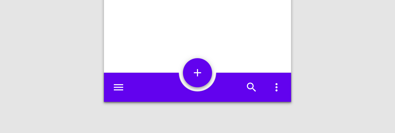
Use color to create contrast between the FAB and surrounding elements, such as the app bar. Your secondary color is the baseline color for use on the FAB. If your canvas uses many colors, your FAB can use monochromatic coloring instead, to stand out from the content.
This app’s secondary color (orange 500) is applied to the FAB, contrasting it from the surrounding UI.

This app’s color theme uses a primary white and a secondary black for all buttons, selection controls, and iconography. These components stand out because they contrast with the vivid, multicolor content.
Typography and iconography
Color can express whether text has greater, or lesser, importance relative to other text. Color also ensures text remains legible when placed above imagery or backgrounds, which can make it difficult to read the text in front of them.
Typographic hierarchy
Color can increase both text’s visibility and its level of importance.
The color theme for this app consists of a primary color (purple 500) and a secondary color (orange 600). Orange accents the card’s headlines, and purple appears on tabs and buttons.
Headlines and tabs
Important text, like tabs and headlines, can use your primary or secondary color.
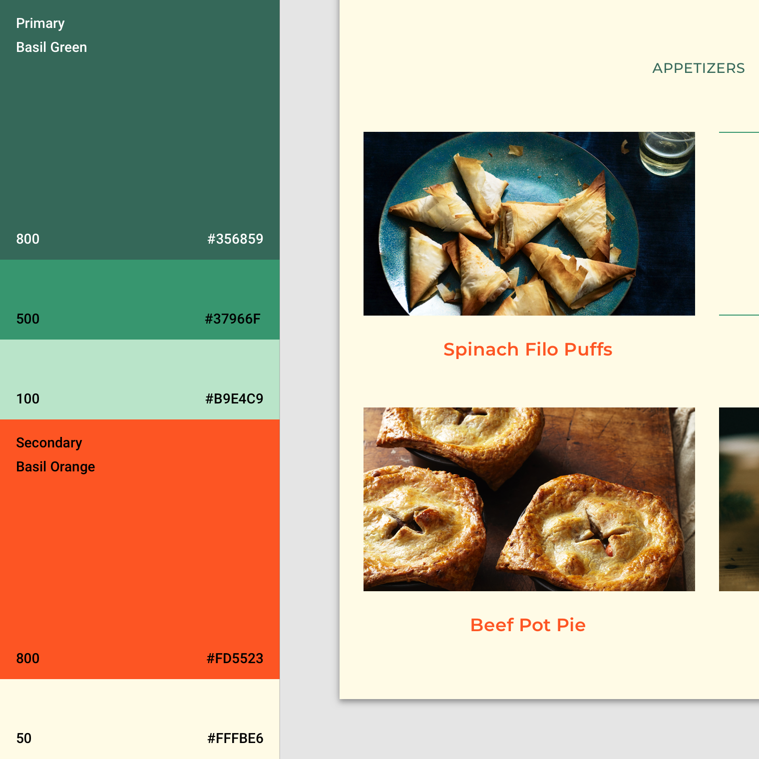
This app uses its secondary color (orange 800) to accent and call attention to the headlines.
This app uses its primary color (green 800) for tabs, with weight changes indicating selected and unselected states.

Use your primary or secondary color to emphasize shorter text, such as headlines.

You can use your primary or secondary color to accent links.
Text legibility
When text is placed above imagery, it often leads to legibility issues. Creating a colored layer between text and image can ensure text remains legible.
This app applies a yellow scrim above imagery to ensure text above it is legible.
Icons
Icons help identify actions and provide information. Their color should contrast against the background to ensure that they are legible and identifiable.
Shrine uses its primary dark variant (pink 900) for icons.