almoamen.net
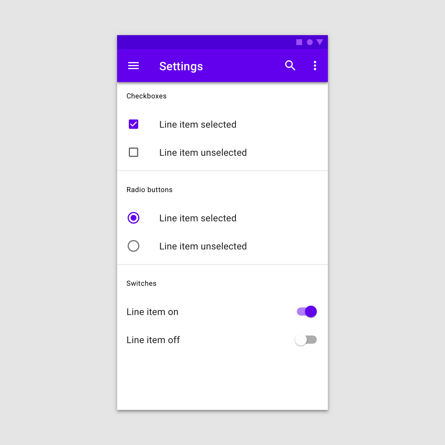
Selection controls
A divider is a thin line that groups content in lists and layouts.
Usage
Selection controls allow users to complete tasks that involve making choices such as selecting options, or switching settings on or off. Selection controls are found on screens that ask users to make decisions or declare preferences such as settings or dialogs.
Principles
Familiar
Selection controls have been in user interfaces for a long time and should be used as expected.
Scannable
It should be visible at a glance if a selection control has been selected, and selected items should be more visually prominent than unselected items.
Efficient
Selection controls make it easy to compare available options.
Types
Radio buttons
Checkboxes
Switches
When to use radio buttons
Use radio buttons to:
- Select a single option from a list
- Expose all available options
If available options can be collapsed, consider using a dropdown menu instead, as it uses less space.
Radio buttons
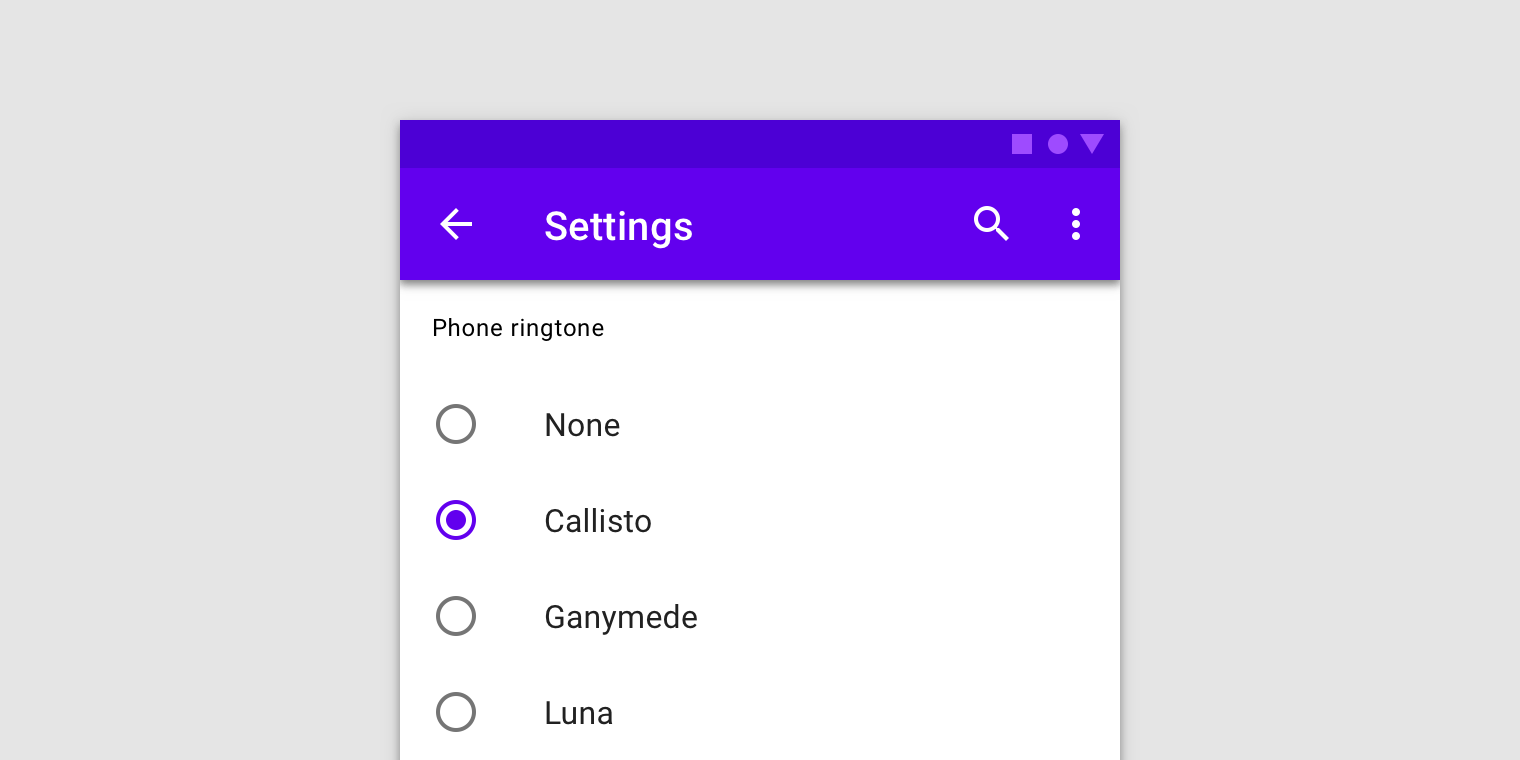
Radio buttons should be used instead of checkboxes if only one item can be selected from a list.
Use radio buttons when only one item can be selected from a list.
When to use switches
Use switches to:
- Toggle a single option on or off, on mobile and tablet
- Immediately activate or deactivate something
Switches
Swtiches should be used instead of radio buttons if only one item can be selected from a list.

Use switches to turn an option on or off, especially on mobile.
When to use checkboxes
Use checkboxes to:
- Select one or multiple items from a list
- Present a list containing sub-selections
- Turn an option on or off in desktop environment
Checkboxes
When to use checkboxes instead of toggles
If a list consists of multiple options, avoid using switches. Use checkboxes instead because they take up less space.
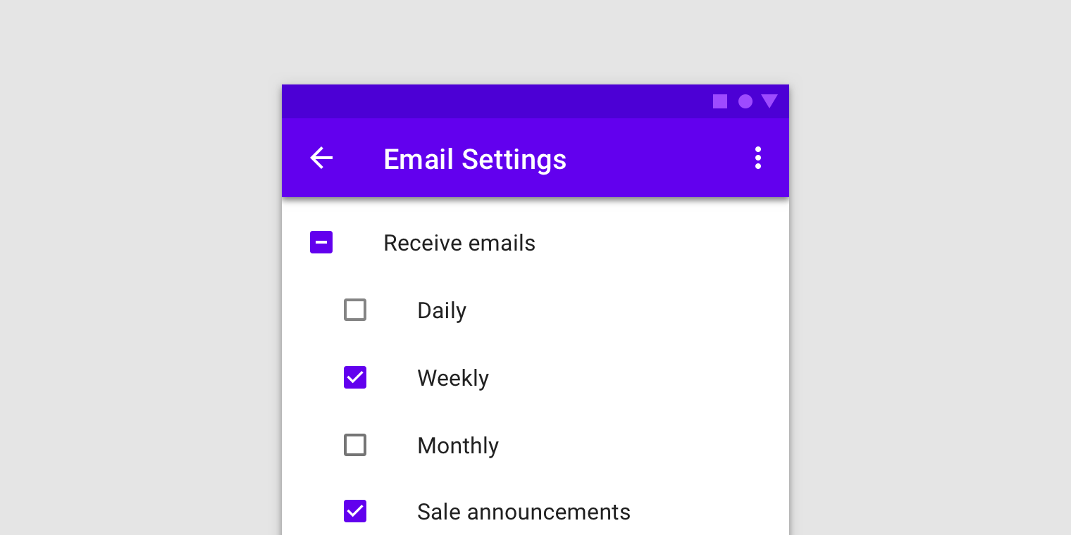
Checkboxes are for making selections from a list. They let users select more than one item and allow for easy selection or deselection of all items with a parent checkbox.
Checkboxes
Usage
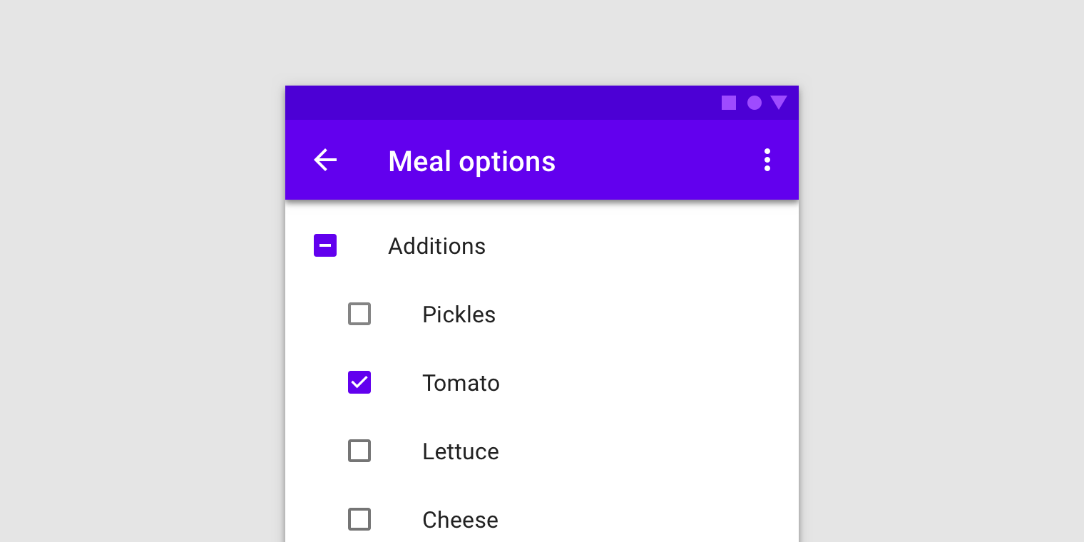
Checkboxes allow the user to select one or more items from a set. Checkboxes can be used to turn an option on or off.
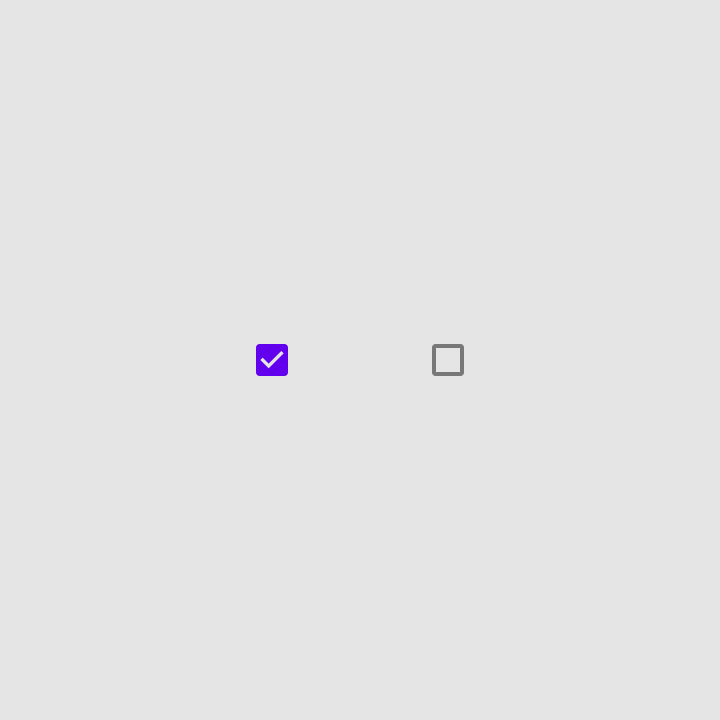
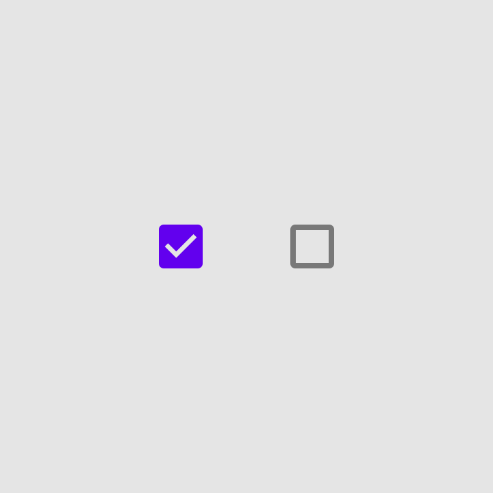
Selected and unselected checkboxes.
Parent and child checkboxes
Checkboxes can have a parent-child relationship with other checkboxes.
- When the parent checkbox is checked, all child checkboxes are checked
- If a parent checkbox is unchecked, all child checkboxes are unchecked
- If some, but not all, child checkboxes are checked, the parent checkbox becomes an indeterminate checkbox
States
Checkboxes can be selected, unselected, or indeterminate. Checkboxes have enabled, hover, focused and pressed states.
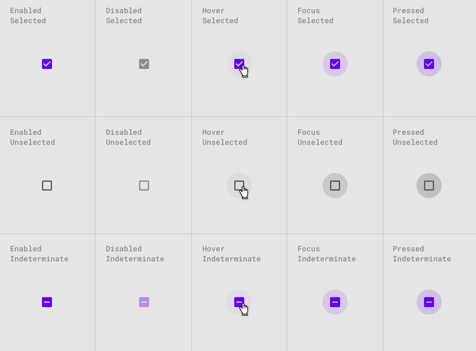
Checkbox states.
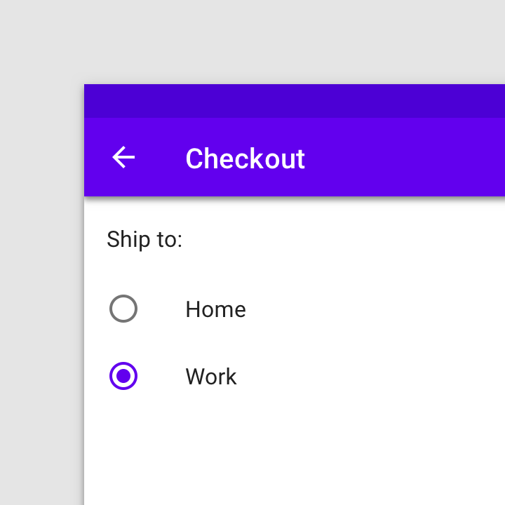
Radio buttons
Usage
Radio buttons allow the user to select one option from a set. Use radio buttons when the user needs to see all available options. If available options can be collapsed, consider using a dropdown menu because it uses less space.
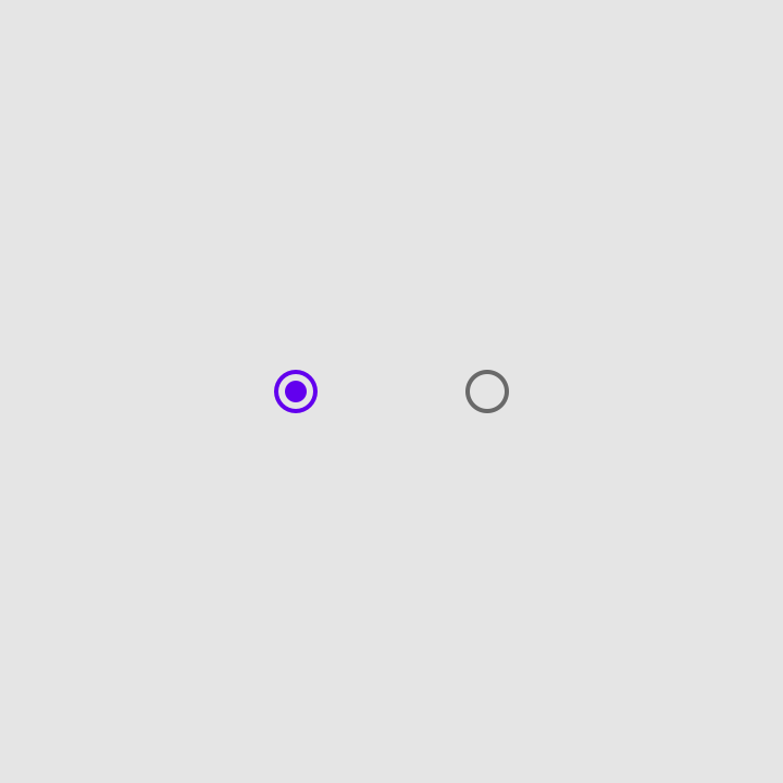
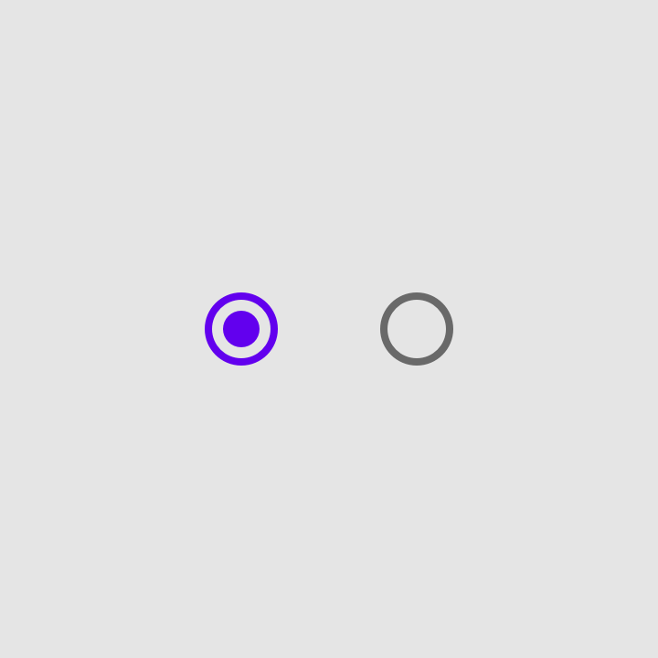
Selected and unselected radio buttons
States
Radio buttons can be selected or unselected. Radio buttons have enabled, hover, focused and pressed states.
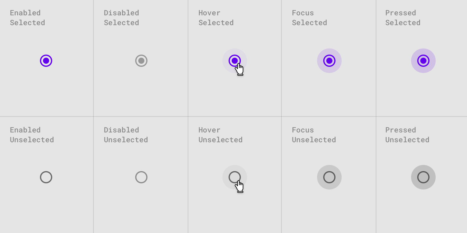
Radio button states.
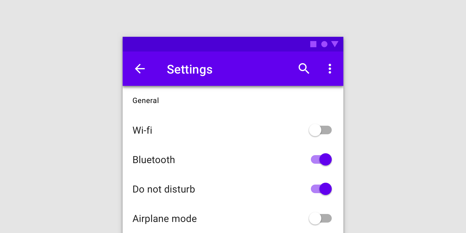
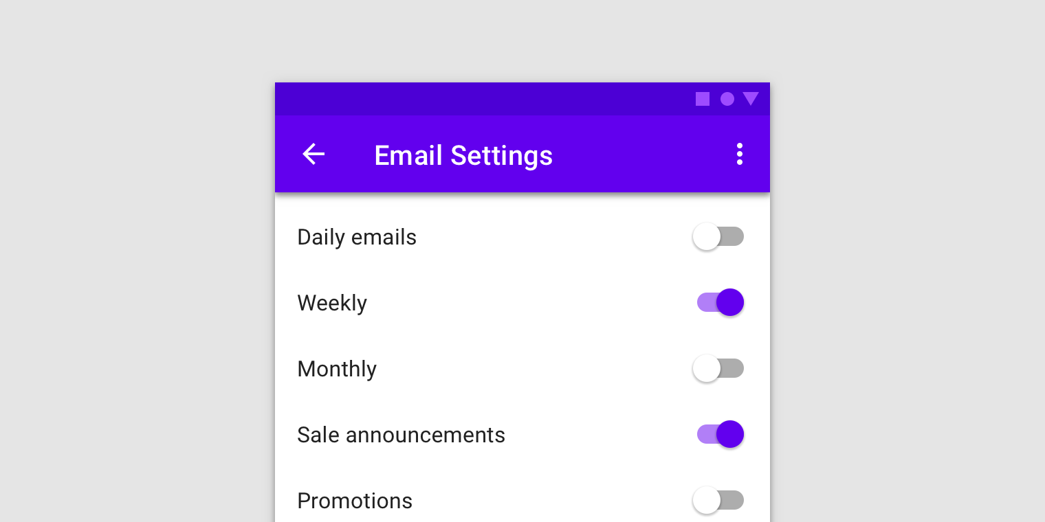
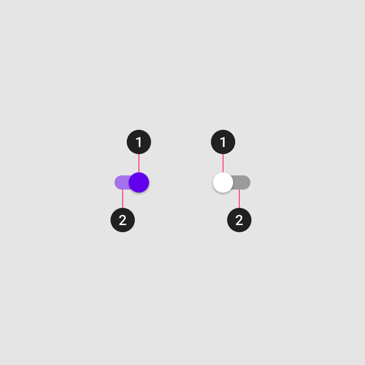
Switches
Usage
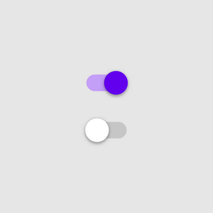
Switches toggle the state of a single setting on or off. They are the preferred way to adjust settings on mobile.
State
A switch is successfully toggled when the user slides a switch thumb to the other side of the track, and the state of the switch changes.
Text label
The option that the switch controls, as well as the state it’s in, should be made clear from the corresponding inline label.
Avoid creating a switch that includes the text “on” and “off” within the graphic itself. The switch alone should be sufficient.
- Thumb
- Track
Behavior
When a user toggles a switch, its corresponding action takes effect immediately. If a switch cannot be turned on, the switch will automatically turn back off.
Display processing status
Because a switch shows the actual status of something, sometimes there is a delay in its change of state. In such cases, a processing status animation can be used.
A processing status is an animation on the thumb of the switch. For example, it can be used when a switch that controls a hardware feature experiences a delay before its final status can be confirmed.
States
Switches can be on or off. Switches have enabled, hover, focused, and pressed states.
Display the outer radial reaction only on form factors that use touch, where interaction may obstruct the element completely.
For desktop, the radial reaction isn’t needed.
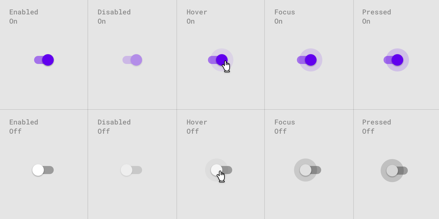
Switch states.
<div class="mdc-checkbox lime-800">
    <input type="checkbox" class="mdc-control">
    <div class="control-icon"></div>
</div>
<div class="mdc-checkbox lime-800 indeterminate">
    <input type="checkbox" class="mdc-control">
    <div class="control-icon"></div>
</div>
<div class="mdc-checkbox lime-800">
    <input type="checkbox" class="mdc-control" checked>
    <div class="control-icon"></div>
</div>

<div class="mdc-checkbox lime-800">
    <input type="checkbox" class="mdc-control" disabled>
    <div class="control-icon"></div>
</div>
<div class="mdc-checkbox lime-800 indeterminate">
    <input type="checkbox" class="mdc-control" disabled>
    <div class="control-icon"></div>
</div>
<div class="mdc-checkbox lime-800">
    <input type="checkbox" class="mdc-control" checked disabled>
    <div class="control-icon"></div>
</div>
<label class="mdc-list-item">
    <div class="mdc-checkbox lime-800">
        <input type="checkbox" class="mdc-control">
        <div class="control-icon"></div>
    </div>
    <div class="text">Dining</div>
</label>
<label class="mdc-list-item">
    <div class="mdc-checkbox lime-800">
        <input type="checkbox" class="mdc-control" checked>
        <div class="control-icon"></div>
    </div>
    <div class="text">Education</div>
</label>
<label class="mdc-list-item">
    <div class="mdc-checkbox lime-800">
        <input type="checkbox" class="mdc-control" disabled>
        <div class="control-icon"></div>
    </div>
    <div class="text">Health</div>
</label>
<label class="mdc-list-item">
    <div class="mdc-checkbox lime-800">
        <input type="checkbox" class="mdc-control" checked disabled>
        <div class="control-icon"></div>
    </div>
    <div class="text">Sport</div>
</label>
Radio buttons
<div class="mdc-radiobutton lime-800">
    <input type="radio" name="radio_1" value="val_1" class="mdc-control">
    <div class="control-icon"></div>
</div>
<div class="mdc-radiobutton lime-800">
    <input type="radio" name="radio_1" value="val_2" class="mdc-control" checked>
    <div class="control-icon"></div>
</div>

<div class="mdc-radiobutton lime-800">
    <input type="radio" name="radio_2" value="val_1" class="mdc-control" disabled>
    <div class="control-icon"></div>
</div>
<div class="mdc-radiobutton lime-800">
    <input type="radio" name="radio_2" value="val_2" class="mdc-control" disabled checked>
    <div class="control-icon"></div>
</div>
<label class="mdc-list-item">
    <div class="mdc-radiobutton lime-800">
        <input type="radio" name="radio_3" value="val_1" class="mdc-control">
        <div class="control-icon"></div>
    </div>
    <div class="text">Dining</div>
</label>
<label class="mdc-list-item">
    <div class="mdc-radiobutton lime-800">
        <input type="radio" name="radio_3" value="val_1" class="mdc-control" checked>
        <div class="control-icon"></div>
    </div>
    <div class="text">Education</div>
</label>
<label class="mdc-list-item">
    <div class="mdc-radiobutton lime-800">
        <input type="radio" name="radio_4" value="val_1" class="mdc-control" disabled>
        <div class="control-icon"></div>
    </div>
    <div class="text">Health</div>
</label>
<label class="mdc-list-item">
    <div class="mdc-radiobutton lime-800">
        <input type="radio" name="radio_4" value="val_1" class="mdc-control" disabled checked>
        <div class="control-icon"></div>
    </div>
    <div class="text">Sport</div>
</label>
Switches
<div class="mdc-switch lime-800">
    <input type="checkbox" class="mdc-control">
    <div class="control-icon">
        <div class="rail"></div>
    </div>
</div>
<div class="mdc-switch lime-800">
    <input type="checkbox" class="mdc-control" checked>
    <div class="control-icon">
        <div class="rail"></div>
    </div>
</div>

<div class="mdc-switch lime-800">
    <input type="checkbox" class="mdc-control" disabled>
    <div class="control-icon">
        <div class="rail"></div>
    </div>
</div>
<div class="mdc-switch lime-800">
    <input type="checkbox" class="mdc-control" checked disabled>
    <div class="control-icon">
        <div class="rail"></div>
    </div>
</div>
<label class="mdc-list-item">
    <div class="text">Dining</div>
    <div class="mdc-switch lime-800">
        <input type="checkbox" class="mdc-control">
        <div class="control-icon">
            <div class="rail"></div>
        </div>
    </div>
</label>
<label class="mdc-list-item">
    <div class="text">Education</div>
    <div class="mdc-switch lime-800">
        <input type="checkbox" class="mdc-control" checked>
        <div class="control-icon">
            <div class="rail"></div>
        </div>
    </div>
</label>
<label class="mdc-list-item">
    <div class="text">Health</div>
    <div class="mdc-switch lime-800">
        <input type="checkbox" class="mdc-control" disabled>
        <div class="control-icon">
            <div class="rail"></div>
        </div>
    </div>
</label>
<label class="mdc-list-item">
    <div class="text">Sport</div>
    <div class="mdc-switch lime-800">
        <input type="checkbox" class="mdc-control" checked disabled>
        <div class="control-icon">
            <div class="rail"></div>
        </div>
    </div>
</label>