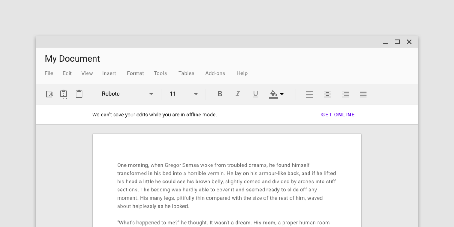
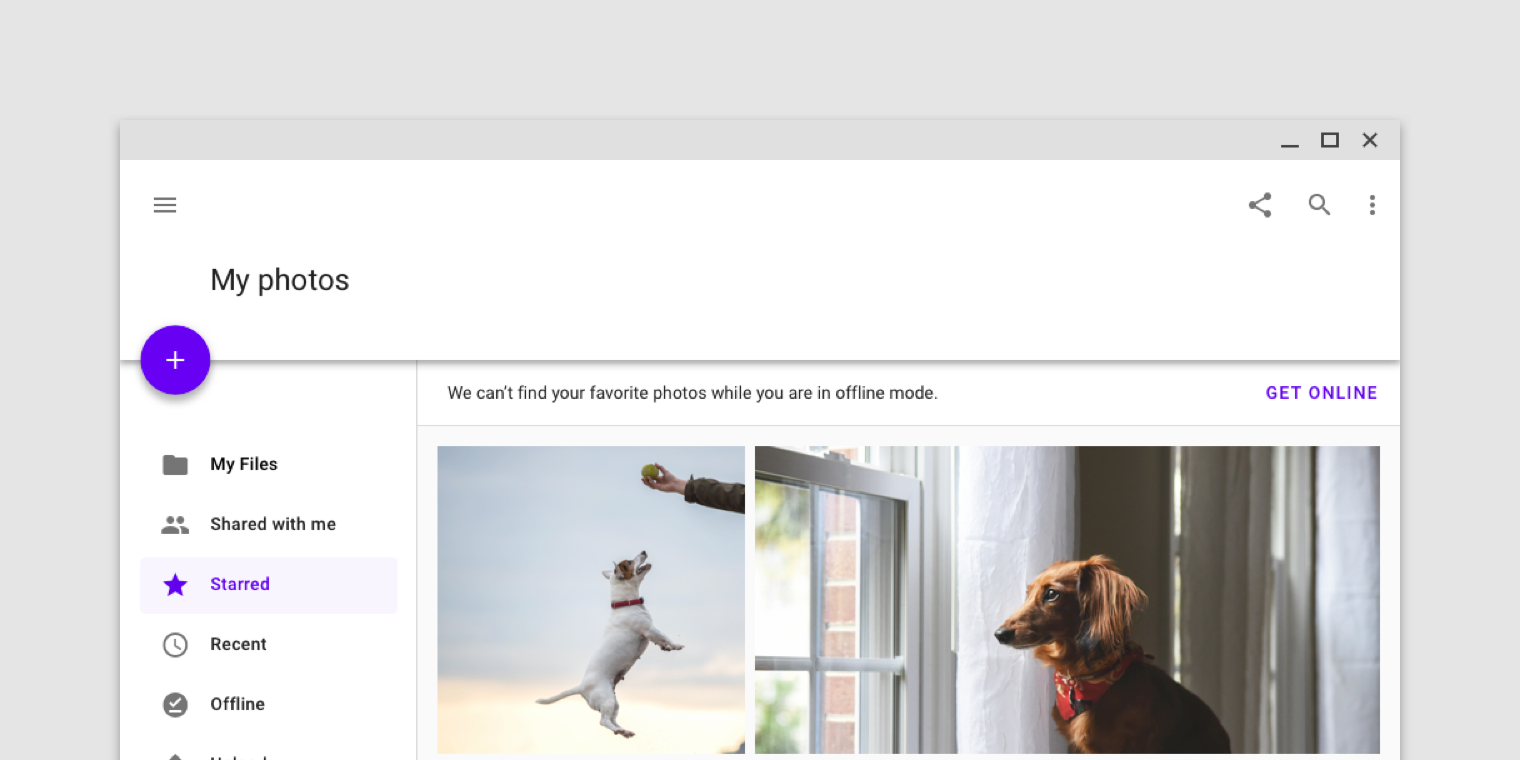
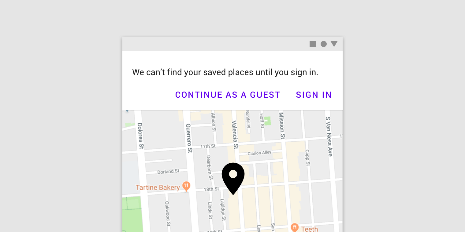
Banners must remain on screen until dismissed by the user.
Banners
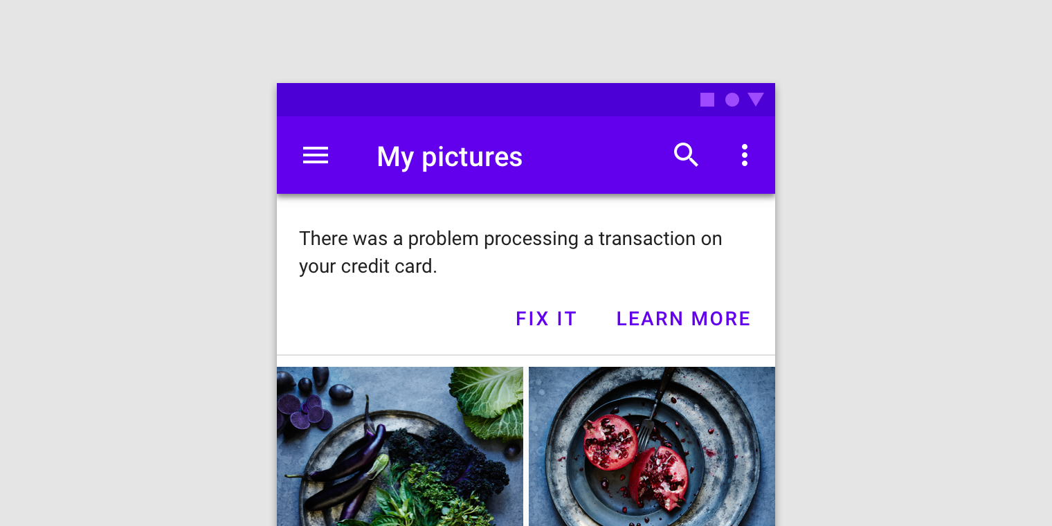
A banner displays a prominent message and related optional actions.
Usage
A banner displays an important, succinct message, and provides actions for users to address (or dismiss the banner). It requires a user action to be dismissed.
Banners should be displayed at the top of the screen, below a top app bar. They are persistent and nonmodal, allowing the user to ignore them or interact with them at any time.
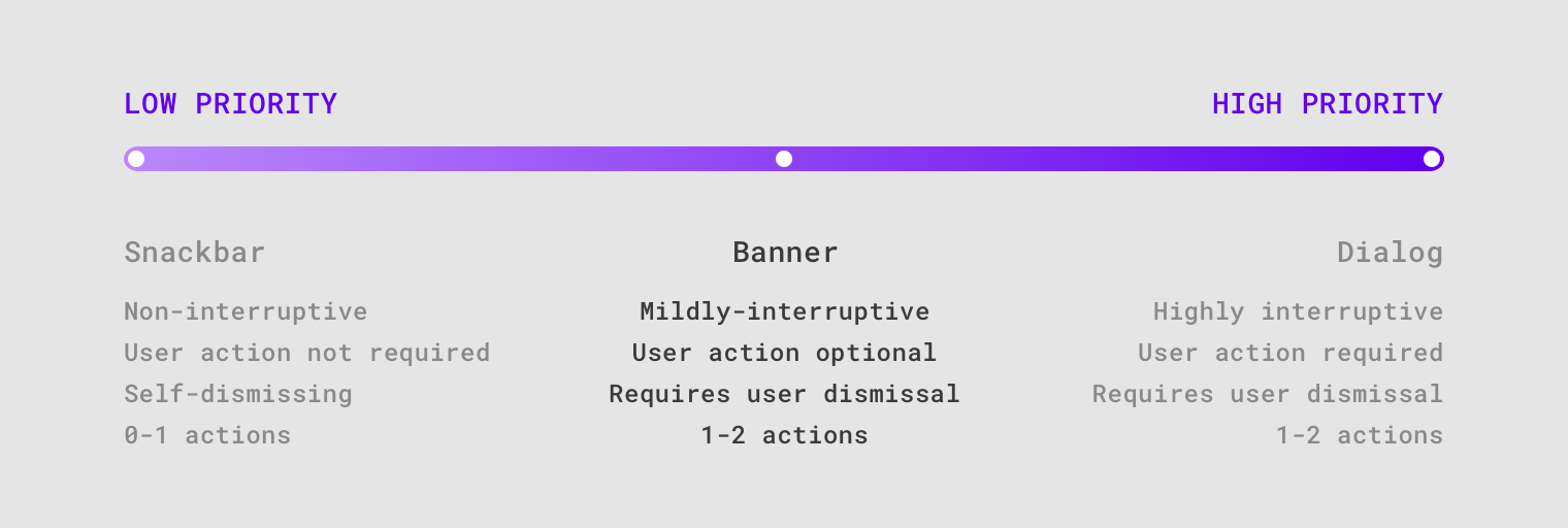
Banners communicate messages which are important but don’t require user action. They are more prominent than snackbars, and less interruptive than dialogs.
Principles

Appropriately interruptive
Banners are interruptive, but their level of interruption should match the information they contain and the context in which they appear.

Clear
Banners communicate a succinct message and what will happen if users interact with them.

Focused
Banners contain a single message and specific actions a user can take.
Anatomy
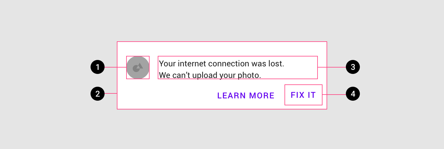
- Supporting illustration (optional)
- Container
- Text
- Buttons
Banner container
A banner container is rectangular, extending the full width of a layout. The container should be placed in a consistent and prominent location throughout an app, sharing the same elevation as screen content.
Only one banner should be shown at a time.
A banner appears above content and below a top app bar.
Banner message
The banner message communicates a change or error within an app.
Banners should be considered as part of your overall in-app messaging strategy.
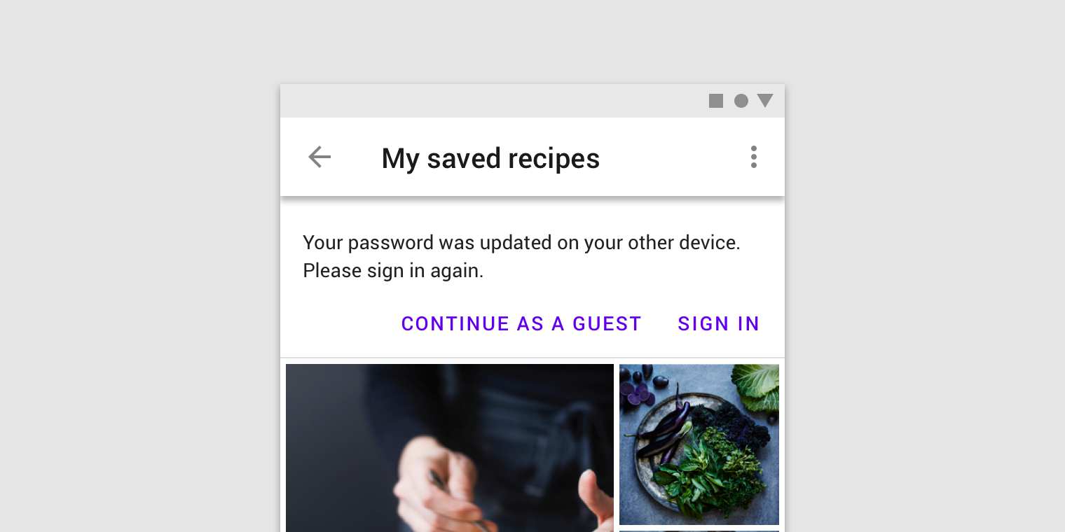
Buttons
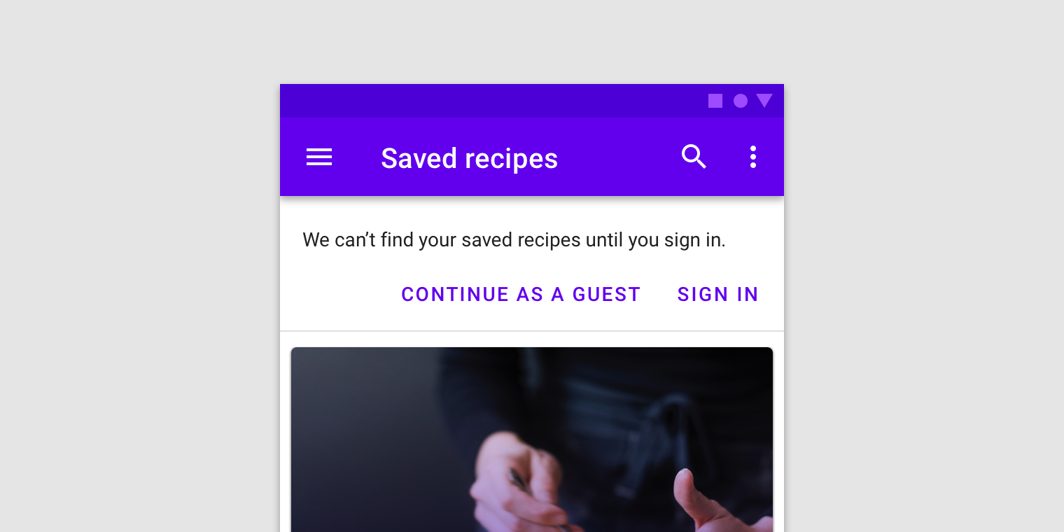
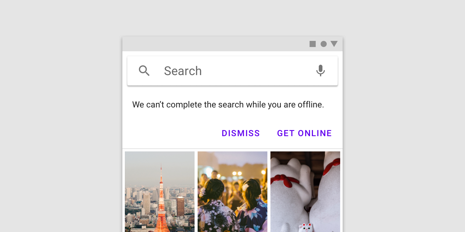
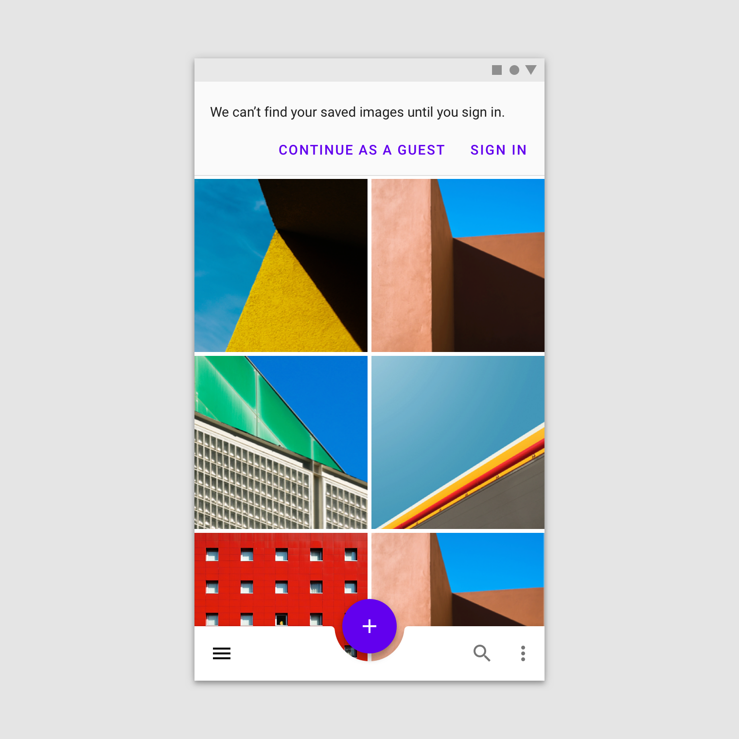
Buttons in banners should directly relate to a banner’s message and clearly represent the banner’s action. Buttons must be labelled with text, not icons, for clarity. Banners can contain up to two text buttons with the dismissive action placed on the left and the confirming action on the right.
Place buttons under the banner message, or on the same line if there is enough room to fit both.
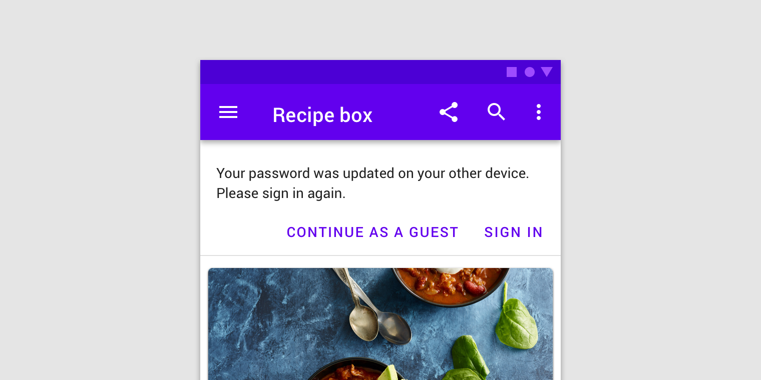
Banners may have one or two low-emphasis text buttons.
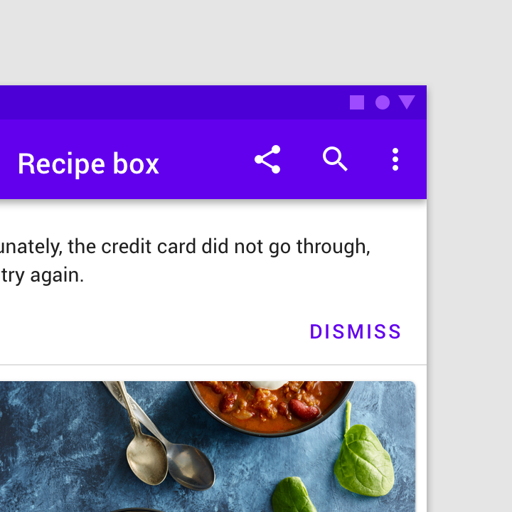
Avoid using a single button as a way to acknowledge a banner and dismiss it. A button to dismiss a banner should be paired with an action to address its message.
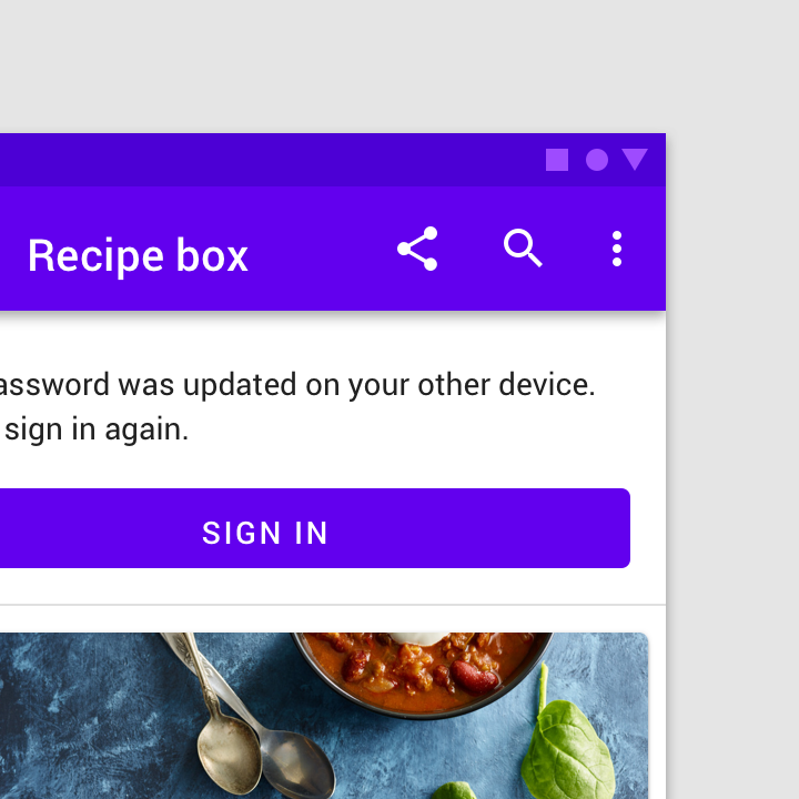
Banners are intended to be minimally interruptive. If a button in a banner requires extra emphasis, a contained, full-width button can be used for a single, prominent action (though its prominence may be distracting).
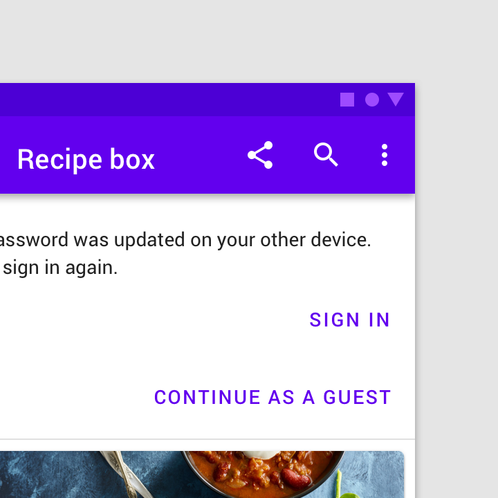
Don’t stack buttons unless there isn’t sufficient room to display them side by side.
Supporting illustration
Banners can supplement their message using a supporting illustration.
Icons can help communicate a banner’s message.
Placement
Banners should be placed at the top of a layout or screen. When scrolling, banners typically move with content and scroll off the screen. Only one banner should be shown at a time.
Banners and top bars
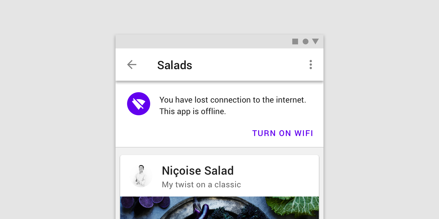
Banners are placed at the top of the screen below the top app bar. They can be fixed, or scroll with content, depending on the environment:
- On mobile, they scroll off-screen with content, at the same elevation as app content.
- On desktop, they remain fixed at the top of the screen, at the same elevation as the top app bar.
Banner and a top bar.
Banners and persistent search
When a banner appears with a persistent search bar, it’s placed below the search bar.
A banner appears below a persistent search bar.
Banners and bottom navigation
When bottom navigation is present, banners should remain at the top of the screen.
Banners appear at the top of the screen when bottom navigation is present.
Banners in wide layouts
Banners in wide layouts span the entire width of the screen. They appear at the same elevation as the top app bar and remain on screen while content scrolls.
A banner in a wide layout appears at the same elevation as the top app bar.
When vertical navigation is present, banners can appear above content rather than across the full width of the screen.
A banner on a screen with a navigation drawer appears slightly above just the content (on the y-axis), at the same elevation as that content.
Banners and pannable content
Banners remain on screen when scrolling pannable content.
Banners remain on screen when scrolling pannable content, such as a map.
Behavior
Appearing
Banners typically appear when a screen loads content.
Banners that appear after a screen loads should animate on screen from the top of a layout. If the banner is at the same elevation as content, it pushes content downwards.
Dismissing banners
Banners must remain on screen until dismissed by the user.
Implementation
Related components:
Javascript methods:
| void MDC.bannerActivate() | ||
|---|---|---|
| A method to activate a banner. Only one banner should be present at a time. | ||
| void MDC.bannerDeactivate() | ||
| A method to da-activate a visible banner. |
Note: banner items should be wraped inside .container or .container-fluid depending on your layout to align banner items perfectly with the page content.
Note: banners placement should be at the top of the content. other placement options are not supported yet.
Caution: only a maximum of 3 lines of text will be visible at all times. keep the text as short as possible to avoid it from being cut.
<div id="mdc-banner">
    <div class="container">
        <div class="text">
            <div class="body">...</div>
        </div>
        <div class="mdc-button-group">
            <button class="mdc-button lime-800">Dismiss</button>
        </div>
    </div>
</div>
<div id="mdc-banner">
    <div class="container">
        <div class="text">
            <div class="body">...</div>
        </div>
        <div class="mdc-button-group">
            <button class="mdc-button lime-800">Action</button>
            <button class="mdc-button lime-800">Dismiss</button>
        </div>
    </div>
</div>
<div id="mdc-banner">
    <div class="container">
        <div class="text">
            <div class="graphic bg-lime-800"><div class="material-icon">pets</div></div>
            <div class="body">...</div>
        </div>
        <div class="mdc-button-group">
            <button class="mdc-button lime-800">Dismiss</button>
        </div>
    </div>
</div>