almoamen.net
Tabs
Tabs organize content across different screens, data sets, and other interactions.
Usage
Tabs organize and allow navigation between groups of content that are related and at the same level of hierarchy.
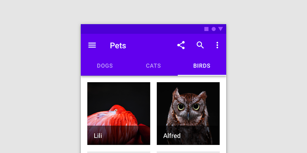
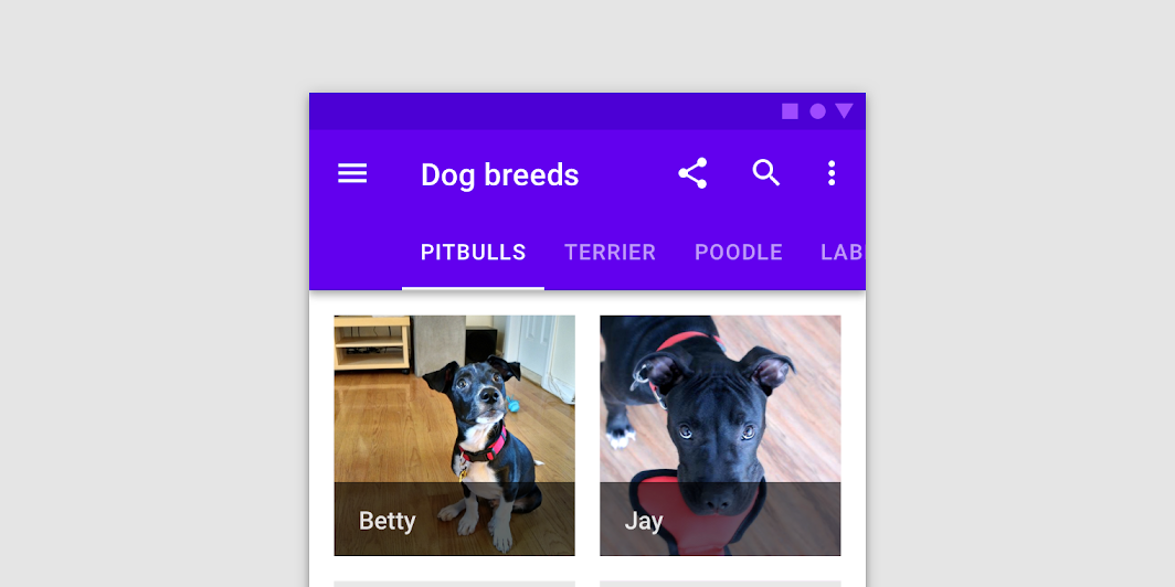
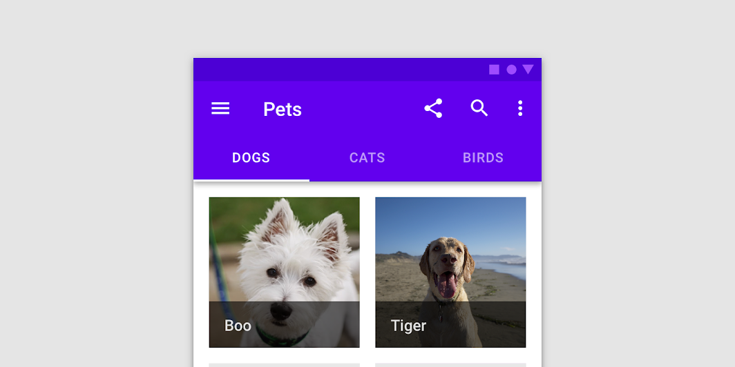
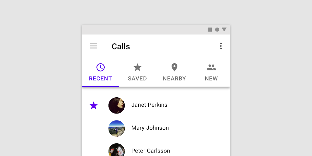
Tabs in a set
Each tab should contain content that is distinct from other tabs in a set. For example, tabs can present different sections of news, different genres of music, or different themes of documents.
Tab labels can include icons and text. Text labels should be short
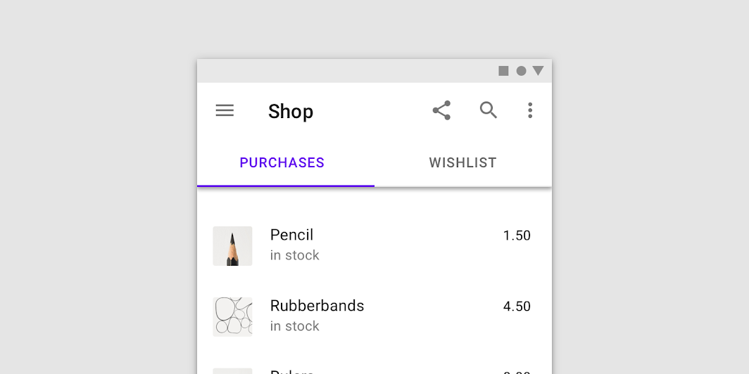
Present tabs as a single row above their associated content.
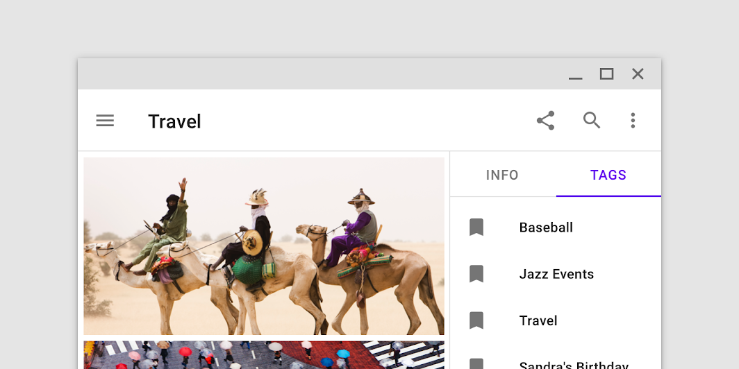
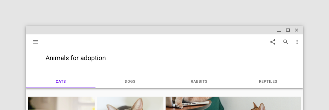
Tabs in a set
Tabs can be paired with components like top app bars, or nested in components like cards and sheets.
Principles
Scalable
As tabs can horizontally scroll, a UI can have as many tabs as needed.
Informative
Tabs organize content into categories to help users easily find different types of information.
Peers
Tabs are displayed next to each other as peers, in categories of equal importance.
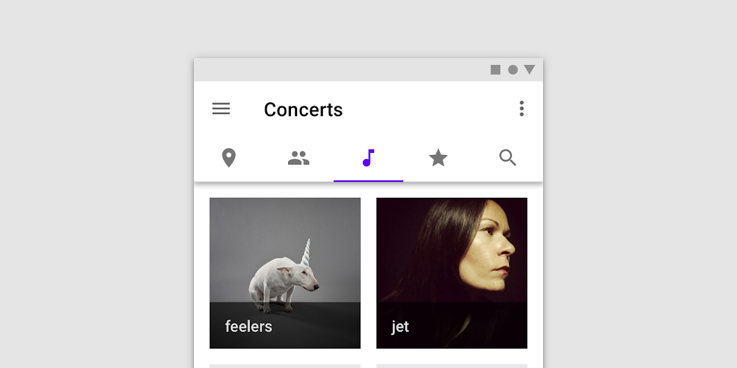
Types
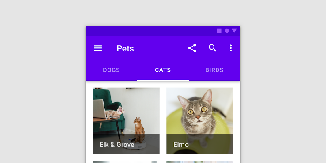
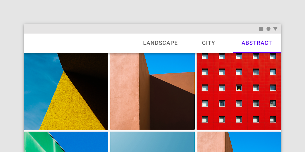
Fixed tabs
Fixed tabs display all tabs on one screen, with each tab at a fixed width. The width of each tab is determined by dividing the number of tabs by the screen width. They don’t scroll to reveal more tabs; the visible tab set represents the only tabs available.
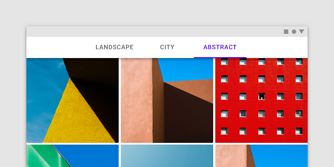
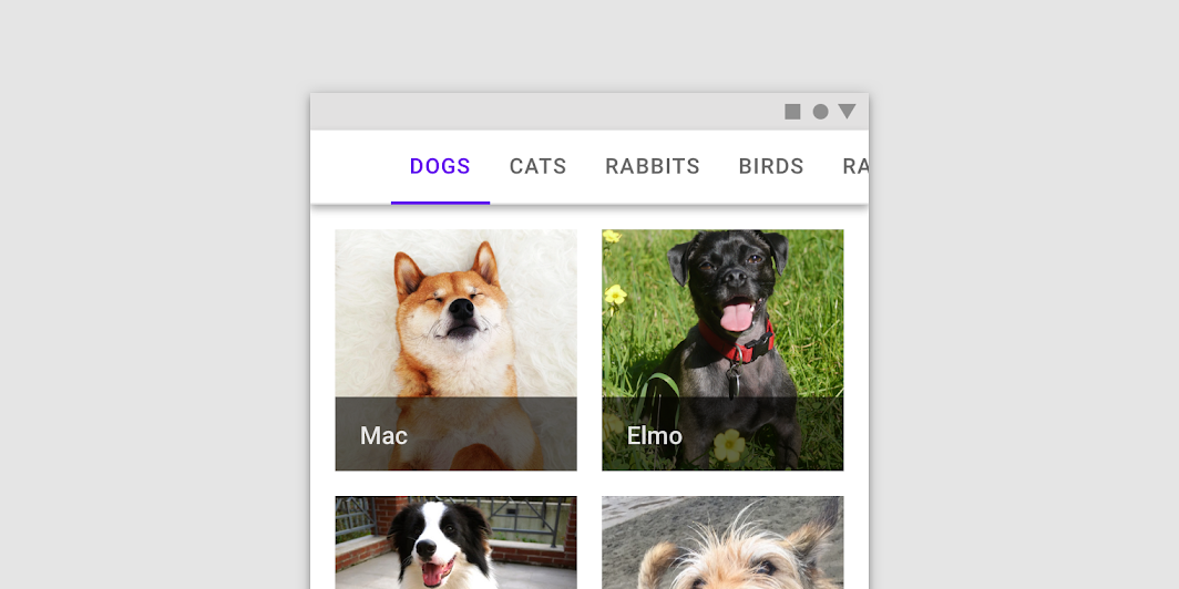
Scrollable tabs
Scrollable tabs are displayed without fixed widths. They are scrollable, such that some tabs will remain off-screen until scrolled.
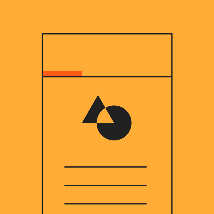
Anatomy
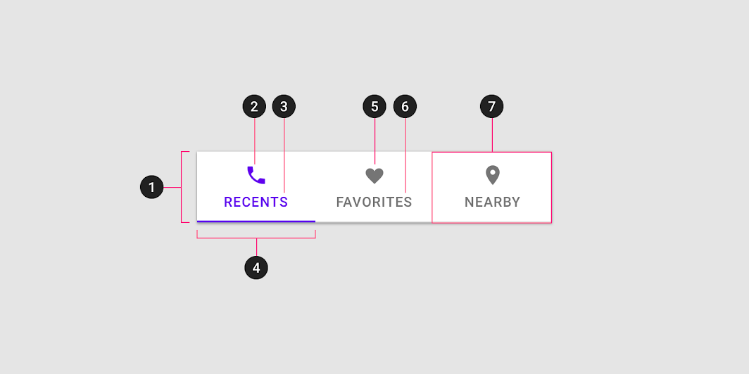
- Container
- Active icon (Optional if there’s a label)
- Active text label (Optional if there’s an icon)
- Active tab indicator
- Inactive icon (Optional if there’s a label)
- Inactive text label (Optional if there’s an icon)
- Tab item
Text label
Text labels should clearly and succinctly describe the content of the tab they represent. Tab content should contain a cohesive set of items that share a common characteristic.
Tab labels appear in a single row. They can use a second line if needed, with truncated text. Alternatively, you can use scrollable tabs to allow room for longer titles.
Icons
Icons communicate the type of content a tab represents in a simple, recognizable way. However, they aren’t as effective as text labels at communicating complex content.
Tabs can use a combination of labels and icons
Tabs can use icons to communicate content
Use caution when only representing tab content with icons, as an icon’s meaning may not be clear on every topic
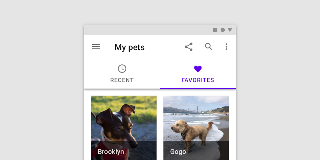
Active tab indicators
To differentiate an active tab from an inactive tab, apply an underline and color change to the active tab’s text and icon.
An underline and color change differentiate an active tab from the inactive ones
Behavior
Moving between tabs
Users can navigate between tabs by tapping a tab, or by performing a swipe gesture over content.
Swipe within the content area
To navigate between tabs, users can swipe left or right within the content area.
Gestures occur differently for each type of tab:
- Fixed tabs don’t respond to the swipe gesture at all
- Upon swipe, scrollable tabs scroll independent of the content area
Use caution when placing other swipeable content (such as interactive maps or list items) in the content area.
Scrolling
When a screen scrolls, tabs can either be fixed to the top of the screen, or scroll off the screen. If they scroll off the screen, they will return when the user scrolls upward.
Scaling and adaptation
Size constraints
For fixed tabs, the maximum width for each tab should be determined by the width of the widest tab. The group of tabs should use a fluid margin and align to the center or leading edge of the body region.
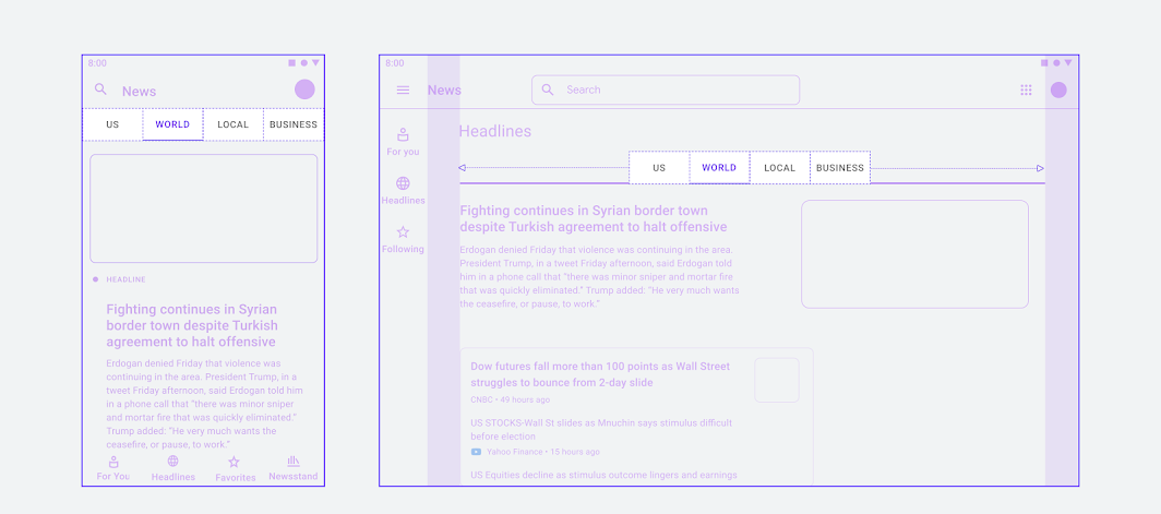
At larger breakpoints, the minimum tab width can be increased and the tab group can be positioned in the center.
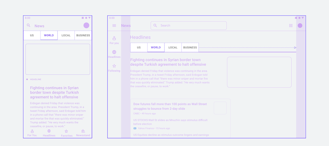
Tab groups can also align to the leading edge of the container, as seen in the diagram of a larger layout on the right.
Placement
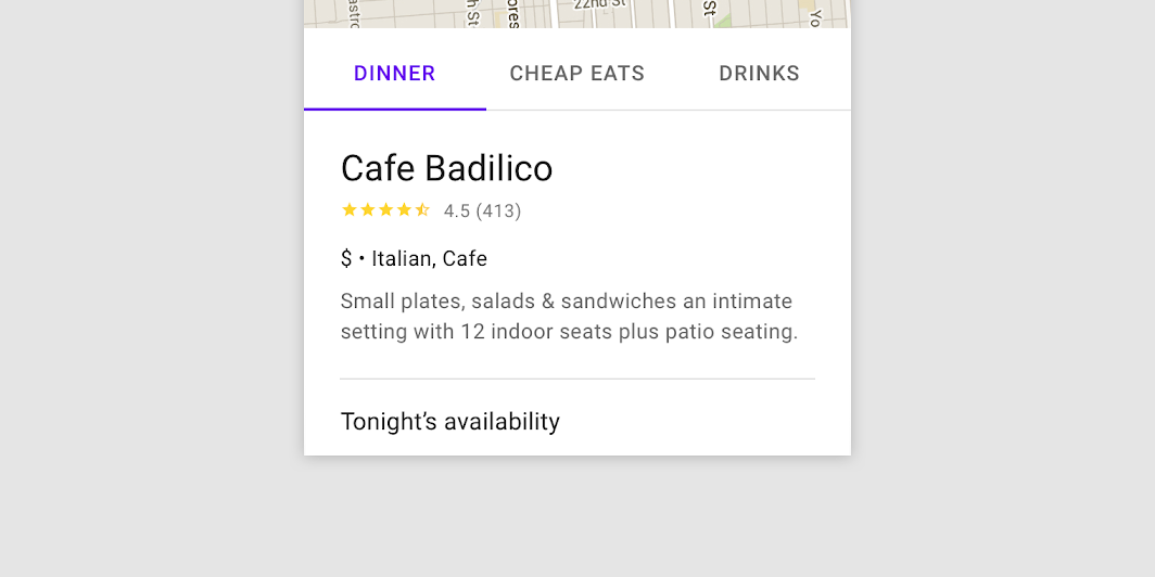
Tab layout
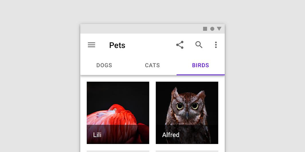
Tabs are displayed in a single row, with each tab connected to the content it represents. As a set, all tabs are unified by a shared topic.
Place tabs above content. avoid nesting a tab within another tab.
Tab placement
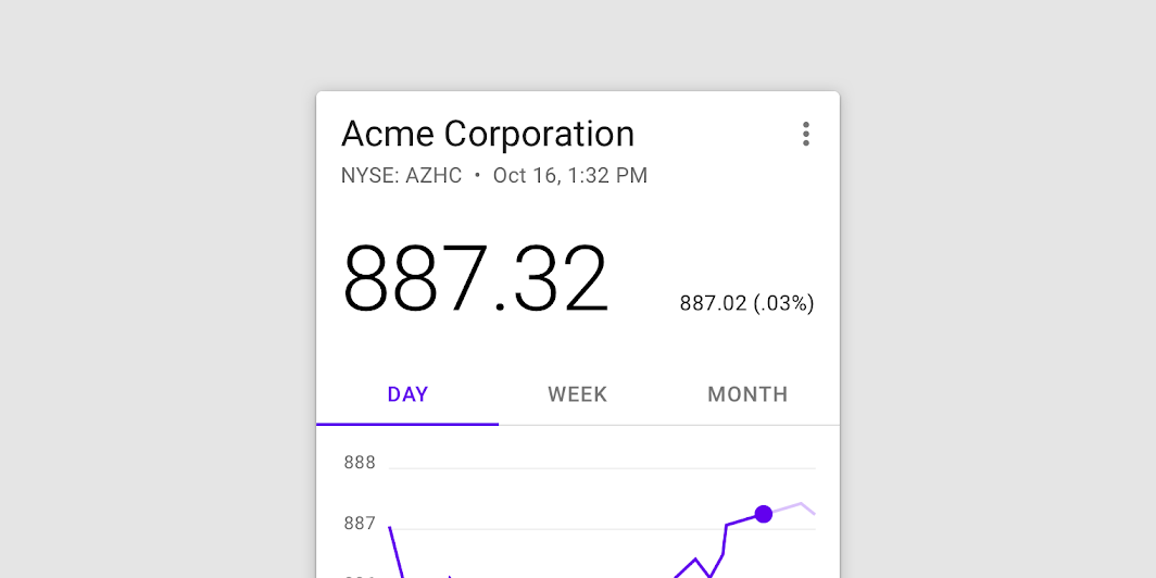
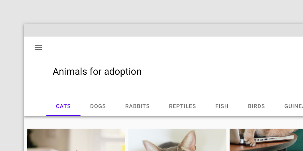
Tabs can be joined with components like top app bars, embedded in a specific UI region, or nested into components like cards and sheets. Tabs control the UI region displayed below them.
Tabs below a top app bar
Tabs can be embedded in a specific UI region in order to control the content displayed in that region.
Tabs embedded in a column, the content of which they can control when tapped. Scaled down to 62.5%
Tabs nested in a card
Tabs nested in a sheet
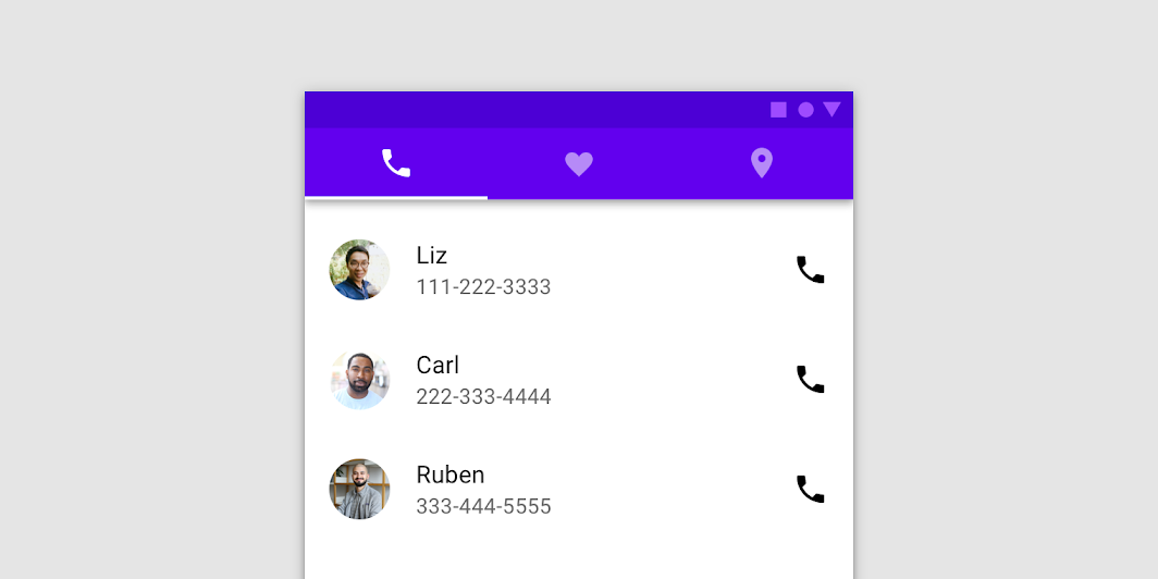
Fixed tabs
Usage
Fixed tabs display all tabs in a set simultaneously. They are best for switching between related content quickly, such as between transportation methods in a map. To navigate between fixed tabs, tap an individual tab, or swipe left or right in the content area.
Use fixed tabs when displaying a limited number of categories.

A fixed tab bar using iconography and labels.
Placement
Fixed tabs have equal width, which can be calculated either as:
- The width of the screen divided by the number of tabs
- The width of the widest tab label
When using fixed tabs, ensure they can all be seen on mobile, without truncating their text. Don’t use more than four fixed tabs at once.
Don’t use more than four fixed tabs in a set.
On wider layouts, fixed tabs increase in width, as their tab width is determined by the width of the screen.
Clustered fixed tabs
Clustered fixed tabs aren’t divided equally across the screen. The tab bar is centered, right-aligned, or left-aligned.
Clustered fixed tabs should be used in wide horizontal layouts, such as landscape mode.
On wider layouts, tabs may be centered on the tab bar.
Fixed tabs in a cluster can be aligned to the left or right.
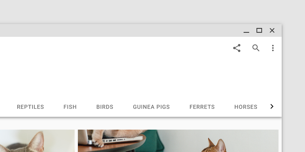
Scrollable tabs
Usage
When a set of tabs cannot fit on screen, use scrollable tabs. Scrollable tabs can use longer text labels and a larger number of tabs. They are best used for browsing on touch interfaces.
A set of scrollable tabs
Placement
Scrollable tabs display a subset of all tabs at once. The width of each tab is defined by the length of its text label.
On mobile and desktop, offset the first tab on the left to signal that tabs are scrollable.
On desktop, provide a visual indicator that more tabs are available off screen.
Behavior
To navigate between a set of scrollable tabs, users swipe the set left or right. A tab set can be looped so when a user reaches the last tab in a set, the first tab is shown again.
To select an individual tab, tap it.
Tab placement on activation
When tapped, a scrollable tab should reposition itself to become fully visible on screen.
States
By default, tabs inherit enabled states with one active state.
The inactive state of a tab can inherit a hover, focus, and pressed state.
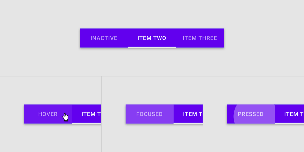
The hover, focus, and pressed states of an enabled tab.
The active state of a tab can inherit a hover, focus, and pressed state.
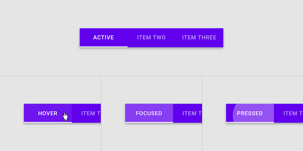
The hover, focus, and pressed states of an active tab
Implementation
Javascript methods:
| void MDC.activateTab(tab, animate = true) | ||
|---|---|---|
| A method to activate a specific tab. | ||
| tab | String | jQuery | Element | The tab element. can be either a css selector string or a jQuery object or a DOM element. |
| animate | Boolean | Wether to animate tab activation indicator or not. |
| void MDC.updateTabs() | ||
| A method to update all active tabs indicator. | ||
Fixed tabs
<div class="mdc-tabs-group">
    <div class="mdc-tabs lime-800" data-target="#tabs-pages">
        <button type="button" class="tab-item active">
            <div class="title">Tab one</div>
        </button>
        <button class="tab-item">
            <div class="title">Tab two</div>
        </button>

        <!-- Disabled tab -->
        <button type="button" class="tab-item" disabled>
            <div class="title">Tab three</div>
        </button>

        <!-- Active tab indicator -->
        <div class="ink-bar"></div>
    </div>
</div>

<div id="tabs-pages" class="mdc-tabs-pages">
    <div class="tab-page">
        ...
    </div>
    <div class="tab-page">
        ...
    </div>
    <div class="tab-page">
        ...
    </div>
</div>
Tabs alignment
Full width
<div class="mdc-tabs-group full-width">
    ...
</div>
Alignment: start
<div class="mdc-tabs-group align-start">
    ...
</div>
Alignment: end
<div class="mdc-tabs-group align-end">
    ...
</div>
Scrollable tabs
<div class="mdc-tabs-group scrollable">
...
</div>
Tab options
Labels only
<div class="mdc-tabs-group align-start">
    <div class="mdc-tabs lime-800">
        <button type="button" class="tab-item active">
            <div class="title">Tab one</div>
        </button>
        <button class="tab-item">
            <div class="title">Tab two</div>
        </button>
        .
        .
        .
        <div class="ink-bar"></div>
    </div>
</div>
Icons only
<div class="mdc-tabs-group align-start">
    <div class="mdc-tabs lime-800">
        <button type="button" class="tab-item active">
            <div class="icon material-icon">place</div>
        </button>
        <button class="tab-item">
            <div class="icon material-icon">people</div>
        </button>
        .
        .
        .
        <div class="ink-bar"></div>
    </div>
</div>
Leading icons
<div class="mdc-tabs-group align-start">
    <div class="mdc-tabs lime-800">
        <button type="button" class="tab-item active">
            <div class="icon material-icon">schedule</div>
            <div class="title">Tab one</div>
        </button>
        <button class="tab-item">
            <div class="icon material-icon">near_me</div>
            <div class="title">Tab two</div>
        </button>
        .
        .
        .
        <div class="ink-bar"></div>
    </div>
</div>
Top icons
<div class="mdc-tabs-group align-start">
    <div class="mdc-tabs stacked lime-800">
        .
        .
        .
    </div>
</div>