almoamen.net
Text legibility
Color plays an important role in text legibility.
Legibility standards
WCAG standards
All text should be legible and meet accessibility standards. The Web Content Accessibility Guidelines (WCAG 2.0) level AA requires a 4.5.1 color contrast between text and background for normal text, and 3:1 to large text.
To learn more about color, contrast, and accessibility design, read Material Design Accessibility.
Text backgrounds
Text on colored backgrounds
Black text is recommended for use on light backgrounds, and white text on dark backgrounds. If your app has both light and dark themes, make sure the text is available in a contrasting color against each theme.
Colored backgrounds or typography additionally change the rules regarding text opacity and different states of text.
Using text opacity
Instead of using gray text and icons on top of colored backgrounds, create better contrast by displaying white or black text with reduced opacity.
For example, black text displayed at 75% opacity on a green background gives the text an appearance of black, with a hint of green.
Alternatively, you can calculate the color of text by doing the following:
- Place the color black at reduced opacity in front of a green background
- Identify the hex value of the resulting darkened green color
- Use that hex value of that color for your text
In this case, if the surface behind the text changes color, you must update the hex color as well.
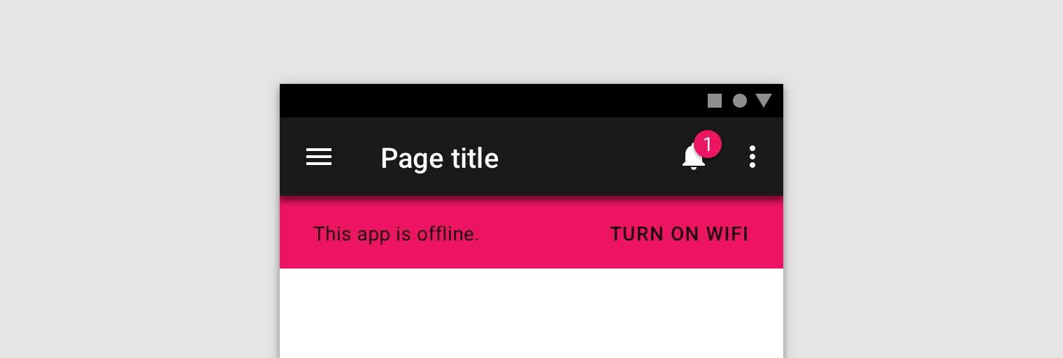
Use a transparent version of black on a colored surface to preserve legibility.
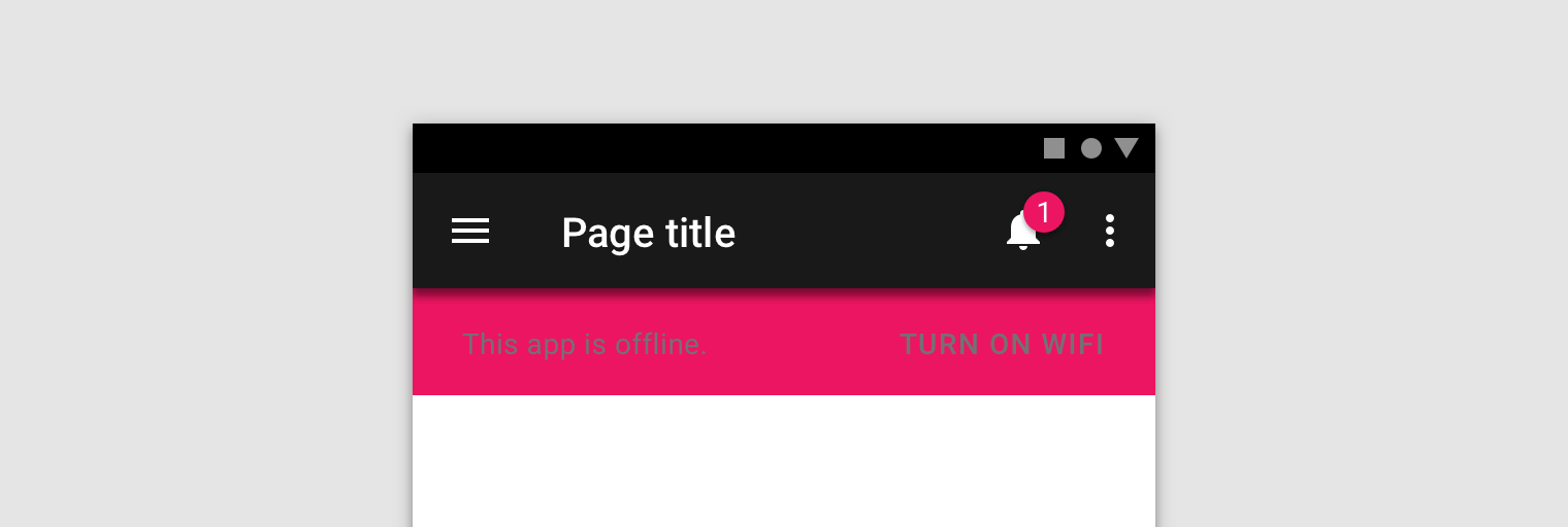
Avoid using opaque gray text that isn’t legible on colored surfaces.
Dark text on light backgrounds
Dark text on light backgrounds (shown here as #000000 on #FFFFFF) applies the following opacity levels:
- High-emphasis text has an opacity of 87%
- Medium-emphasis text and hint text have opacities of 60%
- Disabled text has an opacity of 38%
-
High Emphasis87%#000000
-
Medium Emphasis60%#000000
-
Disabled38%#000000
Light text on dark backgrounds
Light text on dark backgrounds (shown here as #FFFFFF on #000000) applies the following opacity levels:
- High-emphasis text has an opacity of 100%
- Medium-emphasis text and hint text have opacities of 70%
- Disabled text has an opacity of 50%
-
High Emphasis100%#FFFFFF
-
Medium Emphasis70%#FFFFFF
-
Disabled50%#FFFFFF
Colored text and backgrounds
Colored text should be used sparingly to draw attention and apply selective emphasis. Ideally colored text should be reserved for text elements such as headlines, buttons, and links.
Use the Material color tool to determine if certain foreground colors used on text pass accessibility standards on background colors.
Large headlines and short text snippets are best for colored text.

It can be hard to read long body copy that is colored.
Text types
Helper Text
Helper text gives context about a field’s input, such as how the input will be used. It can adopt brand colors, but should be legible as determined by WCAG standards.
Helper text on light backgrounds could apply the following opacity levels and default hexes:
- High emphasis helper: This text uses a hex value #000000 at 87% opacity
- Default color helper text: This text uses a hex value of #000000 at 60% opacity
- Default error helper text: This text uses a hex value of #B00020 at 100% opacity
-
High Emphasis87%#000000
-
Medium Emphasis70%#000000
-
Error Text100%#B00020
Helper text on dark backgrounds could apply the following opacity levels and default hexes:
- High emphasis helper: This text uses a hex value #FFFFFF at 100% opacity
- Default color helper text: This text uses a hex value of #FFFFFF at 70% opacity
- Default error helper text: This text uses a hex value of #FF1744 at 100% opacity
-
High Emphasis100%#FFFFFF
-
Medium Emphasis70%#FFFFFF
-
Error Text100%#FF1744
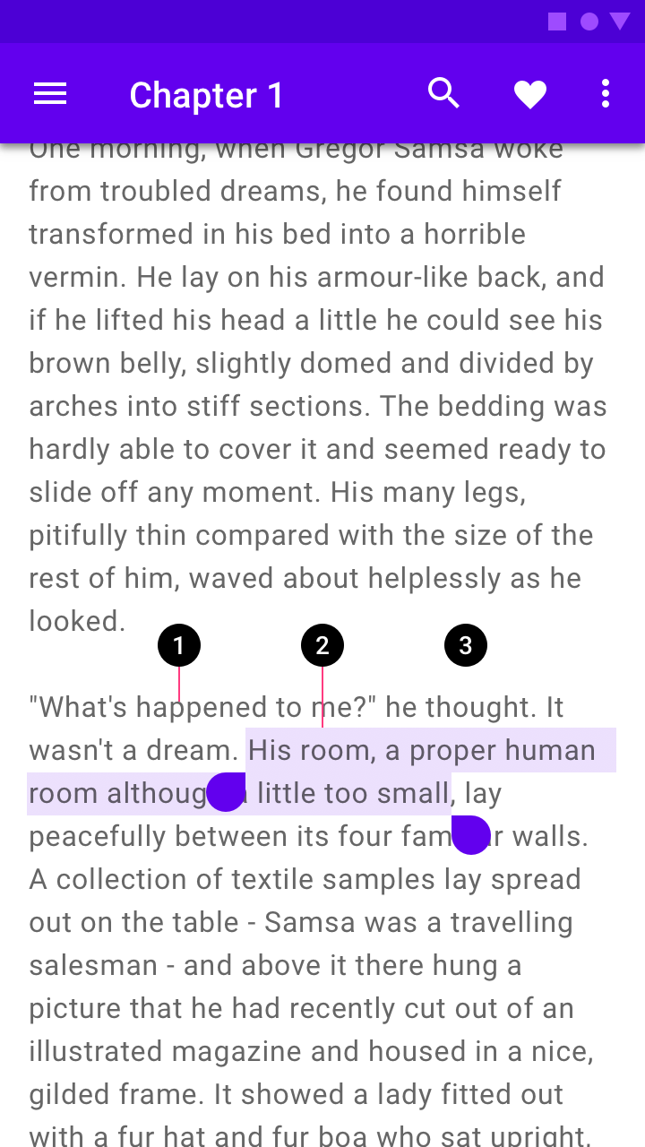
Selected Text
To reflect brand, text selection can use an accent of your primary or secondary color.
Selected text should be legible against the selection color, and the selection color should contrast the background color. Alternatively, you can display outlines, motion, checkmark icons, or other text treatments to indicate selected text.
Learn more about contrast (or try a color contrast analyzer) at webaim.org.
- Text
- Text selection color
- Background
Text selection can be customized using your palette accent color.
Icons and Other symbols
Icons and other elements don’t need to meet WCAG legibility standards, but should be as visible as possible to indicate function or communicate information.
Dark icons (#000000) or other elements on light backgrounds (#FFFFFF) could apply the following opacity levels:
- Active icons have an opacity of 87%
- Inactive icons have an opacity of 60%
- Disabled icones have an opacity of 38%
-
Active87%#000000
-
Inactive60%#000000
-
Disabled38%#000000
Light icons (#FFFFFF) or other elements on dark backgrounds (#000000) could apply the following opacity levels:
- Active icons have an opacity of 100%
- Inactive icons have an opacity of 70%
- Disabled icones have an opacity of 50%
-
Active100%#000000
-
Inactive70%#000000
-
Disabled50%#000000