almoamen.net
The type system
Use typography to present your design and content as clearly and efficiently as possible.
Type Scale
The Material Design type scale includes a range of contrasting styles that support the needs of your product and its content.
The type scale is a combination of 12 styles that are supported by the type system. It contains reusable categories of text, each with an intended application and meaning.
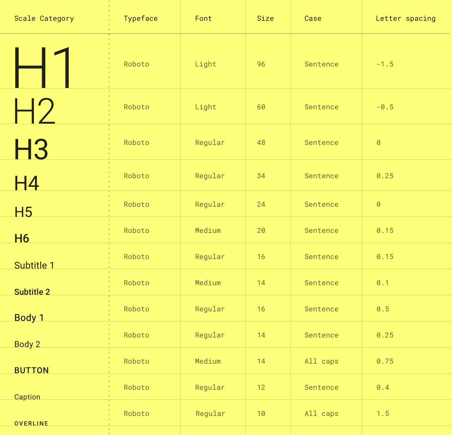
The Material Design type scale. (Letter spacing values are compatible with Sketch.)
Font size units
The following units are used to express font size on Android, iOS, and the web.
| Platform | Font size unit | Conversion ratio |
|---|---|---|
| Android | sp | 1.0 |
| iOS | pt | 1.0 |
| Web | rem | 0.0625 |
Example conversions
| Android | iOS | Web |
|---|---|---|
| 10sp | 10pt | 0.625rem |
| 12sp | 12pt | 0.75rem |
| 24sp | 24pt | 1.5rem |
| 60sp | 60pt | 3.75rem |
Web browsers calculate the REM (the root em size) based on the root element size. The default for modern web browsers is 16px, so the conversion is SP_SIZE/16 = rem.
Letter spacing units
The following units are for spacing letters in a UI.
| Platform | Letter spacing unit | Conversion ratio | Android | em | (Tracking from Sketch / font size in sp) = letter spacing |
|---|---|---|
| iOS | pt | 1.0 |
| Web | em | (Tracking from Sketch / font size in px) = letter spacing |
Letter spacing examples
| Android | iOS | Web |
|---|---|---|
| (0.2 tracking / 16sp font size) = 0.0125 em | -0.1 pt | (0.2 tracking / 16px font size) = 0.0125 em |
Applying the type scale
The type scale appears as text in components and the overall layout. Type attributes can use custom values for the typeface, font, case, size, and letter spacing.
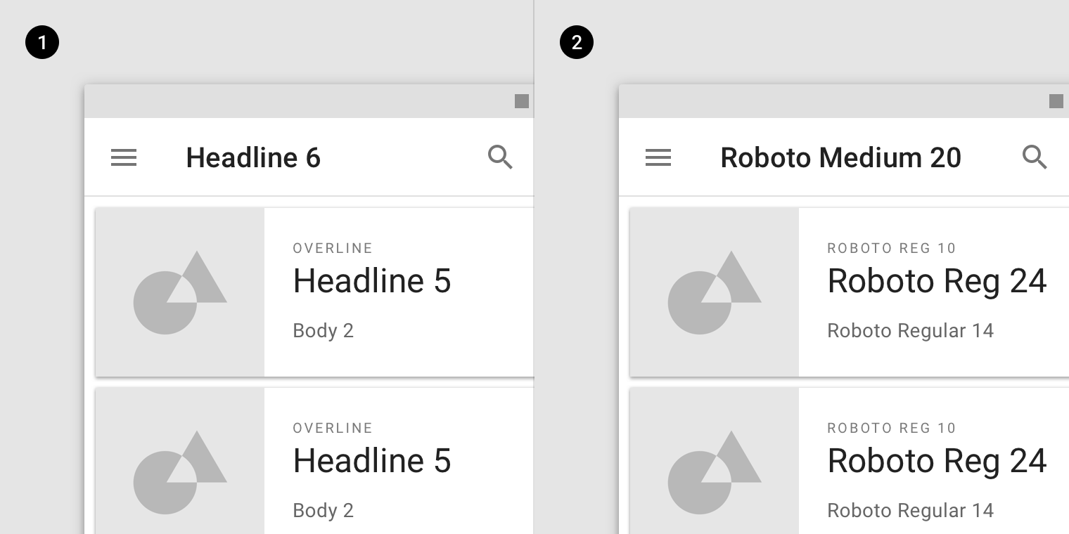
- Scale categories
- Actual values
Headlines
In the type scale, headlines span from a range of 1 through 6. Headlines are the largest text on the screen, reserved for short, important text or numerals.
For headlines, you can choose an expressive font, such as a display, handwritten, or script style. These unconventional font designs have details and intricacy that help attract the eye.
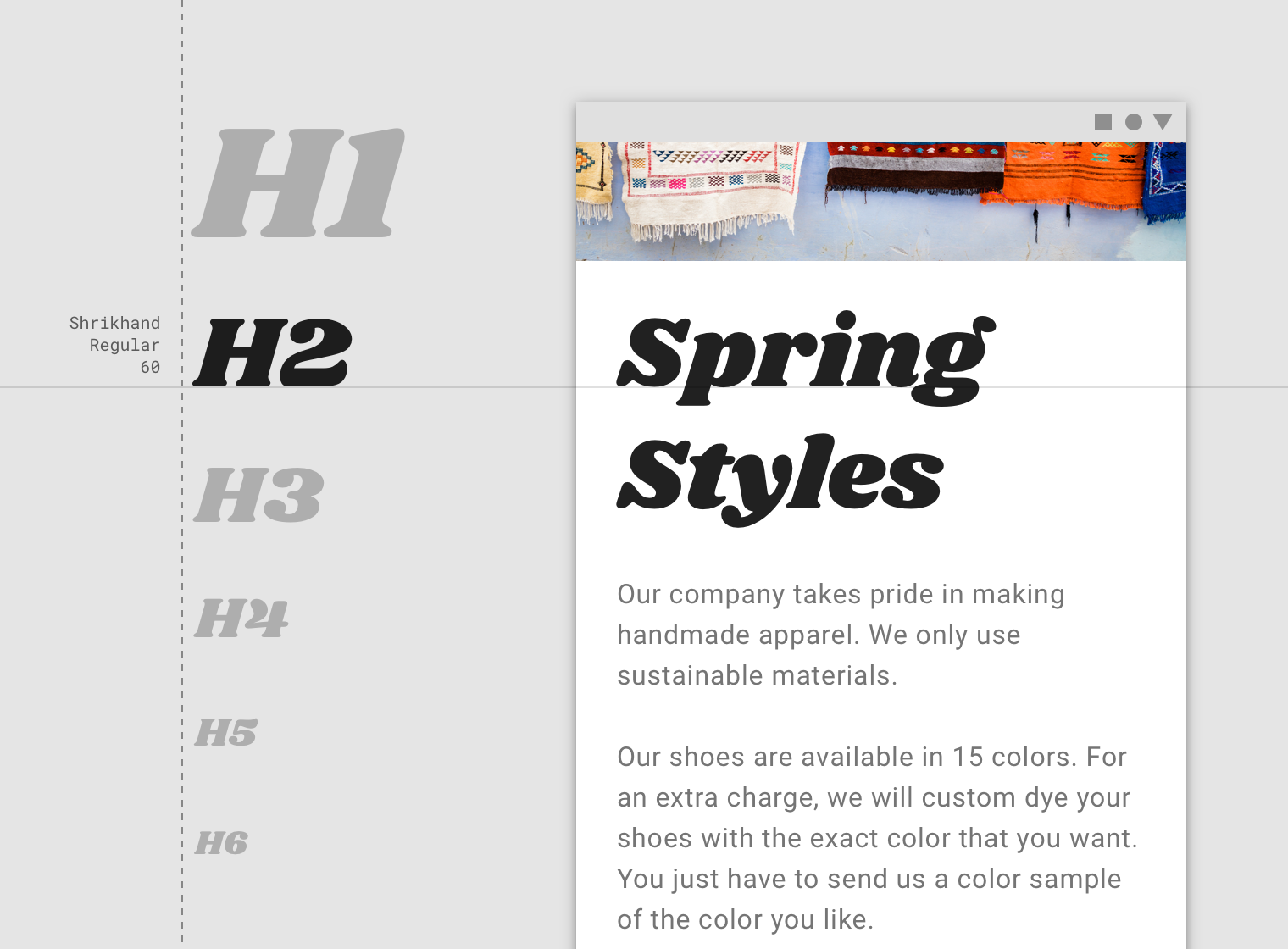
A display style is used for Headline 2.
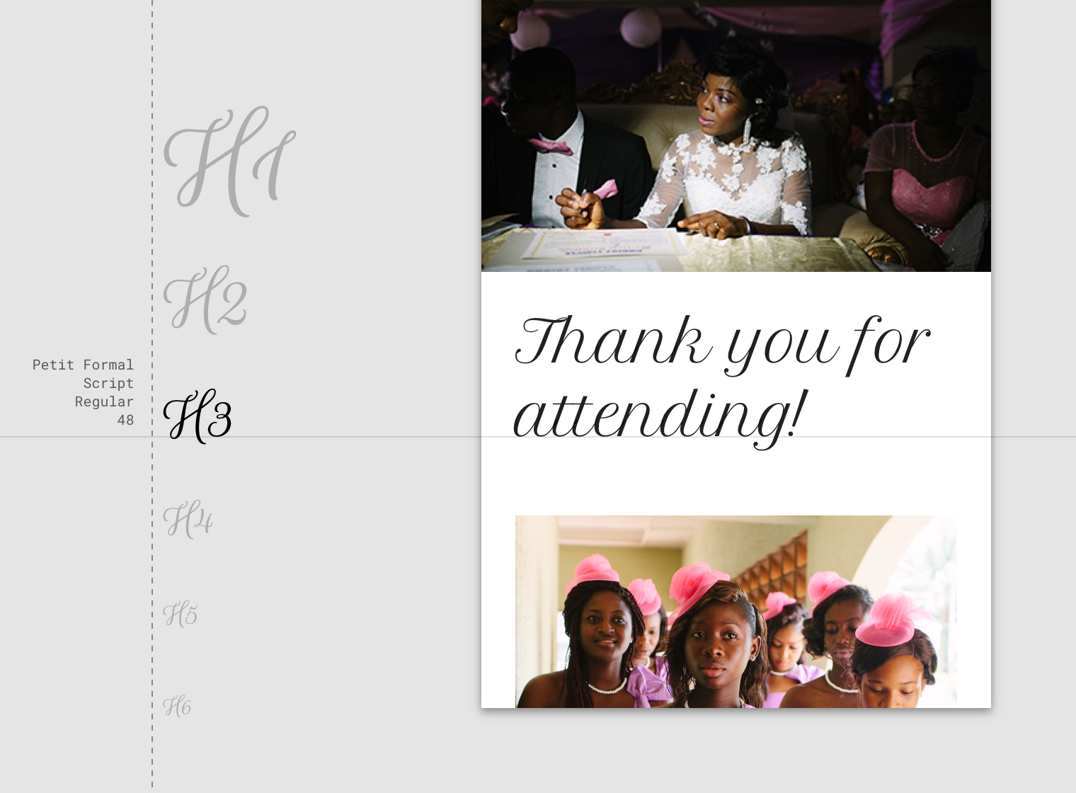
A script style is used for Headline 3.
Serif or sans serif typefaces work well for headlines, especially at smaller sizes.
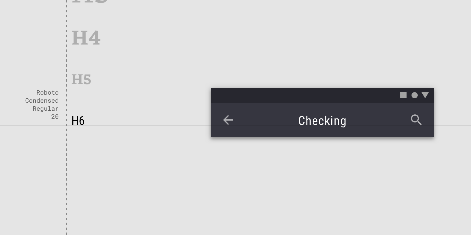
A sans serif is used for Headline 6.
Subtitles
Subtitles are smaller than headlines. They are typically reserved for medium-emphasis text that is shorter in length. Serif or sans serif typefaces work well for subtitles.

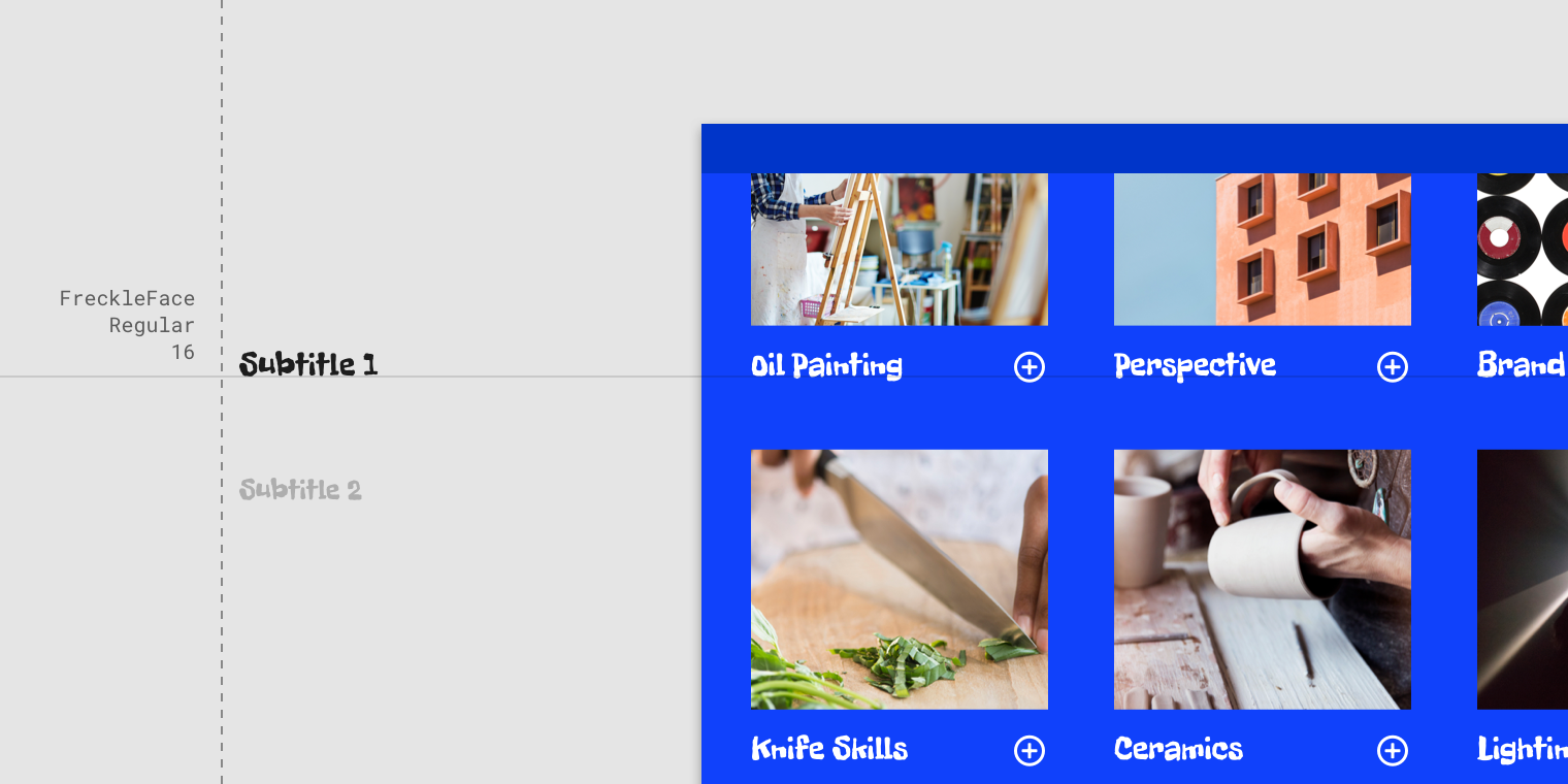
A sans serif typeface is used for Subtitle 1.
For subtitles, use caution when using expressive fonts, including display, handwritten, and script styles.
Use caution when using expressive fonts for subtitles.
Body
Body text comes in ranges 1-2, and it’s typically used for long-form writing as it works well for small text sizes. For longer sections of text, a serif or sans serif typeface is recommended.
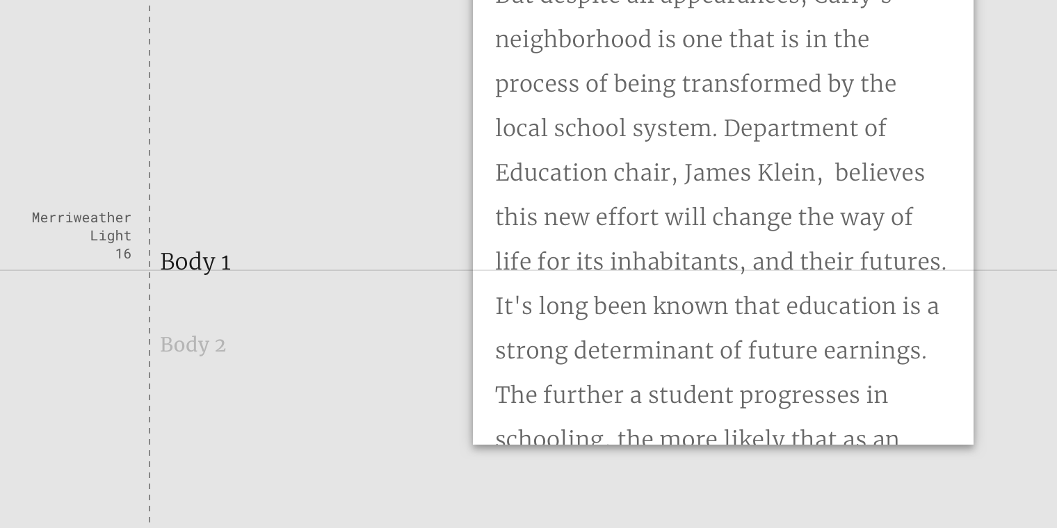
A serif typeface is used for Body 1.
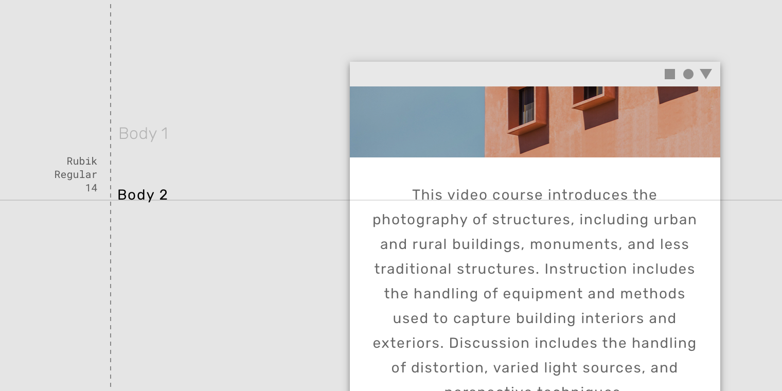
A sans serif typeface is used for Body 2.
Don’t use expressive fonts, including display, handwritten, and script styles for body copy.
Caption and overline
Caption and overline text (text with a line above it) are the smallest font sizes. They are used sparingly to annotate imagery or to introduce a headline.
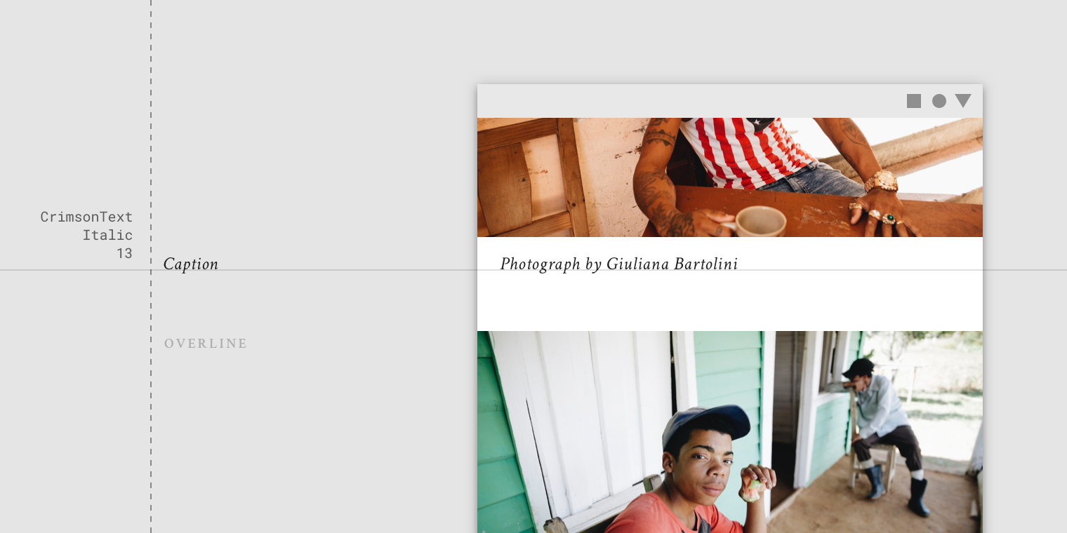
A serif typeface being used for a caption.
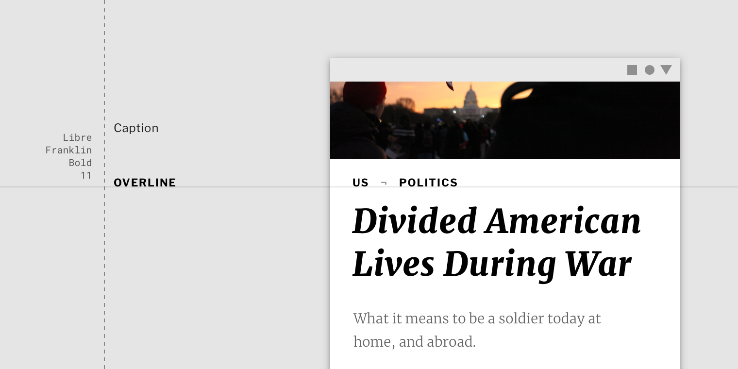
A sans serif typeface being used for an overline.
Don’t use expressive fonts, including display, handwritten, and script styles for caption or overline.
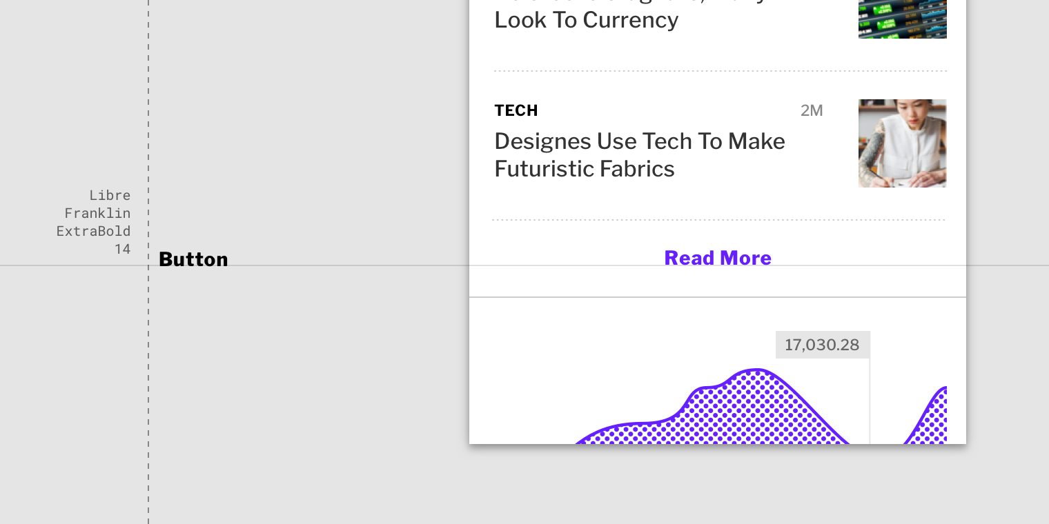
Button
Button text is a call to action used different types of buttons (such as text, outlined and contained buttons) and in tabs, dialogs, and cards.
Button text is typically an all caps sans serif.
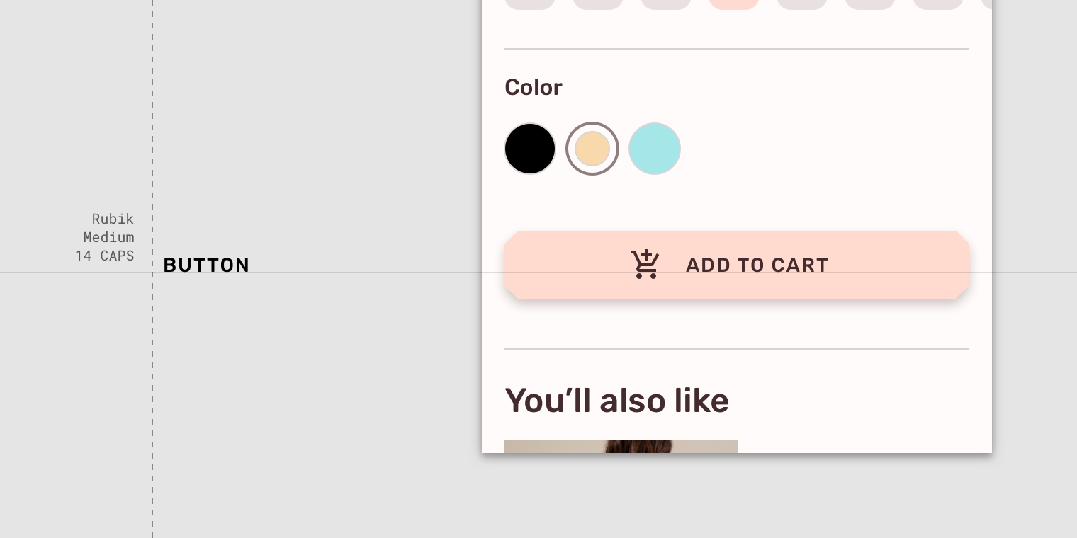
An all caps sans serif typeface being used for a button.
Button text can be sentence case, sans serif, or serif.
Use caution when having button text appear distinct from non-interactive text, such as this upper lower, sans serif typeface on a button.
Don’t use expressive fonts as button text, including display, handwritten, and script styles.