almoamen.net
Color usage
Color helps express hierarchy, establish brand presence, give meaning, and indicate element states.
Hierarchy
In Material Design, color draws attention to specific elements on-screen. When an element’s color contrasts with its surroundings, that element stands out, so users can tell it’s important. Because color themes vary – from bold and bright, to monochromatic or muted – there are different ways to indicate which elements have greater importance.
For example, black icons stand out when they are placed against a white background. Multicolored cards draw attention to themselves when placed next to monochromatic colors.
Surface contrast
To bring attention to important events, use stronger color contrasts between elements.
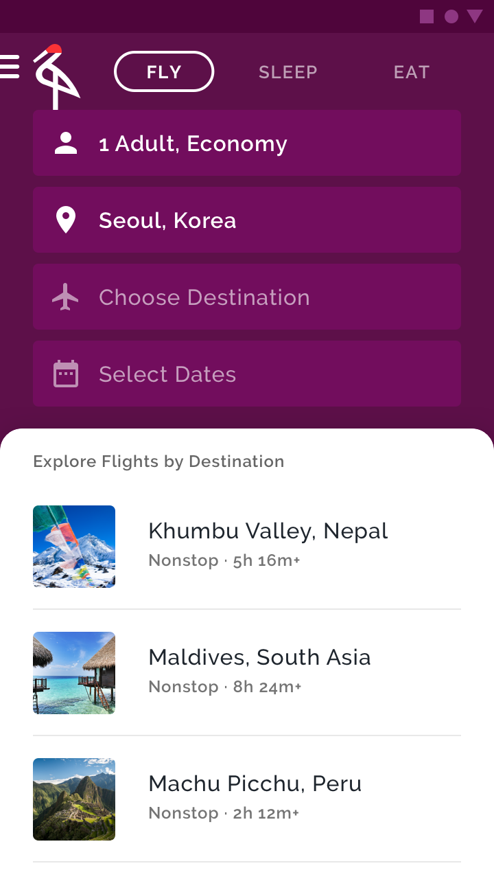
The purple background has a high contrast with the white surface, bringing emphasis to the list item choices – the main point of this travel app.
Color and shape
Visual emphasis is given to an element that changes both color and shape at the same time. Use this kind of emphasis to indicate something has been selected or requires immediate attention.

The chips with curved, pink left corners indicate they have been selected by the user.
Limiting color
By limiting the use of color in your app, the areas that do receive color gain more attention, such as text, images, and individual elements like buttons.
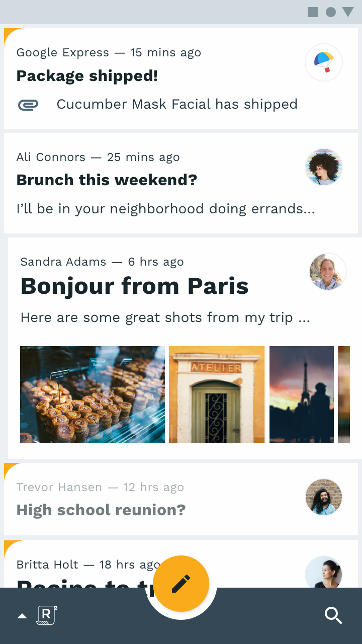
Because the content of this product is multicolored, a black floating action button contrasts greatly with the bright colors, making it more visible.
A grayscale color palette is best for allowing photography and text to stand out.
Brand
Your brand can use color to emphasize its presence. Brand colors can be used in key moments, in ways that associate those colors with specific actions and information.
Brand color application can be bold and brash, subtle and sophisticated, or anywhere in between. Your brand’s personal approach to color should be reflected in your app.
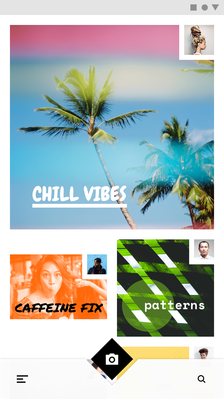
Bold use of color
Brands that wish to convey a sense of energy and excitement often use color in bold ways. Their apps should reflect that same approach, while preserving content legibility and overall usability.
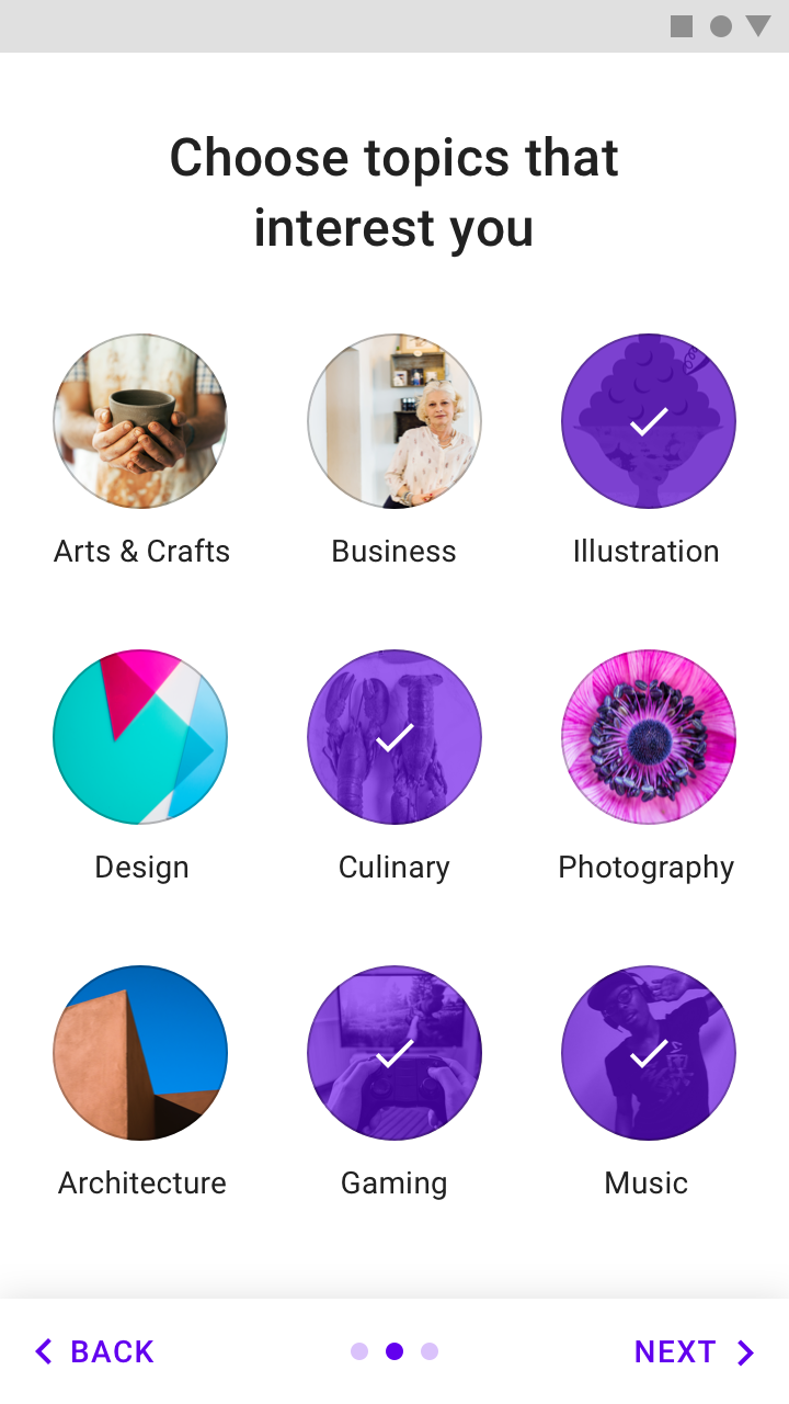
This educational app uses bold, saturated brand colors (yellow, blue, magenta) in a vibrant way that matches the spirit of the brand.
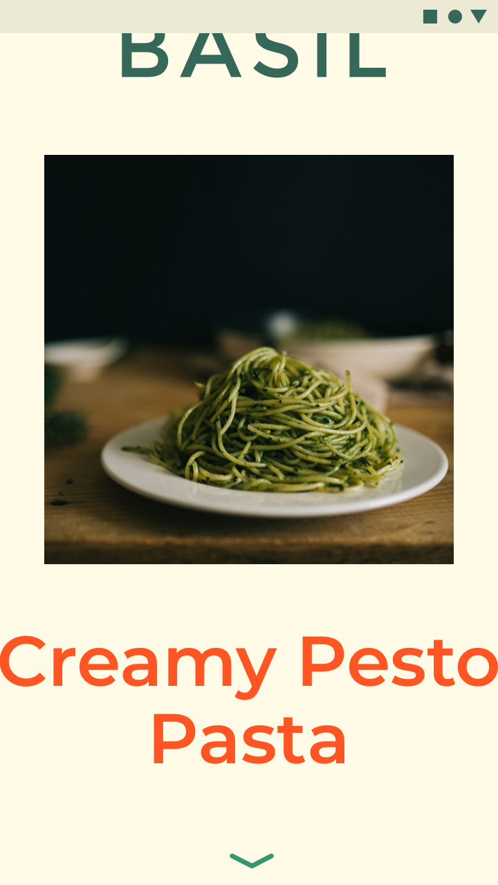
This cooking app’s bold approach to color and typography infuses energy and excitement while remaining legible and usable.
Even brands with more subtle color approaches can use color in bold, celebratory ways.
Launch screens
Launch screens can be celebratory moments that use color in bold ways.
Onboarding
Color used during onboarding can connect content to branding.
Feature discovery
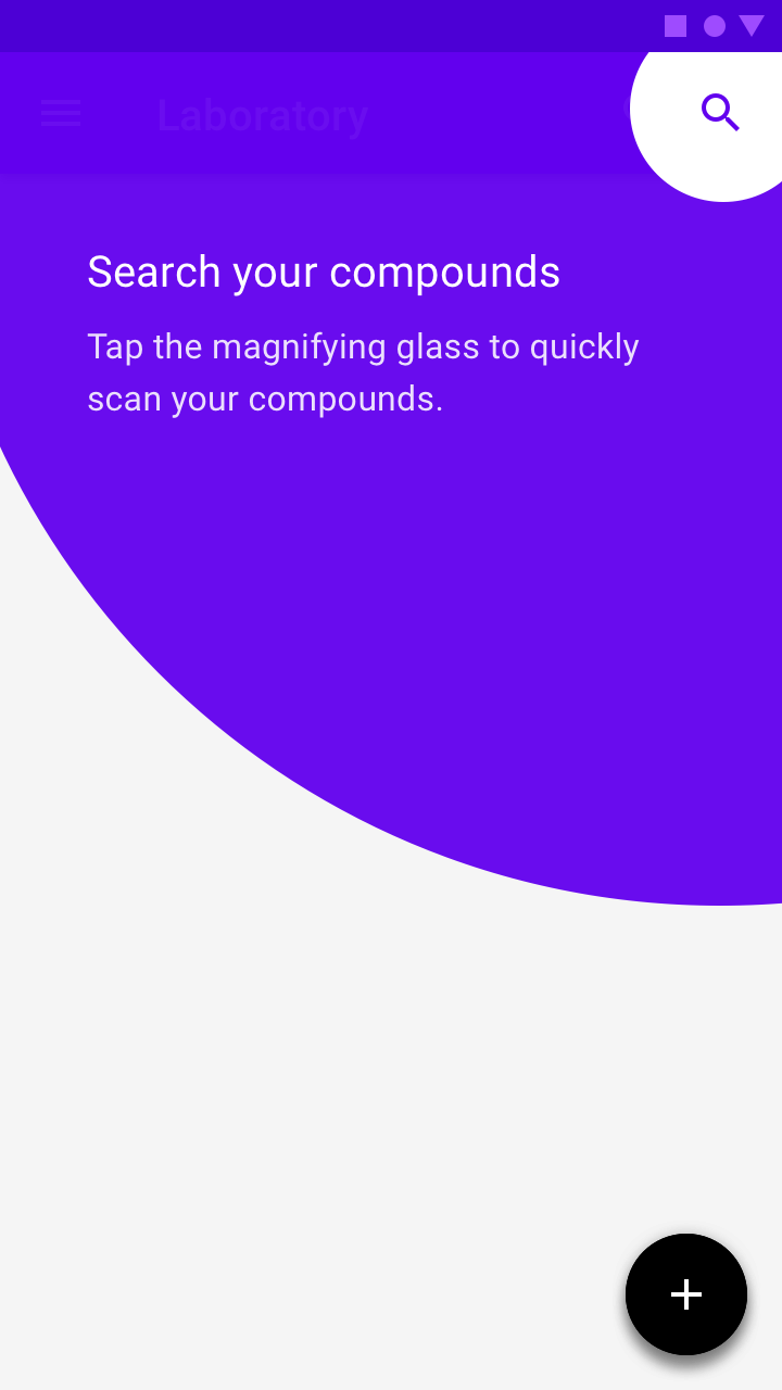
New features can be highlighted to ensure the user sees them by using color to guide user focus.
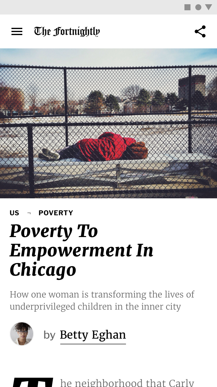
Subtle use of color
Brands can use color in subtle ways, whether that means conveying sophistication, emphasizing content, or suiting content in some other way. When using color with subtlety, ensure that interactive areas and state changes remain identifiable and easily seen.
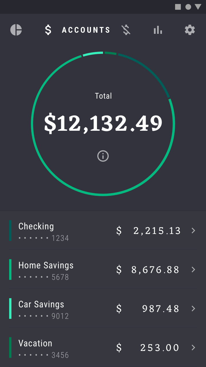
This financial app uses small amounts of color to display information, such as data in graphs. Using color in this way connects information to brand colors.
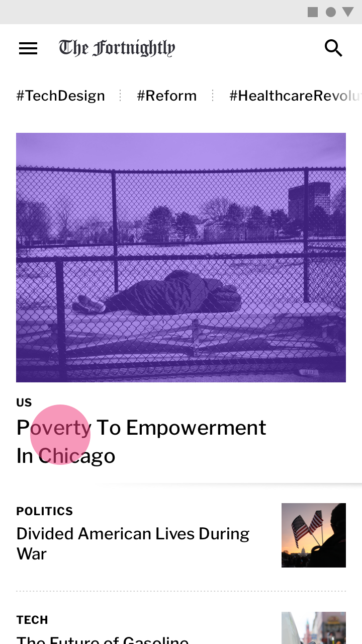
This news app uses its secondary color (purple) sparingly. By doing so, it stands out in the places it is used. Using color in this way makes content the most important element on the page.
Brand presence can be maintained subtly by incorporating brand colors into moments like loading a placeholder UI, showing progress indicators, or expressing state changes.
Placeholder UI
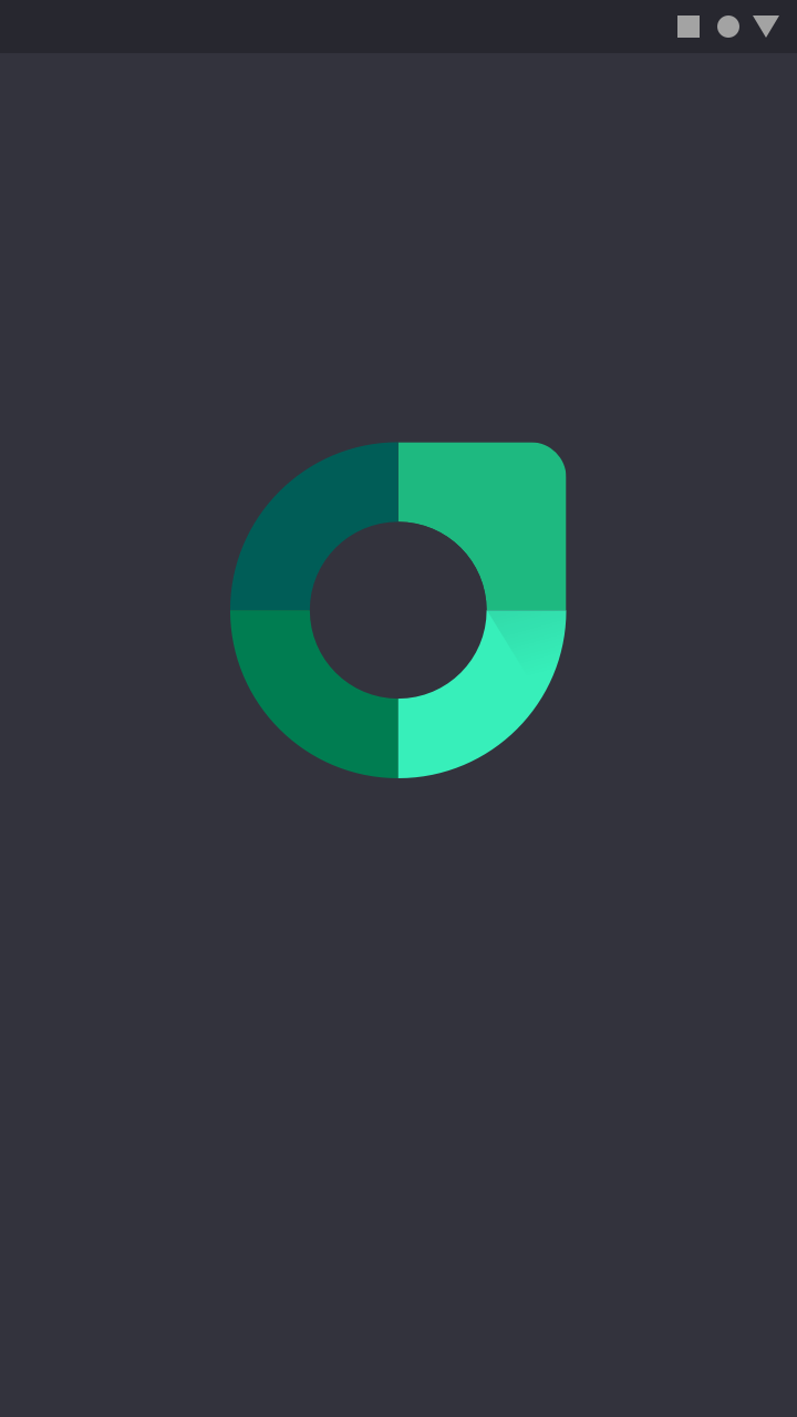
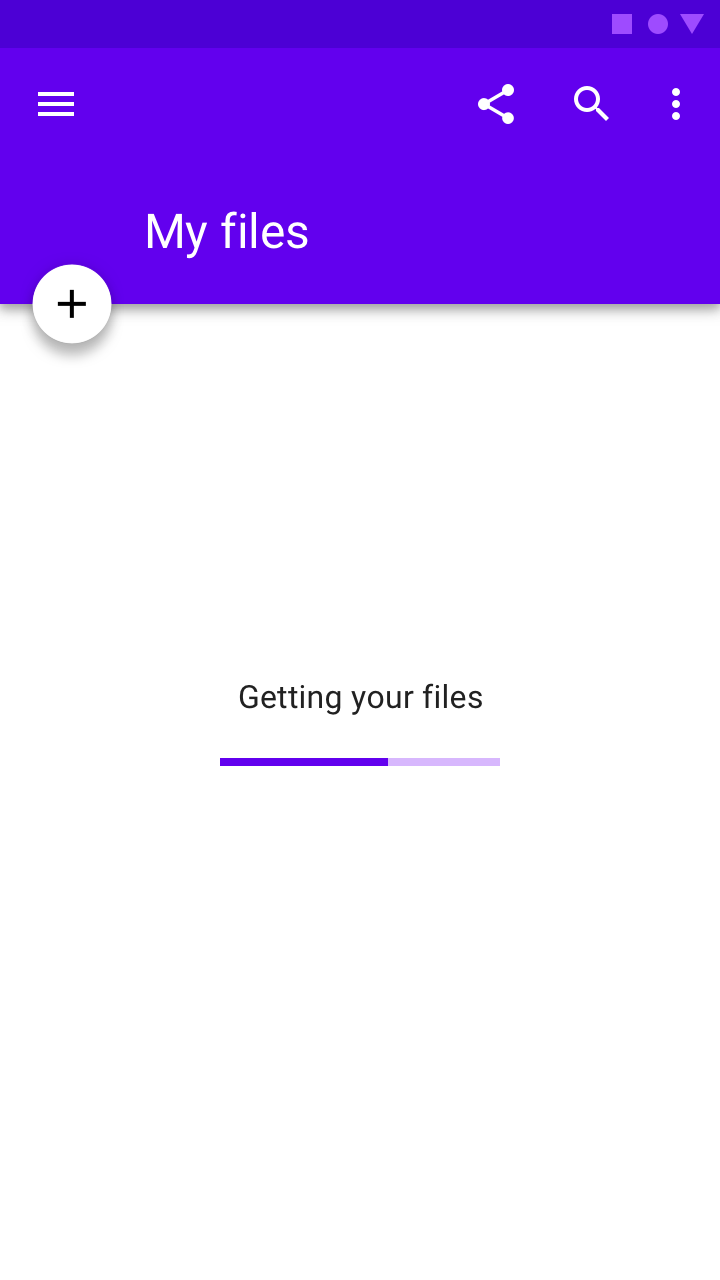
A placeholder UI is displayed while screen content loads. Including a brand color here assures users that they are still in the app as it loads.
Progress indicators
Progress indicators are a subtle but powerful place to incorporate brand color, as they tie the function of the app to the brand.
State changes
State changes can subtly reinforce brand presence.
Meaning
Color can communicate the meaning of different UI elements. For example, a weather app may display colors indicating current weather conditions, and a navigation app may display color showing traffic conditions, with roads colored red or green.
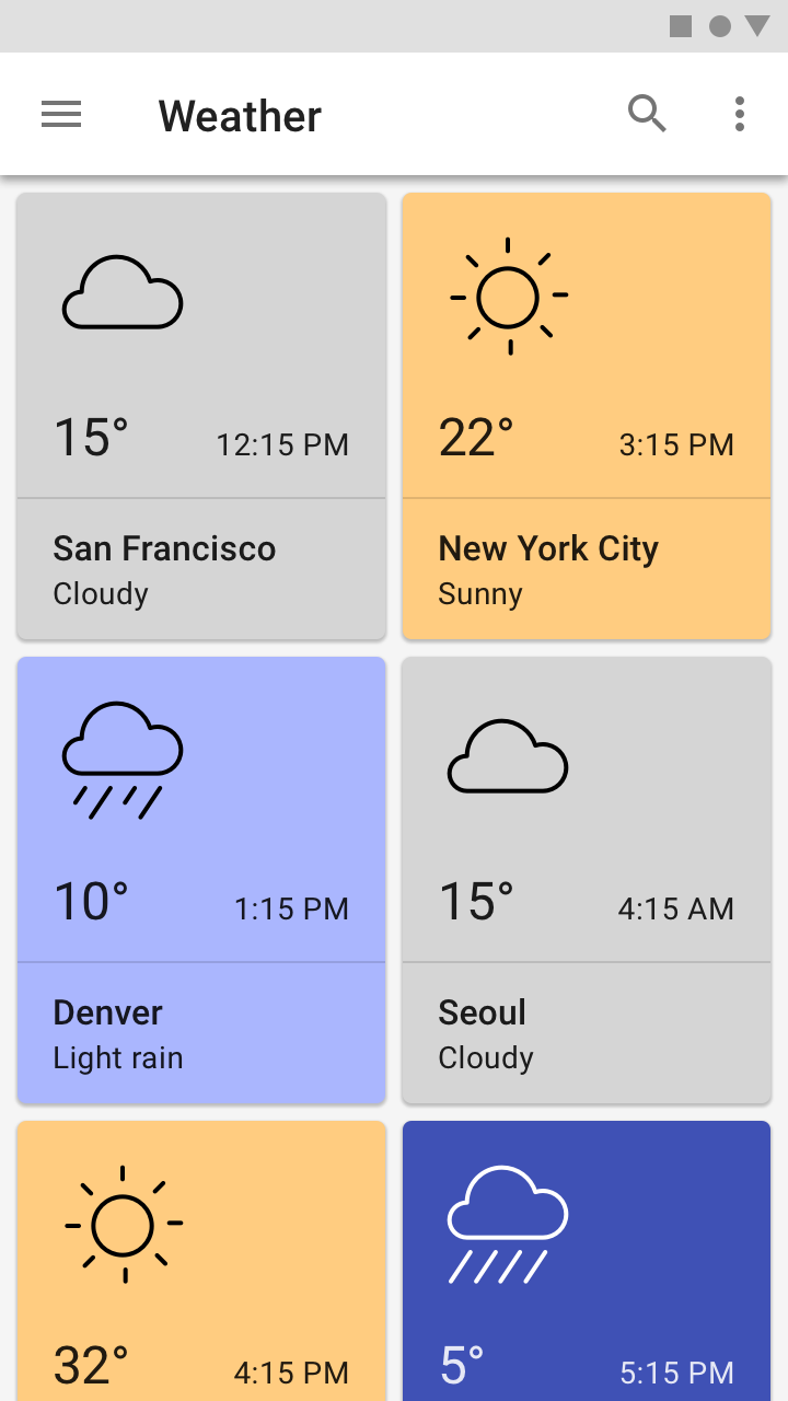
This weather app pairs color with weather conditions.
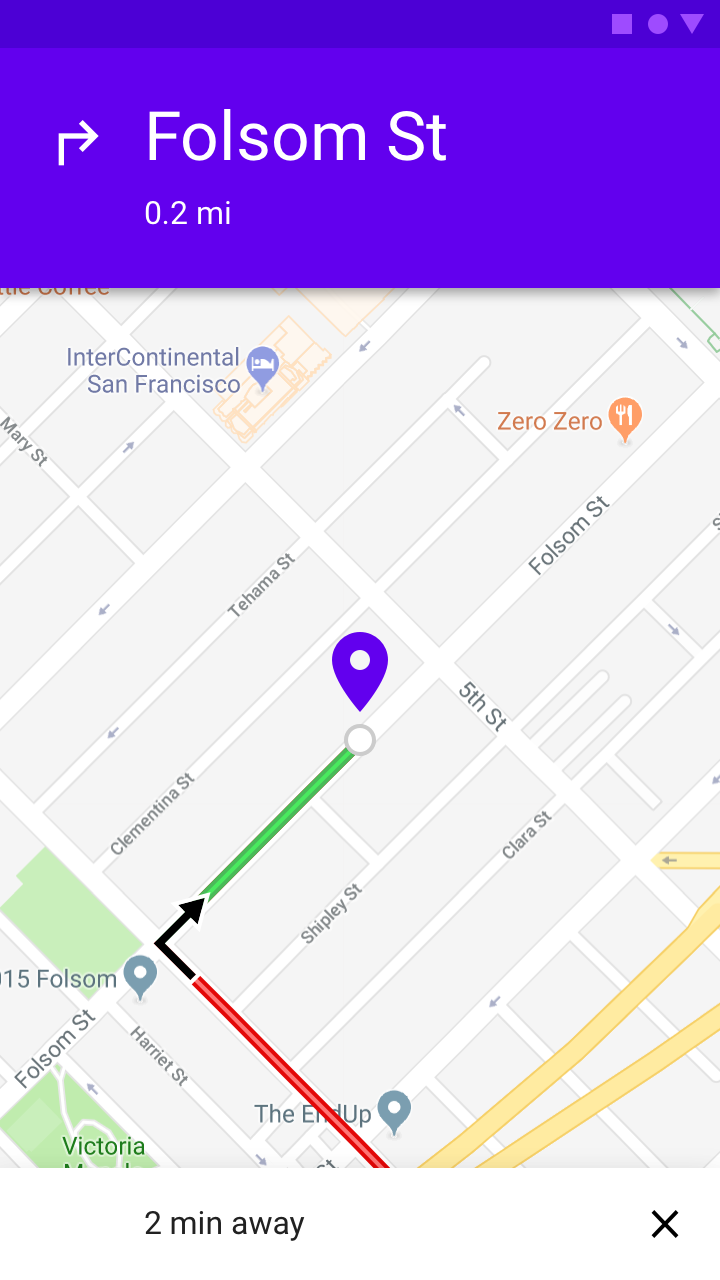
A navigation app uses color to signal traffic conditions.
Consistency and context
Color should be used consistently in a product, so that certain colors always mean the same thing, even if the context changes. Attention should also be given to colors with local or cultural significance. For example, alerts may typically be colored red in some cultures, but not in others.
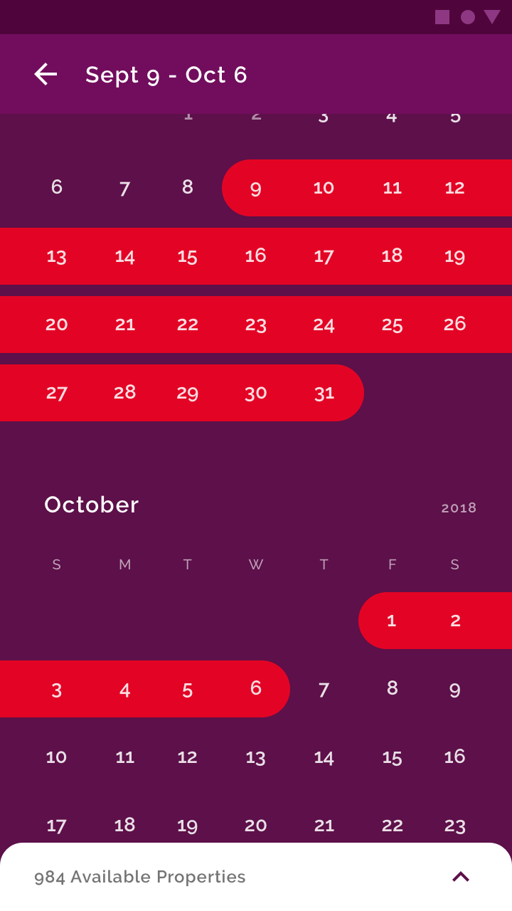
Date selection is shown in red against a purple background, associating the brand’s primary color (red) with choosing travel dates.
Since red is a brand color, don’t also use it to convey an error state.
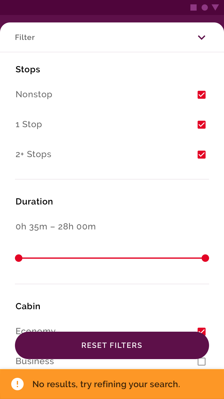
Choose alternative alert colors that don’t use brand coloring.
State
Color can provide information about the state of an app, its components, and elements. This includes:
- Current state of an element or component, such as whether a button is enabled or disabled
- Changes in state to an app, component, or element
Color should be noticeable when indicating state changes, as subtle differences in color may be missed. It’s best to indicate a change of state in more than one way, such as by displaying an icon or moving the location of an element.
Indicating interaction
To emphasize a specific interaction, use strong color contrasts on content that a user has interacted with, relative to content a user hasn’t.
This image has a color treatment that indicates the user is interacting with it.
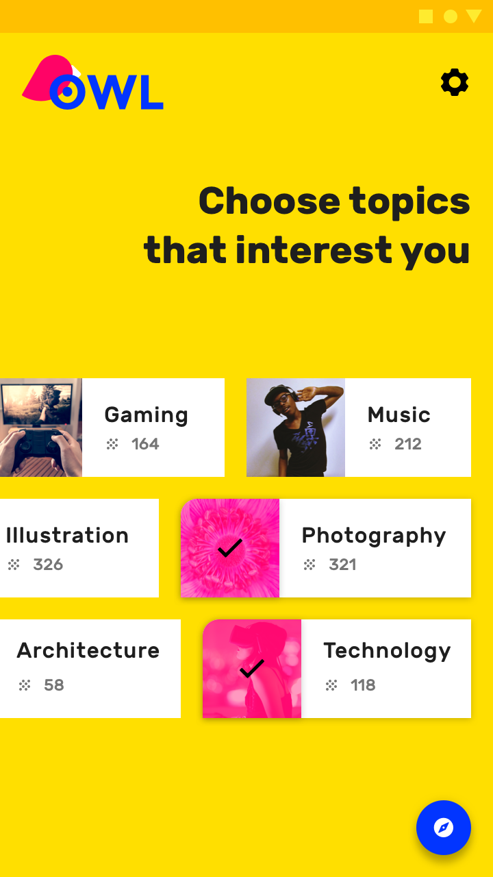
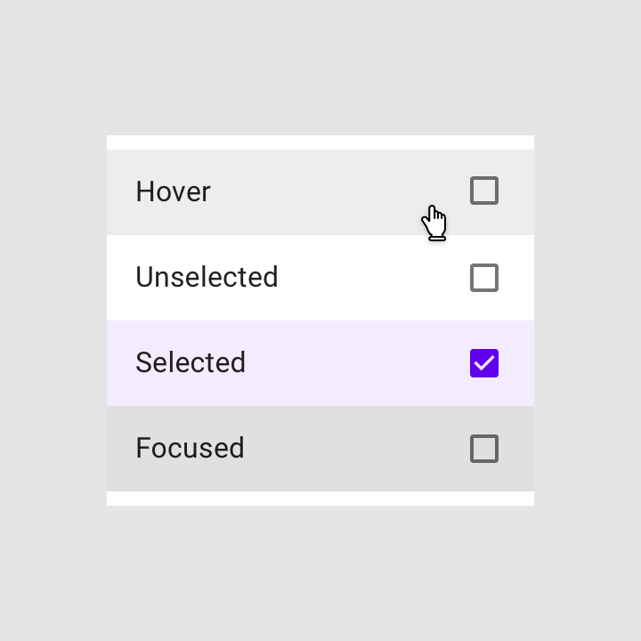
Indicating selection
To emphasize selected elements, use strong color contrasts on those elements.
The emails in this list use brand colors to indicate those which are selected, using a colored corner shape.