Image lists
Image lists display a collection of images in an organized grid.
Usage
Image lists represent a collection of items in a repeated pattern. They help improve the visual comprehension of the content they hold.
Principles

Visual
Image lists allow users to scan content based on images.
Comparable
Image lists allow users to easily compare items within a collection.
Integrated
Image lists are responsively integrated with the surrounding content and layout.
Types
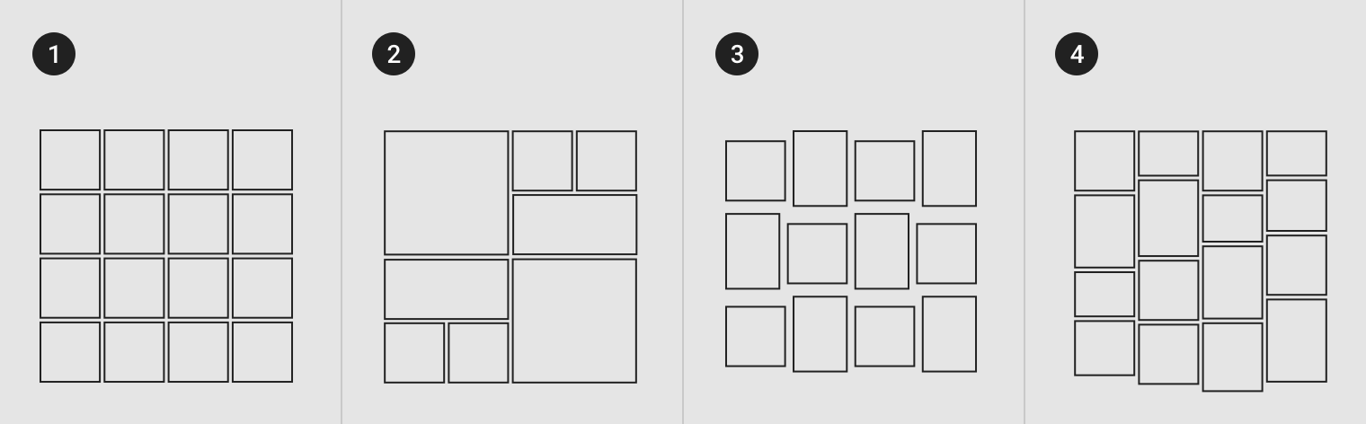
- Standard image lists are best for items of equal importance. They have a uniform container size, ratio, and padding.
- Quilted image lists emphasize certain items over others in a collection. They create hierarchy using varied container sizes and ratios.
- Woven image lists facilitate the browsing of peer content. They display content in containers of varying ratios to create a rhythmic layout.
- Masonry image lists facilitate the browsing of uncropped peer content. Container heights are sized based on the image size.
Anatomy
Image lists are comprised of containers that are set at a certain aspect ratio. Each item in an image list can display optional text and iconography below or above the image container.
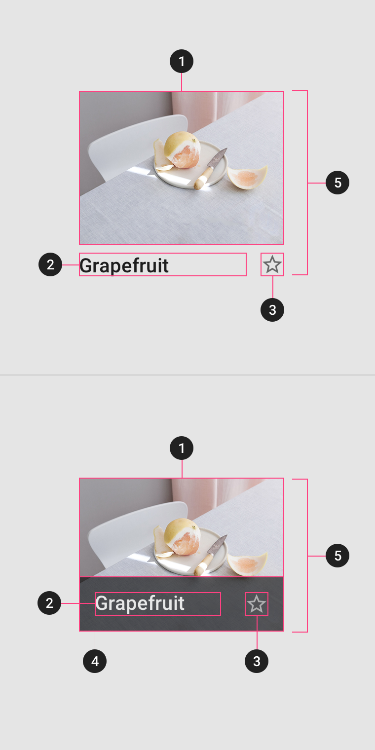
1. Image container
The image container displays an image list item’s image or illustration.
2. Text labels (optional)
Text labels display one line of text related to an image list item.
3. Actionable iconography (optional)
Actionable iconography can represent related actions.
4. Text protection (optional)
Text protection is a semi-opaque scrim placed in front of imagery to keep text above it legible.
5. Image list item
Image list items represent individual items in an image list.
Padding
Padding can vary between images in an image list. The following padding values are recommended: 1, 2, 4, 8, 16, 20, 24, 32 dp.
Behavior
Actions
Image lists items may be tapped, dragged, filtered, or sorted.
Tapping an image list item displays more detail about that item.
Image list content can be filtered or sorted by date, file size, alphabetical order, or other parameters.
You can drag an image list item to reorder it, but this interaction should be disabled if images are sorted or filtered.
Layout grid
Defined layout
Image list column structures don’t need to align to the layout grid. Only the perimeter of the image list itself needs to align to the layout grid.
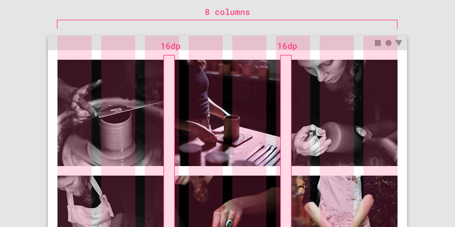
An image list spanning eight columns of the layout grid, with 16dp padding
Alignment with other components
Image lists can be placed adjacent to other components in the layout grid.
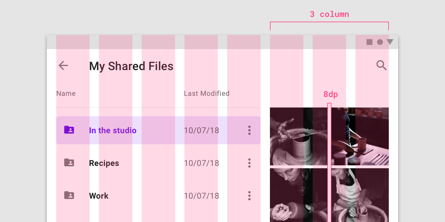
An image list spanning three columns of the layout grid, with 8dp padding
Responsive
Image lists inherit the responsive behavior of the layout grid.
Scrolling
Image lists can scroll vertically or horizontally. All items in an image list must scroll together as a collection. Image cropping can be used to indicate scroll direction.
Types
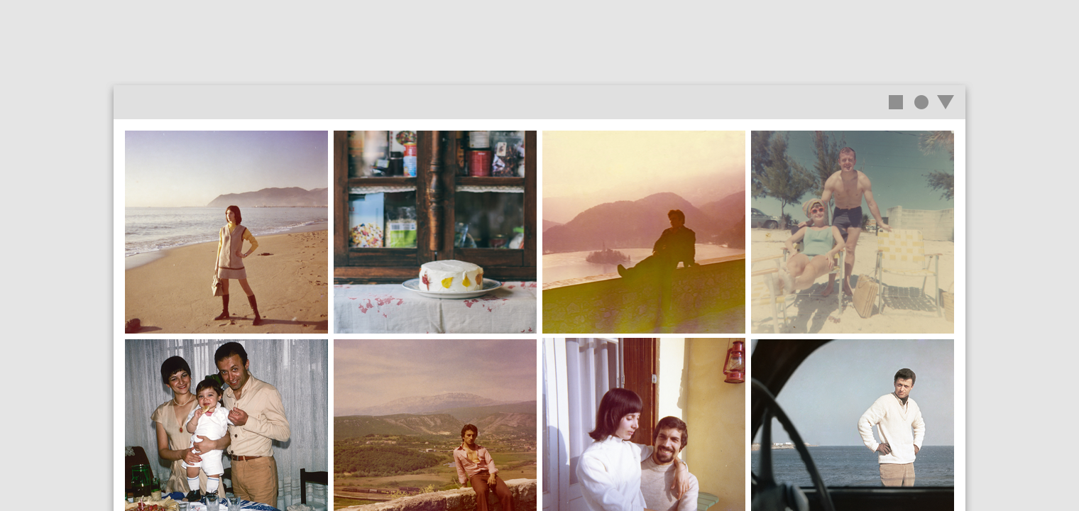
Standard image list
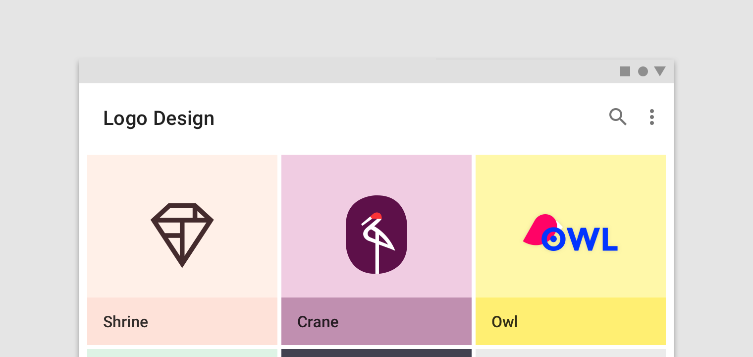
Standard image lists are best for items of equal importance. They have a uniform container size, ratio, and padding.

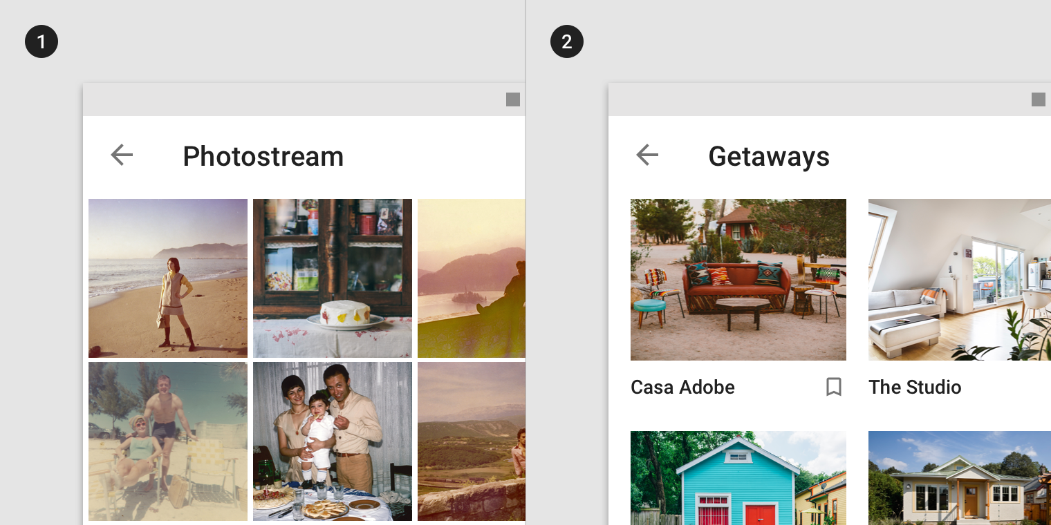
Standard image lists can be displayed with or without text labels.
- image list with images only
- image list with images and text labels
In compact layouts, labels can appear above the image container using an image treatment that provides text protection to ensure legibility.
Quilted image list
Quilted image lists emphasize certain items over others in a collection. They use varied container sizes and ratios to create hierarchy across images.
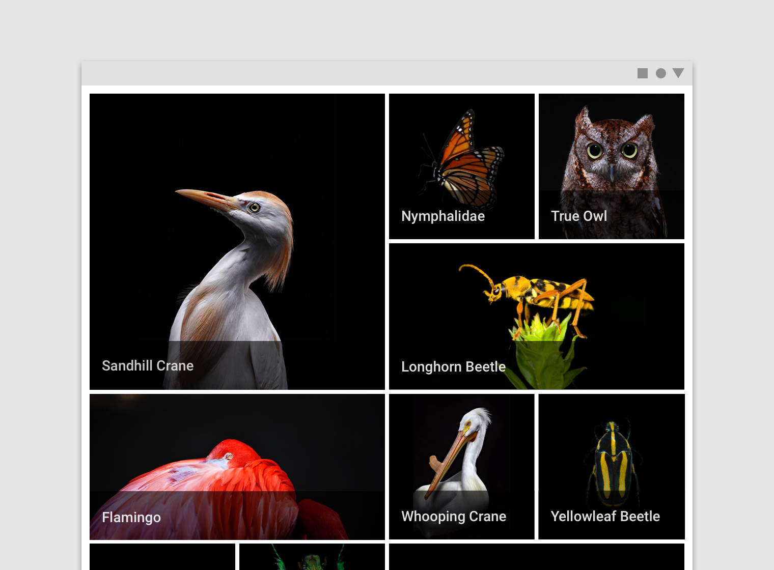
Quilted image lists shouldn’t display text below the image container, as it disrupts the layout.
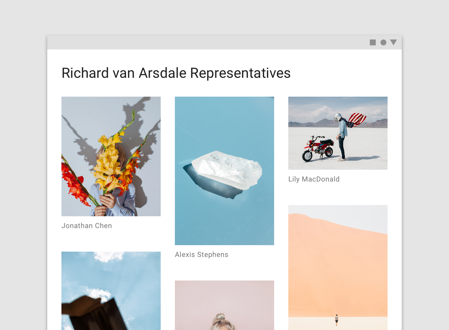
Woven image list
Woven image lists use alternating container ratios to create a rhythmic layout. A woven image list is best for browsing peer content.
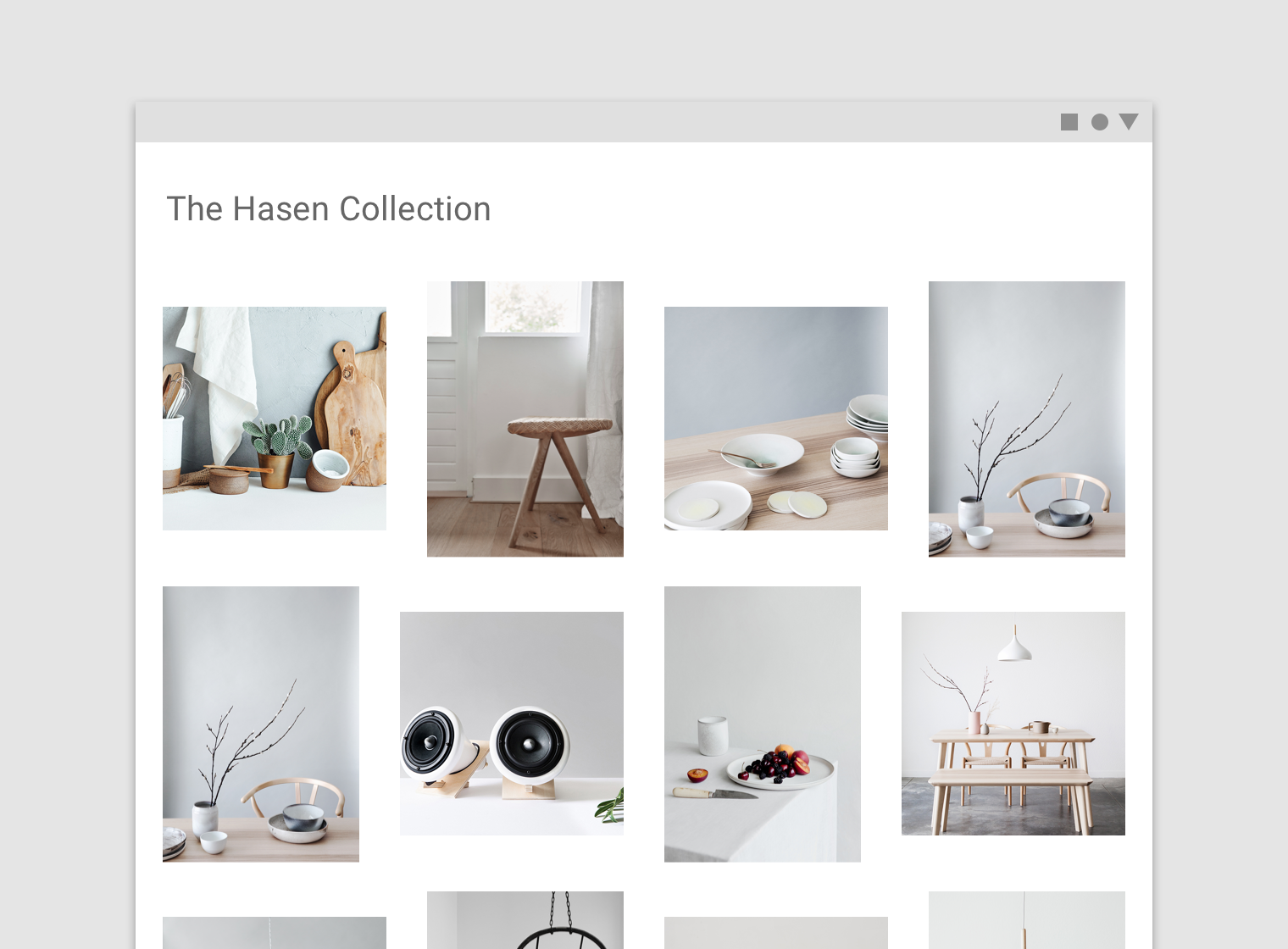
Masonry image list
Masonry image lists use dynamically sized container heights that reflect the aspect ratio of each image. This image list is best used for browsing uncropped peer content.
Implementation
By default, each row will show five list items on .medium and above, four list items on .smallext, three list items on .small, and two list items on .xsmall. Please refer to Breakpoint system for more information.
Default padding is 8 dp and the following padding values are available: 1, 2, 4, 8, 16, 20, 24, 32 dp.
Standard image list
<div class="mdc-image-list">
    <div class="list-item">
        <div class="image" style="background-image: url('...');"></div>
    </div>
    .
    .
    .
</div>
16:9 image ratio
<div class="mdc-image-list md-16by9">
    ...
</div>
Supporting text and iconography
<div class="mdc-image-list">
    <div class="list-item">
        <div class="image" style="background-image: url('...');"></div>
        <div class="support">
            <div class="text">...</div>
            <div class="icon">...</div>
        </div>
    </div>
    .
    .
    .
</div>
Overlay supporting text and iconography
<div class="mdc-image-list overlay-support">
    ...
</div>
Background color classes can be added to each supporting element. Please refer to The color system.
<div class="mdc-image-list overlay-support">
    <div class="list-item">
        ...
        <div class="support bg-red-900">
            ...
        </div>
    </div>
    .
    .
    .
</div>
Text protection opacity can be customized by changing the CSS variable --protection-opacity for the support element. Defaults to 0.6.
.mdc-image-list .list-item .support {
    --protection-opacity: 0.6;
}
Woven image list
<div class="mdc-image-list mdc-style-woven">
    .
    .
    .
</div>
Masonry image list


<div class="mdc-image-list mdc-style-masonry">
    <div class="list-item">
        <div class="image">
            <img src="...">
        </div>
    </div>
    .
    .
    .
</div>