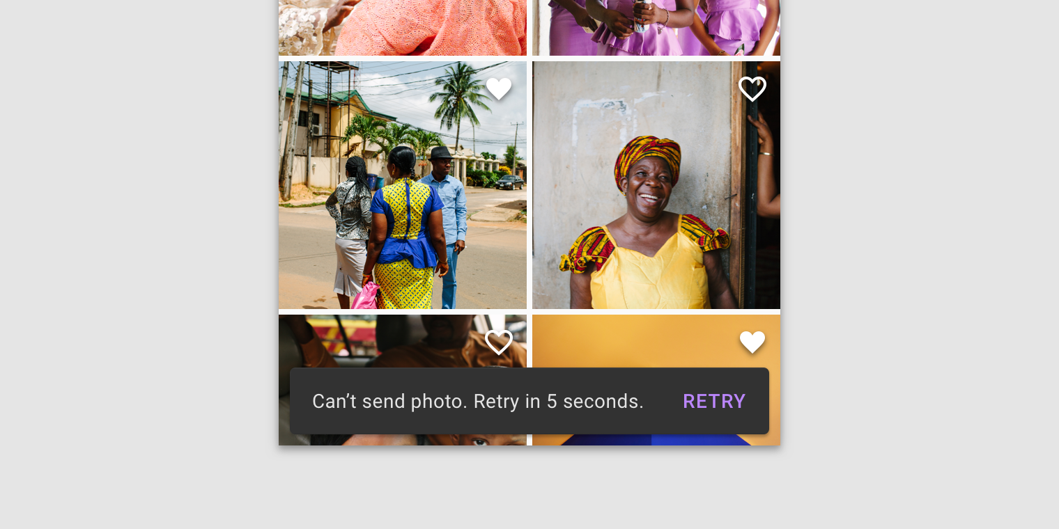
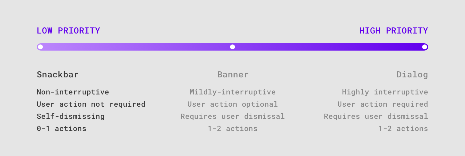
Snackbars
Snackbars provide brief messages about app processes at the bottom of the screen.
Usage
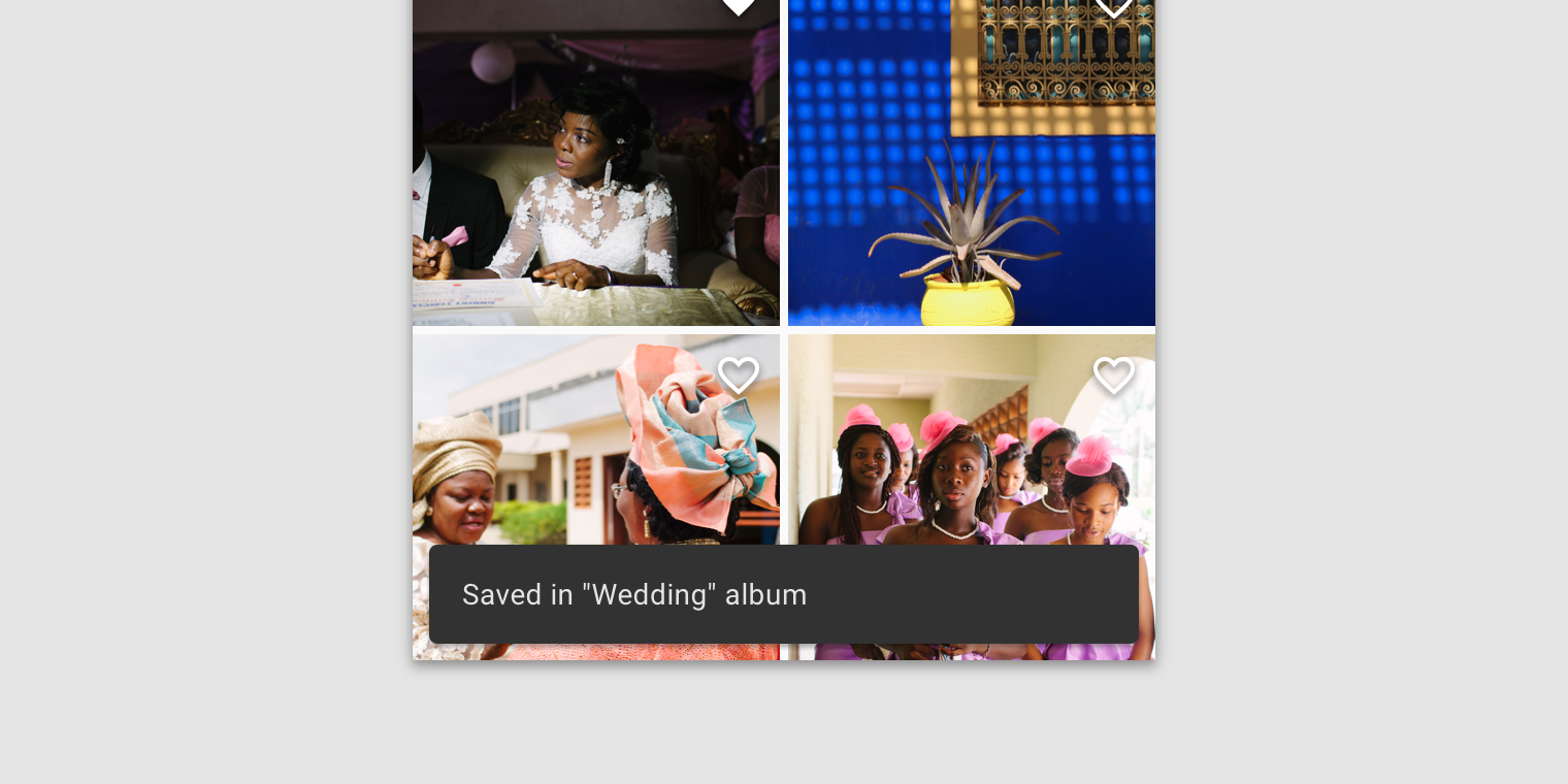
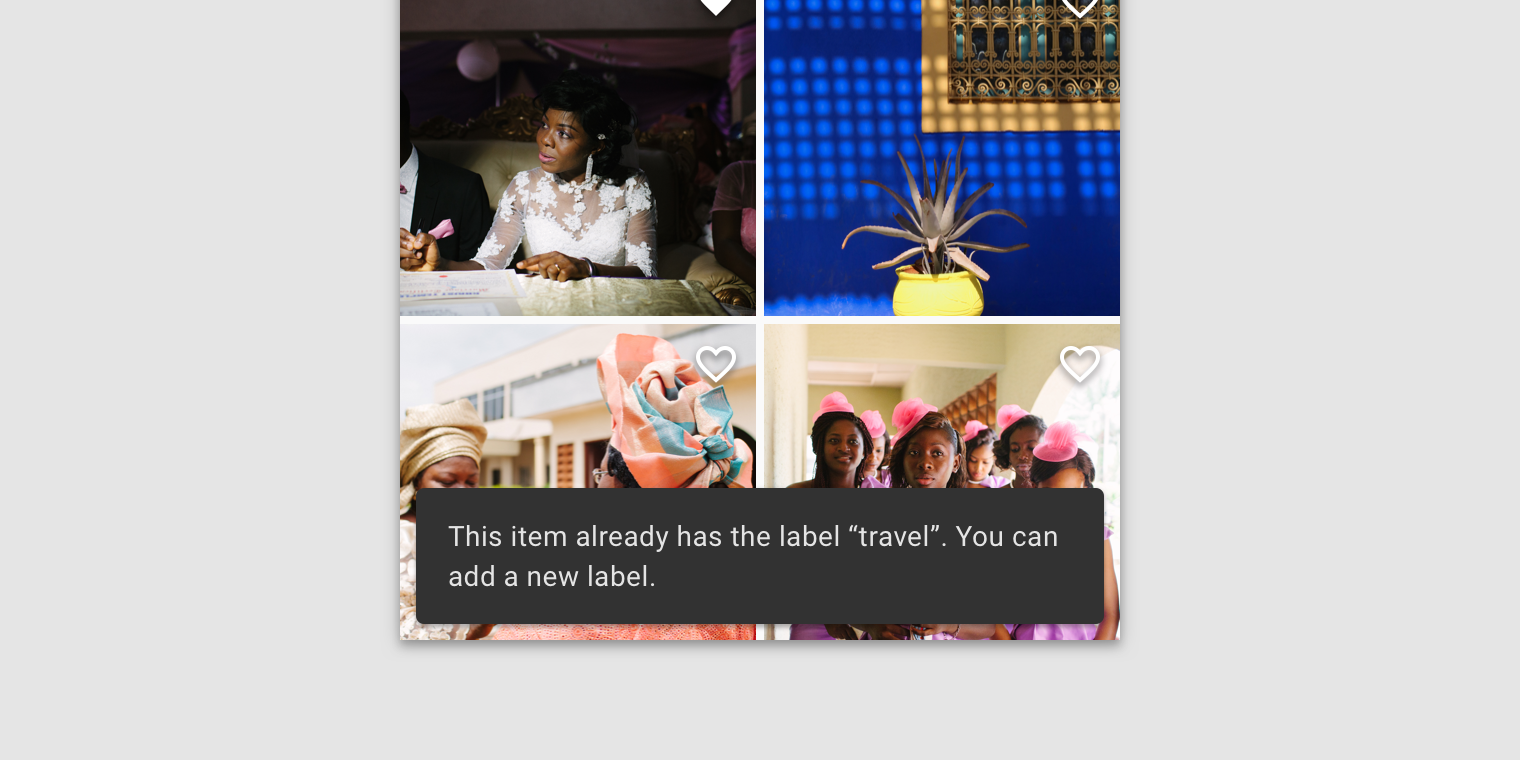
Snackbars inform users of a process that an app has performed or will perform. They appear temporarily, towards the bottom of the screen. They shouldn’t interrupt the user experience, and they don’t require user input to disappear.
Frequency
Only one snackbar may be displayed at a time.
Actions
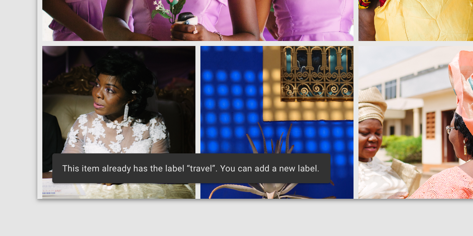
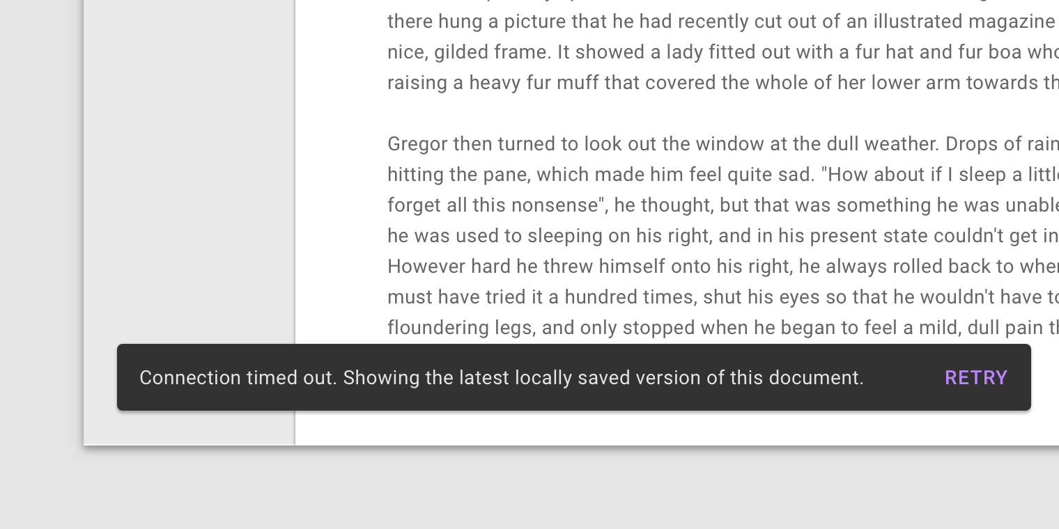
A snackbar can contain a single action. Because they disappear automatically, the action shouldn’t be “Dismiss” or “Cancel”.
Principles
Informational
Snackbars provide updates on an app’s processes.
Temporary
Snackbars appear temporarily, and disappear on their own without requiring user input to be dismissed.
Contextual
Snackbars are placed in the most suitable area of the UI.
When to use
Snackbars should communicate messages that are minimally interruptive; those don’t require user action.
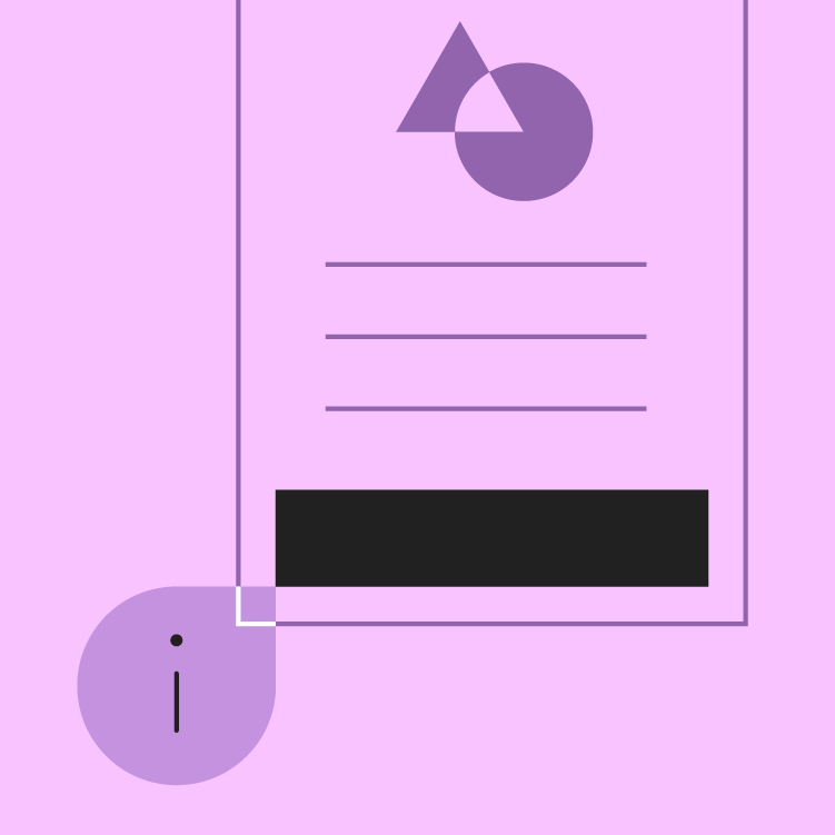
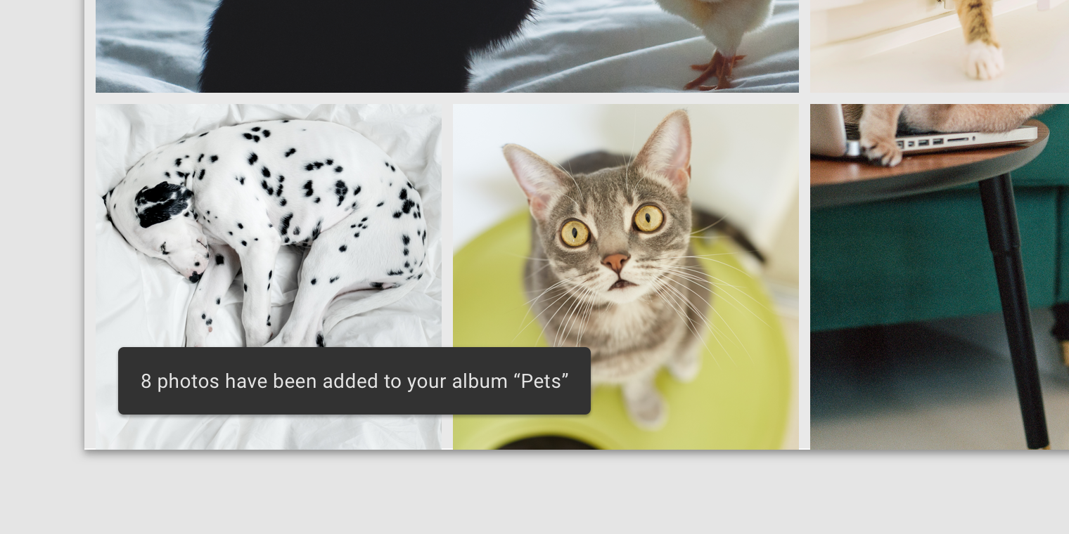
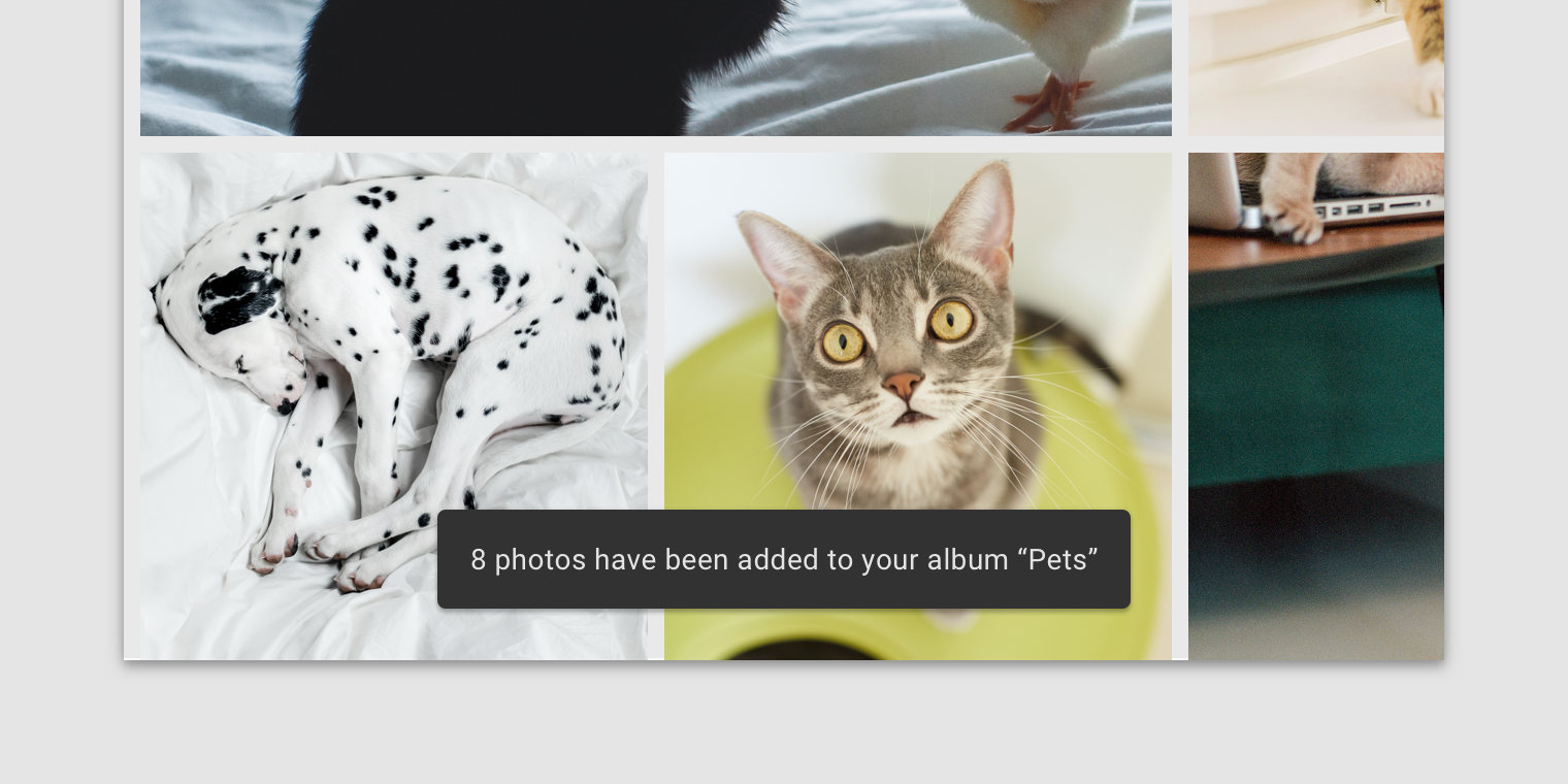
Anatomy
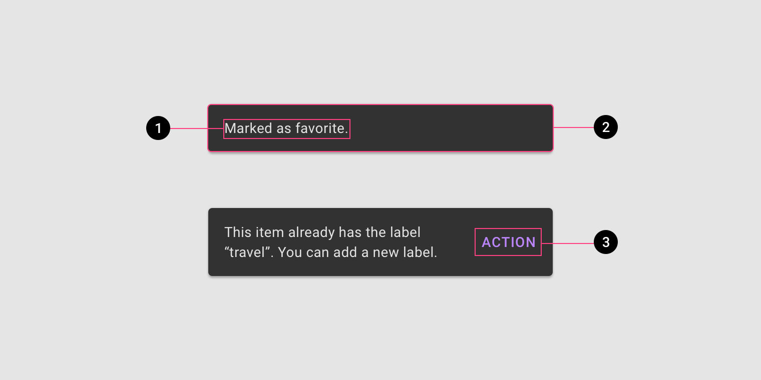
- Text label
- Container
- Action (optional)
Text label
Snackbars contain a text label that directly relates to the process being performed. On mobile, the text label can contain up to two lines of text.
Text labels are short, clear updates on processes that have been performed.
On mobile, use up to two lines of text to communicate the snackbar message.
In wide UIs like desktop and tablet, snackbars should have only a single line of text.
Container
Snackbars are displayed in rectangular containers with a grey background. Containers should be completely opaque, so that text labels remain legible.
Snackbar containers use a solid background color with a shadow to stand out against content.
In wide layouts, extend the container width to accommodate longer text labels.
An app can apply slight transparency to the container background, as long as text remains clearly legible.
Action
Snackbars can display a single text button that lets users take action on a process performed by the app. Snackbars shouldn’t be the only way to access a core use case, to make an app usable.
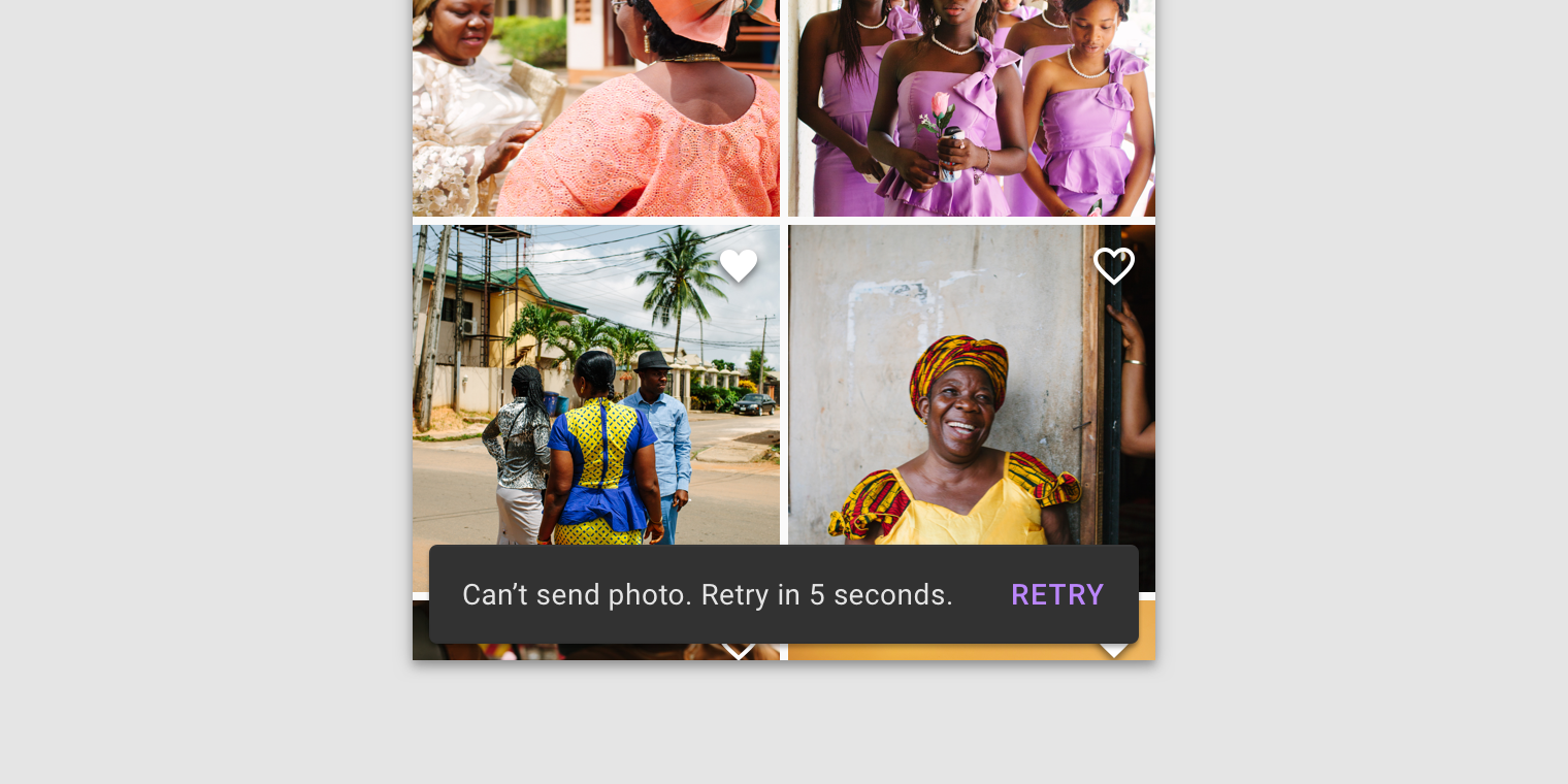
To distinguish the action from the text label, text buttons should display colored text.
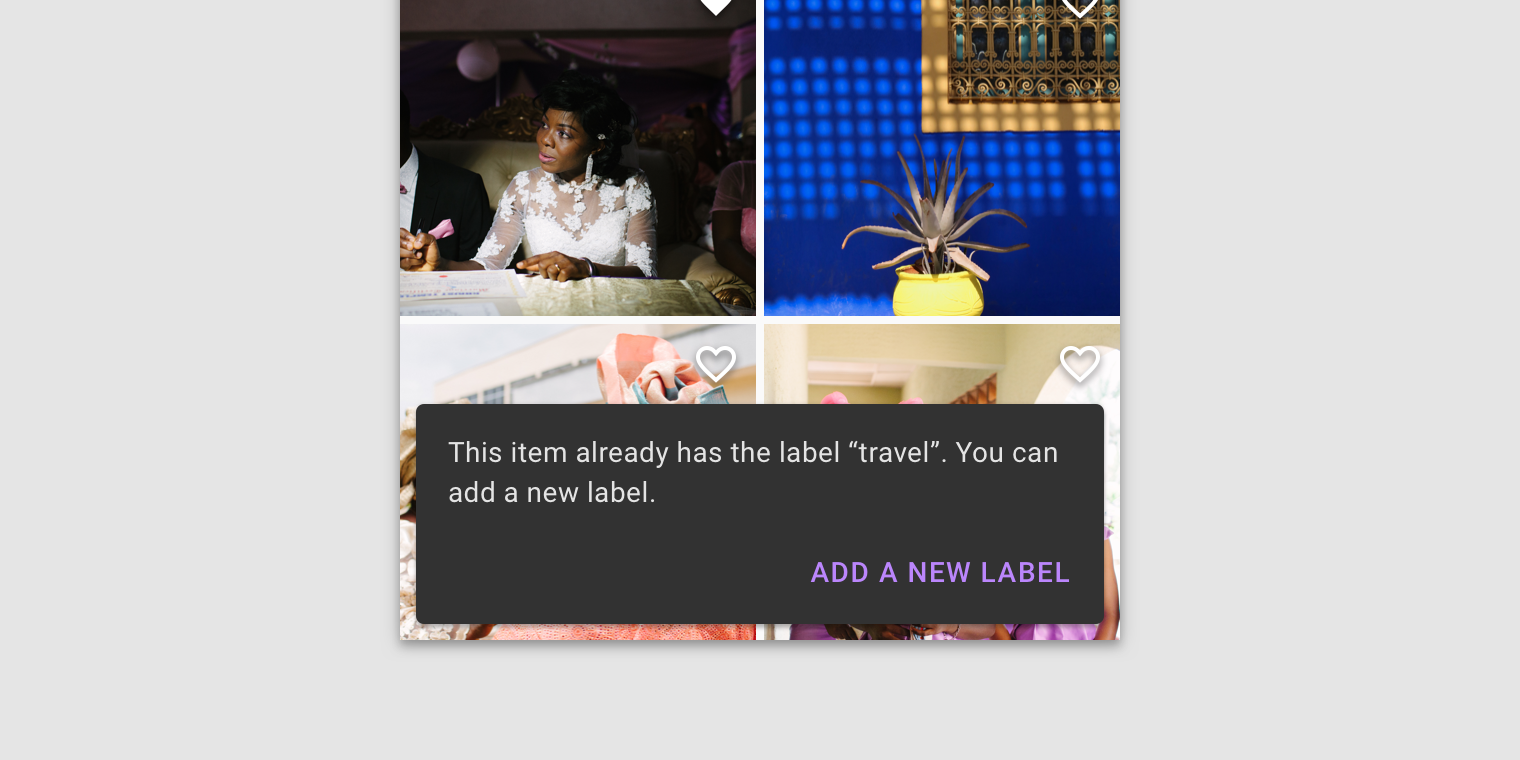
If an action is long, it can be displayed on a third line.

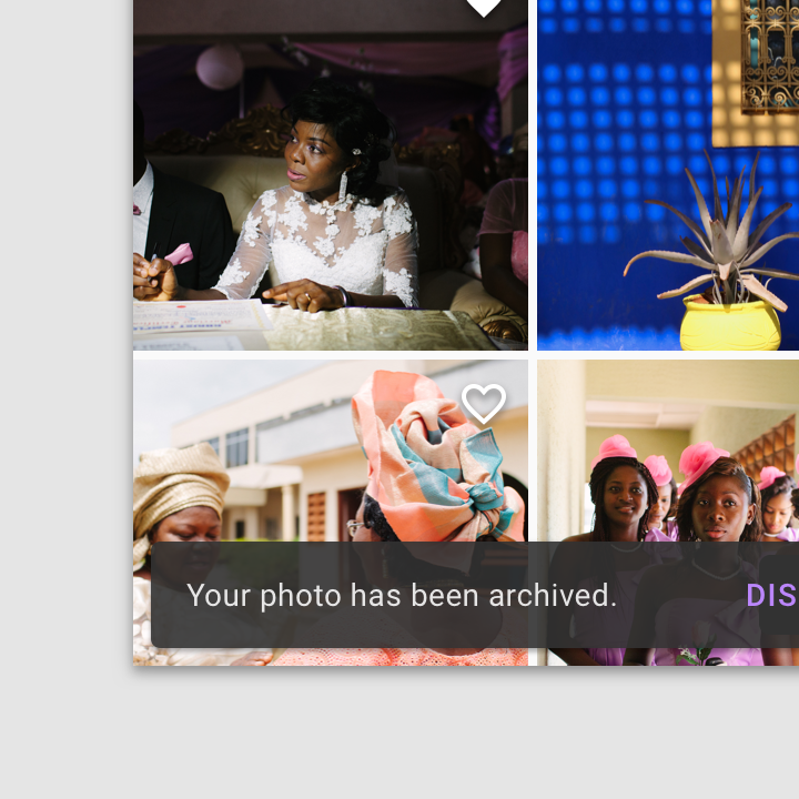
To allow users to amend choices, display an "Undo" action.
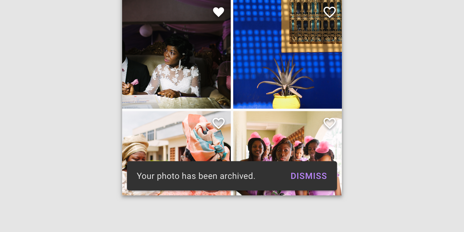
A dismiss action is unnecessary, as snackbar disappears on their own by default.
Behavior
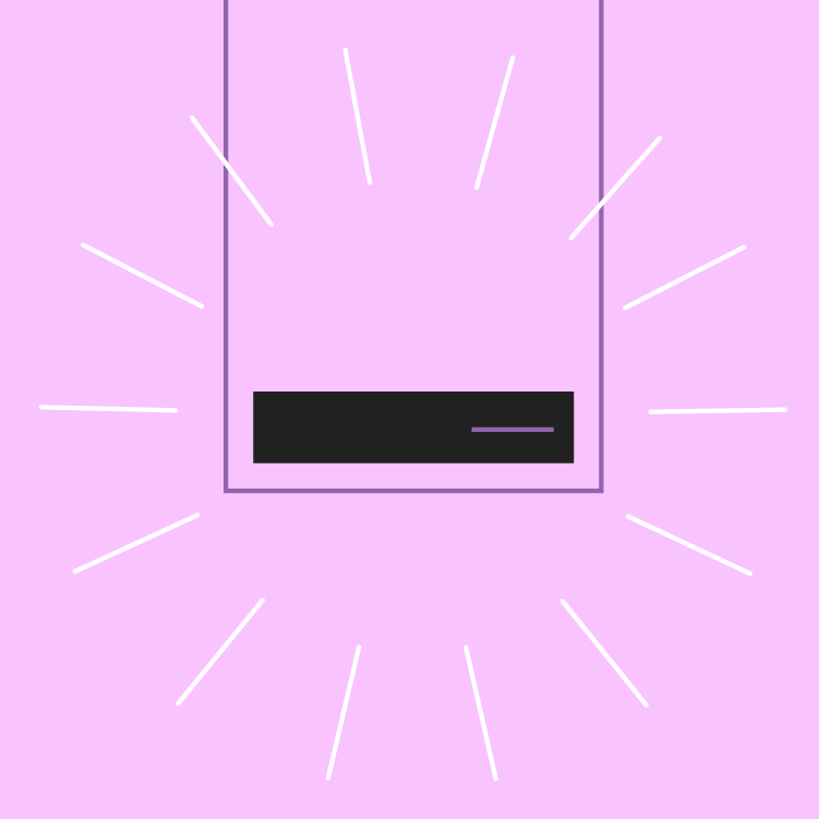
Appearing and disappearing
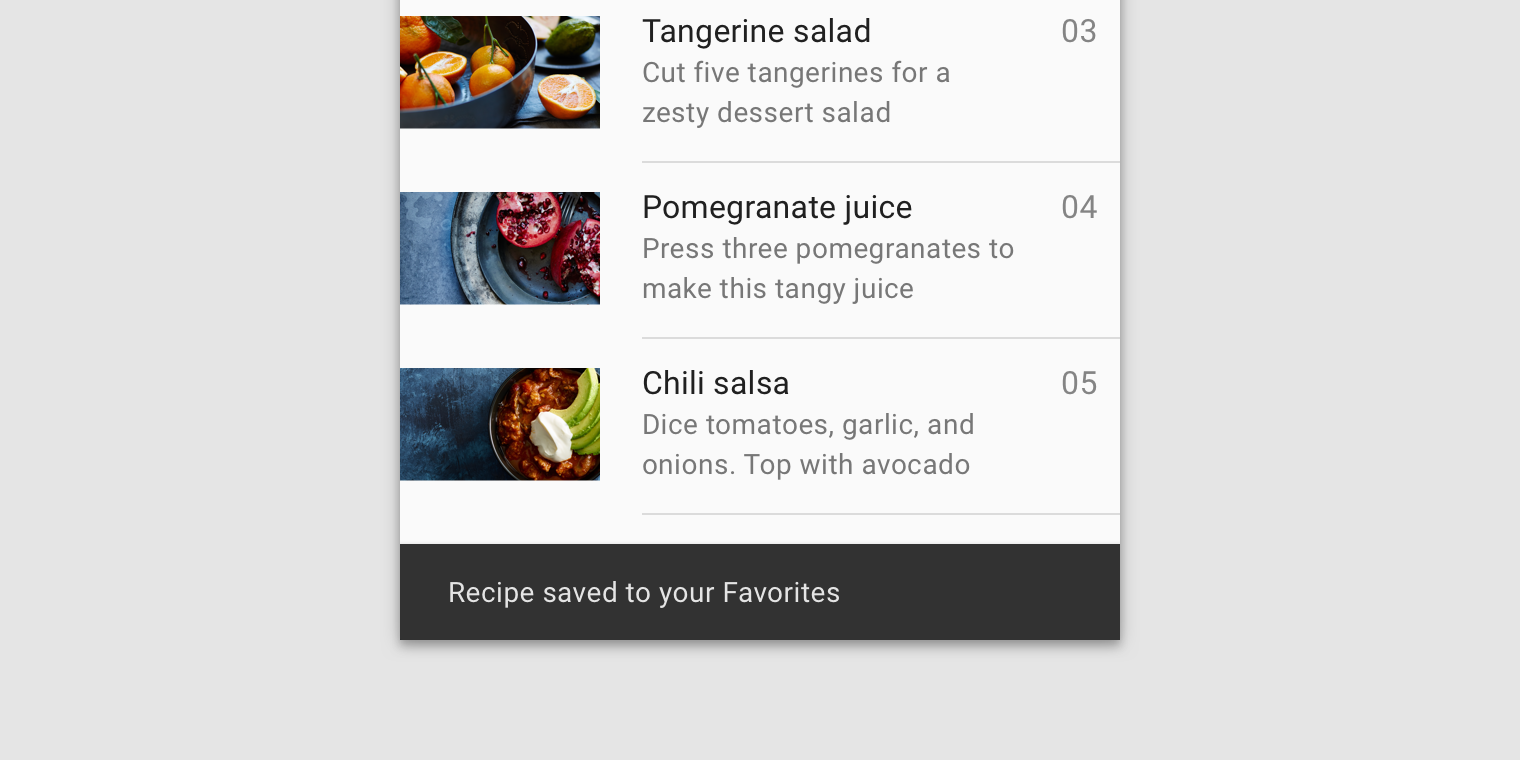
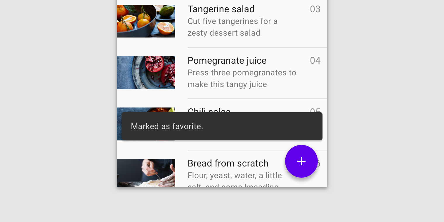
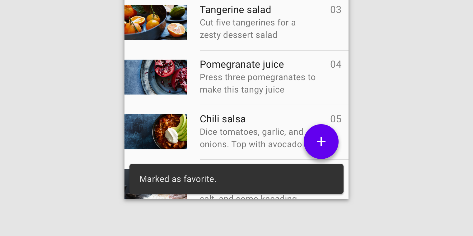
Snackbars appear without warning, and don't require user interaction. They automatically disappear from the screen after a minimum of four seconds, and a maximum of ten seconds.
Consecutive snackbars
When multiple snackbar updates are necessary, they should appear one at a time.
Avoid stacking snackbars on top of one another.
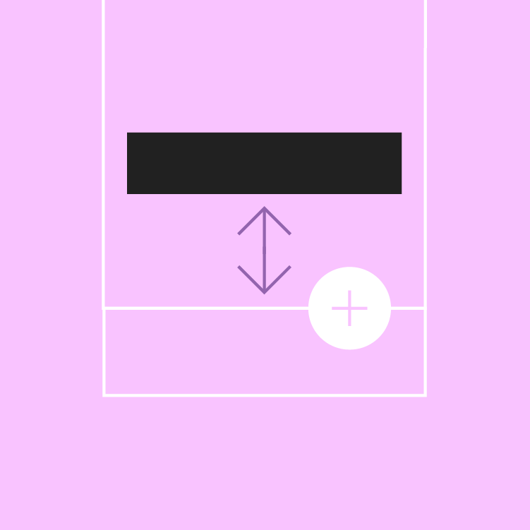
Placement
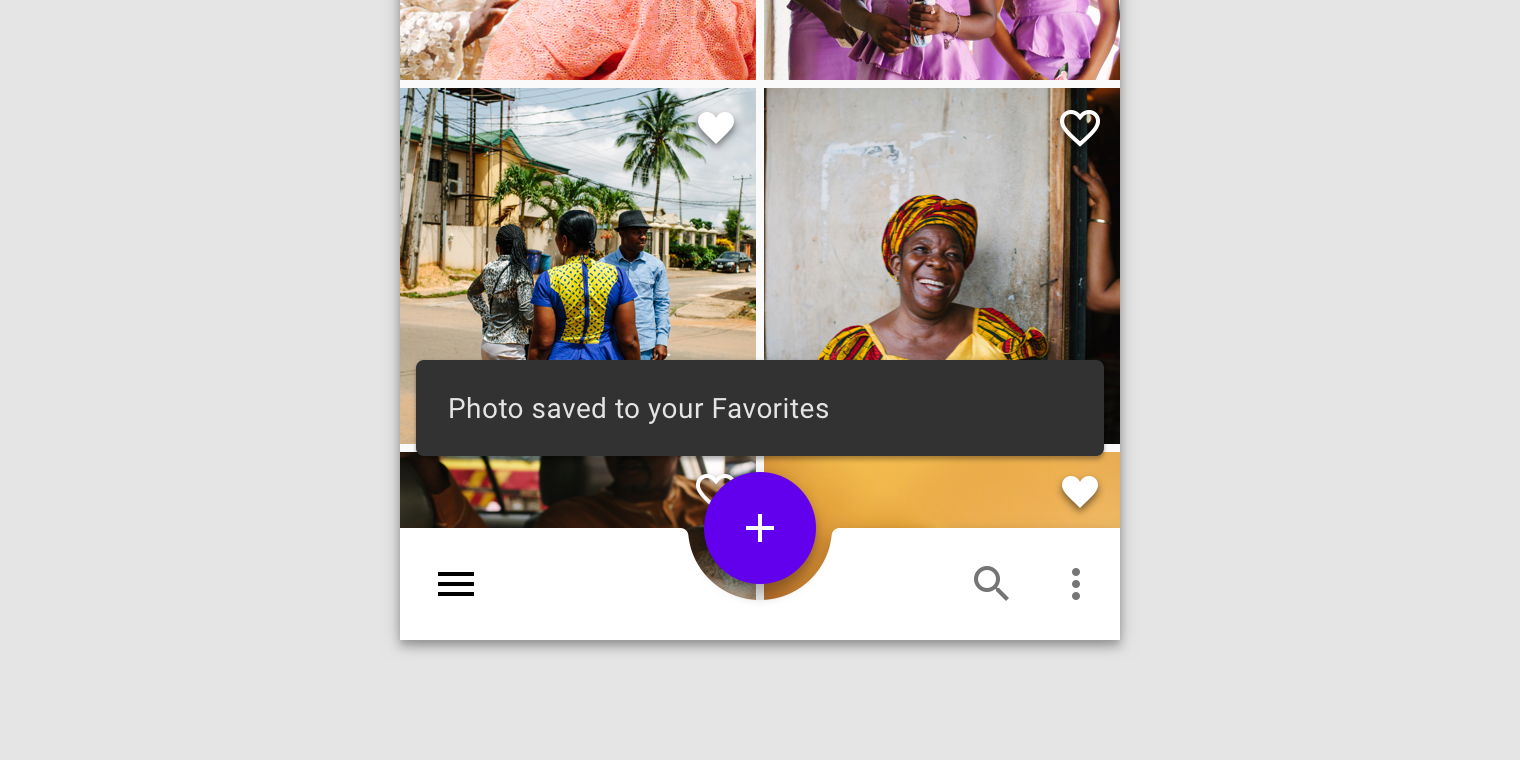
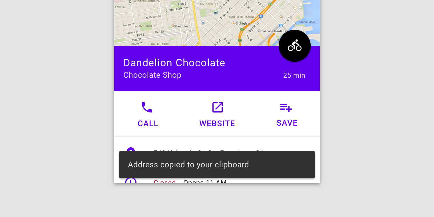
Snackbars should be placed at the bottom of a UI, in front of app content. Avoid placing a snackbar in front of frequently used touch targets or navigation.
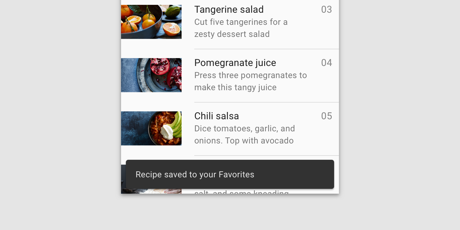
Place a snackbar in front of content.
Snackbars can span the entire width of a UI. However, they should not appear in front of navigation or other important UI elements like floating action buttons.
Snackbars and floating action buttons (FABs)
Snackbars should appear above FABs.
The FAB can be pushed up when a snackbar appears, though this can cause distraction if multiple snackbars appear.
Snackbars and persistent footer elements
Snackbars should appear directly above persistent footer elements.
Place snackbars in front of medium extended sheets.
Snackbars in wide layouts
In wide layouts, snackbars can be left-aligned or center-aligned if they are consistently placed on the same spot at the bottom of the screen.
Implementation
Related components:
Javascript methods:
| void MDC.snackbarsActivate(seconds = 4.0) | ||
|---|---|---|
| A method to run all snackbars sequentially. | ||
| seconds | float | Time in seconds before removing an active snackbar. cannot be less than 4 or more than 10. |
Default snackbar.
<div id="mdc-snackbars">
    <div class="mdc-snackbar">
        <div class="text">
            Photo saved to your favorites
        </div>
    </div>
    .
    .
    .
</div>
Default snackbar with action.
<div id="mdc-snackbars">
    <div class="mdc-snackbar">
        <div class="text">
            Your photo has been archived.
        </div>
        <div class="mdc-button-group">
            <button class="mdc-button blue">Undo</button>
        </div>
    </div>
    .
    .
    .
</div>
Default snackbar with long action.
<div id="mdc-snackbars">
    <div class="mdc-snackbar stacked">
        ...
    </div>
    .
    .
    .
</div>
Snackbars styling options
Snackbars positioned at the edge of the screen.
<div id="mdc-snackbars" class="position-start">
    .
    .
    .
</div>
Standard snackbars
<div id="mdc-snackbars" class="standard">
    .
    .
    .
</div>
Standard snackbars positioned at the edge of the screen.
<div id="mdc-snackbars" class="position-start standard">
    .
    .
    .
</div>