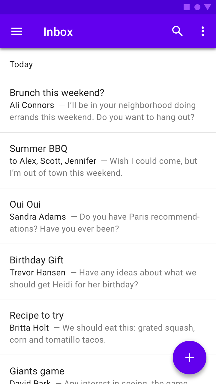
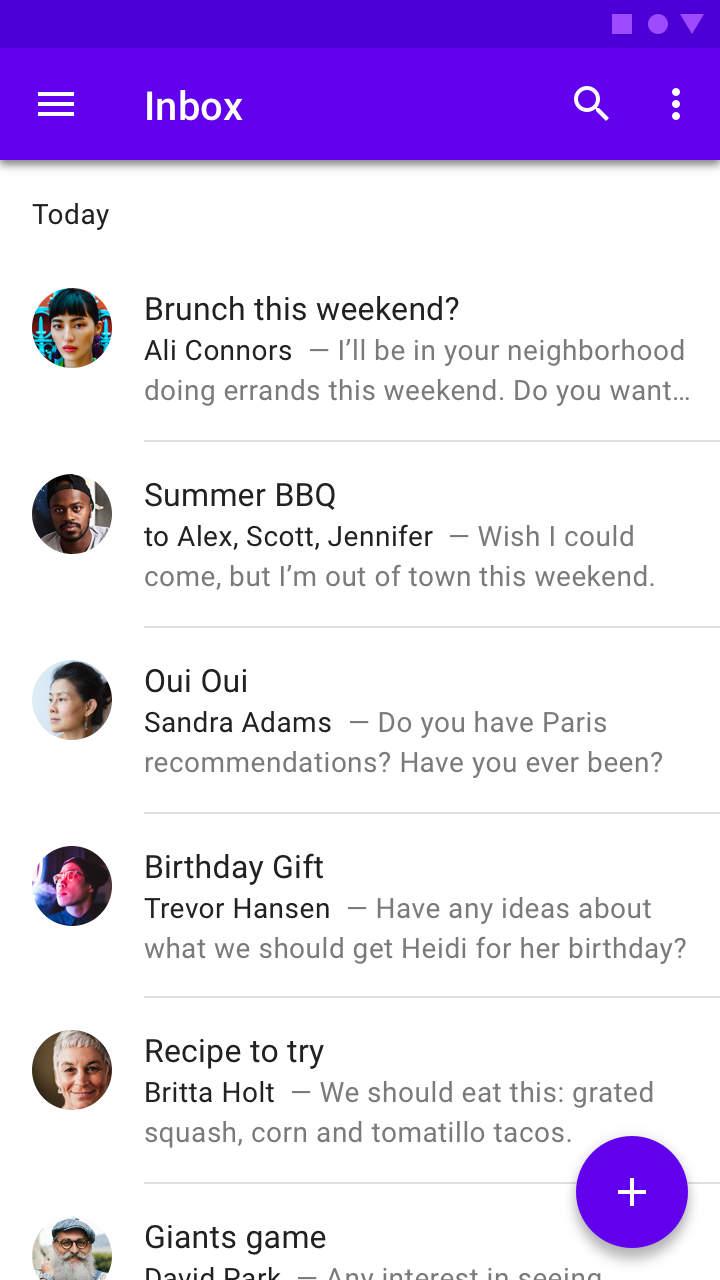
Ali Connors
- I'll be in your neighborhood doing errands this weekend. Do you want ...
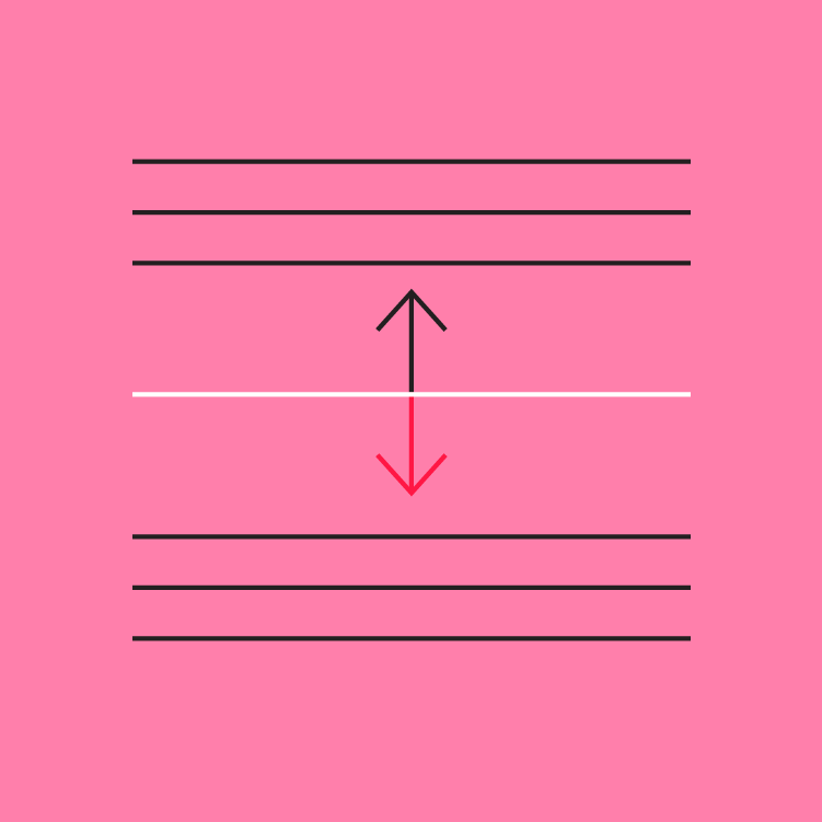
Dividers
A divider is a thin line that groups content in lists and layouts.
Usage
Dividers separate content into clear groups.
Principles

Subtle
Dividers should be noticeable in a layout, but not jarring.
Secondary
Dividers should only be used if elements cannot be separated using white space.
Infrequent
Use dividers sparingly, to create groupings rather than separate items.
Types
Full-bleed dividers
Full-bleed dividers separate content into sections and span the entire length of a layout.
Inset dividers
Inset dividers separate related content, anchored by elements that align with the app bar title.
Middle dividers
Middle dividers space related content and are centered in a layout or list.
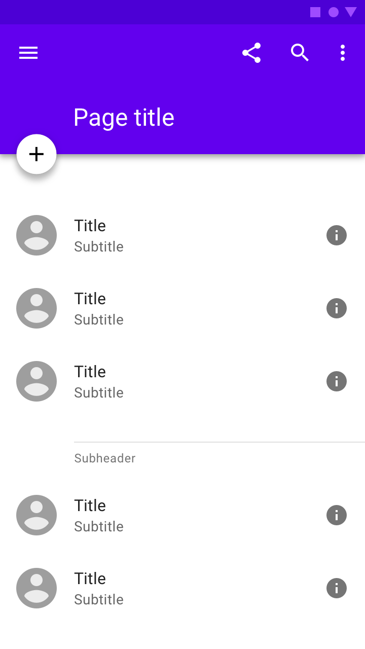
Dividers with subheaders
Dividers can be paired with subheaders to help define content groupings.
Types
Full-bleed dividers
Full-bleed dividers separate content into sections, such as:
- Separating list and layout elements
- Indicating where an element may expand

When lists don’t have an anchoring element (such as an icon), spacing may not be enough to separate content. Full-bleed dividers can help separate individual tiles
A full-bleed divider in a navigation drawer
Inset dividers
Inset dividers separate related content, such as emails in an email thread. They should be used with anchoring elements such as icons or avatars, and left-aligned with the app bar title.
Inset dividers
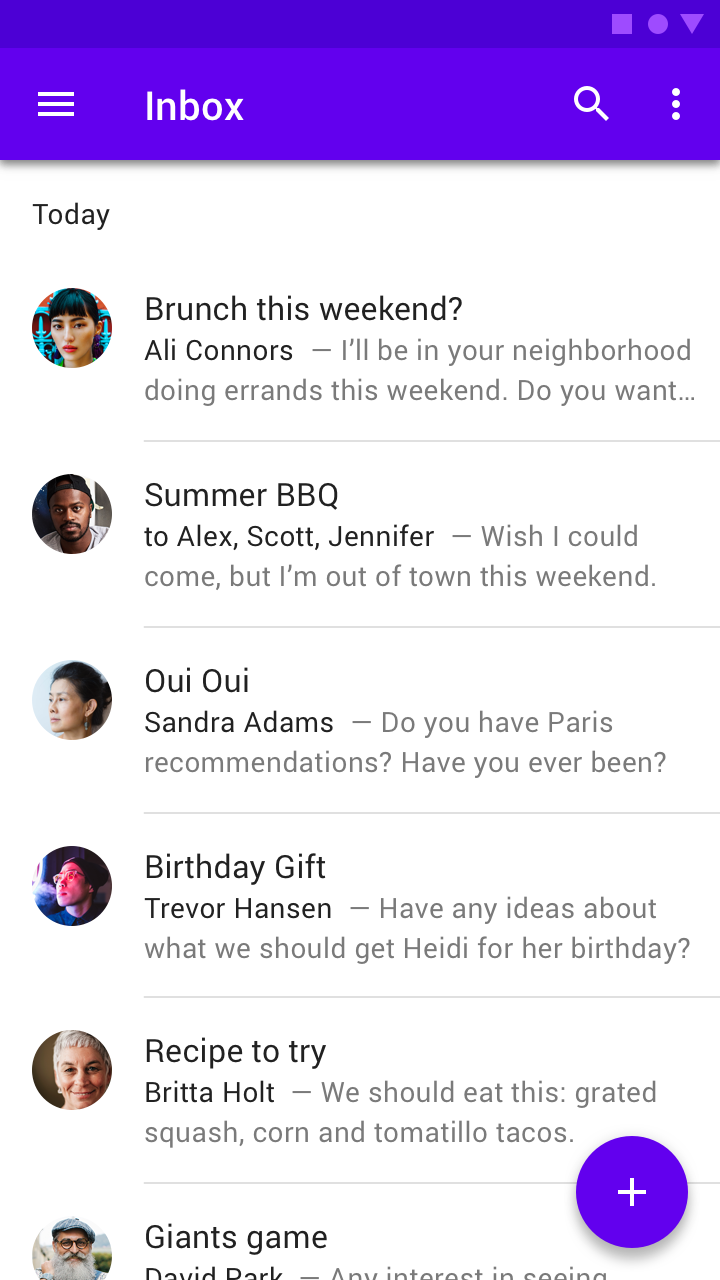
Use inset dividers when there are anchoring elements such as an icon or avatar
Middle dividers
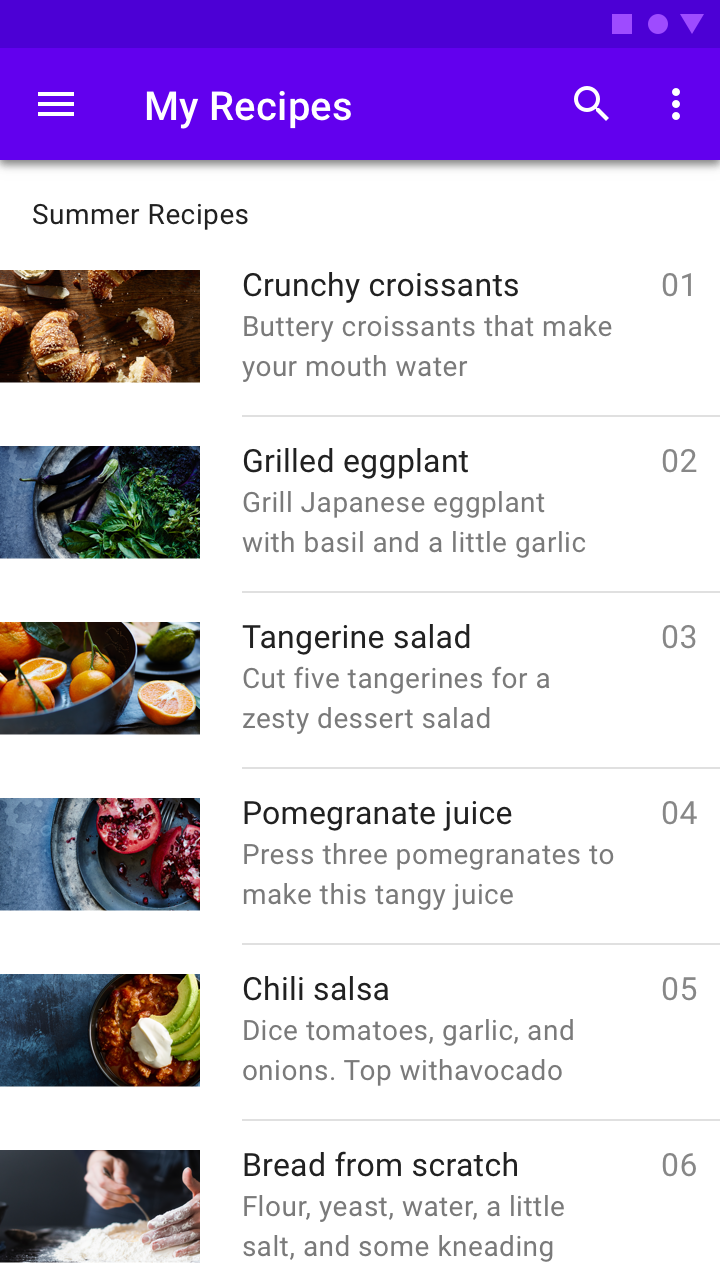
Dividers can also be placed in the middle of a layout. They are best for separating related content, such prices on a receipt.
An inset divider above a subheader
A full divider above a subheader
Dividers with subheaders
Dividers can be paired with subheaders to identify grouped content. Place dividers above subheaders to reinforce the subheader’s connection to content.
An inset divider above a subheader
A full-bleed divider above a subheaderA full divider above a subheader
Implementation
Related components:
Full-bleed dividers
Placing a divider inside any container will cover the whole available width.
Summer BBQ
Birthday Gift
Trevor Hansen
- Have any ideas about what we should get Heidi for her birthday?
Recipe to try
Britta Holt
- We should eat this: Grated Squash, Corn and tomatillo Tacos.
<div class="mdc-list-group md-3line">
    .
    <div class="mdc-divider"></div>
    .
    <div class="mdc-divider"></div>
    .
    .
    .
</div>
Inset dividers
Inset dividers are a special type of full-bleed dividers with additional margin settings.
Summer BBQ
Ali Connors
- I'll be in your neighborhood doing errands this weekend. Do you want ...
Birthday Gift
Trevor Hansen
- Have any ideas about what we should get Heidi for her birthday?
Recipe to try
Britta Holt
- We should eat this: Grated Squash, Corn and tomatillo Tacos.
<div class="mdc-list-group md-3line">
    .
    <div class="mdc-divider inset"></div>
    .
    <div class="mdc-divider inset"></div>
    .
    .
    .
</div>
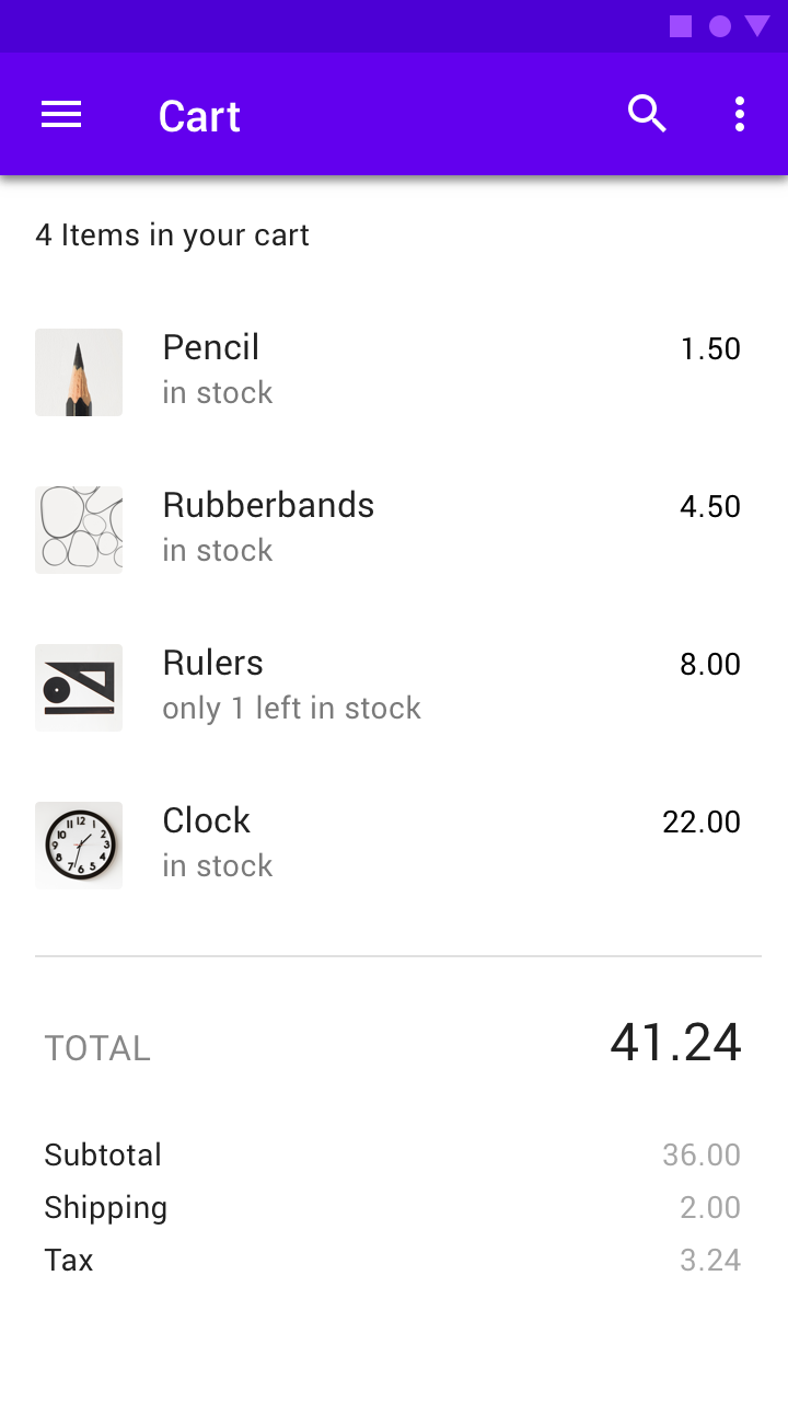
Pencil
in stock
Rubberbands
in stock
Rulers
only 1 in stock
<div class="mdc-list-group md-3line">
    .
    <div class="mdc-divider inset md-56"></div>
    .
    <div class="mdc-divider inset md-56"></div>
    .
    .
    .
</div>
Crunchy Croissants
Buttery, flaky pastry named for its crecent shape.
Grilled Eggplant
Tender with a rich, complex flavor when cooked.
Tngerine Salad
Peak tangerine season lasts from autumn to spring.
<div class="mdc-list-group md-3line">
    .
    <div class="mdc-divider inset md-100"></div>
    .
    <div class="mdc-divider inset md-100"></div>
    .
    .
    .
</div>
Middle dividers
Placing a divider inside an item will act as a middle divider depending on the item padding and margin settings.