almoamen.net
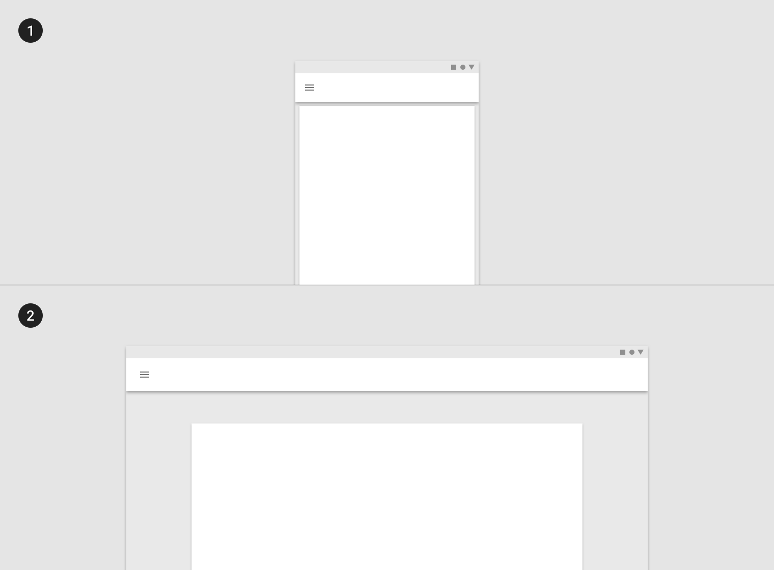
Responsive layout grid
The Material Design responsive layout grid adapts to screen size and orientation, ensuring consistency across layouts.
Columns, gutters, and margins
The Material Design layout grid is made up of three elements: columns, gutters, and margins.
- Columns
- Gutters
- Margins
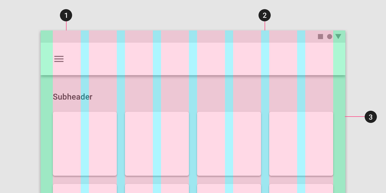
Columns
Content is placed in the areas of the screen that contain columns.
Column width is defined using percentages, rather than fixed values, to allow content to flexibly adapt to any screen size. The number of columns displayed in the grid is determined by the breakpoint range (a range of predetermined screen sizes) at which a screen is viewed, whether it’s a breakpoint for mobile, tablet, or another size.
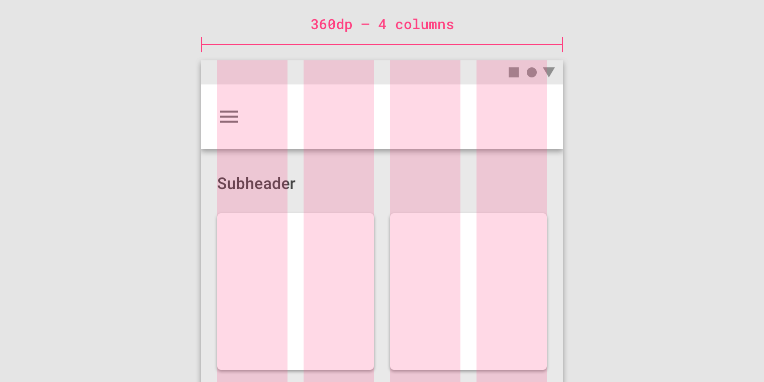
On mobile, at a breakpoint of 360dp, this layout grid uses 4 columns.
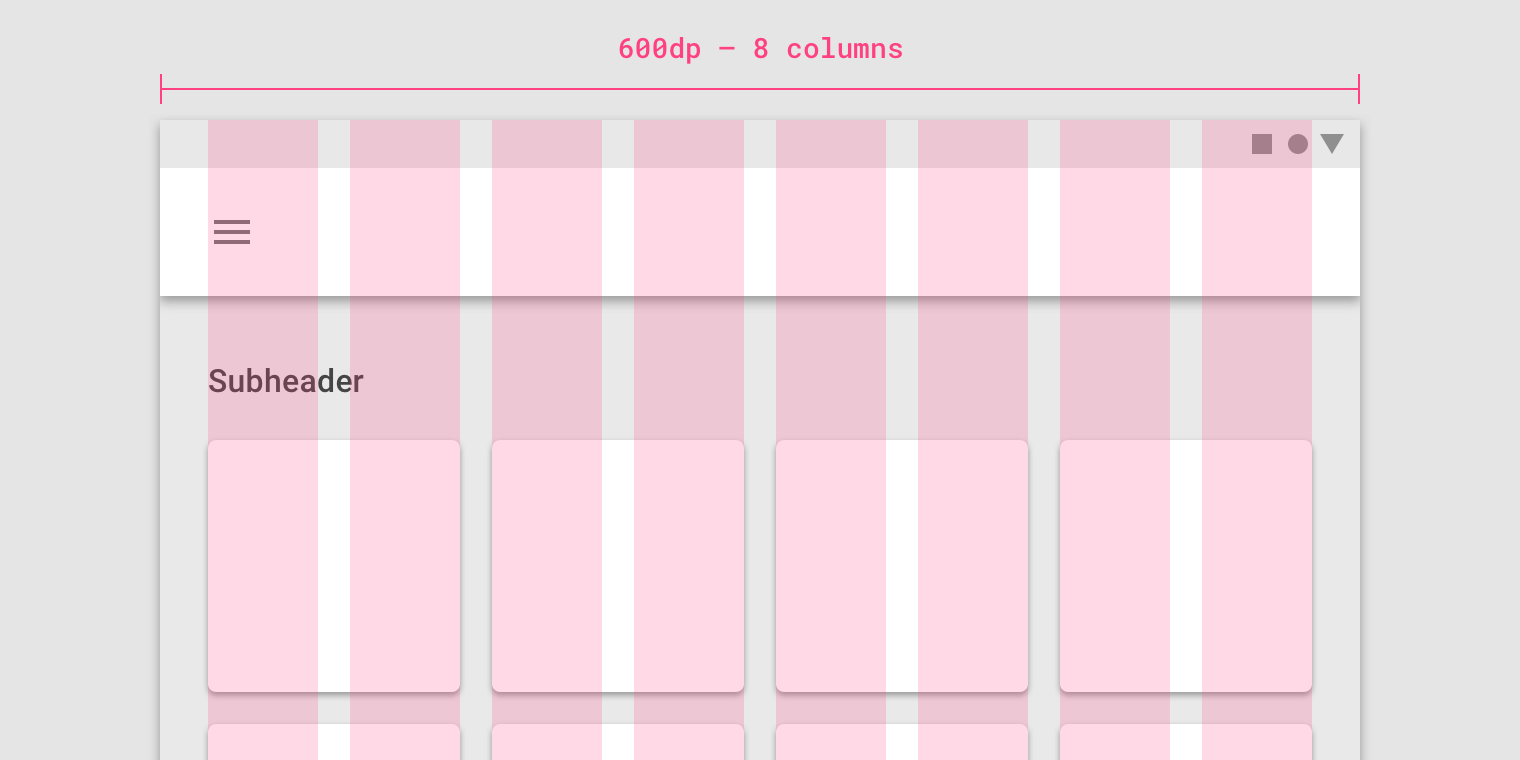
On tablet, at a breakpoint of 600dp, this layout grid uses 8 columns.
Gutters
Gutters are the spaces between columns. They help separate content.
Gutter widths are fixed values at each breakpoint range. To better adapt to the screen, gutter width can change at different breakpoints. Wider gutters are more appropriate for larger screens, as they create more whitespace between columns.
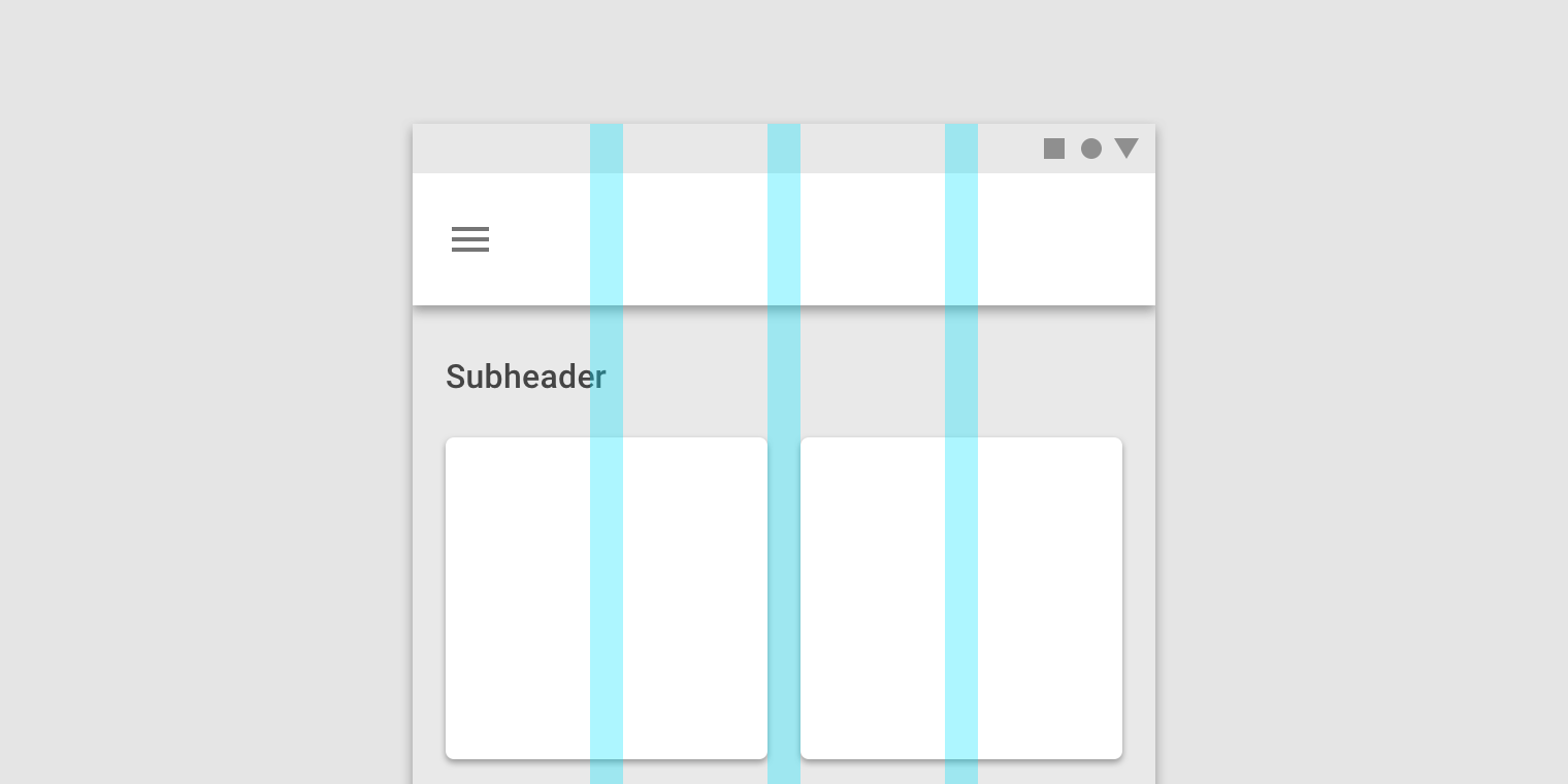
On mobile, at a breakpoint of 360dp, this layout grid uses 16dp gutters.
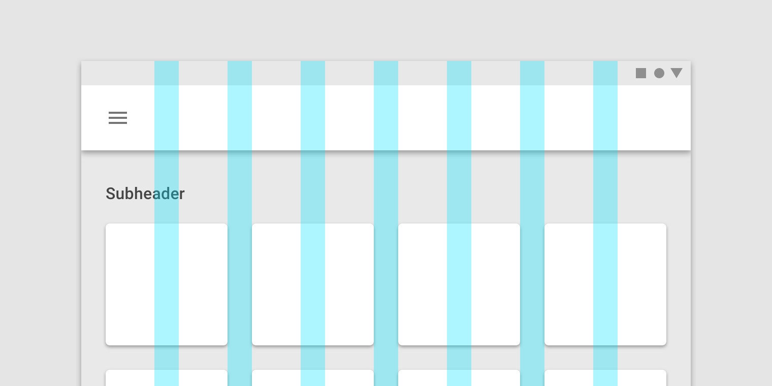
On tablet, at a breakpoint of 600dp, this layout grid uses 24dp gutters.
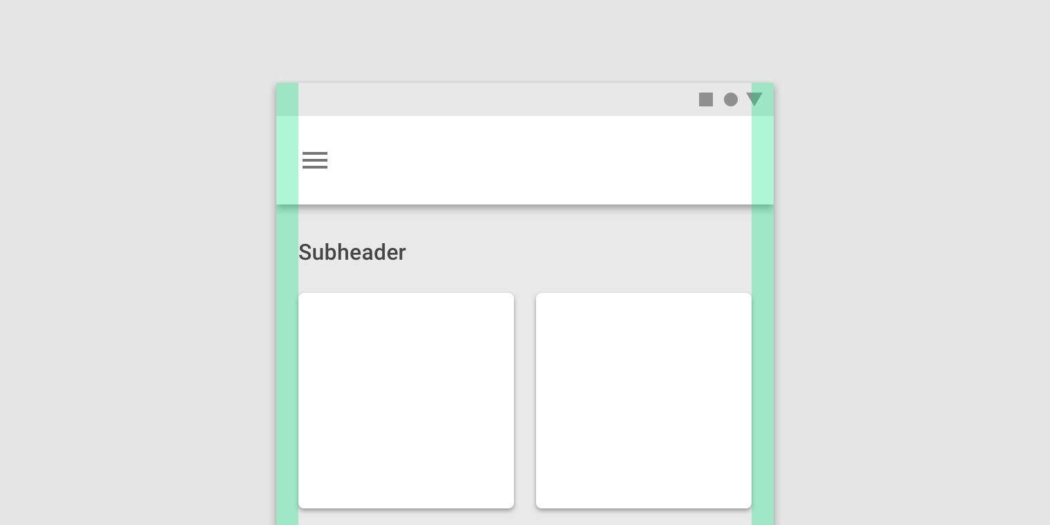
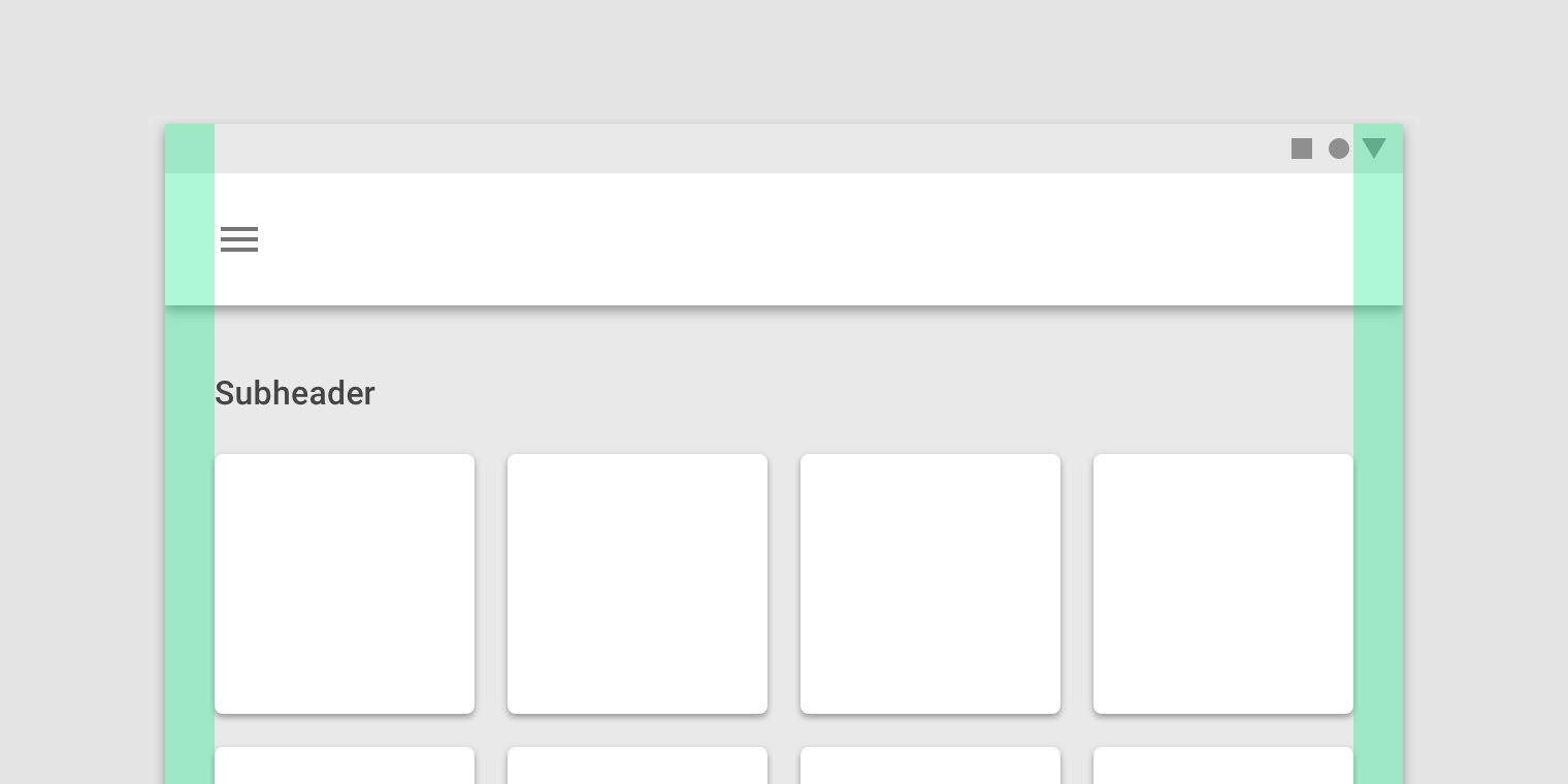
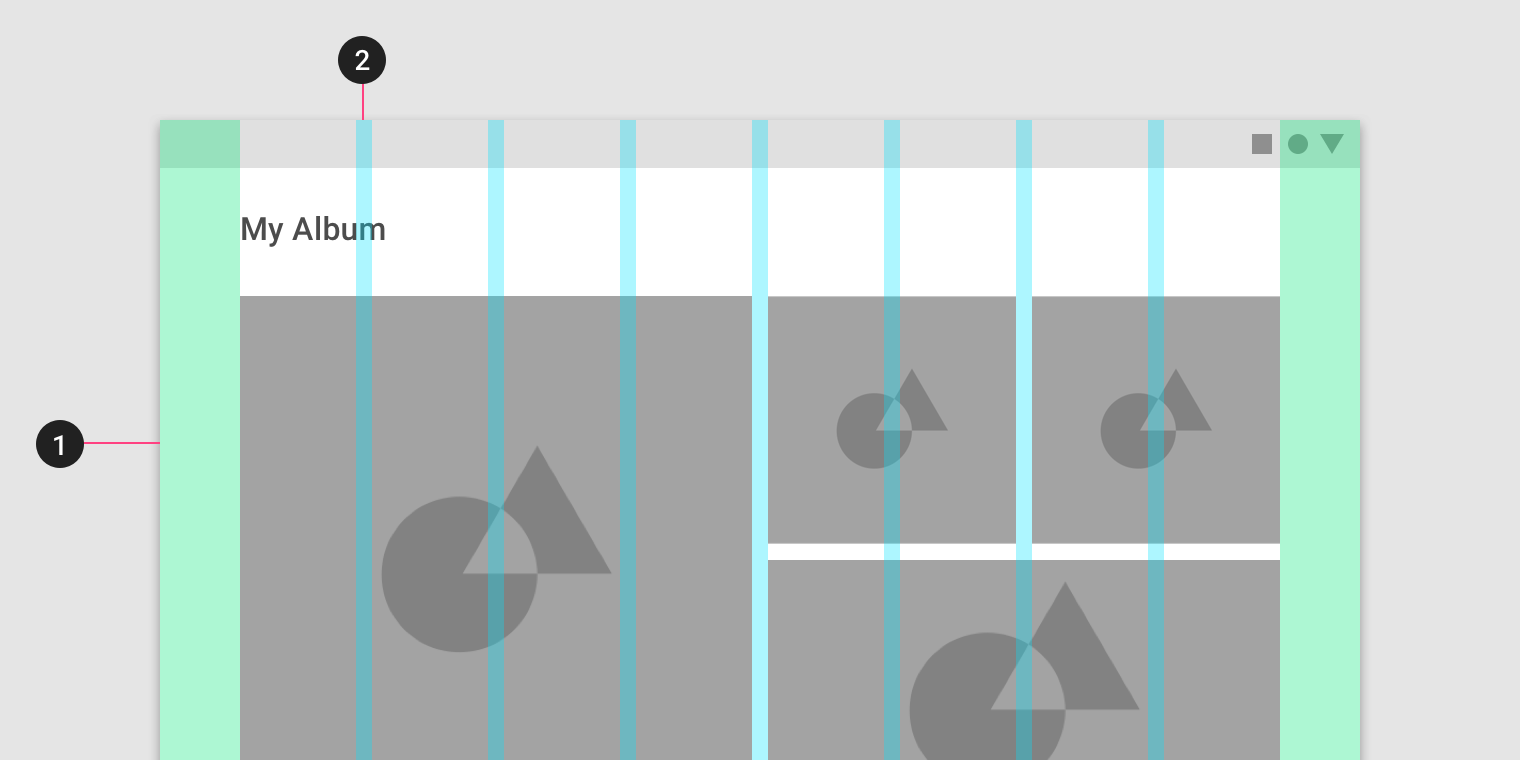
Margins
Margins are the space between content and the left and right edges of the screen.
Margin widths are defined as fixed values at each breakpoint range. To better adapt to the screen, the margin width can change at different breakpoints. Wider margins are more appropriate for larger screens, as they create more whitespace around the perimeter of content.
On mobile, at a breakpoint of 360dp, this layout grid uses 16dp margins.
On a small tablet, at a breakpoint of 600dp, this layout grid uses 24dp margins.
Grid customization
The layout grid can be adjusted to meet the needs of both your product and various device sizes.
Customizing gutters
Gutters can be adjusted to create more or less space between the columns of a layout.
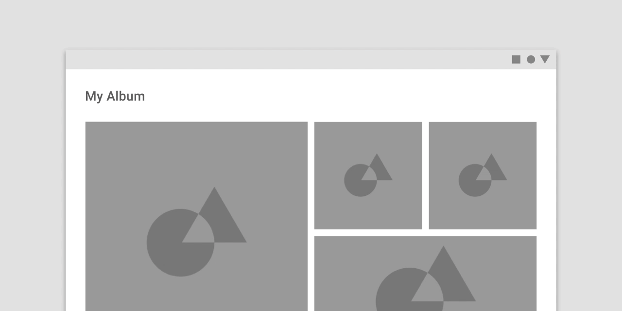
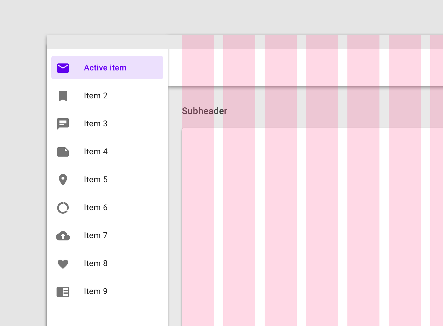
This layout grid uses 8dp gutters. The tighter spacing may suggest the images are closely related to one another, so that they are perceived as part of a collection.
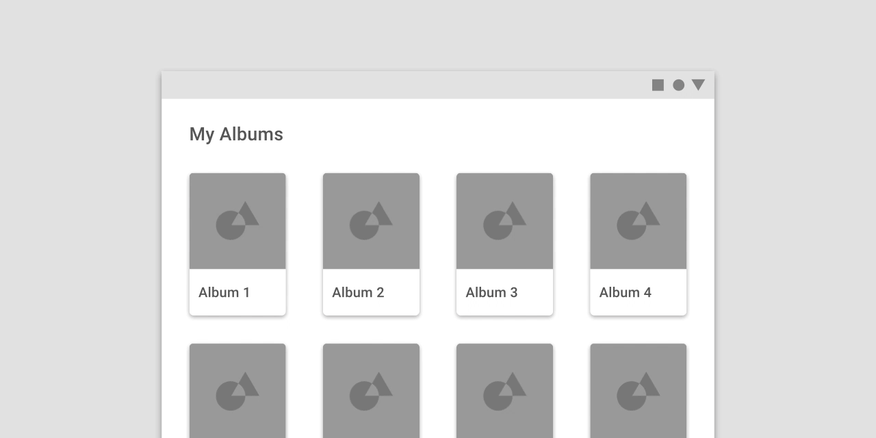
This layout grid uses larger, 32dp gutters to create more separation between columns. The extra space helps each album to be perceived as an individual entity within a collection.
Customizing margins
Margins can be adjusted to create more or less space between content and the edge of the screen. Margins use a fixed value for each breakpoint.
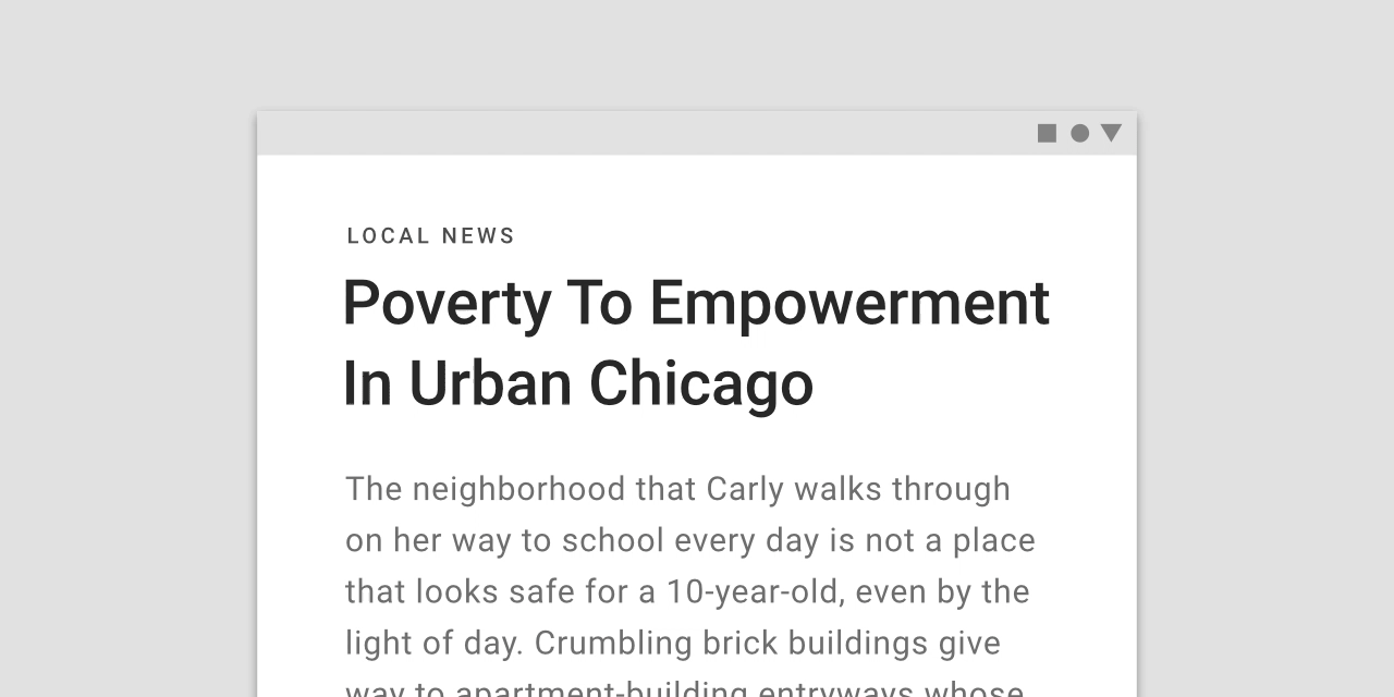
The ideal length for legibility of body copy is 40-60 characters per line.
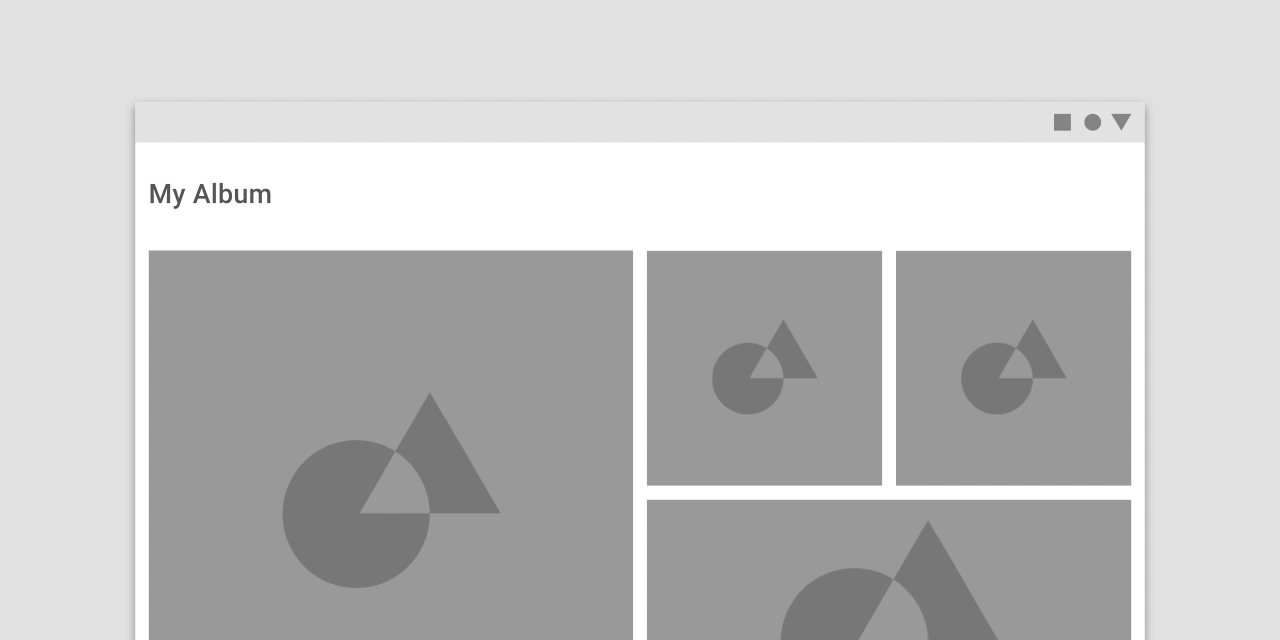
This layout grid uses small, 8dp margins to allow images to take up more space in the layout.
This layout grid uses large, 64dp margins to limit the width of content.
Gutters and margins
Within the same breakpoint, gutter and margin widths can be different from one another.
- 32dp margins
- 8dp gutters
Horizontal grids
The Material Design layout grid can be customized for touch UIs that scroll horizontally. Columns, gutters, and margins are laid out from left to right, rather than top to bottom. The height of the screen determines the number of columns in a horizontal grid.
Horizontally scrolling UIs are uncommon on non-touch and web platforms.
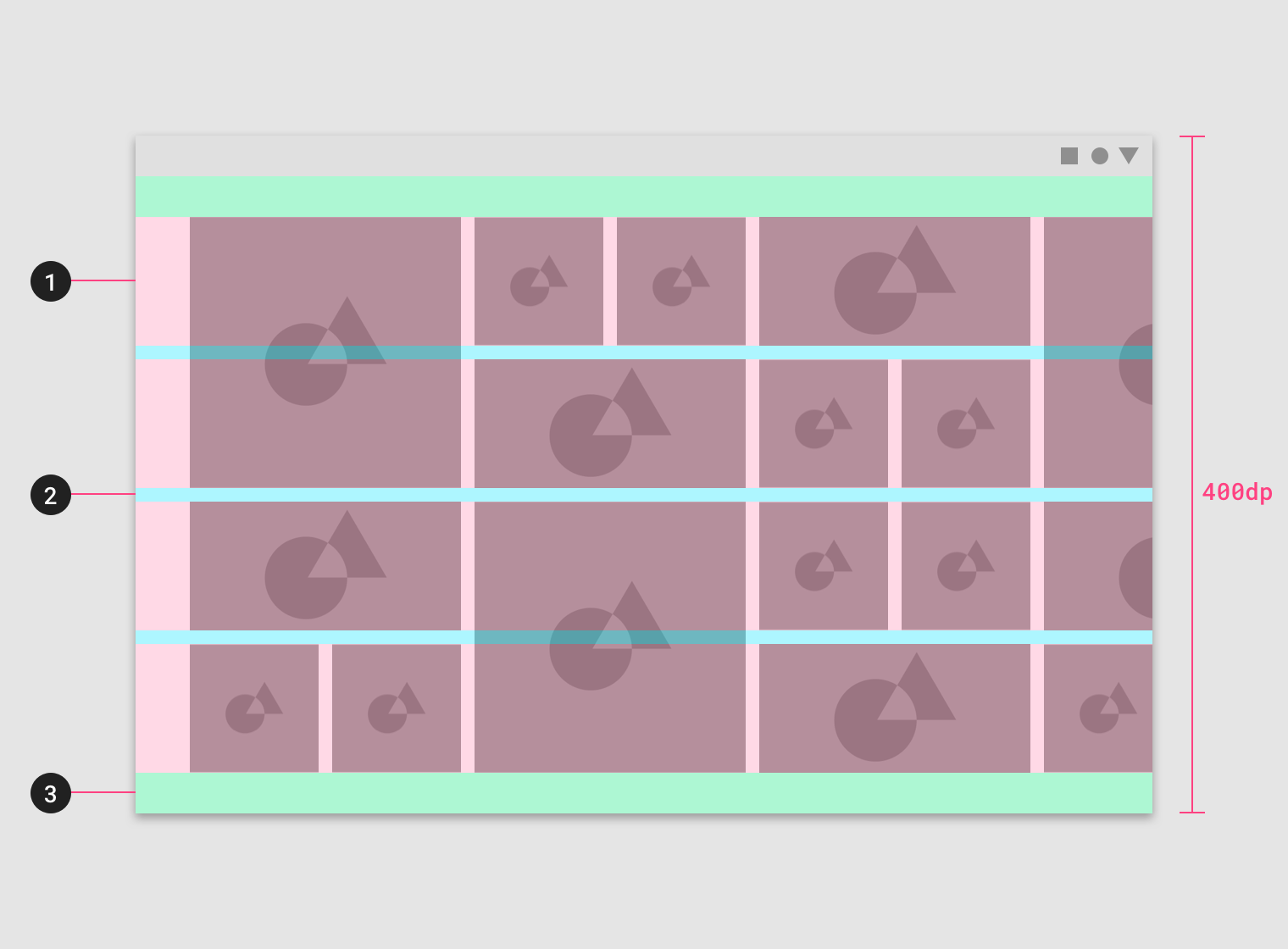
This horizontal layout grid uses four horizontal columns, for a total layout height of 400dp.
- Columns
- Gutters
- Margins
Horizontal grids can be positioned to accommodate different heights, allowing space for app bars or other UI regions at the top.
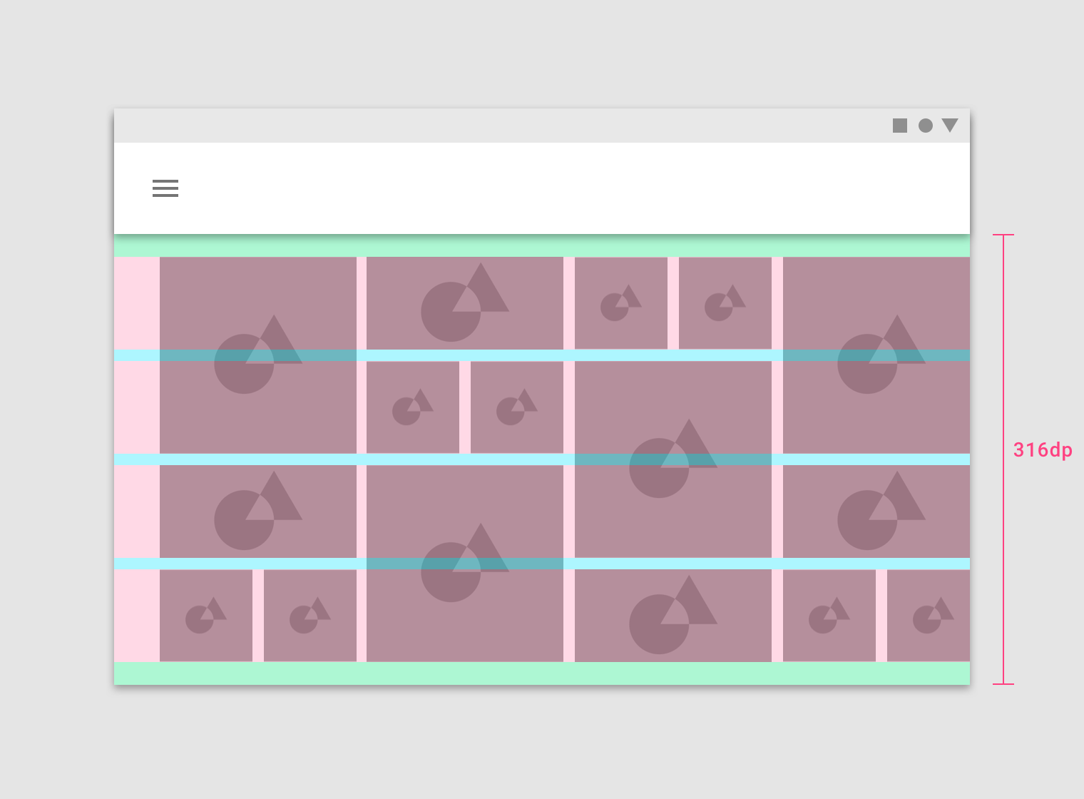
This horizontal layout grid starts below the Top App Bar component and uses four horizontal columns at a height of 316dp.
Breakpoints
A breakpoint is the range of predetermined screen sizes that have specific layout requirements. At a given breakpoint range, the layout adjusts to suit the screen size and orientation.
Breakpoint system
Material Design provides responsive layouts based on the following column structures. Layouts using 4-column, 8-column, and 12-column grids are available for use across different screens, devices, and orientations.
Each breakpoint range determines the number of columns, and recommended margins and gutters, for each display size.
| Breakpoint Range (px) | Column Class | # Columns | Margins / Gutters* |
|---|---|---|---|
| 0 - 599 | .xsmall | 4 | 16 |
| 600 - 719 | .small | 8 | 16 |
| 720 - 839 | .small | 8 | 24 |
| 840 - 1023 | .smallext | 12 | 24 |
| 1024 - 1439 | .medium | 12 | 24 |
| 1440 - 1919 | .large | 12 | 24 |
| 1920+ | .xlarge | 12 | 24 |
*Margins and gutters are flexible and don’t need to be of equal size.
Grid behavior
Fluid grids
Fluid grids use columns that scale and resize content. A fluid grid’s layout can use breakpoints to determine if the layout needs to change dramatically.
Columns expanding in a full-width grid
Fixed grids
Fixed grids use columns of a fixed size, with fluid margins to keep content unchanging within each breakpoint range. A fixed grid’s layout can only change at an assigned breakpoint.
Margins expanding in a fixed grid
Grid Implementation
Containers
Containers are the most basic layout element and are required when using our default grid system. Choose from default container (fixed grids) or fluid container (fluid grids).
<div class="container">
    .
    .
    .
</div>
Default container for fixed grids.
<div class="container-fluid">
    .
    .
    .
</div>
Fluid container for fluid grids.
Rows
Rows are wrappers for columns and should only contain columns inside.
<div class="container-fluid">
    <div class="row">
        .
        .
        .
    </div>
</div>
Row inside a fluid container (fluid grid).
Row items vertical alignment
Columns can be aligned vertically inside a row at top, middle, or bottom. note that in order for this to work, row height should be greater than the contained columns.
<div class="container-fluid">
    <div class="row col-align-top">
        .
        .
        .
    </div>
</div>
Columns vertically aligned at the top.
<div class="container-fluid">
    <div class="row col-align-middle">
        .
        .
        .
    </div>
</div>
Columns vertically aligned at the middle.
<div class="container-fluid">
    <div class="row col-align-bottom">
        .
        .
        .
    </div>
</div>
Columns vertically aligned at the bottom.
Row items horizontal alignment
Columns can be aligned horizontally inside a row. note that in order for this to work, the row should not be full of columns.
<div class="container-fluid">
    <div class="row col-justify-start">
        .
        .
        .
    </div>
</div>
Columns horizontally aligned at the start.
<div class="container-fluid">
    <div class="row col-justify-center">
        .
        .
        .
    </div>
</div>
Columns horizontally aligned at the center.
<div class="container-fluid">
    <div class="row col-justify-end">
        .
        .
        .
    </div>
</div>
Columns horizontally aligned at the end.
<div class="container-fluid">
    <div class="row col-justify-around">
        .
        .
        .
    </div>
</div>
Columns horizontally justified with space around each column.
<div class="container-fluid">
    <div class="row col-justify-between">
        .
        .
        .
    </div>
</div>
Columns horizontally justified with space between columns.
Row items direction
The default direction of columns is from start to end, from left to right in LTR direction and from right to left in RTL direction. however, the direction can br reversed to be from end to start.
<div class="container-fluid">
    <div class="row direction-reverse">
        .
        .
        .
    </div>
</div>
Columns horizontally justified with space between columns.
Columns
We have 6 column classes based on material design breakpoints system (read breakpoints section). be aware of maximum column numbers in each breakpoint.
<div class="container-fluid">
    <div class="row">
        <div class="col xsmall-1 small-3 medium-4">...</div>
        <div class="col xsmall-3 small-5 medium-4">...</div>
        <div class="col xsmall-3 small-5 medium-4">...</div>
        .
        .
    </div>
    .
    .
    .
</div>
Columns with three different breakpoints. xsmall, small, and medium.
Auto sizing
Columns with auto size classes will take the same size as their content and their width can't be less than 1 column.
<div class="container-fluid">
    <div class="row">
        <div class="col xsmall-auto medium-auto">...</div>
        <div class="col xsmall-3 medium-5">...</div>
        <div class="col xsmall-auto medium-auto">...</div>
        .
        .
    </div>
    .
    .
    .
</div>
Columns with auto size class. note that on xsmall breakpoint the third column wraps to a new row because the first row is filled (maximum columns = 4).
To fill the available empty space you can use fill-space classes.
<div class="container-fluid">
    <div class="row">
        <div class="col xsmall-auto medium-auto">...</div>
        <div class="col xsmall-3 medium-5">...</div>
        <div class="col xsmall-fill-space medium-fill-space">...</div>
        .
        .
    </div>
    .
    .
    .
</div>
Column with fill-space class.
Columns vertical aligning
Each Column can be optionally aligned vertically at top, middle, and bottom.
<div class="container-fluid">
    <div class="row">
        <div class="col xsmall-auto align-top">...</div>
        <div class="col xsmall-auto align-middle">...</div>
        <div class="col xsmall-auto align-bottom">...</div>
        .
        .
    </div>
    .
    .
    .
</div>
Each column is aligned vertically.
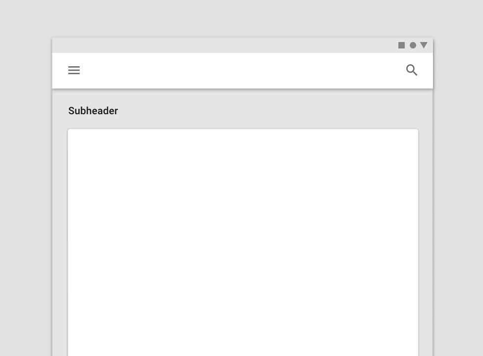
UI regions
A layout is made up of several UI regions, such as side navigation, content areas, and app bars. These regions can display actions, content, or navigation destinations. UI regions should be consistent across devices, while adapting to different breakpoints of different screen sizes.
To increase familiarity across devices, UI elements designed for desktop should be organized in a way that’s consistent with the mobile UI.
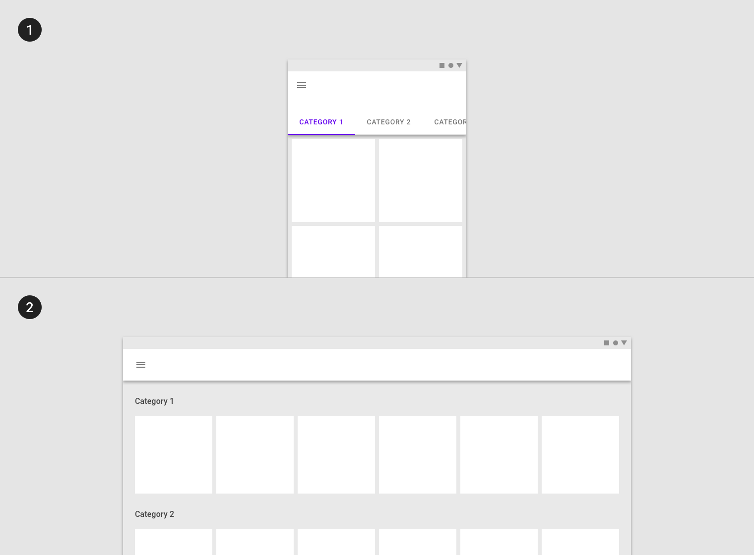
Layout changes on different-sized screens
Permanent UI regions
Permanent UI regions are regions that can be displayed outside of the responsive grid, like a navigation drawer. These regions cannot be collapsed.
When screen space is available, a permanent UI region exposes content.
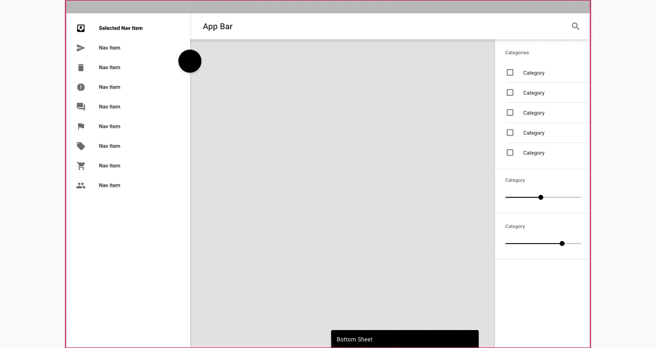
Persistent UI regions
Persistent UI regions are regions that can be displayed upon command at any time, or they can remain visible. They can be toggled on or off, to appear or disappear. When they appear, they condense both content and the grid.
When a persistent UI region is visible, its visibility isn’t affected by interaction with other elements on screen.
When open, this persistent navigation drawer causes the grid (and its content) to condense.
Temporary UI regions
Temporary UI regions appear temporarily, and when they do, they do not affect the responsive grid. When visible, they can be hidden by tapping an item in their region, or any space outside their region.
When a UI region is visible, other screen elements aren’t interactive.

When open, this temporary navigation drawer doesn’t affect the responsive grid or screen content.
Whiteframes
Whiteframes are structured layouts that provide a consistent approach to layout, layering, and shadows. They are a starting point, meant to be modified to meet the specific needs of a product.
- Desktop
- Mobile
- Desktop
- Mobile