almoamen.net
Understanding layout
Material Design layouts encourage consistency across platforms, environments, and screen sizes by using uniform elements and spacing.
Usage
Principles
Predictable
UIs should use intuitive and predictable layouts, with consistent UI regions and spatial organization.
Consistent
Layouts should use a consistent grid, keylines, and padding.
Responsive
Layouts are adaptive and react to input from the user, device, and screen elements.
Structure
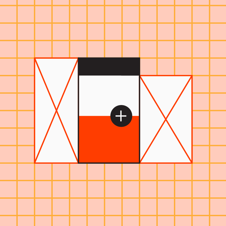
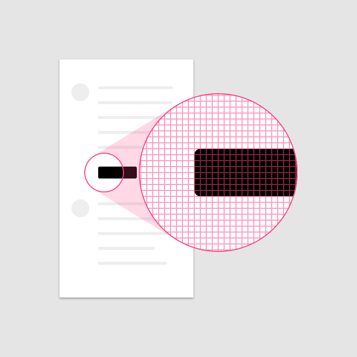
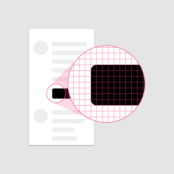
Material Design layouts are visually balanced. Most measurements align to an 8dp grid applied, which aligns both spacing and the overall layout.
Smaller components, such as iconography and typography, can align to a 4dp grid.
8dp and 4dp units
Pixel density
Screen pixel density and resolution vary depending on the platform. Device-independent pixels and scalable pixels are units that provide a flexible way to accommodate a design across platforms.
Calculating pixel density
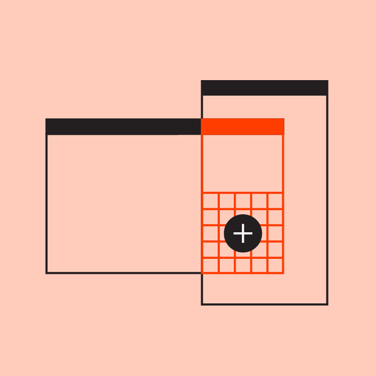
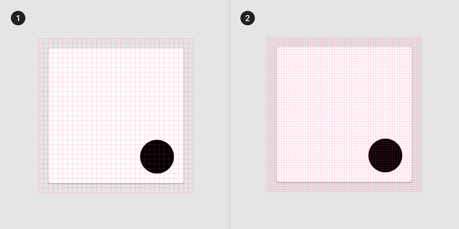
The number of pixels that fit into an inch is referred to as pixel density. High-density screens have more pixels per inch than low-density ones. As a result, UI elements of the same pixel dimensions appear larger on low-density screens, and smaller on high-density screens.
To calculate screen density, you can use this equation:
Screen density = Screen width (or height) in pixels / Screen width (or height) in inches
High-density display
Lower density display
Density independence
Density independence refers to the uniform display of UI elements on screens with different densities.
Density-independent pixels, written as dp (pronounced “dips”), are flexible units that scale to have uniform dimensions on any screen. Material UIs use density-independent pixels to display elements consistently on screens with different densities.
- Low-density screen displayed with density independence
- High-density screen displayed with density independence
Pixel density on the web
Logical resolution
Use the device's logical resolution, which scales to the device's screen resolution.
Units for the web
When designing for the web, replace dp with rem.