almoamen.net
Sheets: side
Side sheets are surfaces containing supplementary content that are anchored to the left or right edge of the screen.
Usage
Side sheets are supplementary surfaces primarily used on tablet and desktop.
They come in two types:
Standard side sheets
Display content that complements the screen’s primary content. They remain visible while users interact with primary content.
Modal side sheets
Used on mobile instead of standard side sheets, due to limited screen size. They can display the same types of content as standard side sheets, but must be dismissed in order to interact with the underlying content.
Common uses include
- Displaying a list of actions that affect the screen’s primary content, such as filters
- Displaying supplemental content and features

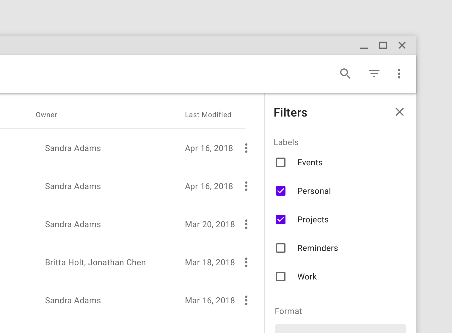
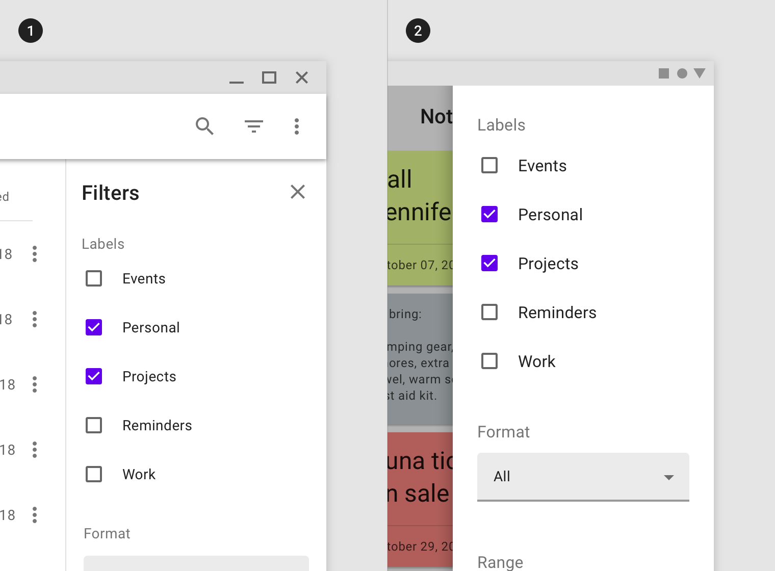
This standard side sheet on desktop contains filters that control the files shown in the primary UI region.

A modal side sheet on mobile is used instead of a standard side sheet, because of the limited screen space.
Principles
Supporting
Side sheets contain content that supplements the screen’s primary UI region.
Flexible
Side sheets display a wide variety of content and layouts.
Contextual
Side sheets can be visible or hidden based on screen size or user need, and they often become bottom sheets on mobile.
Anatomy
- Sheet
- Content
- Scrim (Modal only)
Sheet
Side sheets are anchored to the left or right edge of the screen. They are a fixed width and typically span the height of the screen. Their dimensions depend on how the app’s layout is subdivided into UI regions.
Place side sheets along the left or right edge of the screen.
Content
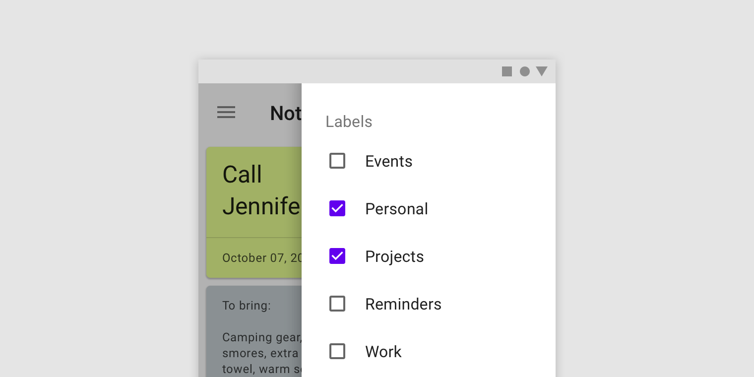
Side sheets can display a wide variety of content and layouts, ranging from a list of actions to supplemental content in a tabular layout.
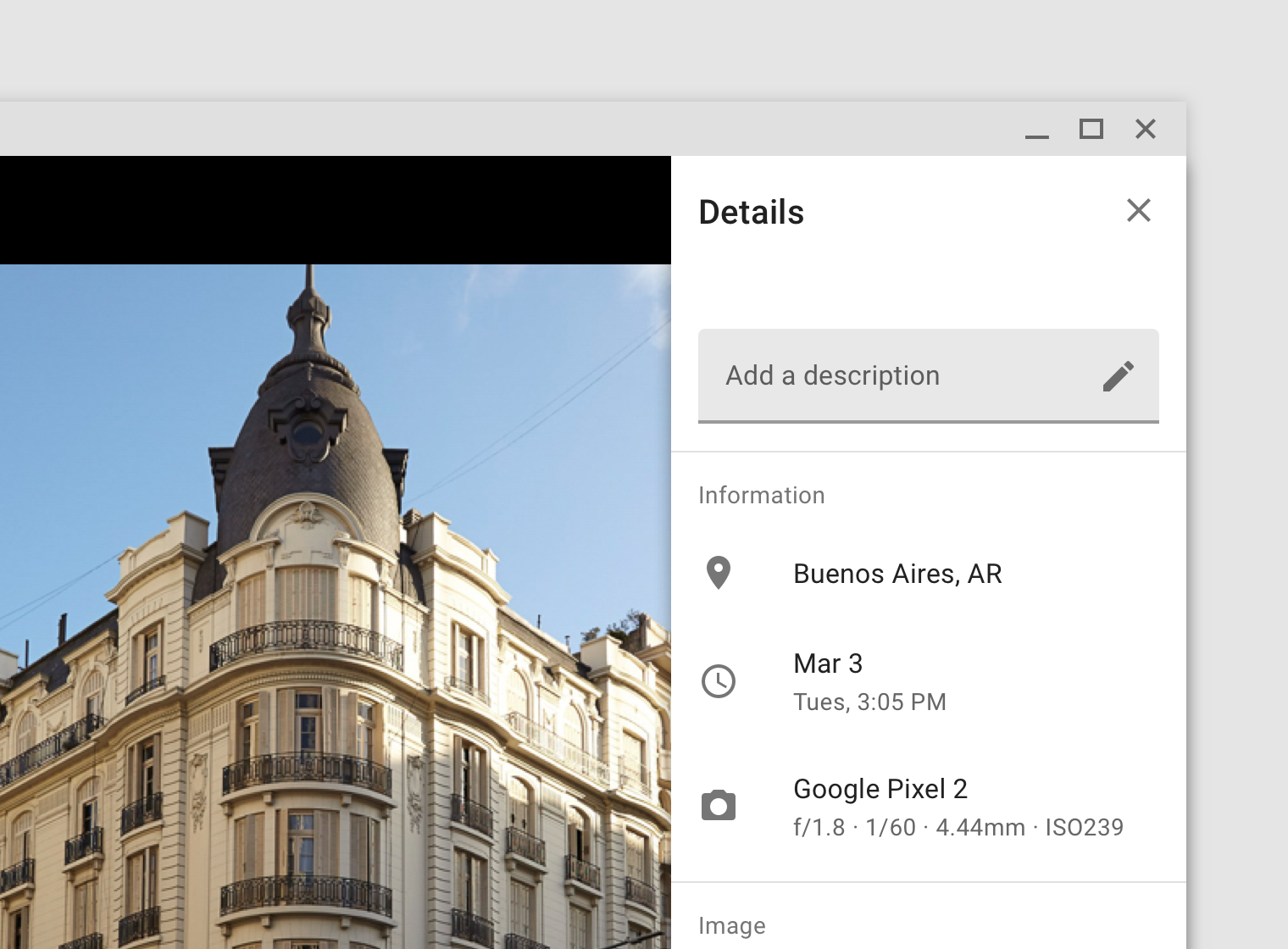
Metadata about a photo in a standard side sheet.
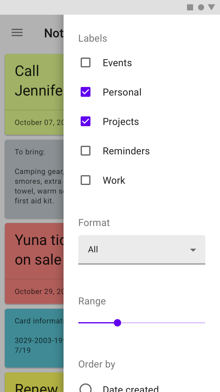
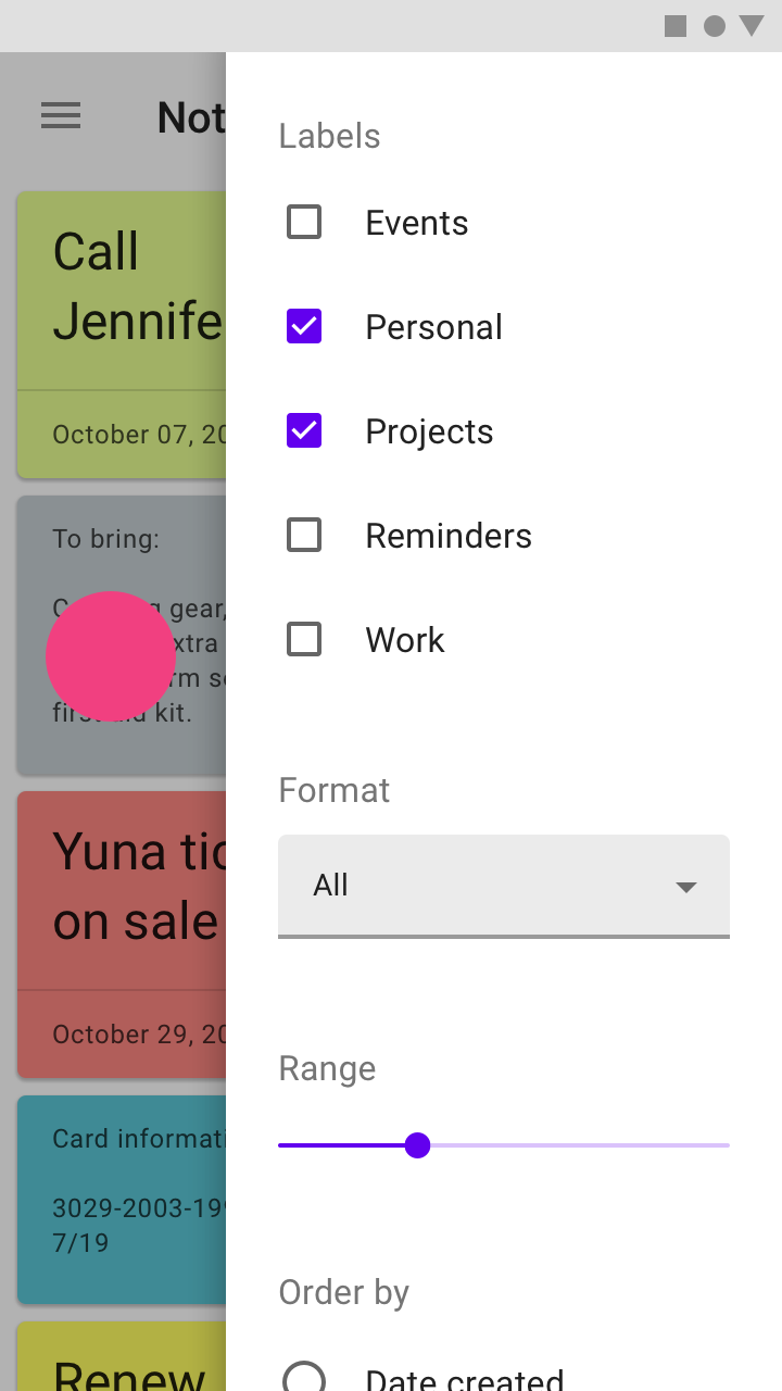
A list of filters in a modal side sheet
Behavior
Scrolling
Side sheets can be vertically scrolled independent of the rest of the UI. This allows their scroll position and contents to persist while the page is scrolled, and vice versa.
Side sheets cannot be horizontally scrolled.
Placement
Screen size
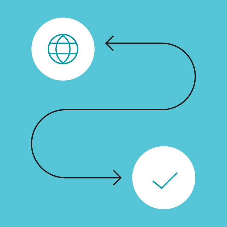
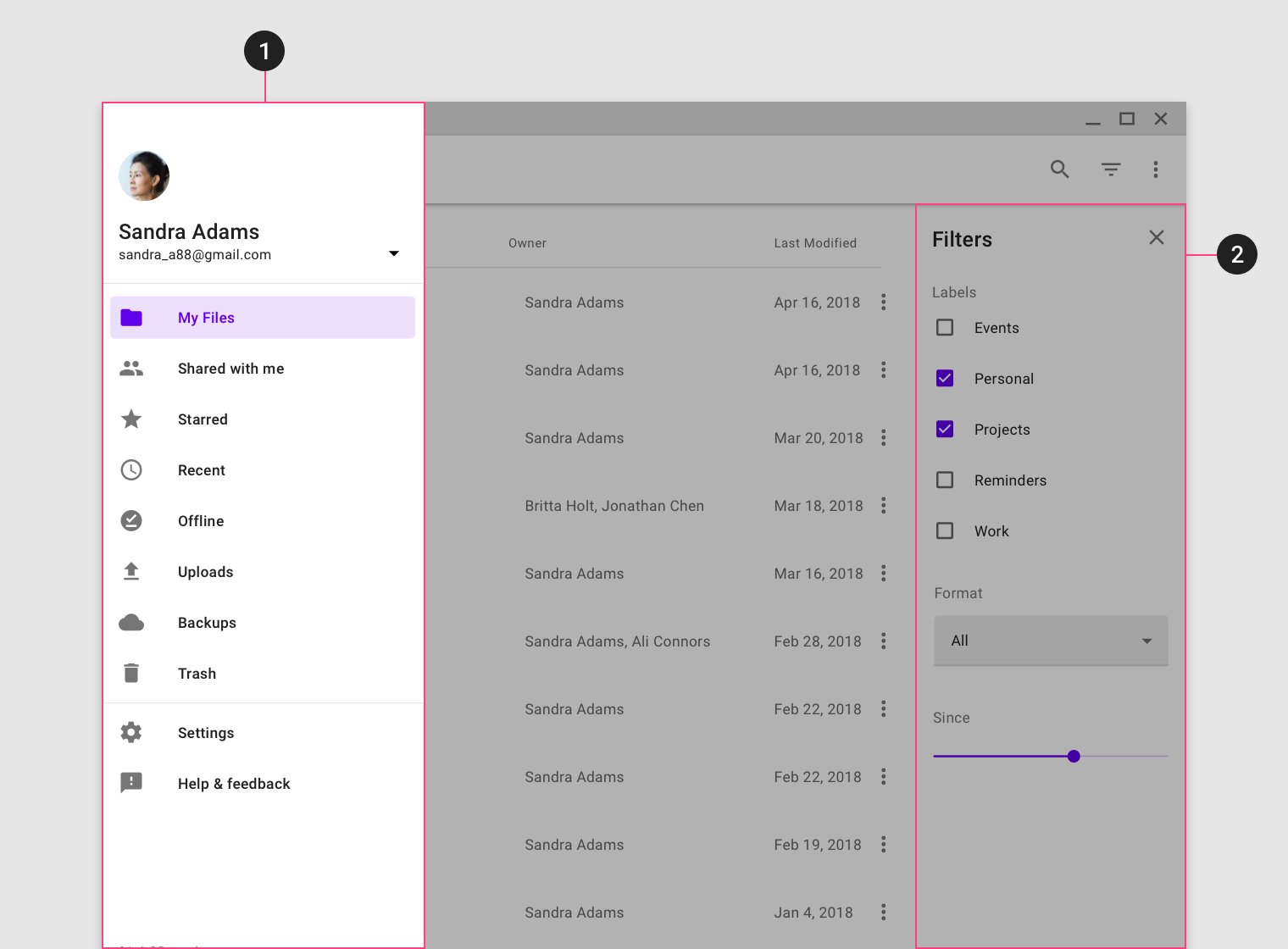
Side sheets that are modal on mobile, due to limited screen width, can become standard side sheets on tablet and desktop. The reverse is also true.
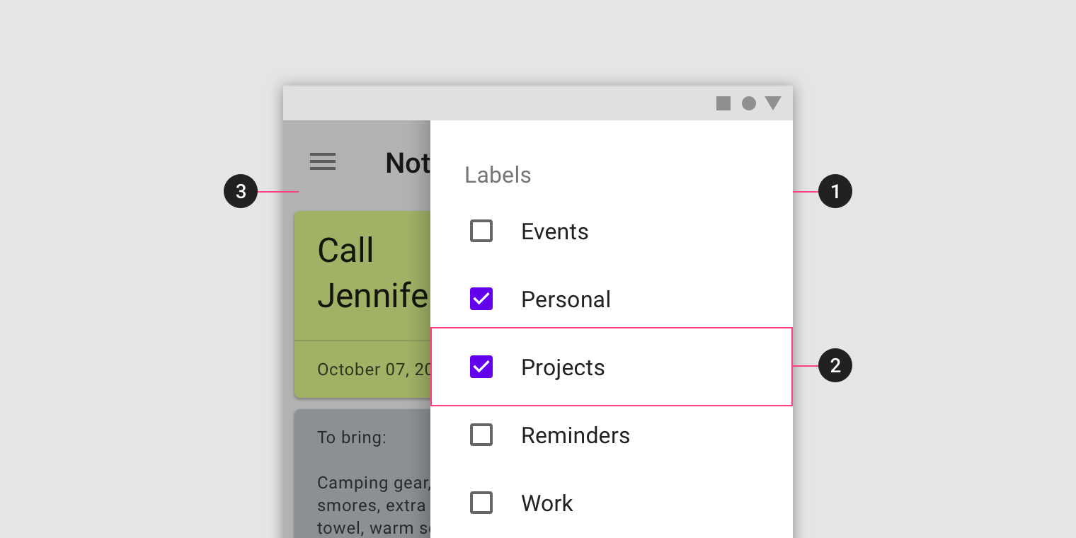
The filters for this app are placed in a standard side sheet on desktop (1) and become modal on mobile due to limited screen width (2).
Pairing with navigation drawers
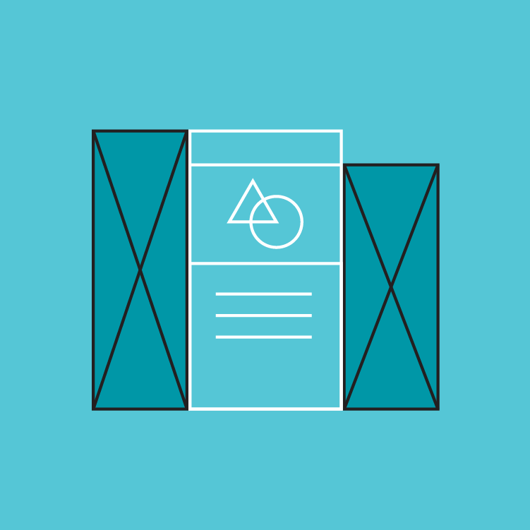
Side sheets should be placed on the opposite side of a side navigation drawer to avoid obstructing the UI or causing confusion about the sheet’s functionality.
Navigation drawers are anchored to the left screen edge in left-to-right languages, and on the right for right-to-left languages.
Place a side sheet on the opposite edge of a navigation drawer. This app uses a left-to-right layout, so the navigation drawer is placed on its left edge (1) and a standard side sheet is anchored to the right edge (2).
Standard side sheet
Usage
Standard side sheets co-exist with the screen’s primary UI region, which allows viewing and interaction with both surfaces. They are used only on tablet and desktop.
Standard side sheets are commonly used for:
- Keeping a feature or content on-screen, if the primary UI region is frequently scrolled or panned
- Contextual actions that affect the primary region, such as filters
- Supporting information or metadata, such as location or photo details
- Short tasks that can be accomplished in a single screen, such as configuring options or specifying item details before making a purchase
Behavior
Opening and closing
Standard side sheets that aren’t permanent should include affordances to open and close the sheet.
Common open affordances include action icons in top app bars or buttons in the screen layout. While a single affordance can be used to toggle the visibility of the sheet on or off, a separate close affordance within the sheet is recommended.
Placement
Elevation
Standard side sheets can be set at the same elevation as the main content or placed above it, at 8dp.
Their elevation can be used to indicate their hierarchical relationship to content or affect its behavior in the layout grid.
Coplanar elevation
Coplanar elevation places the sheet at the same elevation as content, indicating the two surfaces are related and of equal importance. Coplanar sheets affect the layout grid and shrink the available area for content.
Above content
When the standard side sheet is elevated above content, it can indicate hierarchical meaning or simply be for layout purposes. Surfaces elevated in front of others often convey more importance or control over those behind them. They don’t affect the layout grid, and should only be used for temporarily visible sheets since they obscure content.

This filter sheet is coplanar with the main UI region, indicating its connection to content and allowing both regions to be fully visible.

The metadata for this photo is elevated above it to avoid resizing the image as the sheet opens and closes.
Modal side sheet
Usage
Modal side sheets present content while blocking interaction with the rest of the screen.
On mobile, they are used instead of standard side sheets. On larger screens, they can help focus a user’s attention on a key flow, such as making a purchase.
Behavior
Elevation and scrim
Modal side sheets have a default elevation of 16dp. This elevation allows them to appear over all UI elements.
A modal side sheet places all content and UI elements behind a scrim, which indicates that they will not respond to user interaction. Tapping the scrim dismisses both the modal side sheet and scrim from view.

A visible scrim informs users they cannot interact with the rest of the screen.
Control
Modal side sheets appear when triggered by a user action, such as tapping a button or action icon in a top app bar. They can be dismissed by:
- Tapping the scrim
- Swiping towards the sheet’s anchoring edge (left or right)
- Using a close affordance within the side sheet’s header, if available
Tapping the scrim will dismiss a modal side sheet.
A modal side sheet can be dismissed by swiping towards the sheet’s anchoring edge.
Implementation
Javascript methods:
| void MDC.sideSheetOpen(container) | ||
|---|---|---|
| A method to open the sheet. | ||
| container | String | jQuery | Element | The sheet container. can be either a css selector string or a jQuery object or an element. |
| void MDC.sideSheetClose(container) | ||
| A method to close the sheet. | ||
| container | String | jQuery | Element | The sheet container. can be either a css selector string or a jQuery object or an element. |
Coplanar side sheet
    <div class="mdc-sheets-side fixed">
        <div class="header">
            <div class="title">Side sheet title</div>
            <div class="close-action">
                <button class="material-icon">close</button>
            </div>
        </div>
        <div class="body">
            ...
        </div>
    </div>
    <div class="mdc-sheets-side-scrim" tabindex="-1"></div>
Above content side sheet
    <div class="mdc-sheets-side">
        .
        .
        .
    </div>
    <div class="mdc-sheets-side-scrim" tabindex="-1"></div>
Modal side sheet
    <div class="mdc-sheets-side model">
        .
        .
        .
    </div>
    <div class="mdc-sheets-side-scrim" tabindex="-1"></div>
Side sheet title
Lorem ipsum dolor sit amet, consectetur adipiscing elit. Cras luctus odio ac facilisis varius. Aliquam a felis in erat facilisis rutrum sit amet non velit. Aliquam quis enim nisi. Proin quis vulputate lectus. Praesent ac sem vel augue semper tincidunt. Quisque eget est turpis. Praesent laoreet turpis ac tortor mattis, nec pellentesque ipsum iaculis. Pellentesque turpis lorem, scelerisque id semper eu, volutpat nec risus. In hac habitasse platea dictumst. Donec hendrerit tristique tincidunt. Mauris nec elementum tortor, eget sodales urna. Ut dapibus et diam a pretium. Phasellus tristique eu risus vitae accumsan.
Quisque semper, urna vel elementum ornare, elit nisi blandit risus, sed tempus sem tellus eget leo. Integer aliquet convallis accumsan. Quisque vel consectetur lectus. Proin diam tortor, viverra quis sapien eu, cursus pulvinar eros. In in sem vulputate, lacinia nulla et, eleifend ex. Vestibulum euismod lacus eu cursus dapibus. Vestibulum gravida tincidunt metus. Interdum et malesuada fames ac ante ipsum primis in faucibus. In suscipit velit ligula, eu hendrerit est maximus et. Curabitur malesuada massa eget volutpat lobortis. Mauris vel ultrices tellus. Nulla tincidunt lorem eu enim sollicitudin laoreet. Phasellus sed odio eget purus vulputate faucibus id nec eros.