almoamen.net
Buttons
Buttons allow users to take actions, and make choices, with a single tap.
Usage
Buttons communicate actions that users can take. They are typically placed throughout your UI, in places like:
- Dialogs
- Modal windows
- Forms
- Cards
- Toolbars
Principles
Identifiable
Buttons should indicate that they can trigger an action.
Findable
Buttons should be easy to find among other elements, including other buttons.
Clear
A button’s action and state should be clear.
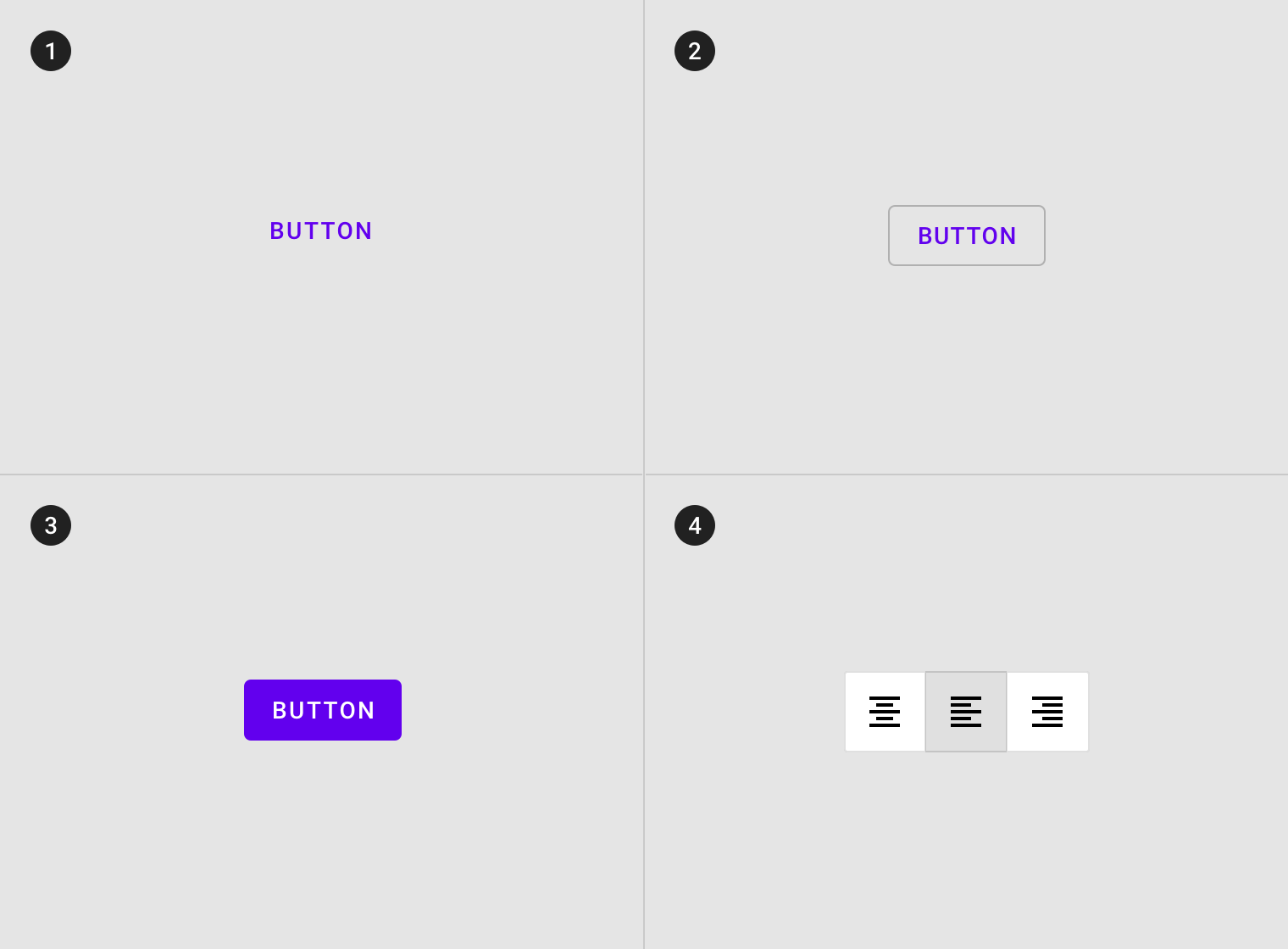
Types
-
Text button (low emphasis)
Text buttons are typically used for less important actions. -
Outlined Button (medium emphasis)
Outlined buttons are used for more emphasis than text buttons due to the stroke. -
Contained button (high emphasis)
Contained buttons have more emphasis, as they use use a color fill and shadow. -
Toggle button
Toggle buttons group a set of actions using layout and spacing. They’re used less often than other button types.
Anatomy
Buttons contain only one required element and some optional elements.
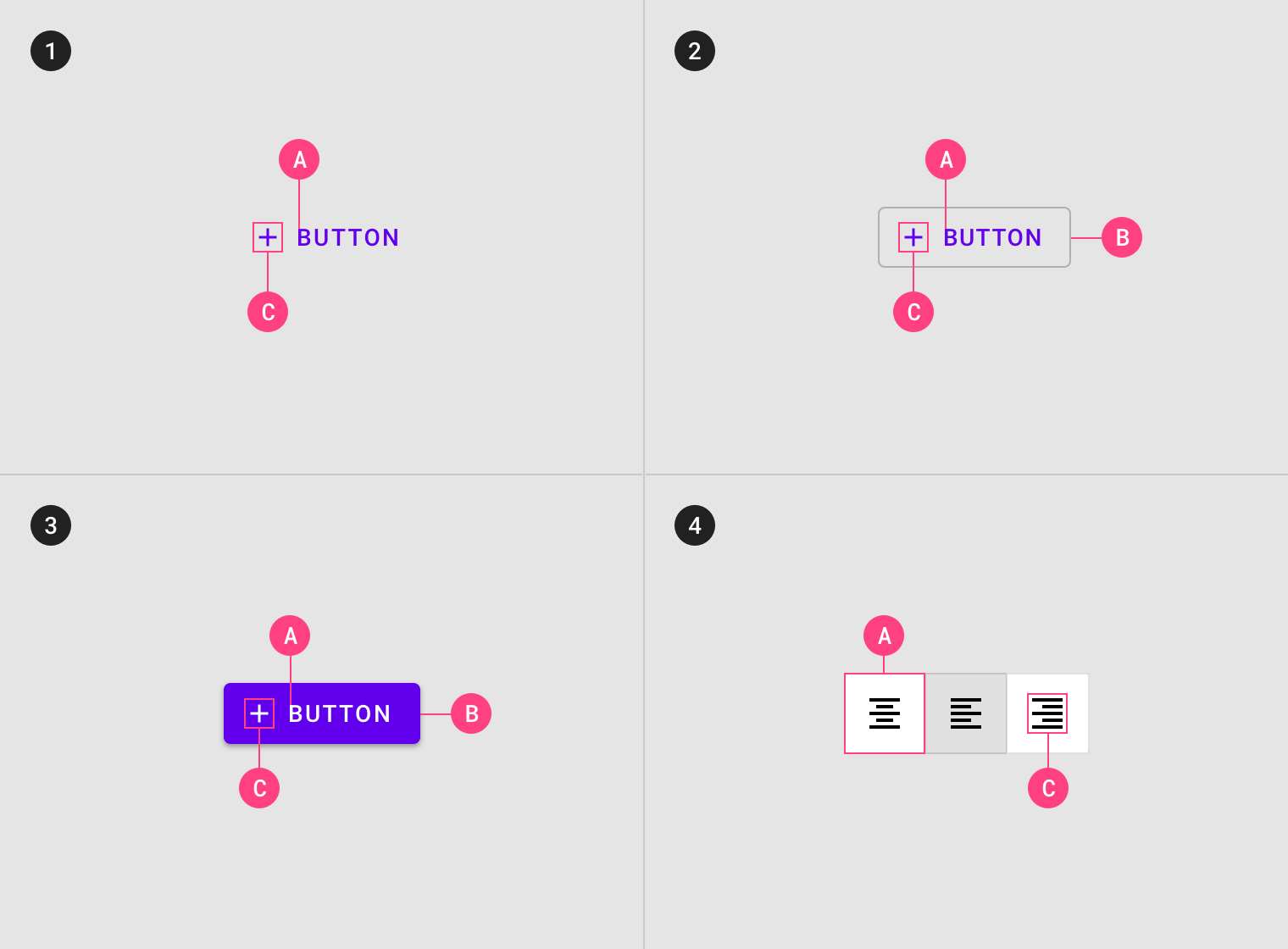
1. Text button
A. Text label
C. Icon (optional)
2. Outlined button
A. Text label
B. Container
C. Icon (optional)
3. Contained button
A. Text label
B. Container
C. Icon (optional)
4. Toggle button
A. Container
C. Icon
Text label
Text buttons and contained buttons use text labels, which describe the action that will occur if a user taps a button. If a text label is not used, an icon should be present to signify what the button does.
By default Material uses capitalized button text labels (for languages that have capitalization). This is to distinguish the text label from surrounding text. If a text button does not use capitalization for button text, find another characteristic to distinguish it such as color, size, or placement.
Hierarchy and placement
Hierarchy
A single, prominent button
A layout should contain a single prominent button that makes it clear that other buttons have less importance in the hierarchy. This high-emphasis button commands the most attention.
Other buttons
An app can show more than one button in a layout at a time, so a high-emphasis button can be accompanied by medium- and low-emphasis buttons that perform less important actions. When using multiple buttons, ensure the available state of one button doesn’t look like the disabled state of another.
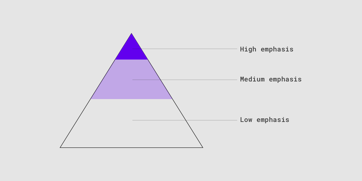
A button’s level of emphasis helps determine its appearance, typography, and placement.
Placement
Multiple button types can be used to express different emphasis levels.
This screen layout uses:
- An extended floating action button for the highest emphasis
- A contained button for high emphasis
- A text button for low emphasis
Text button
Usage
Text buttons are typically used for less-pronounced actions, including those located:
- In dialogs
- In cards
In cards, text buttons help maintain an emphasis on card content.
Text button
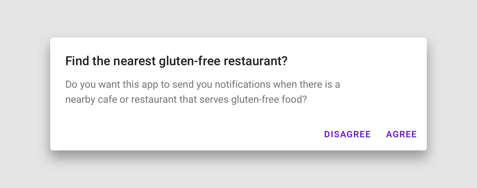
Use a text button in snackbars.
A text button against an image background
Text label
A button’s text label is the most important element on a button, as it communicates the action that will be performed when the user touches it.
Text label using a distinct action
Placement
Text buttons are often embedded in contained components like cards and dialogs, in order to relate themselves to the component in which they appear. Because text buttons don’t have a container, they don’t distract from nearby content.
Dialogs use text buttons because the absence of a container helps unify the action with the dialog text. Align text buttons to the right edge for left-to-right scripts.
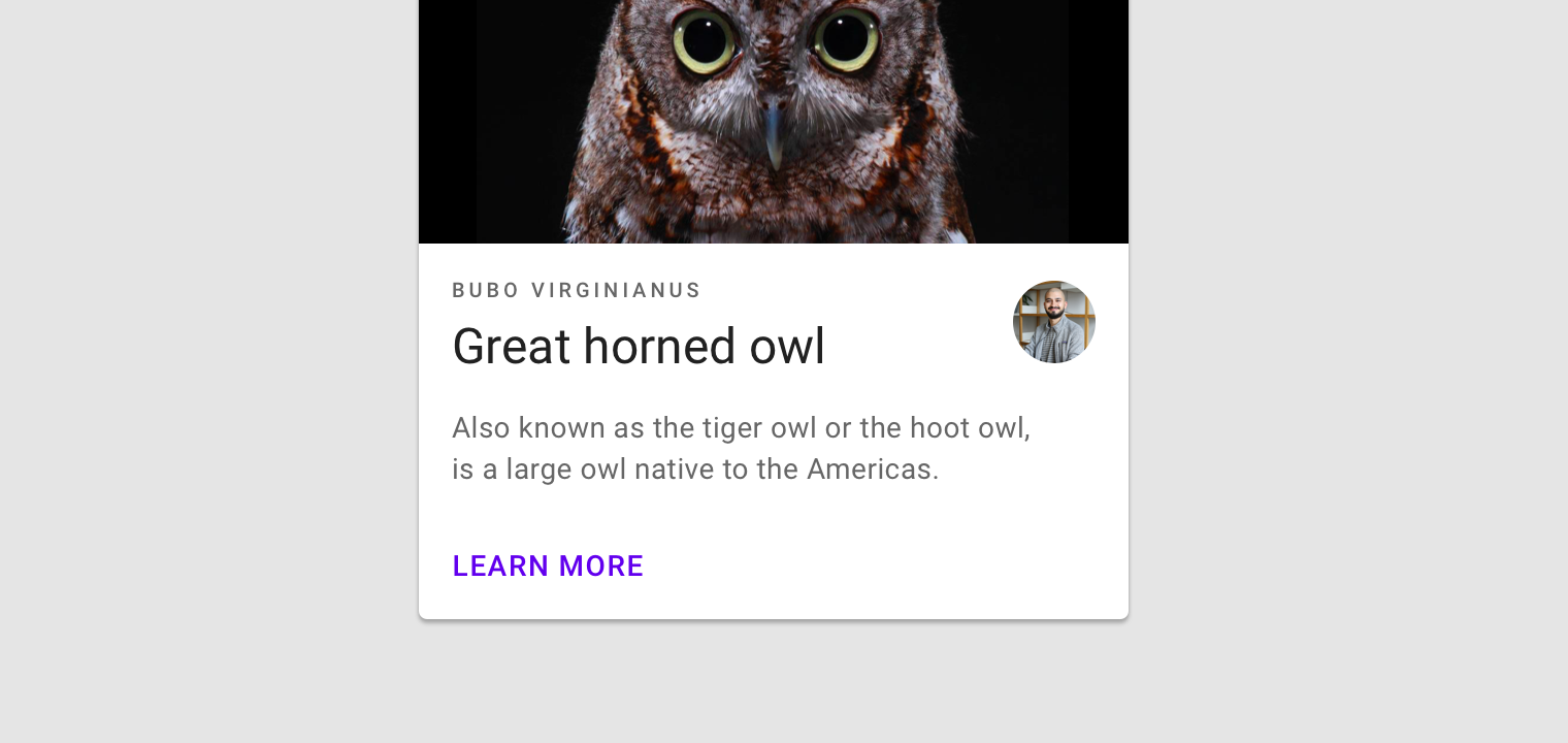
Text buttons minimize distraction from card content.
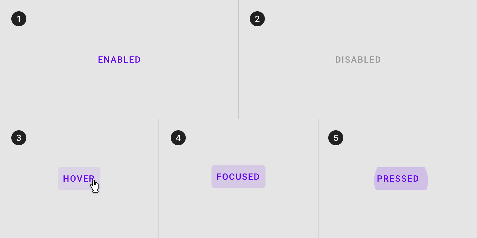
States
Text buttons can be placed in front of a variety of backgrounds. Until the button is interacted with, its container isn’t visible.
To maintain accessibility, Material Design provides baseline opacity values for the color overlays used by states. A brand can adjust opacity values to suit its color scheme.
Text button states
Outlined button
Usage
Outlined buttons are medium-emphasis buttons. They contain actions that are important, but aren’t the primary action in an app.
Alternatives
Outlined buttons are also a lower emphasis alternative to contained buttons, or a higher emphasis alternative to text buttons.
Container
Outlined buttons display a stroke around a text label. Stroke can be represented in different ways:
- Set a button’s width to be the size of the text label, with 16dp padding on the left and right
- Set the button’s relative position to the responsive layout grid
In a resting state, outlined buttons should display containment with a stroke and no fill.
Outlined button
States
Outlined buttons can be placed on top of a variety of backgrounds. Its container is transparent and until the button is interacted with, a color isn’t visible.
To maintain accessibility, Material Design provides baseline opacity values for the color overlays used by states. A brand can adjust opacity values to suit its color scheme.
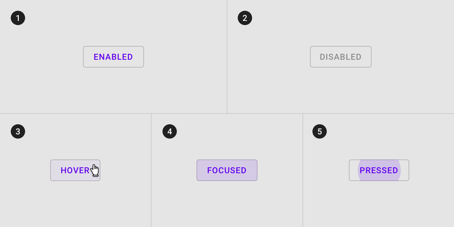
Outlined button states
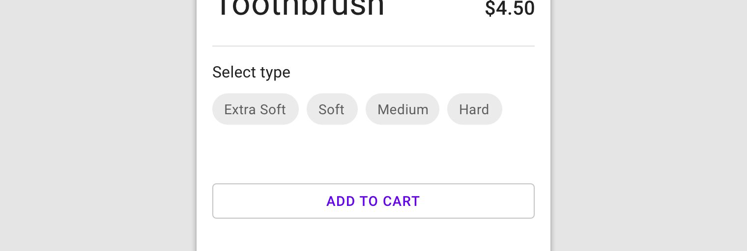
Contained button
Usage
Contained buttons are high-emphasis, distinguished by their use of elevation and fill. They contain actions that are primary to your app.
A contained button
Container
Contained buttons display a container around a text label. Containers can be represented in different ways:
- Set container width to the size of the text label with 16dp padding on the left and right
- Set the container’s relative position to the responsive layout grid
Contained buttons should display containers with a solid color.
A contained button with solid color
Button container width can be set according to the responsive layout grid.
Contained button in a responsive layout grid
Shadow & elevation
Buttons at higher elevations typically appear more prominent in a design. On press, elevated buttons lift up and the container displays touch feedback.
Higher elevation increases the prominence of a contained button.
States
The following opacity values are recommended for button container fill colors. Each app can alter the overlay values to suit their brand’s color palette.
Contained button states
Toggle button
Usage
Toggle buttons can be used to group related options. To emphasize groups of related toggle buttons, a group should share a common container.
Selected action
Only one option in a group of toggle buttons can be selected and active at a time. Selecting one option deselects any other.
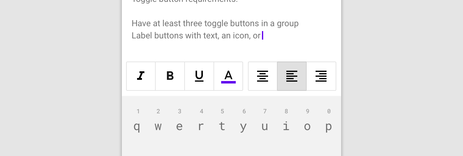
These toggle buttons present options for aligning text to the left, right, and center.
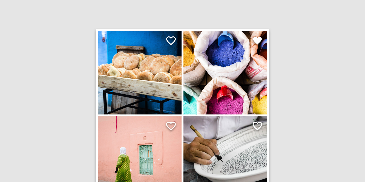
Icons can be used as toggle buttons when they allow selection, or deselection, of a single choice, such as marking an item as a favorite.
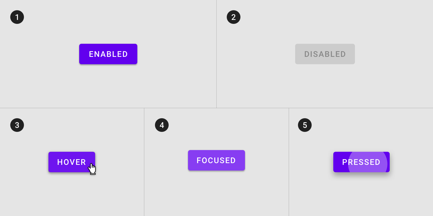
States
Active and available toggle buttons
A toggle button’s state makes it clear which button is active. Hover and focus states express the available selection options for buttons in a toggle group.
Disabled toggle buttons
Toggle buttons that cannot be selected can either be given a disabled state, or be hidden.
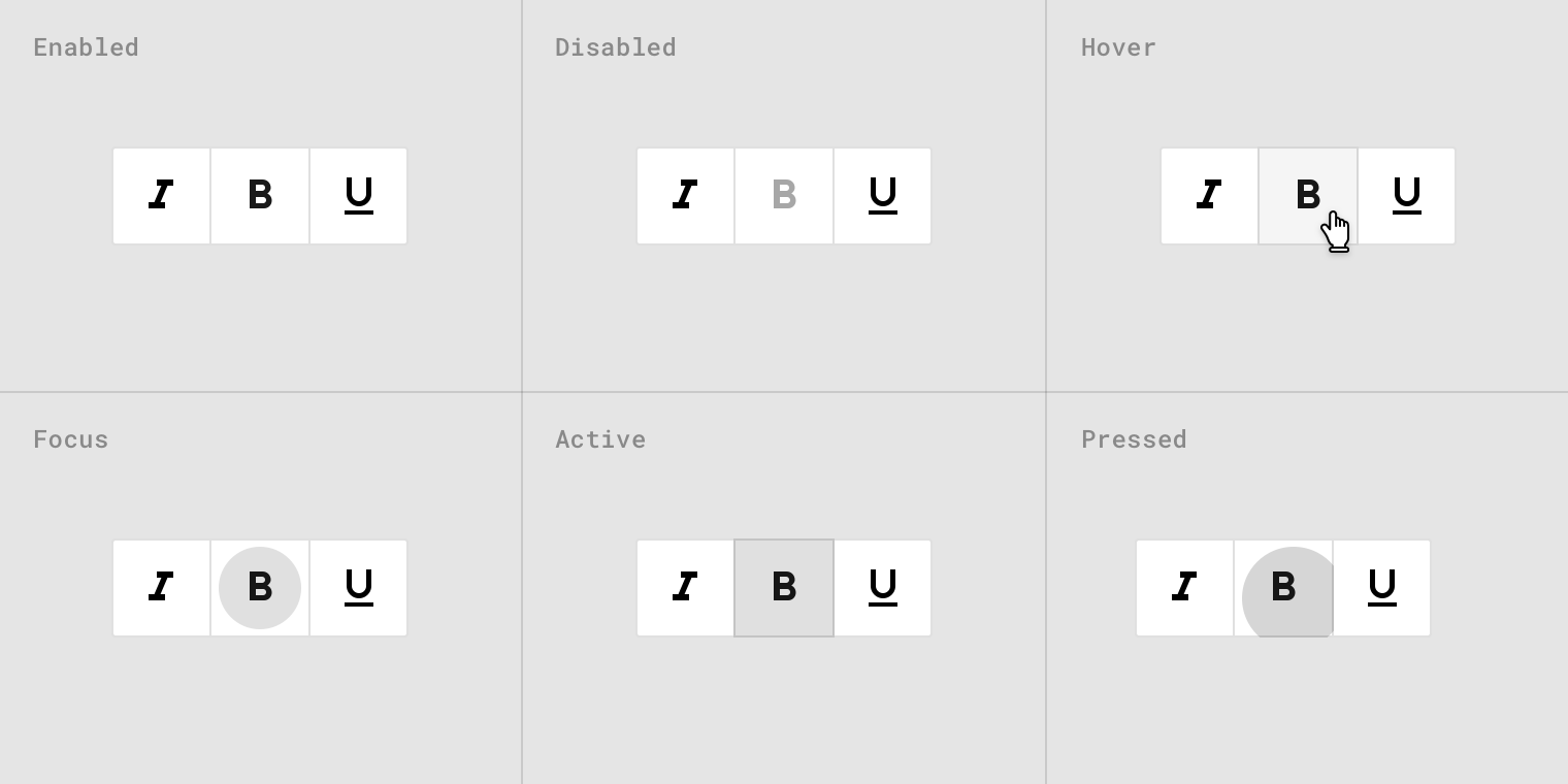
Toggle button states
Implementation
Text buttons
<div class="mdc-button-group">
    <button class="mdc-button lime-800">Text</button>
    <button class="mdc-button lime-800" disabled>Text</button>
</div>

<div class="mdc-button-group">
    <button class="mdc-button lime-800">
        <div class="icon material-icon">favorite</div>
        Text
    </button>
    <button class="mdc-button lime-800" disabled>
        <div class="icon material-icon">favorite</div>
        Text
    </button>
</div>
Outlined buttons
<div class="mdc-button-group">
    <button class="mdc-button btn-outlined lime-800">Text</button>
    <button class="mdc-button btn-outlined lime-800" disabled>Text</button>
</div>

<div class="mdc-button-group">
    <button class="mdc-button btn-outlined lime-800">
        <div class="icon material-icon">favorite</div>
        Text
    </button>
    <button class="mdc-button btn-outlined lime-800" disabled>
        <div class="icon material-icon">favorite</div>
        Text
    </button>
</div>

<button class="mdc-button btn-outlined full-width lime-800">Text</button>
<button class="mdc-button btn-outlined full-width lime-800" disabled>Text</button>

<button class="mdc-button btn-outlined full-width lime-800">
    <div class="icon material-icon">favorite</div>
    Text
</button>
<button class="mdc-button btn-outlined full-width lime-800" disabled>
    <div class="icon material-icon">favorite</div>
    Text
</button>
Contained buttons
<div class="mdc-button-group">
    <button class="mdc-button btn-contained lime-800">Text</button>
    <button class="mdc-button btn-contained lime-800" disabled>Text</button>
</div>

<div class="mdc-button-group">
    <button class="mdc-button btn-contained lime-800">
        <div class="icon material-icon">favorite</div>
        Text
    </button>
    <button class="mdc-button btn-contained lime-800" disabled>
        <div class="icon material-icon">favorite</div>
        Text
    </button>
</div>

<button class="mdc-button btn-contained full-width bg-lime-800">Text</button>
<button class="mdc-button btn-contained full-width bg-lime-800" disabled>Text</button>

<button class="mdc-button btn-contained full-width bg-lime-800">
    <div class="icon material-icon">favorite</div>
    Text
</button>
<button class="mdc-button btn-contained full-width bg-lime-800" disabled>
    <div class="icon material-icon">favorite</div>
    Text
</button>
Toggle buttons
<div class="mdc-toggle-buttons">
    <button class="mdc-button"><div class="icon material-icon">format_italic</div></button>
    <button class="mdc-button active"><div class="icon material-icon">format_bold</div></button>
    <button class="mdc-button" disabled><div class="icon material-icon">format_underlined</div></button>
</div>

<div class="mdc-toggle-buttons lime-800">
    <button class="mdc-button"><div class="icon material-icon">format_italic</div></button>
    <button class="mdc-button active"><div class="icon material-icon">format_bold</div></button>
    <button class="mdc-button" disabled><div class="icon material-icon">format_underlined</div></button>
</div>