almoamen.net
Tooltips
Tooltips display informative text when users hover over, focus on, or tap an element.
Usage
When activated, tooltips display a text label identifying an element, such as a description of its function.
Principles
Transient
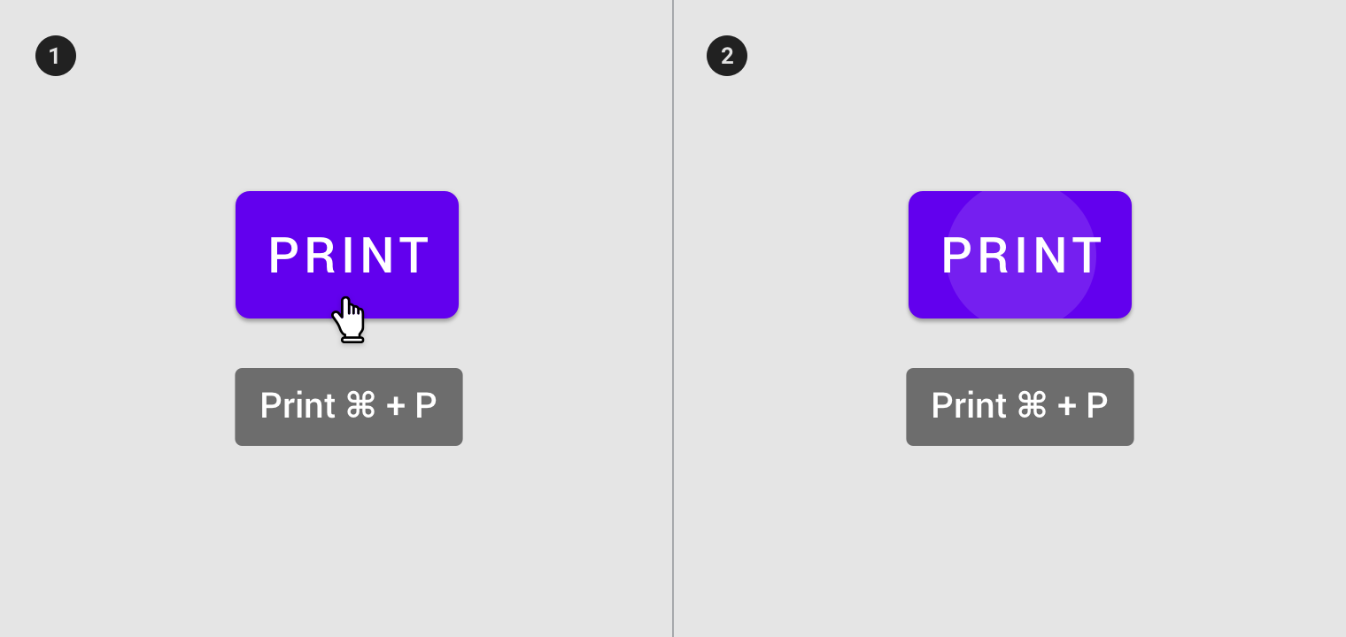
Tooltips appear on hover, focus, or touch, and disappear after a short duration.
Paired
Tooltips are always paired nearby the element with which they are associated.
Succinct
Tooltips only include short, descriptive text.
Placement
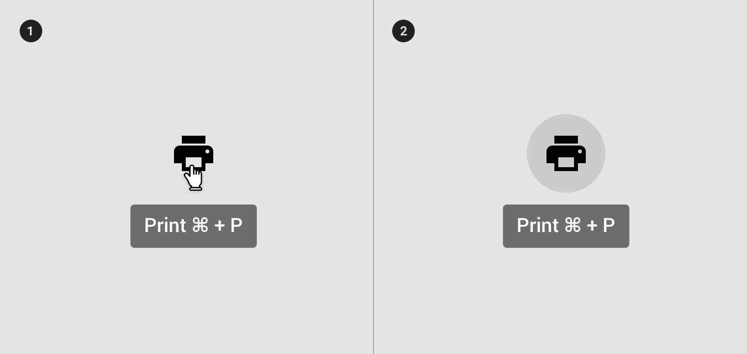
Use tooltips for interactive imagery.
- On hover
- On focus
Don’t use tooltips to restate visible UI text.
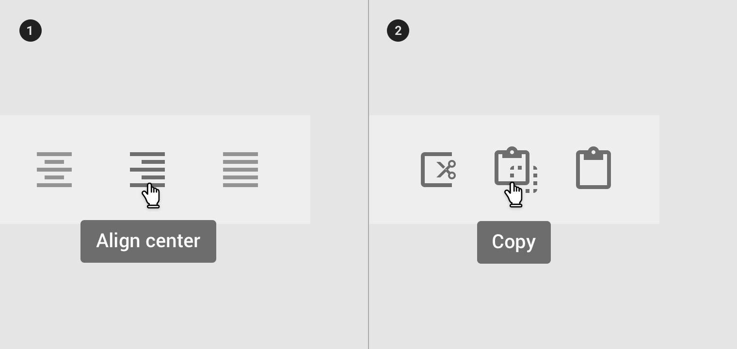
- Tooltips describe differences between similar elements
- Tooltips distinguish actions with related iconography
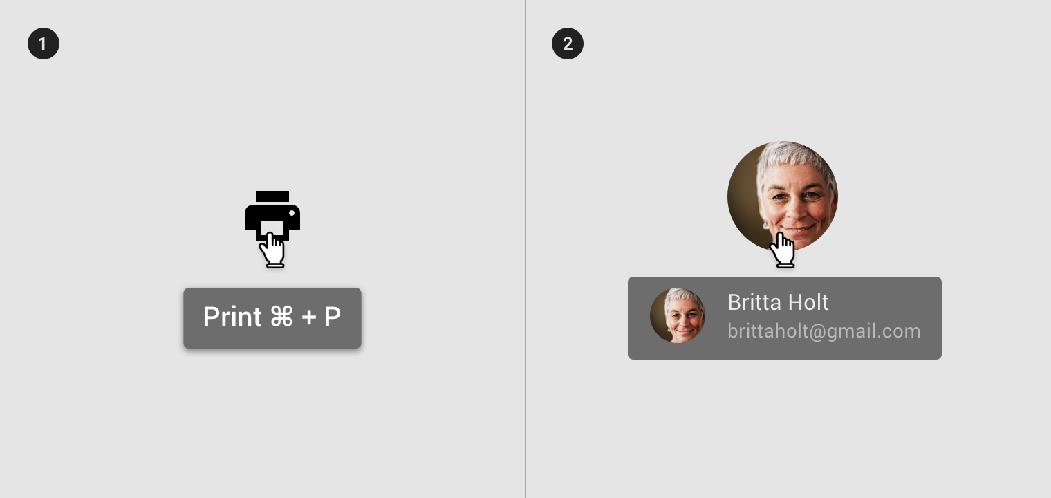
- Don’t display shadows on tooltips
- Don’t display rich information and imagery on tooltips
Behavior
A tooltip is displayed upon tapping and holding a screen element or component (on mobile) or hovering over it (desktop). Continuously display the tooltip as long as the user long-presses or hovers over the element.
Timing
Display the tooltip for 1.5 seconds. If the user takes another action before that time ends, the tooltip will disappear.
Motion
Over 150ms, tooltips fade in and scale up using the deceleration curve. They fade out over 75ms.
On desktop, tooltips appear in the center of click targets and stay in place while cursor moves within the target.
Implementation
Simply add .has-tooltip to the desired element. then add the tooltip component inside it.
Start date
<div class="mdc-toggle-buttons lime-800">
    <button class="mdc-button has-tooltip">
        <div class="icon material-icon">format_align_left</div>
        <div class="mdc-tooltip">Align left</div>
    </button>
    ...
</div>

<div class="mdc-text-field lime-800">
    <div class="input has-tooltip">
        <input class="input-element" type="text" value="July, 18 2019">
    </div>
    <label class="label">Date</label>
    <div class="mdc-tooltip">Start date</div>
</div>