almoamen.net
Text fields
Text fields let users enter and edit text.
Usage
Text fields allow users to enter text into a UI. They typically appear in forms and dialogs.
Principles

Discoverable
Text fields should stand out and indicate that users can input information.
Clear
Text field states should be clearly differentiated from one another.

Efficient
Text fields should make it easy to understand the requested information and to address any errors.
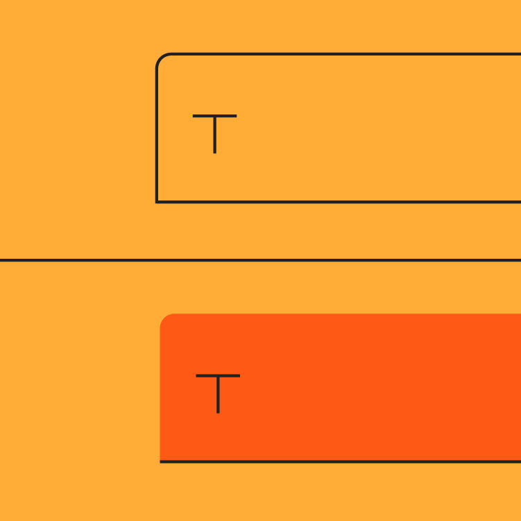
Types
Text fields come in two types:
- Filled text fields
- Outlined text fields
Both types of text fields use a container to provide a clear affordance for interaction, making the fields discoverable in layouts.
- Filled text fields
- Outlined text fields
Choosing the right text field
Both types of text fields provide the same functionality, so the type of text field you use can depend on style alone.
Choose the type that:
- Works best with your app’s visual style
- Best accommodates the goals of your UI
- Is most distinct from other components (like buttons) and surrounding content
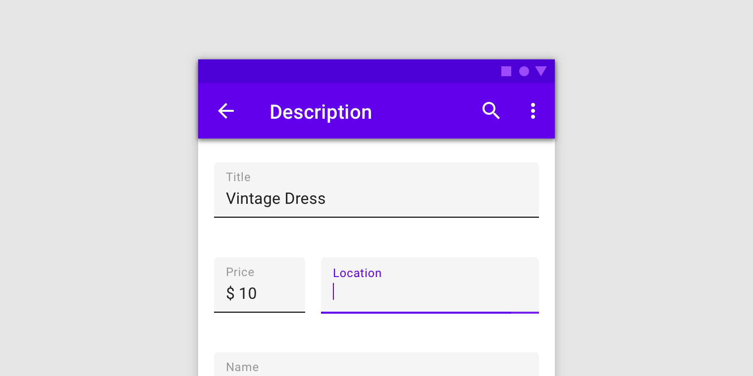
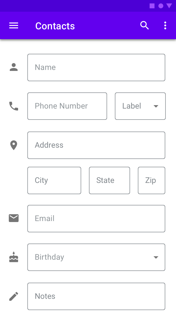
Mobile form using filled text fields.
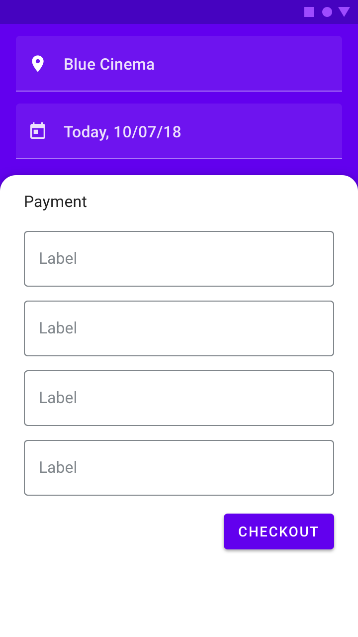
The same mobile form using outlined text fields.
Both types of text fields in one UI
If both types of text fields are used in a single UI, they should be used consistently within different sections, and not intermixed within the same region. For example, you could use outlined text fields in one section and filled text fields in another.
When using both types of text fields in a UI, separate them by region.
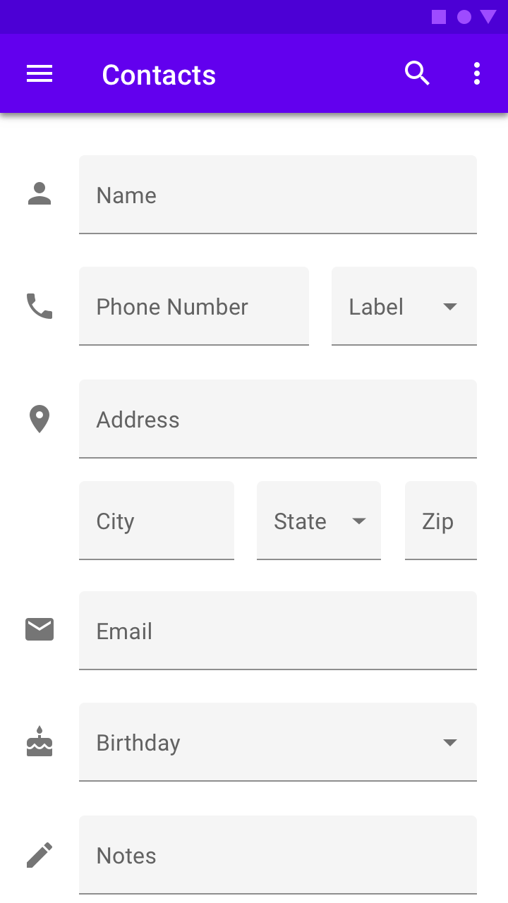
Anatomy
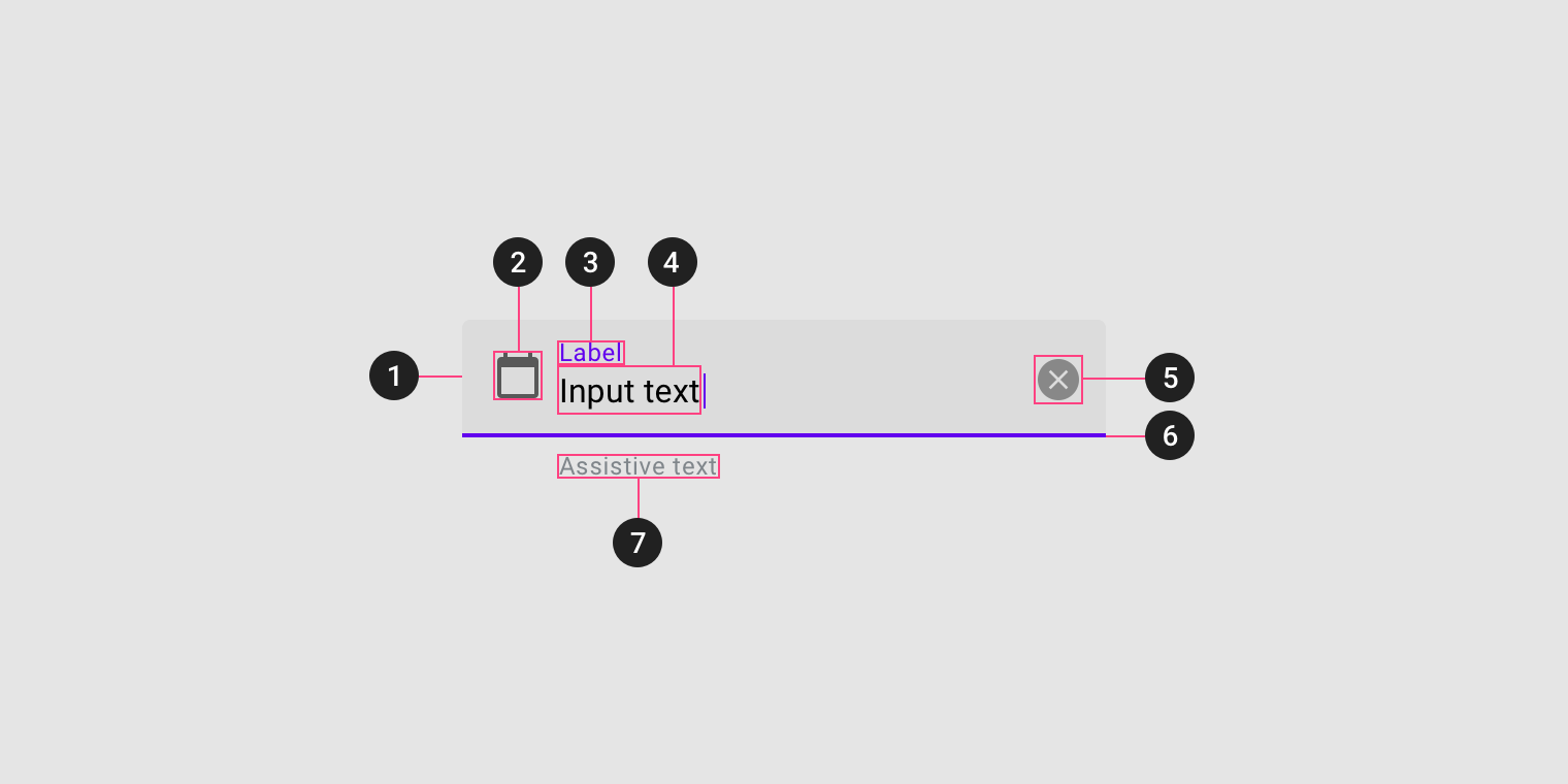
- Container
- Leading icon (optional)
- Label text
- Input text
- Trailing icon (optional)
- Activation indicator
- Assistive text (optional)
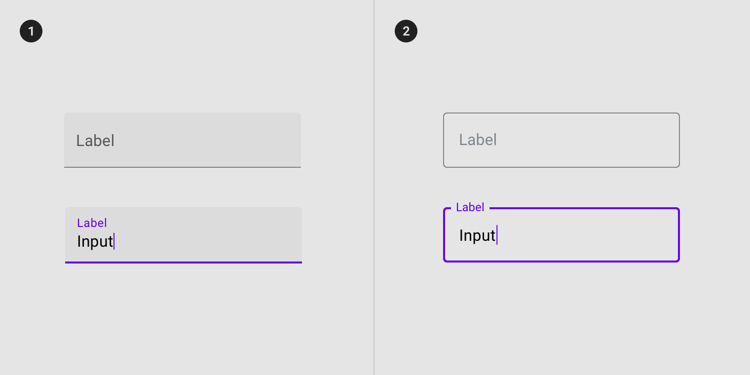
Container
Containers improve the discoverability of text fields by creating contrast between the text field and surrounding content.
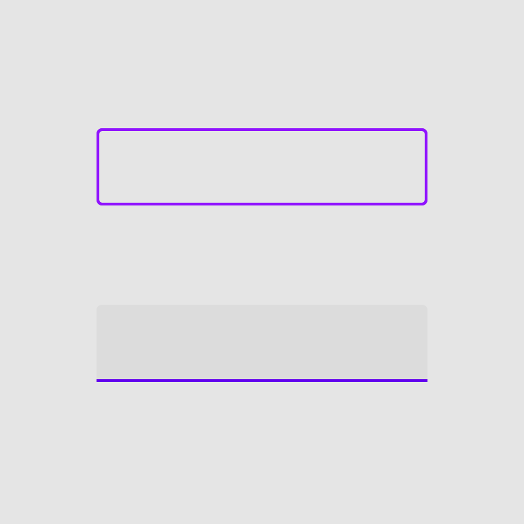
Fill and stroke
A text field container has a fill and a stroke (either around the entire container, or just the bottom edge). The color and thickness of a stroke can change to indicate when the text field is active.
Rounded corners
The container of an outlined text field has rounded corners, while the container of a filled text field has rounded top corners and square bottom corners.
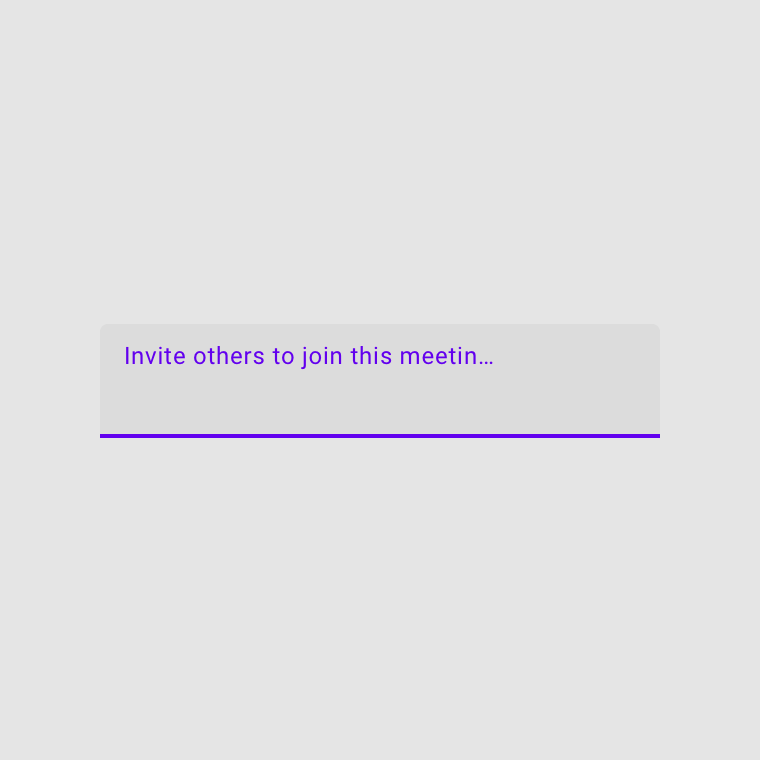
Label text
Label text is used to inform users as to what information is requested for a text field. Every text field should have a label.
Label text is used to inform users as to what information is requested for a text field. Every text field should have a label.
Label text shouldn’t be truncated. Keep it short, clear, and fully visible.
Label text shouldn’t take up multiple lines.
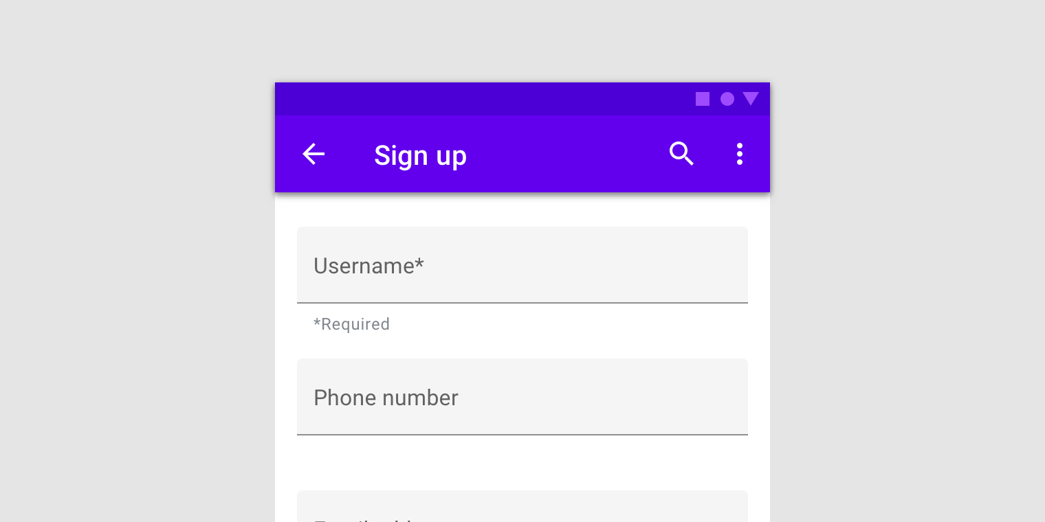
Required text indicator
To indicate that a field is required, display an asterisk (*) next to the label text and mention near the form that asterisks indicate required fields.
- If some fields are required, indicate all required ones
- If most fields are required, indicate optional fields by displaying the word “optional” in parentheses next to the label text
- If required text is colored, that color should also be used for the asterisk
Required text with asterisk
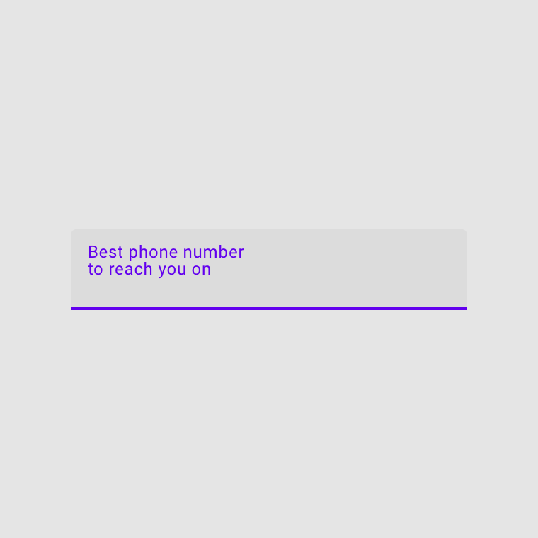
Input text
Input text is text the user has entered into a text field.
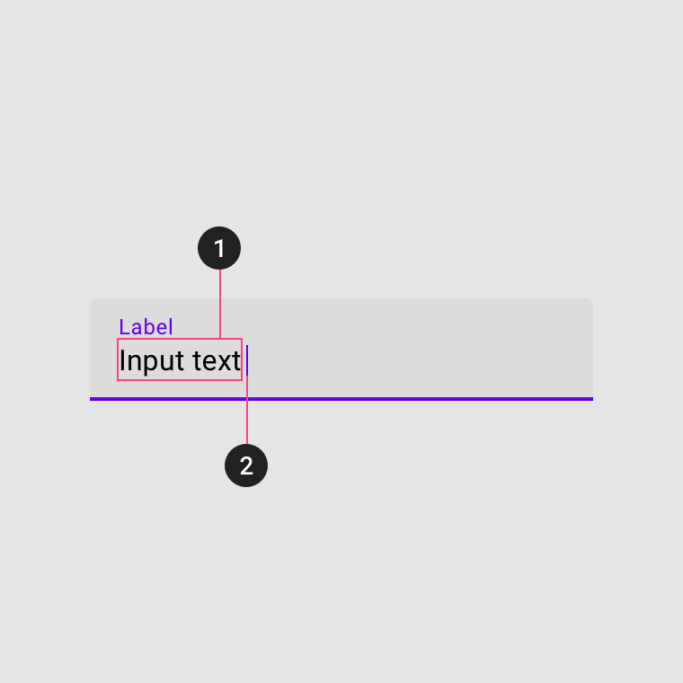
1. Input text
Input text is text entered by the user.
2. Cursor
A cursor indicates the current location of text input in a field.
Assistive elements
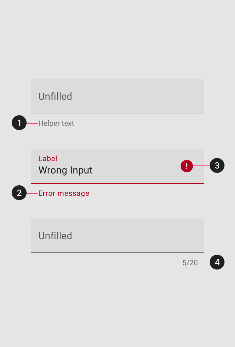
Assistive elements provide additional detail about text entered into text fields.
1. Helper text
Helper text conveys additional guidance about the input field, such as how it will be used. It should only take up a single line, being persistently visible or visible only on focus.
2. Error message
When text input isn’t accepted, an error message can display instructions on how to fix it. Error messages are displayed below the input line, replacing helper text until fixed.
3. Icons
Icons can be used to message alerts as well. Pair them with error messages to provide redundant alerts, which are useful when you need to design for colorblind users.
4. Character counter
Character or word counters should be used if there is a character or word limit. They display the ratio of characters used and the total character limit.
Error text
For text fields that validate their content (such as passwords), replace helper text with error text when applicable. Swapping helper text with error text helps prevent new lines of text from being introduced into a layout, thus bumping content to fit it.
- If only one error is possible, error text describes how to avoid the error
- If multiple errors are possible, error text describes how to avoid the most likely error
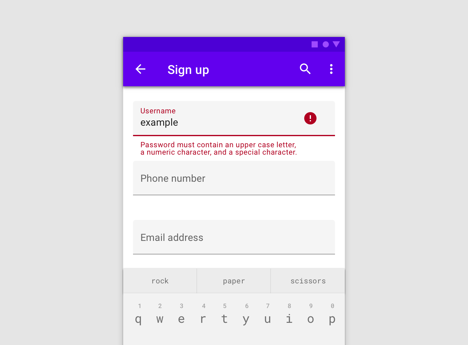
Long errors can wrap to multiple lines if there isn’t enough space to clearly describe the error. In this case, ensure padding between text fields is sufficient to prevent multi-lined errors from bumping layout content.
Icons
Icons in text fields are optional. Text field icons can describe valid input methods (such as a microphone icon), provide affordances to access additional functionality (such as clearing the content of a field), and can express an error.
Leading and trailing icons change their position based on LTR or RTL contexts.
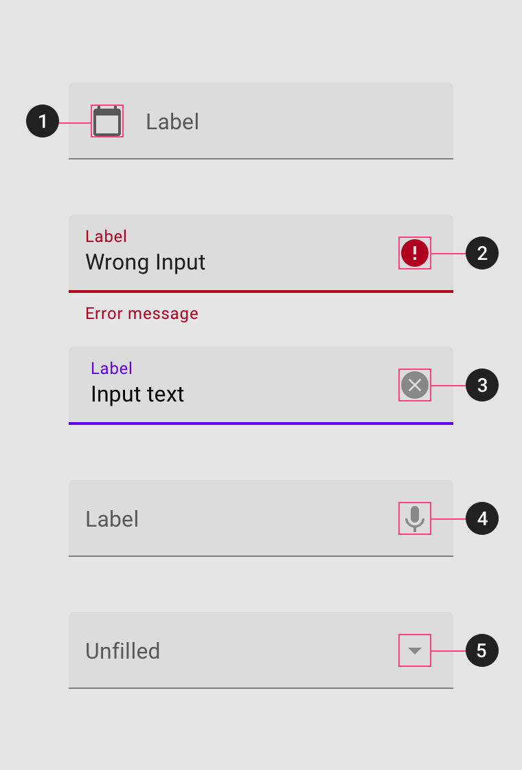
1. Icon signifier
Icon signifiers can describe the type of input a text field requires, and be touch targets for nested components. For example, a calendar icon may be tapped to reveal a date picker.
2. Valid or error icon
Iconography can indicate both valid and invalid inputs, making error states clear for colorblind users.
3. Clear icon
Clear icons let users clear an entire input field. They appear only when input text is present.
4. Voice input icon
A microphone icon signifies that users can input characters using voice.
5. Dropdown icon
A dropdown arrow indicates that a text field has a nested selection component.
Filled text field
Usage
Filled text fields carry more visual emphasis, making them stand out when surrounded by other content and components.
States
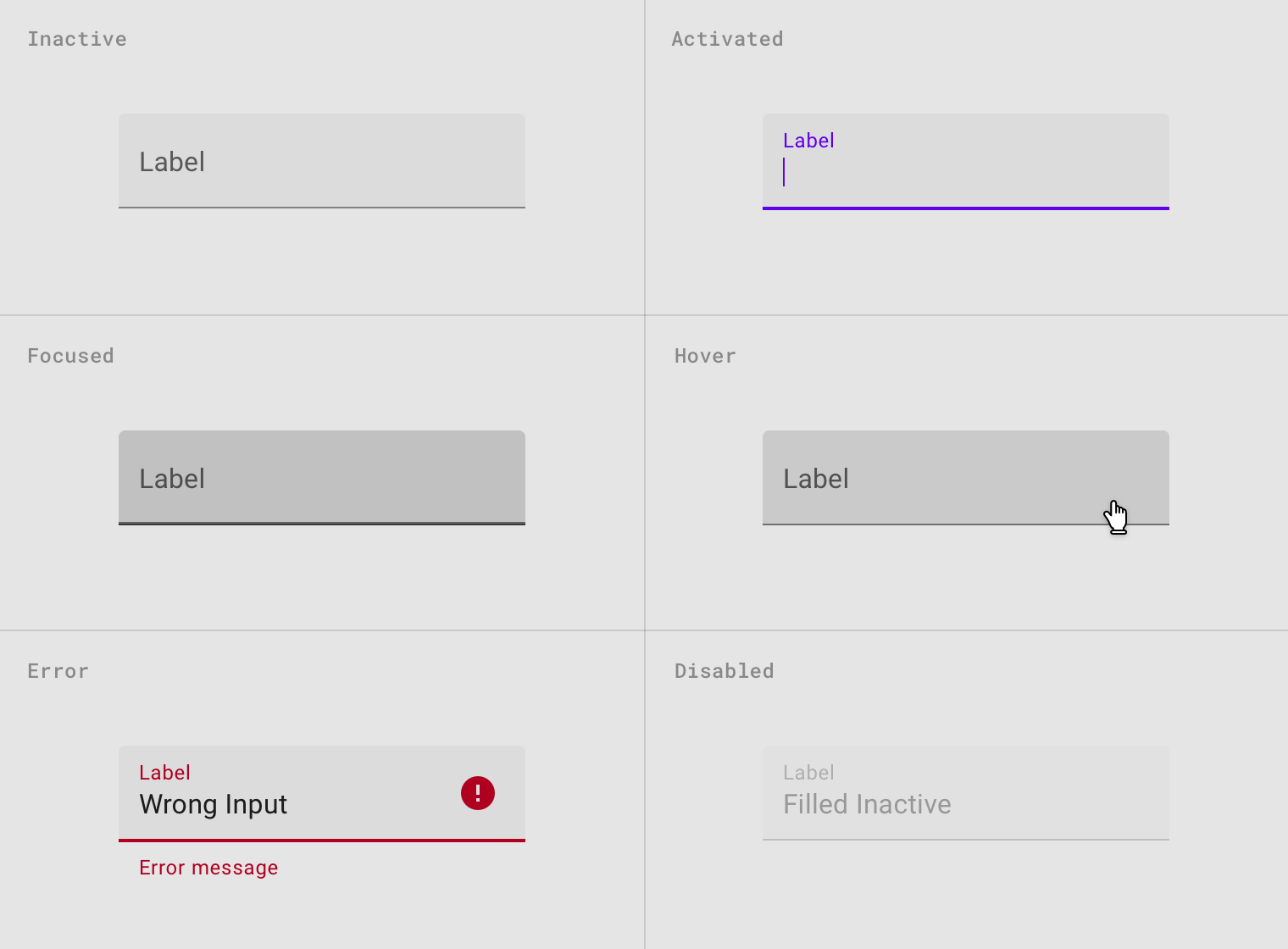
Filled text field states are inactive, activated, focused, hover, error, and disabled.
Outlined text field
Usage
Outlined text fields have less visual emphasis than filled text fields, which helps simplify layout in places like forms, where many text fields are placed together.
States
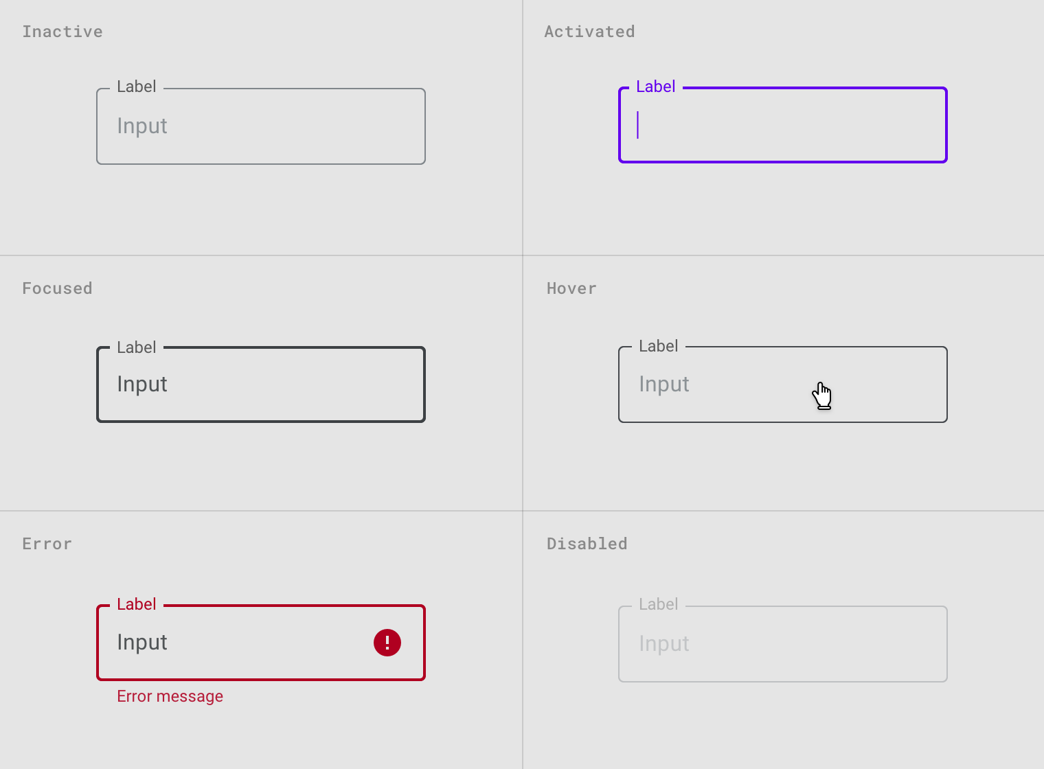
Outlined text field states are inactive, activated, focused, hover, error, and disabled.
Input types
Text fields can display user input in the following ways:
- Single line text fields display only one line of text
- Multi-line text fields grow to accommodate multiple lines of text
- Text areas are fixed-height fields
Single-line fields
In single-line fields, as the cursor reaches the right field edge, text longer than the input line automatically scrolls left.
Single-line fields are not suitable for collecting long responses. For those, use a multi-line text field or text area instead.
Multi-line fields
Multi-line text fields show all user input at once. Overflow text causes the text field to expand (shifting screen elements downward), and text wraps onto a new line.
These fields initially appear as single-line fields, which is useful for compact layouts that need to be able to accomodate large amounts of text.
Text areas
Text areas are taller than text fields and wrap overflow text onto a new line. They are a fixed height and scroll vertically when the cursor reaches the bottom of the field.
The large initial size indicates that longer responses are possible and encouraged.
These should be used instead of multi-line fields on the web. Ensure the height of a text area fits within mobile screen sizes.
Implementation
Caution: when creating forms you should use form.mdc-form.
Note: you can use form.mdc-form.inline for inline styled forms.
Javascript methods:
| void MDC.textFieldsInit() | ||
|---|---|---|
| A method to initialize all outlined text fields and text areas. note that only outline style needs to be initialized. this method is called on document ready by default. | ||
| void MDC.outlinedTextFieldInit(outlinedTextField) | ||
| A method to initialize a specific outlined text field or text area. useful for dynamic forms. | ||
| outlined_text_field | String | jQuery | Element | The outlined text field container. can be either a css selector string or a jQuery object or an element. |
Filled text field
Help text
Help text
Help text
Help text
<!-- Filled text field -->
<div class="mdc-text-field lime-800">
    <div class="input"><input class="input-element" type="text"></div>
    <label class="label">Label</label>
    <div class="help-block">Help text</div>
</div>
<!-- Disabled text field -->
<div class="mdc-text-field lime-800">
    <div class="input disabled">
        <input class="input-element" type="text" value="Disabled text field input">
    </div>
    .
    .
</div>
<!-- Text field with icon -->
<div class="mdc-text-field lime-800">
    <div class="icon material-icon">person</div>
    <div class="input"><input class="input-element" type="text"></div>
    <label class="label">Label</label>
    <div class="help-block">Help text</div>
</div>
<!-- Text field with trailing icon -->
<div class="mdc-text-field lime-800">
    <div class="icon material-icon trailing">person</div>
    .
    .
    .
</div>
Standard text field
Help text
Help text
Help text
<!-- Standard text field -->
<div class="mdc-text-field standard lime-800">
    .
    .
    .
</div>
Outlined text field
Help text
Help text
Help text
<!-- Outlined text field -->
<div class="mdc-text-field outlined lime-800">
    .
    .
    .
</div>
Text field styling options
Full width text fields
Help text
<!-- Full width text field -->
<div class="mdc-text-field full-width lime-800">
    .
    .
    .
</div>
Filled text area
Help text
Help text
<!-- Filled text area -->
<div class="mdc-text-area lime-800">
    <div class="input"><textarea class="input-element custom-scrollbars"></textarea></div>
    <label class="label">Label</label>
    <div class="help-block">Help text</div>
</div>
<!-- Disabled text field -->
<div class="mdc-text-area lime-800">
    <div class="input disabled">
        <textarea class="input-element custom-scrollbars">Disabled text area input</textarea>
    </div>
    .
    .
</div>
Standard text area
Help text
<!-- Standard text area -->
<div class="mdc-text-area standard lime-800">
    .
    .
    .
</div>
Outlined text area
Help text
<!-- Outlined text area -->
<div class="mdc-text-area outlined lime-800">
    .
    .
    .
</div>
Text area has a fixed height showing 4 lines by default. you can change --number-of-lines to increase the number of visible lines.
Caution: the number of visible lines cannot be less than 4. if so it will default to 4 automatically.
.mdc-text-area {
    --number-of-lines: 4;
}
Note: same as text fields, you can add .full-width CSS class to a text area container.