almoamen.net
Understanding typography
Typography expresses hierarchy and brand presence.
Type properties
A typeface is a collection of letters. While each letter is unique, certain shapes are shared across letters. A typeface represents shared patterns across a collection of letters.
Typefaces that are selected for their style, legibility, and readability are most effective when following the fundamental principles of typographic design.
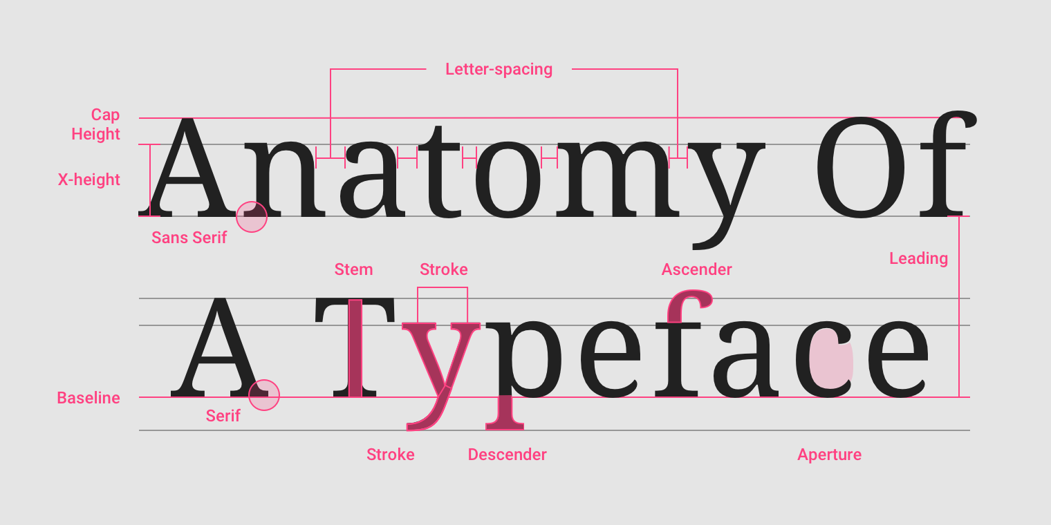
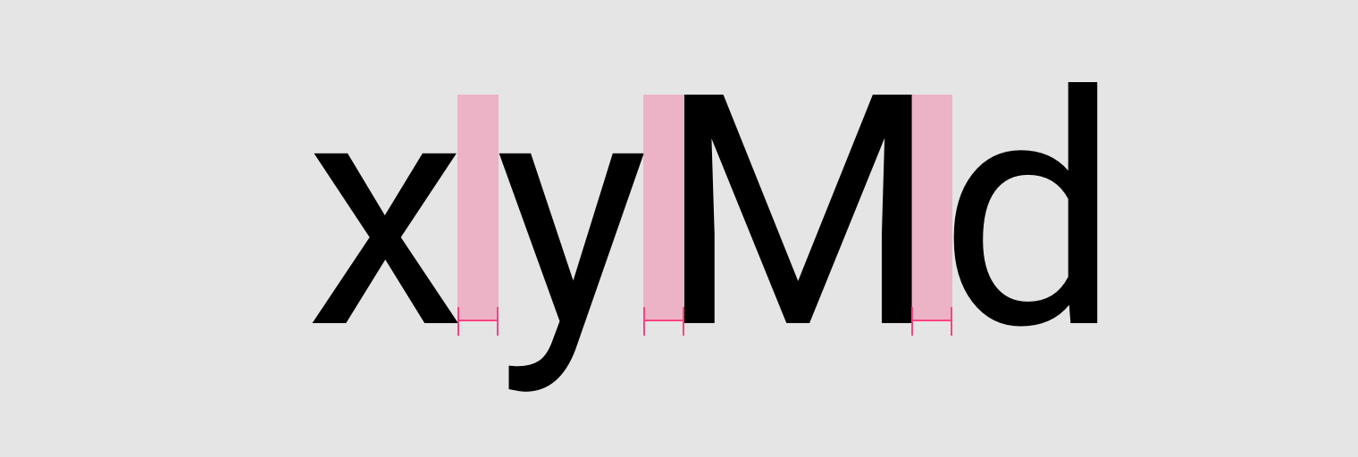
Names of letterform parts: aperture, ascender, baseline, cap height, descender, leading, letter-spacing, sans serif, serif, stem, stroke, x-height.
Letter spacing examples
The baseline is the invisible line upon which a line of text rests. In Material Design, the baseline is an important specification in measuring the vertical distance between text and an element.
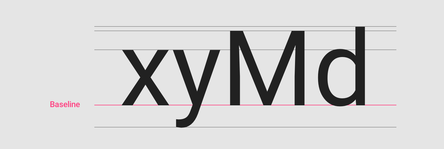
The baseline.
4dp grid
Type aligns to the 4dp baseline grid.
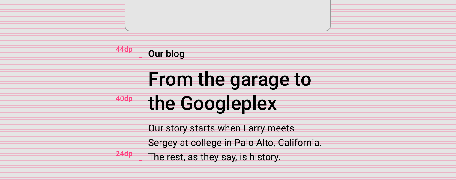
Regardless of pt / sp size, a text’s baseline must sit on the 4dp grid. Line-height must be a value divisible by 4 to maintain the grid.
Measurement from the baseline
Specify distances from UI elements from the baseline. Baseline values are software-agnostic, so they work in any design program, and work with the grid. On Android and iOS, code can be translated from baseline-relative specs into padding. For the web, automate the calculation using Sass or CSS.
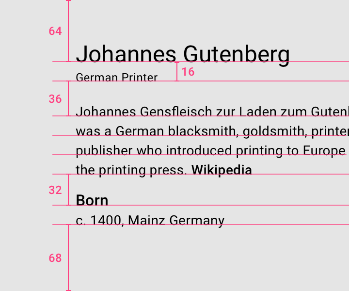
Reference baselines for vertical alignment, instead of bounding boxes. This produces more accurate implementation across design software and platforms.
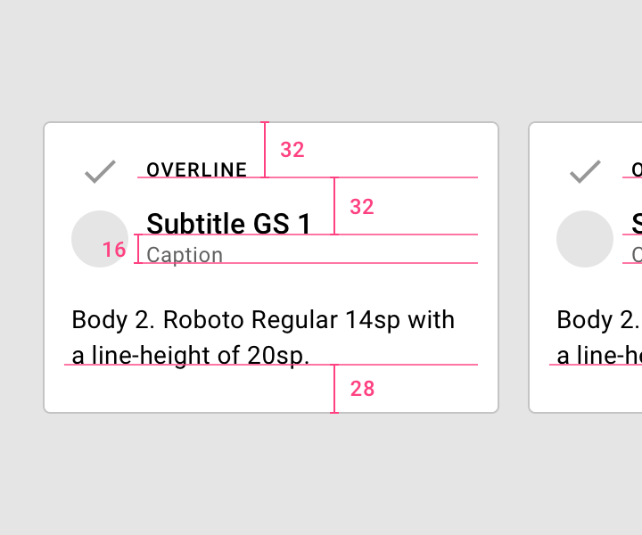
Measure text in relation to other components.
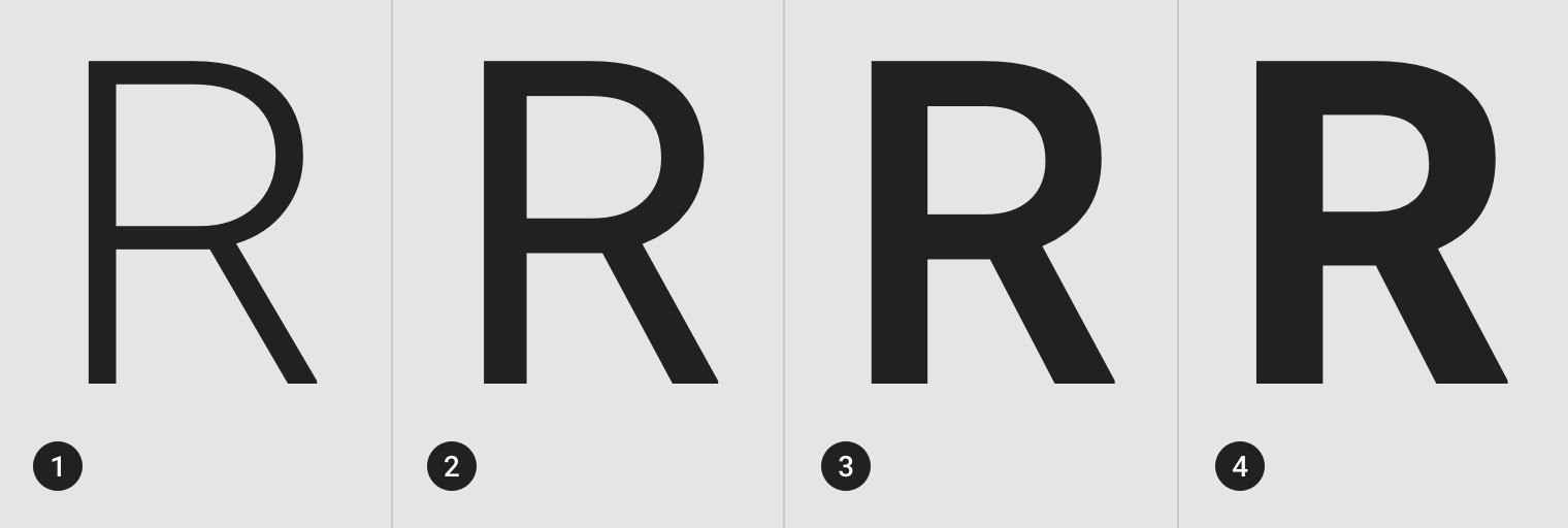
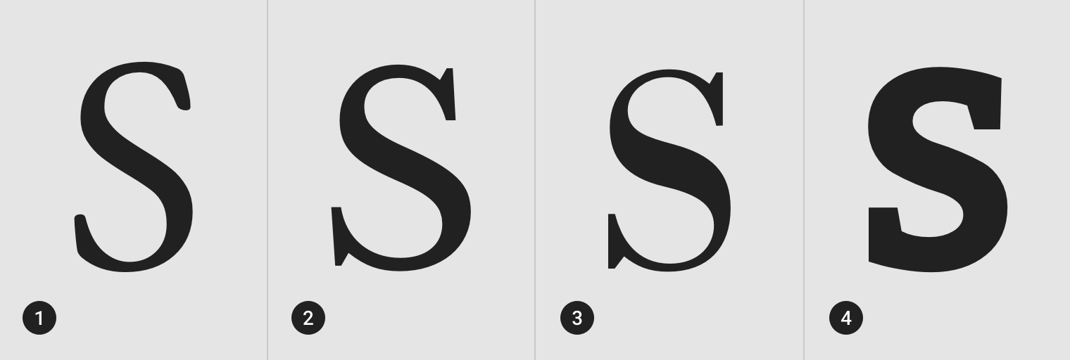
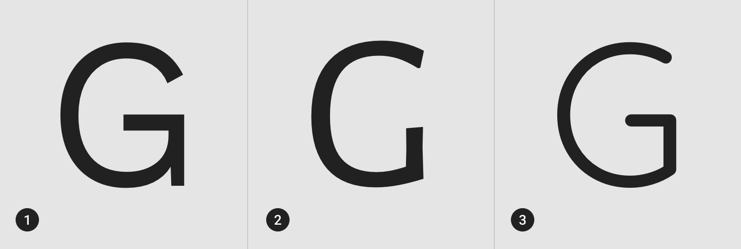
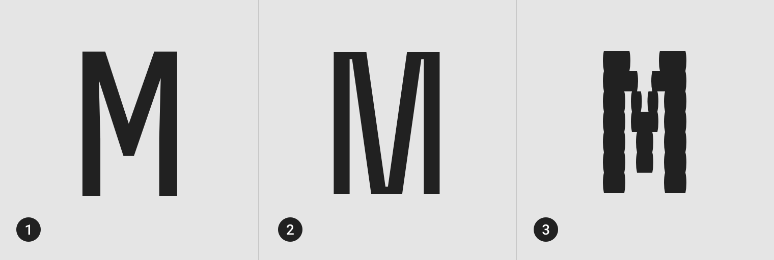
Cap height
Cap height refers to the height of a typeface’s flat capital letters (such as M or I) measured from the baseline. Round and pointed capital letters, such as S and A, are optically adjusted by being drawn with a slight overshoot above the cap height to achieve the effect of being the same size. Every typeface has a unique cap height.
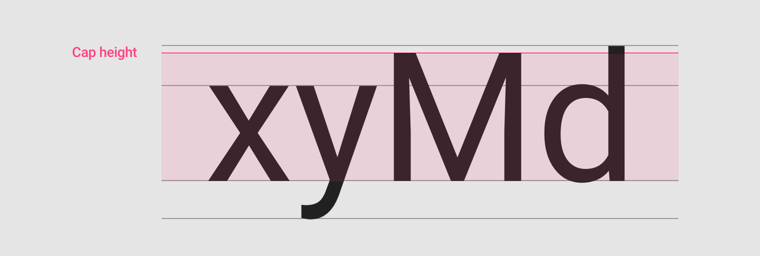
Cap height.
X-height
X-height refers to the height of the lowercase x for a typeface, and it indicates how tall or short each glyph in a typeface will be.
Typefaces with tall x-heights have better legibility at small font sizes, as the white space within each letter is more legible.
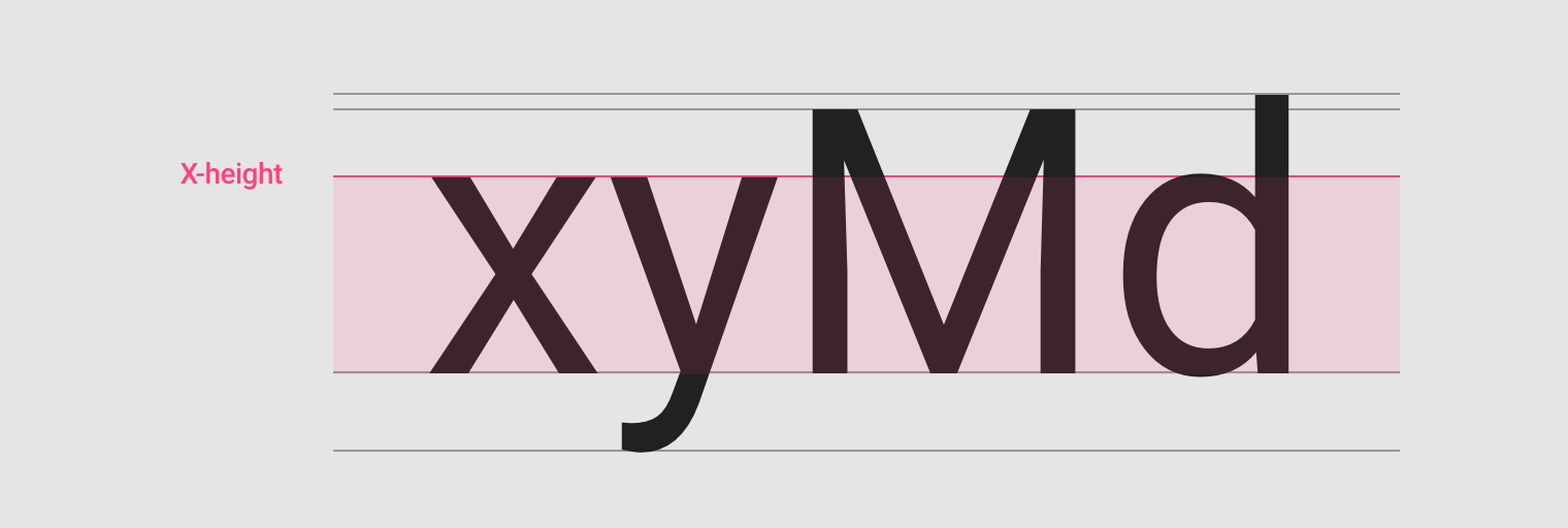
The height of a typeface’s lower-case x determines its x-height.
Ascenders and descenders
Ascenders are an upward vertical stroke found in certain lowercase letters that extend beyond either the cap height or baseline. Descenders are the downward vertical stroke in these letters. In some cases, a collision between these strokes can occur when the line height (the vertical distance between baselines) is too tight.
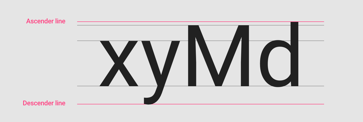
Ascenders and descender.
Weight
Weight refers to the relative thickness of a font’s stroke. A typeface can come in many weights; and four to six weights is a typical number available for a typeface.
Common weights:
- Light
- Regular
- Medium
- Bold
Type classification
Serif
A serif is a small shape or projection that appears at the beginning or end of a stroke on a letter. Typeface with that have serifs are called a serif typeface. Serif fonts are classified as one of the following:
Old-Style serifs resemble writing in ink, with:
- Low contrast between thick and thin strokes
- Diagonal stress in the strokes
- Slanted serifs on lower-case ascenders
Transitional serifs have:
- High contrast between thick and thin strokes
- Medium-High x-height
- Vertical stress in the strokes
- Bracketed serifs
Didone or neoclassical serifs have:
- Very high contrast between thick and thin strokes
- Vertical stress in the strokes
- “Ball” terminal strokes.
Slab serifs have:
- Heavy serifs with imperceptible differences between the stroke weight
- Minimal or no bracketing
- EB Garamond, old-style serif
- Libre Baskerville, transitional serif
- Libre Bodoni, didone / neoclassical serif
- Bitter, slab serif
Sans Serif
A typeface without serifs is called a sans serif typeface, from the French word “sans” that means "without." Sans serifs can be classified as one of the following:
- Grotesque: Low contrast between thick and thin strokes, vertical or no observable stress
- Humanist: Medium contrast between thick and thin strokes, slanted stress
- Geometric: Low contrast between thick and thin strokes, with vertical stress, and circular round forms
- Work Sans, grotesque sans serif
- Alegreya Sans, humanist sans serif
- Quicksand, geometric sans serif
Monospace
Monospace typefaces display all characters with the same width.
- Roboto Mono, monospace
- Space Mono, monospace
- VT323, monospace
Handwriting
Handwriting typefaces are unconventional with a natural, handwritten feel. These typically are used as H1 - H6 in your type scale. They come in the following forms:
- Black letter: High contrast, narrow, with straight lines and angular curves
- Script: Replication of calligraphic styles of writing (more formal)
- Handwriting: Replication of handwriting (less formal)
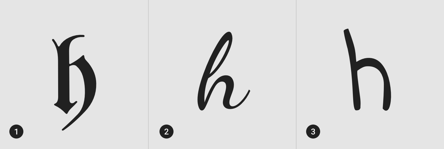
- UnifrakturMaguntia, black letter
- Dancing Script, script
- Indie Flower, handwriting
Display
A miscellaneous category for all classification types that are only suitable for use at large point sizes. Display fonts typically are used as H1 - H6 in your type scale.
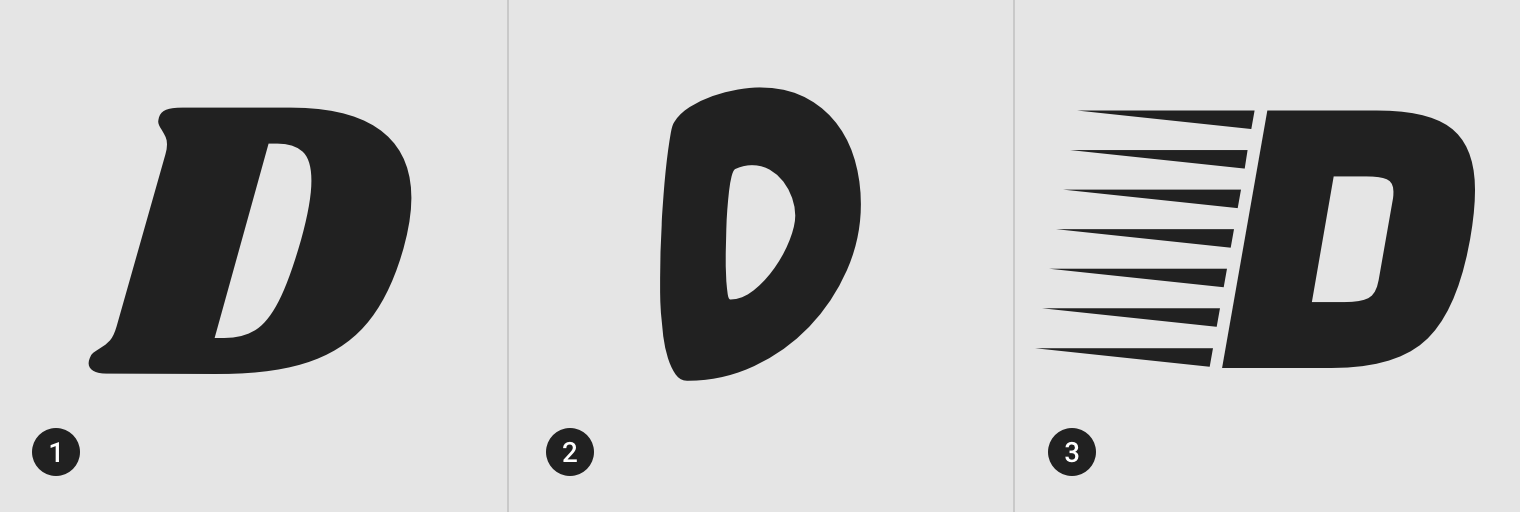
- Shrikhand, display
- Chewy, display
- Faster One, display
Readability
While legibility is determined by the characters in a typeface, readability refers to how easy it is to read words or blocks of text, which is affected by the style of a typeface.
Letter-spacing
Letter-spacing, also called tracking, refers to the uniform adjustment of the space between letters in a piece of text.
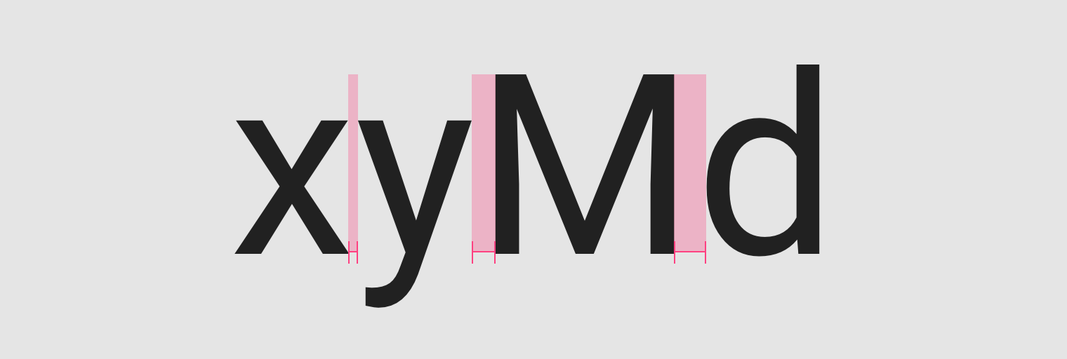
Larger type sizes, such as headlines, use tighter letter-spacing to improve readability and reduce space between letters.
Tighter letter-spacing.
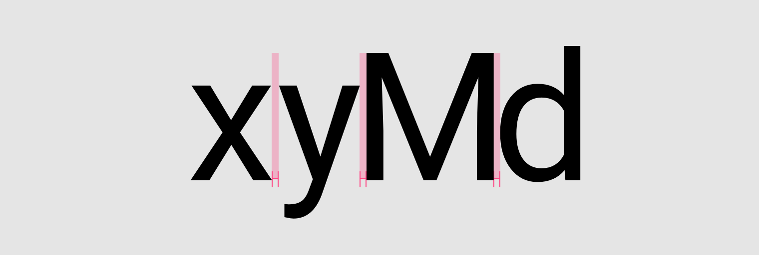
For smaller type sizes, looser letter spacing can improve readability as more space between letters increases contrast between each letter shape. Text in all caps, even at small type sizes, has improved readability because of its added letter spacing.
Looser letter-spacing.
Tabular figures
Use tabular figures (also known as monospaced numbers), rather than proportional digits, in tables or places where values may change often.
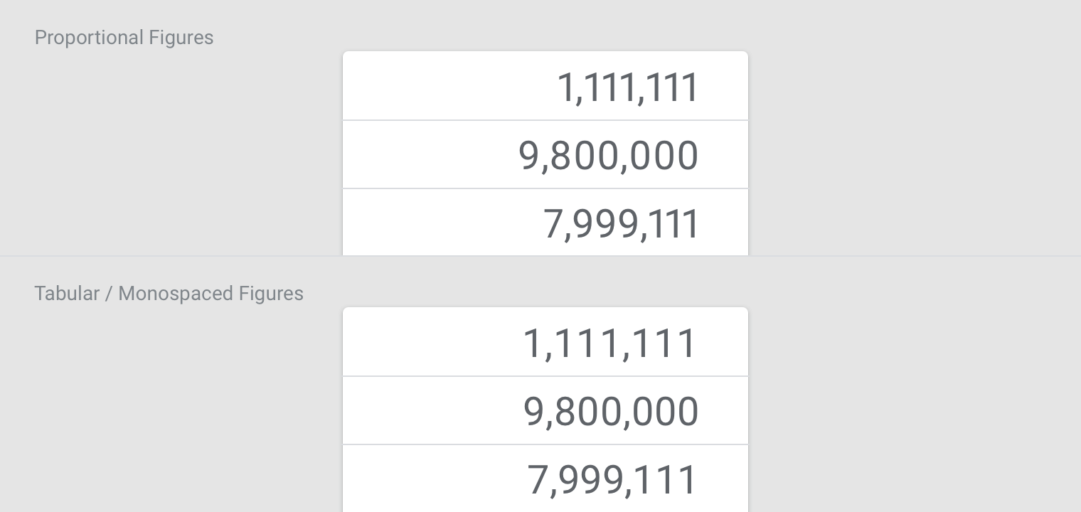
Tabular figures keep values optically aligned for better scanning..
Line length
Line lengths for body text are usually between 40 to 60 characters. In areas with wider line lengths, such as desktop, longer lines that contain up to 120 characters will need an increased line height from 20sp to 24sp.
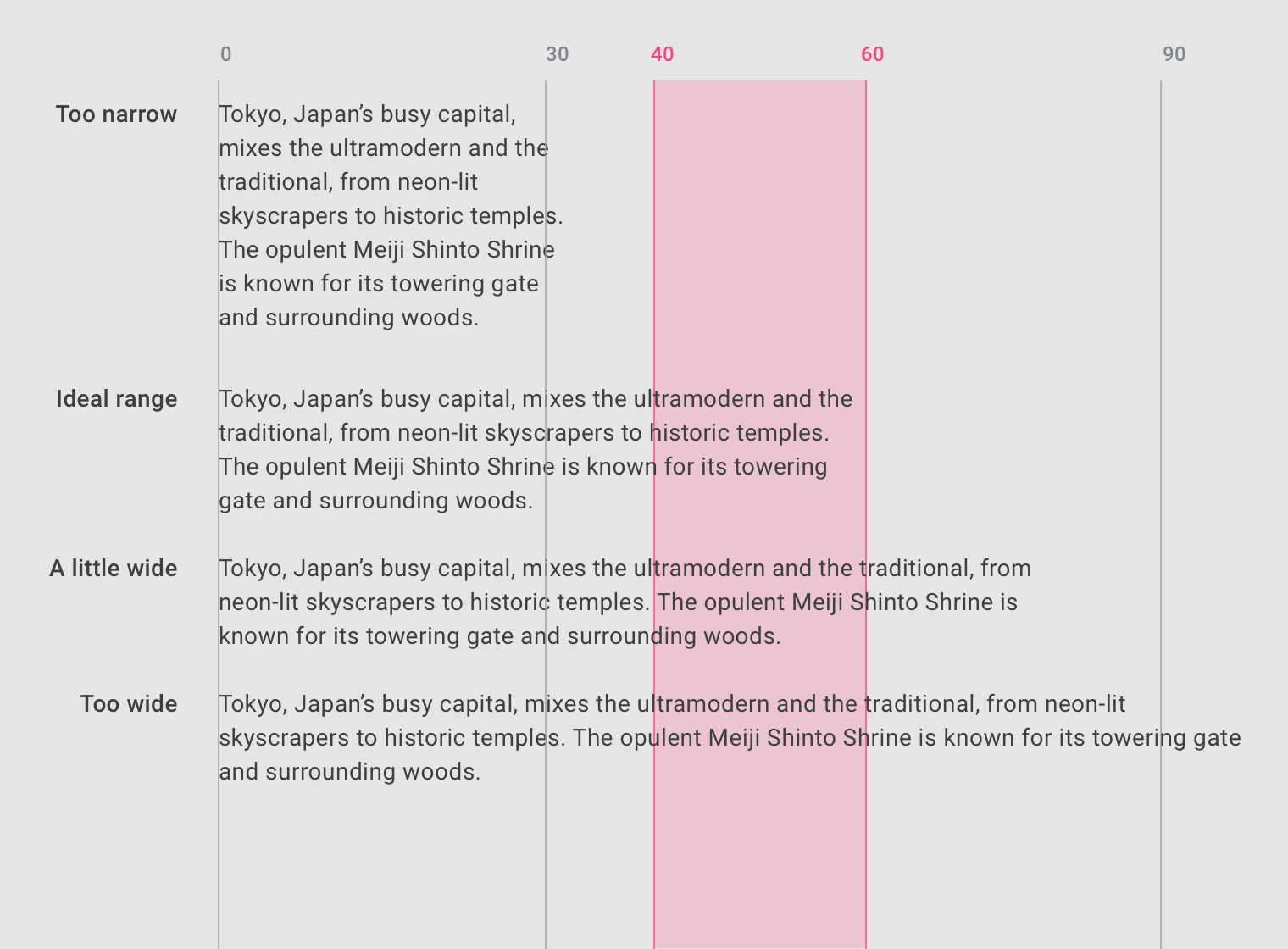
The ideal line length is 40-60 characters per line for English body text.
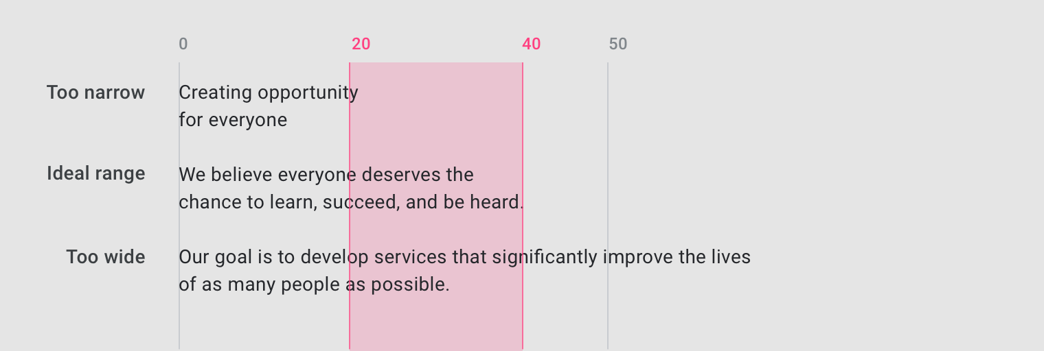
The ideal line length for short lines of English text is 20-40 characters per line.
Line height
Line height, also known as leading, controls the amount of space between baselines in a block of text. A text’s line height is proportional to its type size.
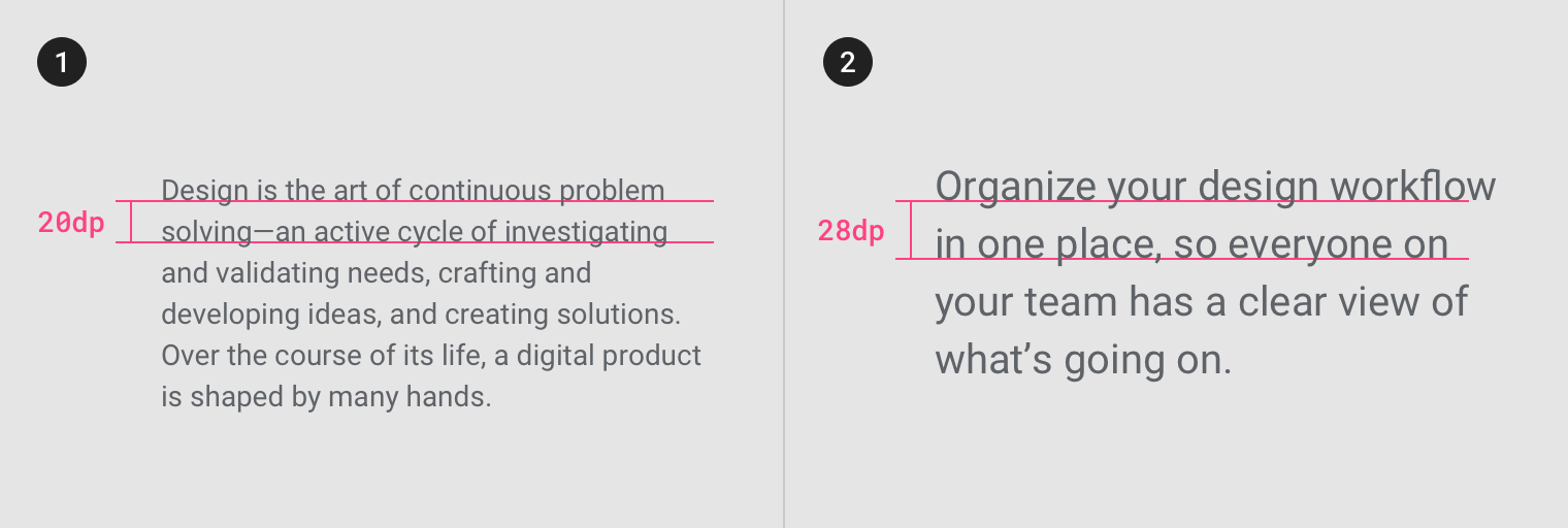
- Type size 14, Line-height 20dp
- Type size 20, Line-height 28dp
Paragraph spacing
Keep paragraph spacing in the range between .75x and 1.25x of the type size.
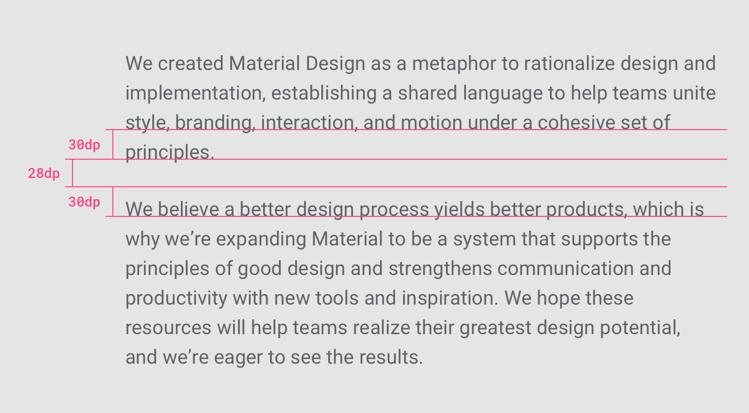
Type size 20sp, line-height 30dp, paragraph spacing 28dp.
Type alignment
Type alignment controls how text aligns in the space it appears. There are three type alignments:
- Left-aligned: when text is aligned to the left margin
- Right-aligned: when text is aligned to the right margin
- Centered: when text is aligned to the center of the area it is set in
Left-aligned
Left-aligned text is the most common setting for left-to-right languages such as English.
Left-aligned text applied to body copy.
Right-aligned
Right-aligned text is the most common setting for right-to-left languages, such as Arabic and Hebrew.
Left-to-right languages can use right-aligned text, though it is best for distinguishing short typographic elements within a layout (such as side notes), and is not recommended for long copy.
Right-aligned text applied to a side note.
Centered
Centered text is best used to distinguishing short typographic elements within a layout (such as pull quotes), and is not recommended for long copy.
Center-aligned text applied to a pull quote.
System fonts
System fonts come pre-installed on your computer or device. They typically have wide language support and no licensing costs for developers. Using the system default font in your app font unites the consistency of the platform with your app’s look and feel. However, because they appear in many places on devices, they may not stand out.
Using system fonts
Native system typefaces should be used for large blocks of text and any text below 14sp.
Roboto is the default system font for Android. For platforms outside of Android and web products, use a system typeface that is preferred on that platform. For example, iOS applications should use Apple’s San Francisco font.
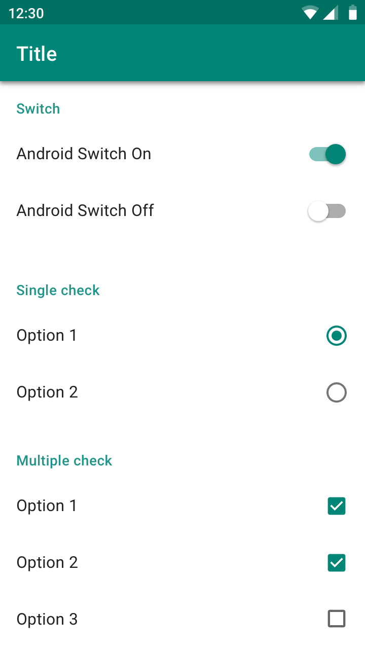
Android
Roboto system font
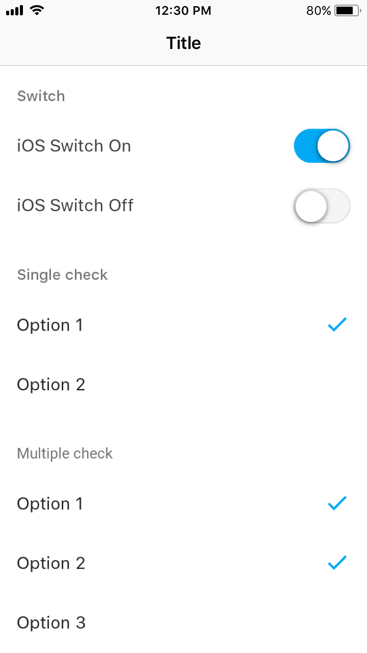
iOS
San Francisco system font