almoamen.net
Accessibility
Accessible design allows users of all abilities to navigate, understand, and use your UI successfully.
Understanding accessibility
A well-designed product is accessible to users of all abilities, including those with low vision, blindness, hearing impairments, cognitive impairments, motor impairments or situational disabilities, such as a broken arm. Improving your product’s accessibility enhances the usability for all users, which Material Design’s built-in accessibility considerations will help you accommodate.
Mobile guidance
This section primarily applies to mobile UI design. For more information on designing and developing fully accessible products, visit the Google accessibility site.
Principles

Clear
Help users navigate your app by designing clear layouts with distinct calls to action. Every added button, image, and line of text make the UI more complicated. Simplify your app with:
- Clearly visible elements
- Sufficient contrast and size
- A clear hierarchy of importance
- Key information that is discernable at a glance
Robust
Design your app to accommodate a variety of users. A user may be new to your product or use a text-only screen reader (a program that reads text aloud or uses a braille display). Your app should make it easy to:
- Navigate: Give users confidence in knowing where they are in your app and what is important.
- Understand important tasks: Reinforce information through multiple visual and textual cues like color, shape, text, and motion.
- Access your app: Include appropriate content labelling to accommodate users who experience a text-only version of your app.
Specific
Support assistive technologies specific to your platform, just as you support the input methods of touch, keyboard, and mouse. For example, ensure your Android app works with Google’s screen reader, TalkBack.
Assistive technology helps increase, maintain, or improve the functional capabilities of individuals with disabilities, through devices like screen readers, magnification devices, wheelchairs, hearing aids, or memory aids.
Composition
Apps should give users feedback and a sense of where they are in the app. Navigation controls should be easy to locate and clearly written. Visual feedback (such as labels, colors, and icons) and touch feedback show users what is available in the UI.
Navigation should have clear task flows with minimal steps. Focus control, or the ability to control keyboard and reading focus, should be implemented for frequently used tasks.
Screen readers
Screen readers give users multiple ways to navigate a screen, including:
- Touch interface screen readers allow users to run their finger over the screen to hear what is directly underneath. This provides the user a quick sense of an entire interface. Or the user can quickly move to a UI element from muscle memory. In TalkBack, this feature is called “explore by touch.” To select an item, the user must double tap.
- Users may also move focus by swiping backwards or forwards on screen to read pages linearly, from top to bottom. This allows users to hone in on certain elements. In TalkBack, this is called linear navigation.
Users may switch between both “explore by touch” and “linear navigation” modes. Some assistive technologies allow users to navigate between page landmarks, such as headings, when these landmarks use the appropriate semantic markup.
Hardware or software directional controllers (such as a D-pad, trackball, or keyboard) allow users to jump from selection to selection in a linear fashion.
Hierarchy
Place items on the screen according to their relative level of importance.
- Important actions: Place important actions at the top or bottom of the screen (reachable with shortcuts).
- Related items: Place related items of a similar hierarchy next to each other.
By placing important actions at the top of the screen, they are given more importance in the hierarchy.
Focus order
Input focus should follow the order of the visual layout, from the top to the bottom of the screen. It should traverse from the most important to the least important item. Determine the following focus points and movements:
- The order in which elements receive focus
- The way in which elements are grouped
- Where focus moves when the element in focus disappears
Clarify where the focus exists through a combination of visual indicators and accessibility text.
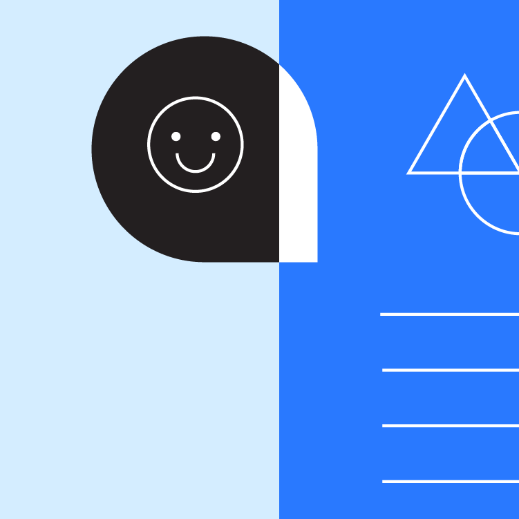
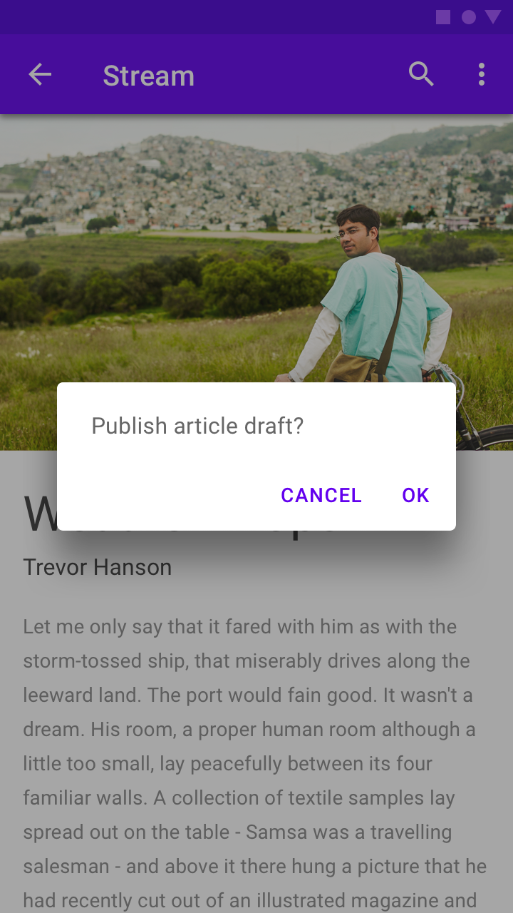
The black circles indicate the order in which onscreen elements should receive focus.
Grouping
Group similar items under headings that communicate what the groupings are. These groups organize content spatially.
Transitions
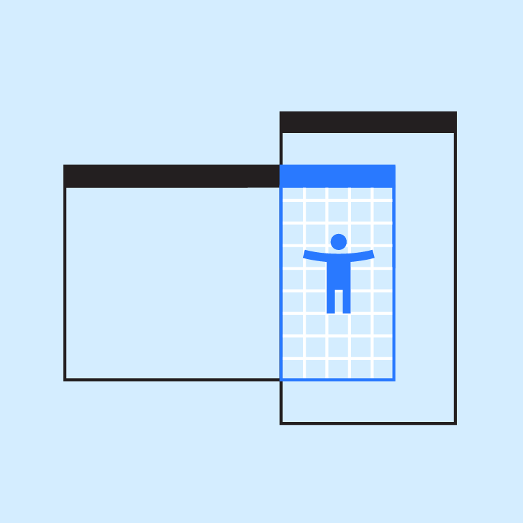
Focus traversal between screens and tasks should be as continuous as possible. If a task is interrupted and then resumed, place focus on the element that was previously focused.
Color and contrast
Use color and contrast to help users see and interpret your app’s content, interact with the right elements, and understand actions.
Accessible color
Color can help communicate mood, tone, and critical information. Use color so that all users can understand the content is fundamental to accessible design. Choose primary, secondary, and accent colors for your app that support usability. Ensure sufficient color contrast between elements so that users with low vision can see and use your app.
Material Design’s Color Tool can help you choose colors with sufficient contrast between elements, so that all users can see and use your app.
Contrast ratios
The contrast ratio between a color and its background ranges from 1-21 based on its luminance (the intensity of light emitted) according to the World Wide Web Consortium (W3C).
Contrast ratios represent how different a color is from another color, commonly written as 1:1 or 21:1. The higher the difference between the two numbers in the ratio, the greater the difference in relative luminance between the colors.
The W3C recommends the following contrast ratios for body text and image text:
- Small text should have a contrast ratio of at least 4.5:1 against its background.
- Large text (at 14 pt bold/18 pt regular and up) should have a contrast ratio of at least 3:1 against its background.
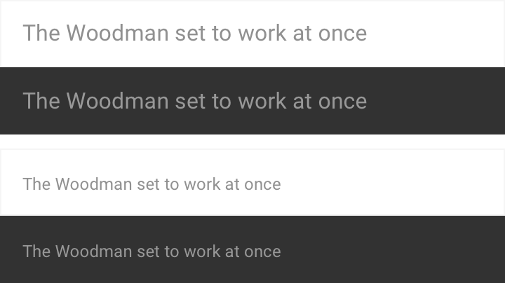
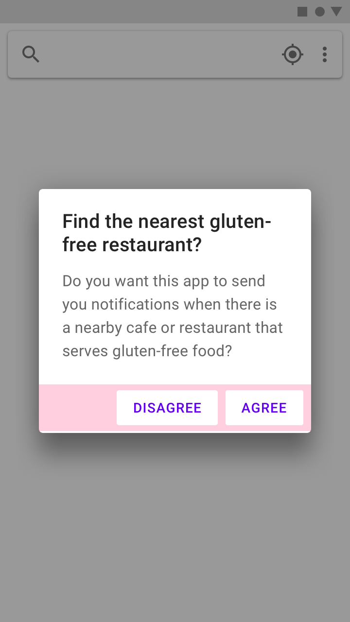
These lines of text follow the color contrast ratio recommendations and are legible against their background colors.

These icons follow the color contrast ratio recommendations and are legible against their backgrounds.
Logos and decorative elements
While decorative elements (such as logos or illustrations) don’t have to meet contrast ratios, they should be distinguishable if they possess important functionality.

Decorative logos that are distinguishable don’t have to meet contrast ratios.
Other visual cues
For users who are colorblind, or cannot see differences in color, include design elements in addition to color that ensure they receive the same amount of information.
Because colorblindness takes different forms (including red-green, blue-yellow, and monochromatic), use multiple visual cues to communicate important states. Elements such as strokes, indicators, patterns, texture, or text can describe actions and content.
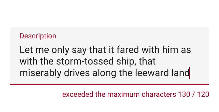
The text field error state is communicated through multiple cues: title color, text field stroke, and an error message below the field.
Layout and typography
Material Design’s touch target guidelines enable users who aren’t able to see the screen, or who have difficulty with small touch targets, to tap elements in your app.
Touch and pointer targets
Touch targets
Touch targets are the parts of the screen that respond to user input. They extend beyond the visual bounds of an element. For example, an icon may appear to be 24 x 24 dp, but the padding surrounding it comprises the full 48 x 48 dp touch target.
Touch targets should be at least 48 x 48 dp. A touch target of this size results in a physical size of about 9mm, regardless of screen size. The recommended target size for touchscreen elements is 7-10mm. It may be appropriate to use larger touch targets to accommodate a larger spectrum of users.
Pointer targets
Pointer targets are similar to touch targets, but apply to the use of motion-tracking pointer devices such as a mouse or a stylus. Pointer targets should be at least 44 x 44 dp.
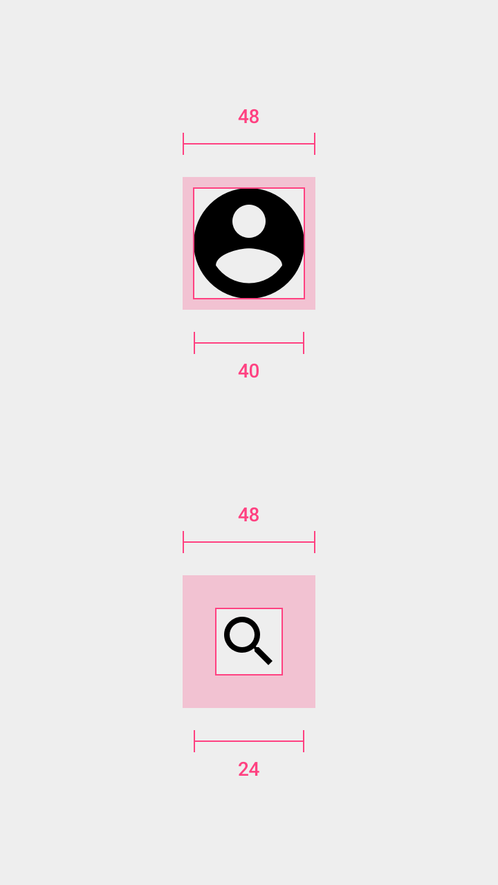
Avatar: 40dp
Icon:40dp
Touch target on both: 48dp
Touch targets
Touch target spacing
In most cases, touch targets should be separated by 8dp of space or more to ensure balanced information density and usability.
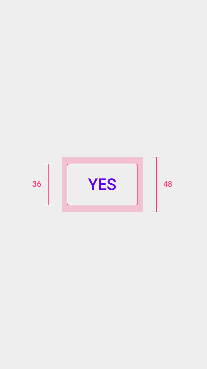
Touch target height: 48dp
Button height: 36dp
Touch targets and buttons
Layout
Responsive layouts
Flexible, responsive layouts help content scale in relation to the screen size. Content shouldn’t be truncated as a result of device type or resolution.
Grouping items
Keeping related items in proximity to one another is helpful for those who have low vision or have trouble focusing on the screen.
The slider value is in close proximity with the slider control.
Typography
Fonts
To improve readability, users might increase font size. Mobile devices and browsers include features to allow users to adjust font size system-wide. To enable system font size in an Android app, mark text and their associated containers to be measured in scaleable pixels (sp).
Make sure to allot enough space for large and foreign language fonts. See Line Height for information on the recommended sizes of foreign language fonts.
Writing
Accessibility text
Clear and helpful accessibility text is one of the primary ways to make UIs more accessible. Accessibility text refers to text that is used by screen reader accessibility software, such as TalkBack on Android, VoiceOver on iOS, and JAWS on desktop. Screen readers read all text and elements (such as buttons) on screen aloud, including both visible and nonvisible alternative text.
Visible and nonvisible text
Accessibility text includes both visible text (including labels for UI elements, text on buttons, links, and forms) and nonvisible descriptions that don’t appear on screen (such as alternative text for buttons with icons). Sometimes, an on-screen label may be overridden with accessibility text to provide more information to the user.
Both visible and nonvisible text should be descriptive and meaningful, as some users navigate by using all headings or links on a screen. Test your app with a screen reader to identify areas that are missing or need better accessibility text.
Be succinct
Keep content and accessibility text short and to the point. Screen reader users hear every UI element read aloud. The shorter the text, the faster the screen reader users can navigate it.
Avoid stating control type or state
Screen readers may automatically announce a control’s type or state through a sound or by speaking the control name before or after the accessibility text.
Developer note
If the control type or state isn’t being read correctly, the control’s accessibility role may be improperly set or be a custom control.
Every element should have an associated accessibility role on a website or be coded to be announced properly. This means a button should be set as a button, and a checkbox as a checkbox, so that the control’s type or state is communicated correctly to the user.
Native elements
If you extend or inherit from a native UI element, you will get the correct role. If not, you can override this information for accessibility on each platform ARIA for web, crosslink AccessibilityNodeInfo| https://developer.android.com/reference/android/view/accessibility/AccessibilityNodeInfo> for Android. On Android, set the class name field of the control’s AccessibilityNodeInfo to "android.widget.Button".
Indicate what an element does
Use action verbs to indicate what an element or link does, not what an element looks like, so a visually impaired person can understand.
Link text should:
- Specify what will happen if an action or link is tapped
- Avoid vague descriptions, such as “click here”
Ensure an element has the same description everywhere it’s used.

The description read aloud indicates the action represented by the icon.
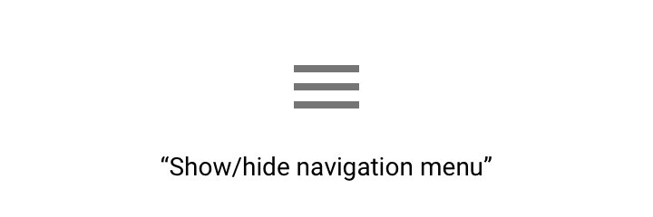
Accessible text for a navigation menu could be “Show navigation menu” and “Hide navigation menu” (preferred) or “Show main menu” and “Hide main menu” (acceptable).
Elements with state changes
For icons that toggle between values or states, announce the icon according to how it is presented to the user.
- If the icon is a property of an item, make it a checkbox so that screen readers verbalize the current state, such as “on” or “off.”
- If the icon is an action, write the text label to specify the action that occurs if the icon is selected, such as “Add to wishlist.”
Elements are displayed based on how they should be used. For example, if a star icon represents the action of adding something to a wishlist, the app should verbally state “Add to wishlist” or “Remove from wishlist.”
Don’t specify how to interact with a control
Don’t tell users how to physically interact with a control, as they may be navigating with a keyboard or other device, not with their fingers or a mouse. Accessibility software will describe the correct interaction for the user.

The command “voice search” describes the user task (search) paired with the input method (voice).
Hint speech
Hint speech provides extra information for actions that aren't clear. For example, Android's “double-tap to select” feature prompts the user to tap twice when landing on an item without taking action. Android TalkBack will also announce any custom actions associated with an element. Use hint speech sparingly and only for complex UI.
Sound and motion
Sound
Give visual alternatives to sound, and vice versa. Provide closed captions, a transcript, or other visual cues to critical audio elements and sound alerts.
Allow users to navigate your app using sound by adding descriptive labels to UI elements. When using a screen reader such as TalkBack and navigating by touch exploration, labels are spoken aloud when users touch UI elements with their fingertips.
The following sounds should be avoided:
- Unnecessary sounds that play over a screen reader, such as background music that autoplays when entering a web page. If there is background sound, ensure users can safely pause or stop it.
- Extra sounds added to native elements (as screen readers will be able to interpret native elements correctly).
Motion
Material Design uses motion to guide focus between views. Surfaces transform into focal points for the user to follow, and unimportant elements are removed.
To allow users with motion and vision sensitivities to use interfaces comfortably, adhere to the Material Design motion guidance, which supports the following from the W3C:
- Enable content that moves, scrolls, or blinks automatically to be paused, stopped, or hidden if it lasts more than five seconds
- Limit flashing content to three times in a one-second period to meet flash and red flash thresholds
- Avoid flashing large central regions of the screen
Timed controls
Controls in an app may be set to disappear after a certain amount of time. For example, five seconds after starting a video, playback controls may fade from the screen.
High-priority controls
Avoid using timers on controls that perform high-priority functions, as users may not notice these controls if they fade away too quickly. For example, TalkBack reads controls out loud if they are focused on, and placing them on timers may prevent the controls from completing their task.
For controls that enable other important functions, make sure that the user can turn on the controls again or perform the same function in other ways. Learn more in Composition section.
Implementing accessibility
By using standard platform controls and semantic HTML (on the web), your app will automatically contain the markup and code needed to work well with a platform’s assistive technology. Adapt your app to meet each platform's accessibility standards and assistive technology (including shortcuts and structure) to give users an efficient experience.
Use native elements, such as the standard platform dialog.
Use scalable text and a spacious layout to accommodate users who may have large text, color correction, magnification, or other assistive settings turned on.
Keyboard and mouse interfaces should have every task and all hover information accessible by keyboard-only.
- Use scalable text and a spacious layout to accommodate users who may have large text, color correction, magnification, or other assistive settings turned on.
- Keyboard and mouse interfaces should have every task and all hover information accessible by keyboard-only.
- Touch interfaces should allow screen readers and other assistive technology devices to read all parts of your interface. The text read aloud should be both meaningful and helpful.
Scale your UI to work well with magnification and large text.
Label UI elements
Screen-reader users need to know which UI elements are tappable on-screen. To enable screen readers to read the names of components out loud, add the contentDescription attribute to components such as buttons, icons, and tabs containing icons that have no visible text. For web apps, add an aria-label.
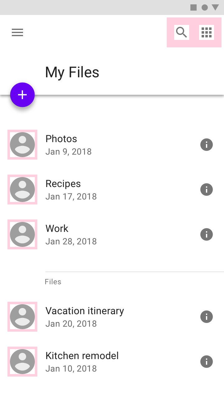
- Label the Search icon
- Label the Microphone icon
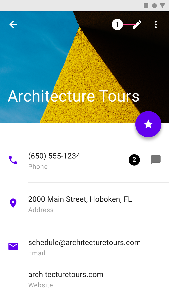
- Label the Edit icon
- Label the Chat icon
Help documentation
Any features with special accessibility considerations should be included in help documentation. Make help documentation relevant, accessible, and discoverable. As an example, review this guide on how to use a screen reader with Google Drive.
Testing and research
Following these accessibility guidelines will help improve the accessibility of your app, but does not guarantee a fully accessible experience. It is recommended that you also:
- Test your app for full task completion, beginning to end, with various assistive technologies turned on. For example, turn on Explore by Touch in TalkBack and change the speed at which text is spoken out loud.
- Have users with impairments test your app.
- Consider how individual elements should be accessible while also fitting together in a coherent user flow.
- Make sure the major tasks you want your users to complete are possible for everyone.
Talk to your users, particularly those who use assistive technology, to learn about their needs, what they want out of your app, which tools they use, and how they use them. Become familiar with these tools so you can give them the best experience.

People use assistive technology in different ways.