almoamen.net
Menus
Menus display a list of choices on temporary surfaces.
Usage
A menu displays a list of choices on a temporary surface. They appear when users interact with a button, action, or other control.
Principles
Nimble
Menus should be easy to open, close, and interact with.
Contextual
Menu content should be suited to user needs.
Scannable
Menu items should be easy to scan.
Types
Menus allow users make a selection from multiple options. They are less prominent and take up less space than selection controls, such as a set of radio buttons.
Dropdown menus
Dropdown menus display a list of options, triggered by an icon, button, or action. Their placement varies based on the element that opens them.
Exposed dropdown menus
Exposed dropdown menus display the currently selected menu item above the list of options. Some variations can accept user-entered input.
Placement
Elevation
Menus appear in front of all other permanent UI elements.
Menus appear at a higher elevation than all other permanent UI elements.
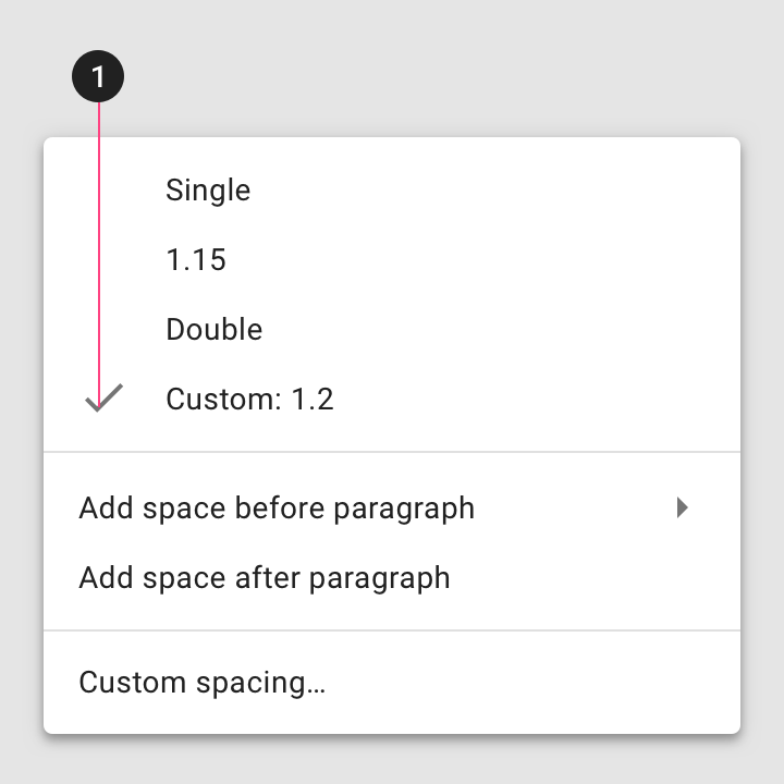
Height
The maximum height of a menu should be at least one row less than the height of the app’s UI.
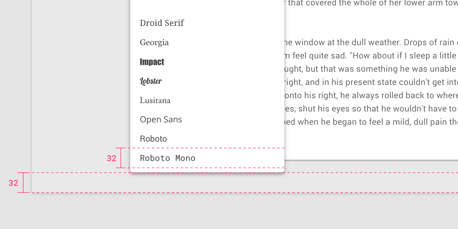
The rows in this menu are 32dp tall. That’s also the space used between the menu and the bottom of the screen.
Position
Menus should be positioned relative to the edge of the screen or browser. They typically appear next to (or in front of) the element that generates them. If they are in a position to be cut off by the browser or screen’s edge, the menu can instead appear to the left, right, or above the element that generates it.
Menus can change their position to avoid being truncated by the screen or browser’s edge.
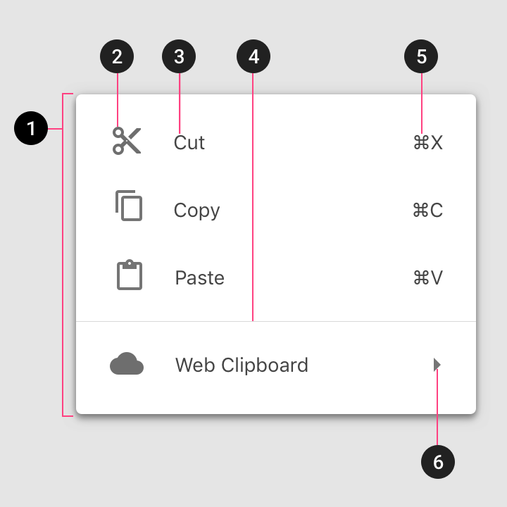
Anatomy
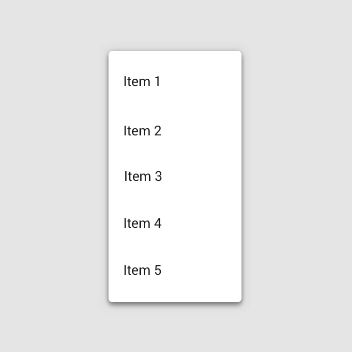
Menus display lists of related options (which can be grouped together) as well as unrelated options. Menus appear when a user taps an interactive UI element such as an icon, button, action, or content, such as selected items or text.
Text list
- Container
- Text
- Divider
Text and icon list
- Container
- Leading icon
- Text
- Divider
Text, icon, and keyboard command list
- Container
- Leading icon
- Text
- Divider
- Command
- Cascading menu indicator
Text with selection state list
- Selection state
Actions
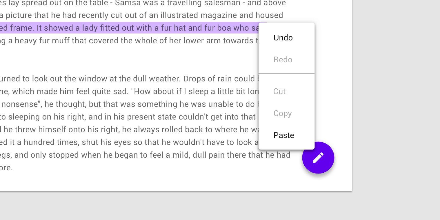
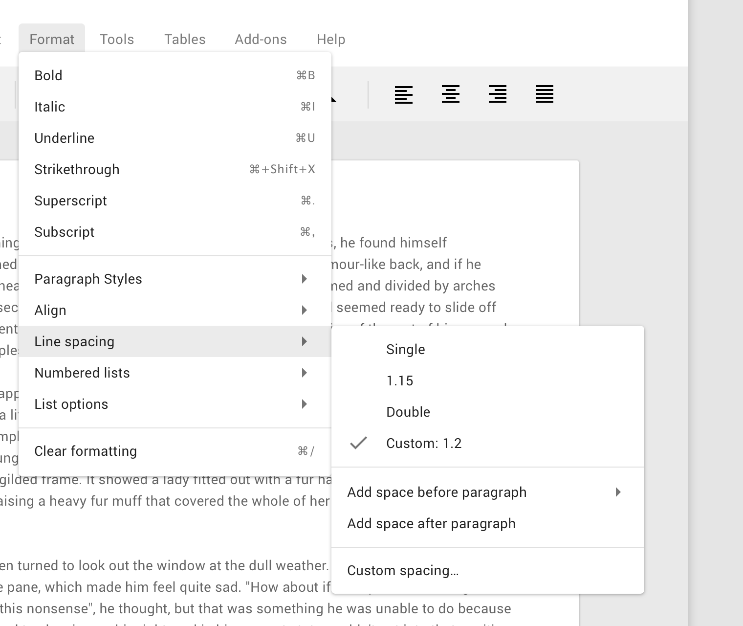
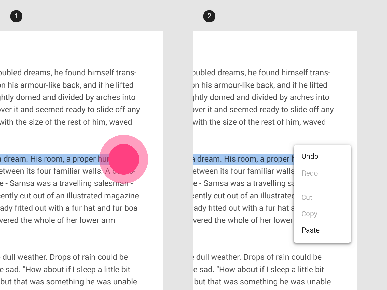
Disabled actions
Display actions as disabled when they can only be used sometimes, under certain conditions. They should be displayed as disabled rather than removing them.
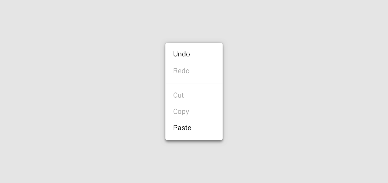
The Redo action is disabled when that action isn’t available, and the Cut and Copy actions are disabled until content is selected.
Behavior
Scrolling
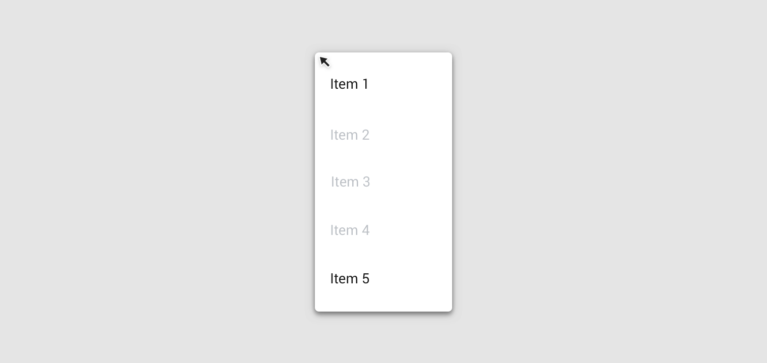
If not all menu items are displayed at once, menus can be scrollable. In this state, menus show a persistent scrollbar.
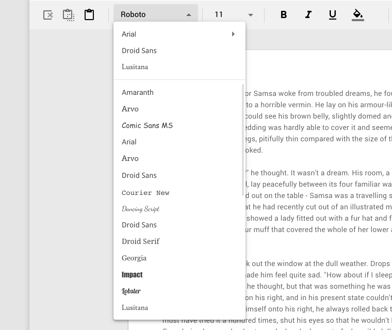
When its content is scrollable, menus display scrollbars.
Motion
Menus open using a scale animation (an animation that shows an element grow in size). The animation creates a relationship between the menu and the action that generates the menu.
Position
A menu’s position on screen affects where and how it will appear. If opened at the top of the screen, it will expand downwards (to avoid being cropped).
By default, menus open with an entrance animation. However, on desktop, menus can skip the animation and open instantly instead.
Dropdown menu
Usage
A dropdown menu is a compact way of displaying multiple choices. It appears upon interaction with an element (such as an icon or button) or when users perform a specific action.
Placement
Dropdown menus are positioned relative to both the element that generates them and the edges of the screen or browser. They can appear in front of, beside, above, or below the element that generates them.
Default placement
A dropdown menu is typically positioned below the element that generates it.
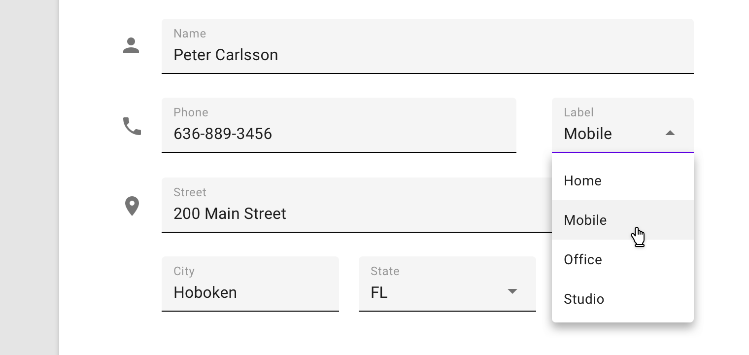
A dropdown menu triggered by an icon on mobile.
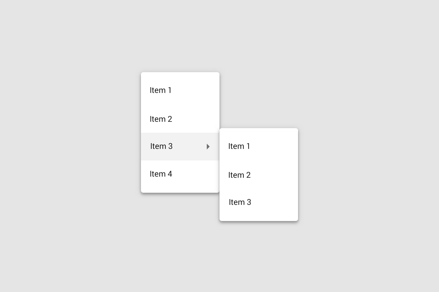
Cascading menu (Desktop only)
Cascading menus allow users to choose from a large variety of choices, by displaying menus with multiple levels of hierarchy.
They are organized into menus of parent list items that contain child list items. Child list items appear to right or left of parent list items, depending on where there is room to expand child list items.
A parent list item can trigger a cascading menus containing child actions.
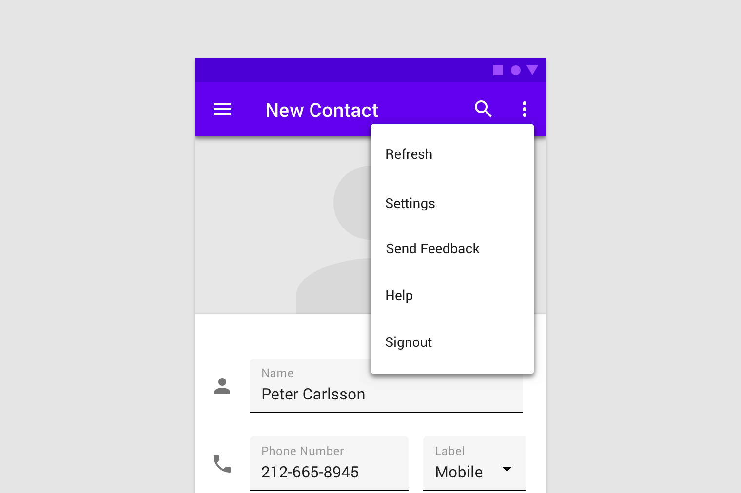
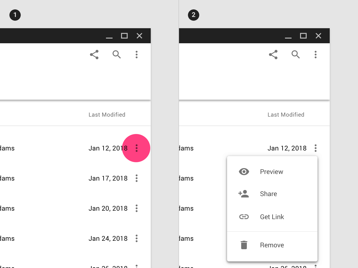
Contextual menu
Contextual menus aren’t triggered by a consistent UI element. They appear next to where a user taps, and their actions can vary based on the tap target.
To reveal a contextual menu, tap and hold, or right click (desktop), selected text.
A contextual menu appears next to selected text.
Behavior
When an option is chosen from a dropdown menu, the element that generates it remains the same.
- Tapping the icon triggers a dropdown menu.
- Choosing a menu option doesn’t change the icon of the element generating the menu.
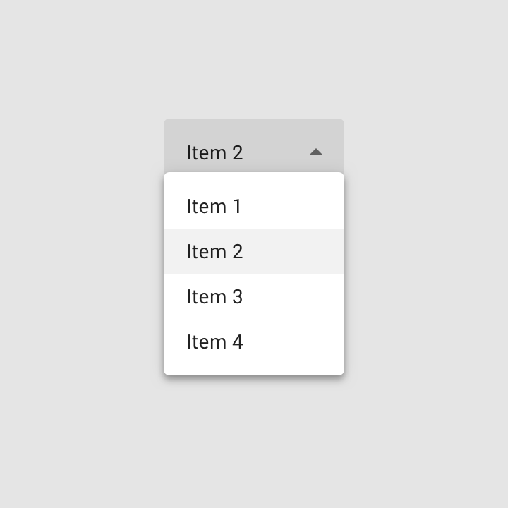
Exposed dropdown menu
Usage
Exposed dropdown menus display the currently selected menu item above the menu.
They can only be used when a single menu item can be chosen at a time.
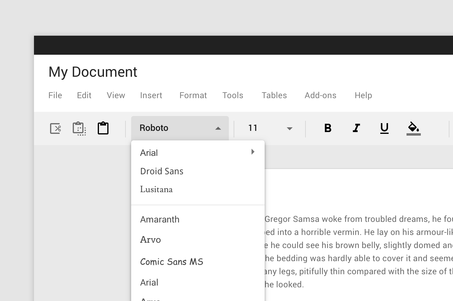
This exposed dropdown menu displays the currently selected font above the menu.
Behavior
Upon selecting an item, an exposed dropdown menu updates to display that item. In some cases, it can accept user input and display a value (whether or not it’s listed as a menu choice).
Placement
An exposed dropdown menu is positioned below the element that generates the dropdown. On mobile, it can appear in front of the element generating the dropdown.
Variations
An exposed dropdown menu can be customized to have a different appearance or behavior.
Text field dropdown menu
Text field dropdown menus look like text fields and display the currently selected item above the menu.
On desktop, a text field dropdown menu appears below the element triggering the dropdown. On mobile, a text field dropdown menu can open a native picker.
On desktop, a text field dropdown menu appears below the currently selected menu item.
Editable dropdown menu
An editable dropdown menu displays the currently selected menu item above the menu. It can accept a user-entered value not listed in the menu, but may accept only certain types of values, such as only positive numbers.
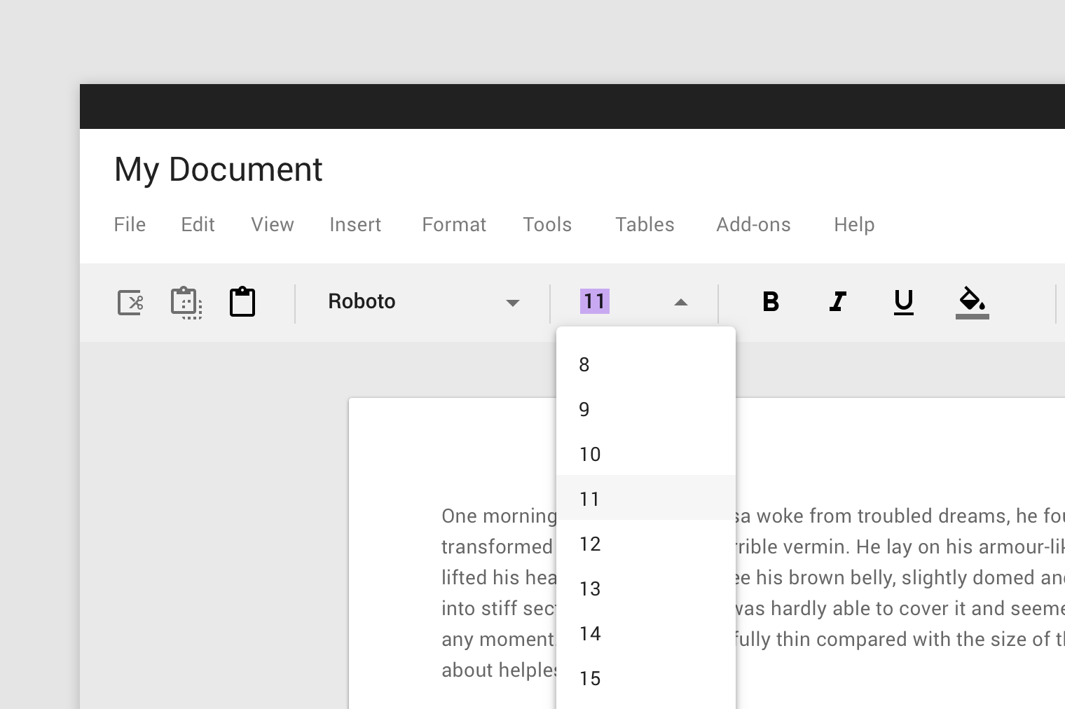
This editable dropdown menu displays the currently selected font size. A user can also enter a value not listed in the menu, such as seven.
Implementation
Related components:
Javascript methods:
| void MDC.menuCloseAll() | ||
|---|---|---|
| A method to close all active menus. | ||
| void MDC.menuClose(container) | ||
| A method to close a specific menu. | ||
| container | String | jQuery | Element | The menu container. can be either a css selector string or a jQuery object or an element. |
Dropdown menu
<div class="mdc-menu-container">
    <button class="menu-button ...">Menu</button>
    <div class="menu-container">
        <div class="mdc-list-container">
            <div class="mdc-list-group">
                <button class="mdc-list-item"><div class="text">Item 1</div></button>
                .
                .
                .
            </div>
            .
            .
            .
        </div>
        .
        .
        .
    </div>
    <div class="menu-scrim" tabindex="-1"></div>
</div>
Exposed dropdown menu
Default menu
<div class="mdc-menu-container select-menu">
    <button class="menu-button mdc-text-field lime-800">
        <div class="icon material-icon trailing">arrow_drop_down</div>
        <div class="input"><div class="input-element"></div></div>
        <label class="label">Select menu</label>
        <input type="hidden" class="select-value" name="select_menu_1">
    </button>
    <div class="menu-container">
        <div class="mdc-list-container">
            <div class="mdc-list-group">
                <button class="mdc-list-item" data-value="val_1" data-label="item_1">
                    <div class="text">Item 1</div>
                </button>
                .
                .
                .
            </div>
            .
            .
            .
        </div>
        .
        .
        .
    </div>
    <div class="menu-scrim" tabindex="-1"></div>
</div>
Searchable menu
<div class="mdc-menu-container select-menu">
    <div class="menu-button mdc-searchable mdc-text-field lime-800">
        <div class="icon material-icon trailing">arrow_drop_down</div>
        <div class="input"><input class="input-element"></div>
        <label class="label">Select menu</label>
        <input type="hidden" class="select-value" name="select_menu_2">
    </div>
    <div class="menu-container">
        <div class="mdc-list-container">
            <div class="mdc-list-group">
                .
                .
                .
                <div class="mdc-list-item mdc-error-message">
                    <div class="text text-hint">Can't find any item!</div>
                </div>
            </div>
            .
            .
            .
        </div>
        .
        .
        .
    </div>
    <div class="menu-scrim" tabindex="-1"></div>
</div>