almoamen.net
Progress indicators
Progress indicators express an unspecified wait time or display the length of a process.
Usage
Progress indicators inform users about the status of ongoing processes, such as loading an app, submitting a form, or saving updates. They communicate an app’s state and indicate available actions, such as whether users can navigate away from the current screen.
Progress as a group
When displaying progress for a sequence of processes, indicate overall progress rather than the progress of each activity.
Principles

Informative
Progress indicators look and animate in ways that reflect the status of a process. They are never simply decorative.
Animated
Progress indicators use animation to capture attention and inform users of an activity’s progress.
Consistent
Progress indicators should be applied to all instances of a process (such as loading) in a consistent format (linear or circular).
Types
Linear and circular
Material Design offers two visually distinct types of progress indicators: linear and circular progress indicators. Only one type should represent each kind of activity in an app. For example, if a refresh action displays a circular indicator on one screen, that same action shouldn’t use a linear indicator elsewhere in the app.
Determinate and indeterminate
Progress indicators may be determinate or indeterminate:
Determinate indicators
Determinate indicators display how long a process will take. They should be used when the process completion rate can be detected.
Indeterminate indicators
Indeterminate indicators express an unspecified amount of wait time. They should be used when progress isn’t detectable, or if it’s not necessary to indicate how long an activity will take.
As more information about a process becomes available, a progress indicator can switch from an indeterminate to a determinate state.
Linear progress indicators
Anatomy
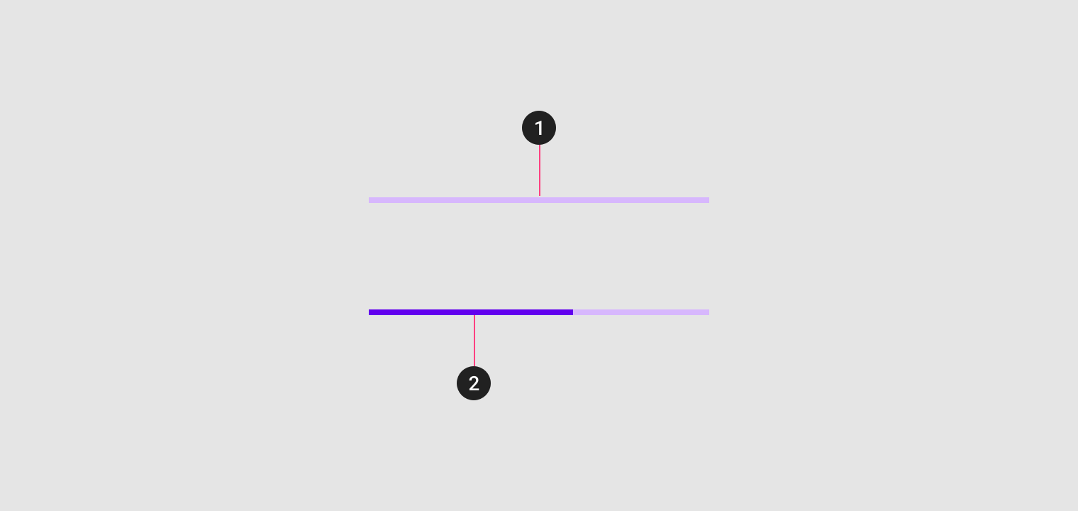
Linear progress indicators are composed of two required elements:
1. Track
The track is a fixed width rule, with set boundaries for the indicator to travel along.
2. Indicator
The indicator animates along the length of the track.
Behavior
Linear progress indicators display progress by animating an indicator along the length of a fixed, visible track. The behavior of the indicator is dependent on whether the progress of a process is known.
Types
Linear progress indicators support both determinate and indeterminate operations.
- Determinate operations display the indicator increasing in width from 0 to 100% of the track, in sync with the process’s progress.
- Indeterminate operations display the indicator continually growing and shrinking along the track until the process is complete.
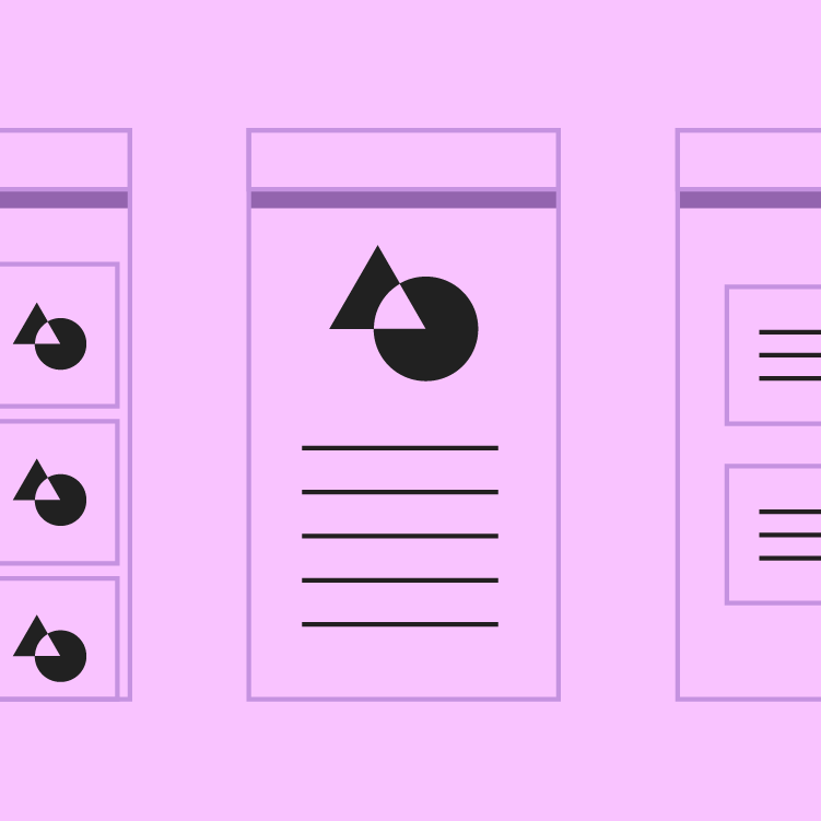
Placement
The placement of a linear progress indicator can indicate the scope of a process. For example:
- A linear indicator at the center of the screen can indicate loading all screen content
- A linear indicator attached to a container, such as a card, can indicate the process applies to that particular item (and that interaction with the rest of the UI is possible)
- Expanding items can place a linear indicator along their expanding edge to draw user attention to where new content will appear
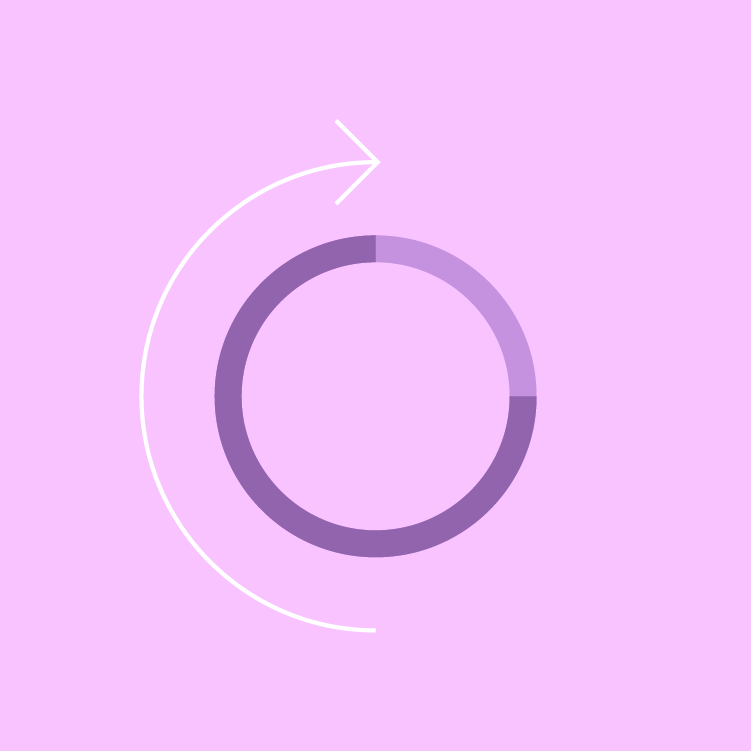
Circular progress indicators
Behavior
Circular progress indicators display progress by animating an indicator along an invisible circular track in a clockwise direction. They can be applied directly to a surface, such as a button or card.
On Android, the “swipe to refresh” gesture displays a circular progress indicator to indicate that the UI is being refreshed.
Types
Circular progress indicators support both determinate and indeterminate processes.
- Determinate circular indicators fill the invisible, circular track with color, as the indicator moves from 0 to 360 degrees.
- Indeterminate circular indicators grow and shrink in size while moving along the invisible track.
Placement
Circular progress indicators are positioned to indicate the process that they represent.
- When centered on the screen, they indicate the initial loading of screen content.
- When placed above or below existing content, they draw attention to where new content will appear.
Integrating with actions
A circular indicator can be integrated into a button or actionable icon to express a connection between an interaction and a specific item. They are typically used to express when an interaction, such as clicking a button again, isn’t available.
They should be used for short, indeterminate activities (between 2-5 seconds). Longer activities may require alternate methods of communication, such as snackbars or notifications.
Implementation
Linear progress indicators
Determinate
Indeterminate
Buffer
<div class="mdc-progress-track lime-800">
    <div class="indicator determinate" style="width: 70%;"></div>
</div>


<div class="mdc-progress-track lime-800">
    <div class="indicator indeterminate"></div>
</div>


<div class="mdc-progress-track buffer lime-800">
    <div class="buffered" style="width: 70%;"></div>
    <div class="buffer-indicator" style="width: 30%;"></div>
    <div class="indicator" style="width: 50%;"></div>
</div>
Circular progress indicators
Regular
Mini
<div class="mdc-progress-wrapper active lime-800">
    <div class="spinner">
        <div class="circle-clipper">
            <div class="circle"></div>
        </div>
        <div class="gap-patch">
            <div class="circle"></div>
        </div>
        <div class="circle-clipper">
            <div class="circle"></div>
        </div>
    </div>
</div>


<div class="mdc-progress-wrapper mini active lime-800">
    <div class="spinner">
        <div class="circle-clipper">
            <div class="circle"></div>
        </div>
        <div class="gap-patch">
            <div class="circle"></div>
        </div>
        <div class="circle-clipper">
            <div class="circle"></div>
        </div>
    </div>
</div>