almoamen.net
Date pickers
Date pickers let users select a date, or a range of dates.
Usage
Date pickers let users select a date or range of dates. They should be suitable for the context in which they appear.
Date pickers can be embedded into:
- Dialogs on mobile
- Text field dropdowns on desktop
Principles
Relevant
Date pickers can display past, present, or future dates – as relevant to the task.
Clear
Clearly indicate important dates, such as current and selected days.
Intuitive
To ensure picking a day or time is intuitive, use common picker patterns, such as a calendar.
Anatomy
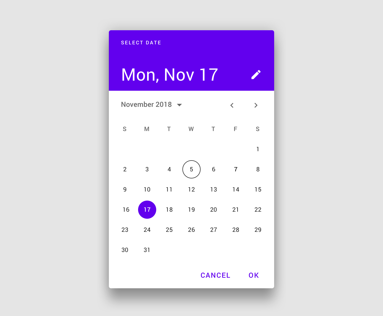
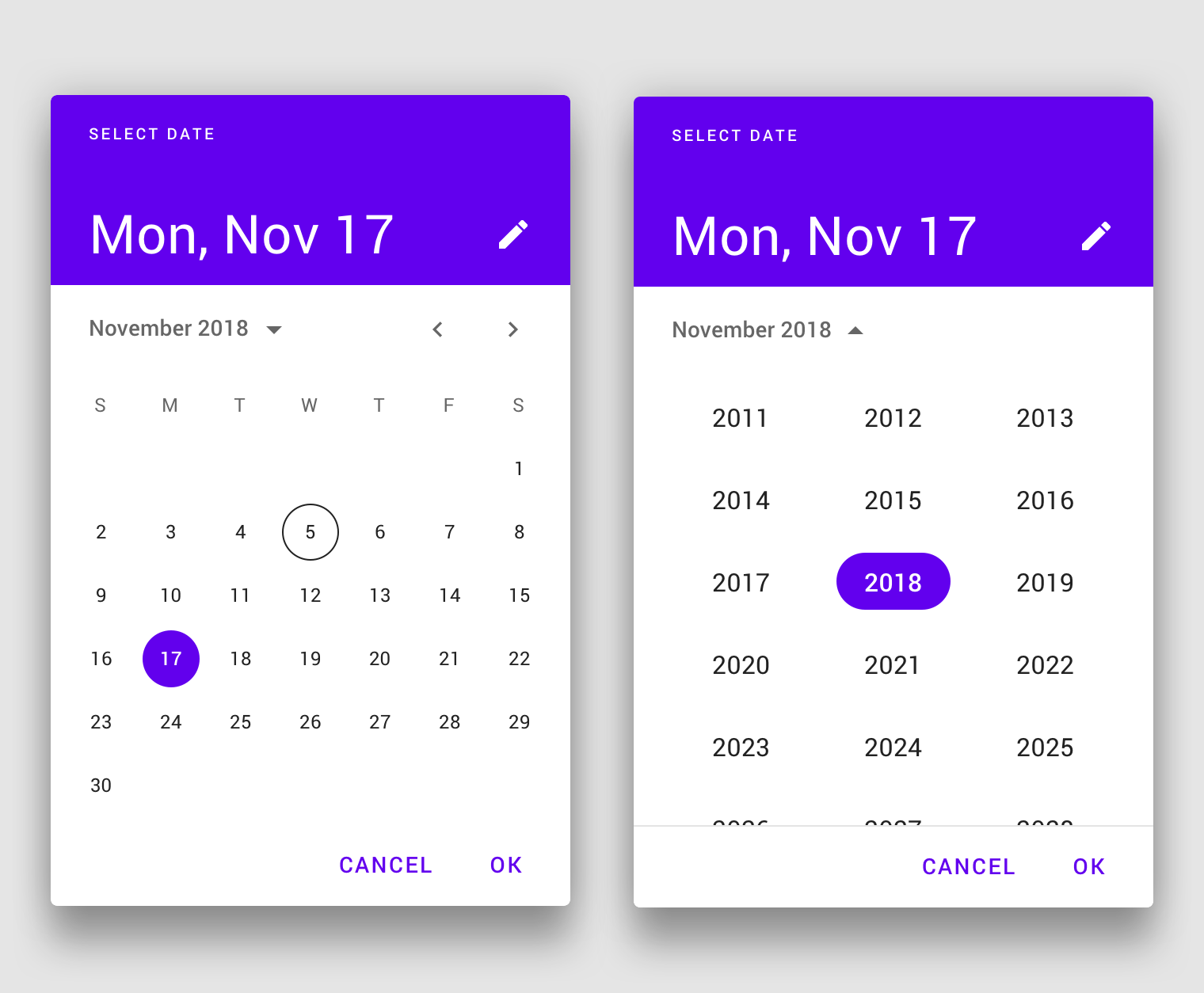
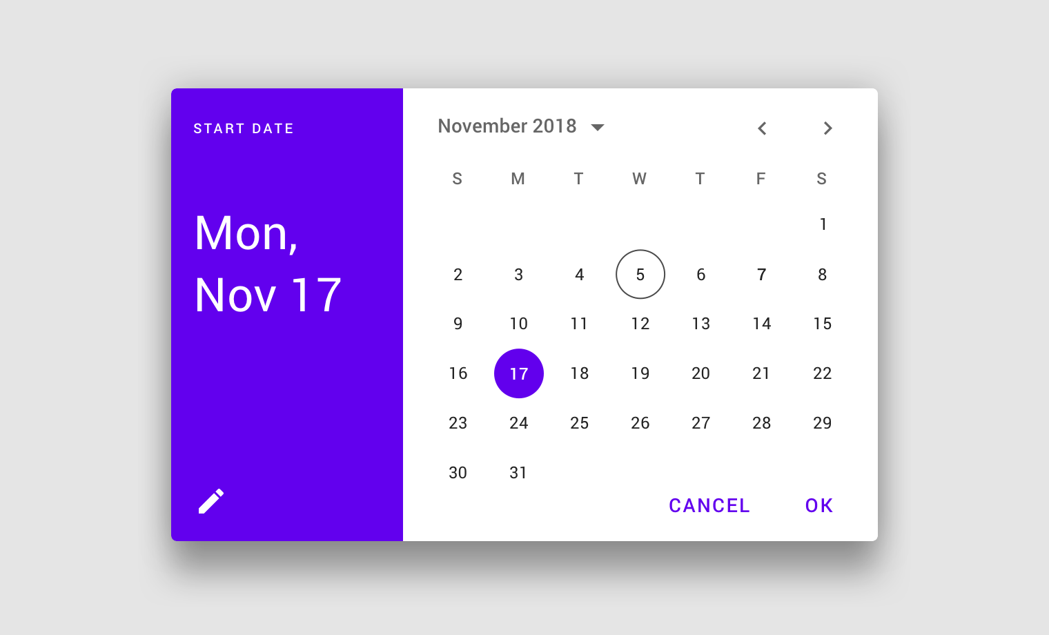
Mobile calendar date picker
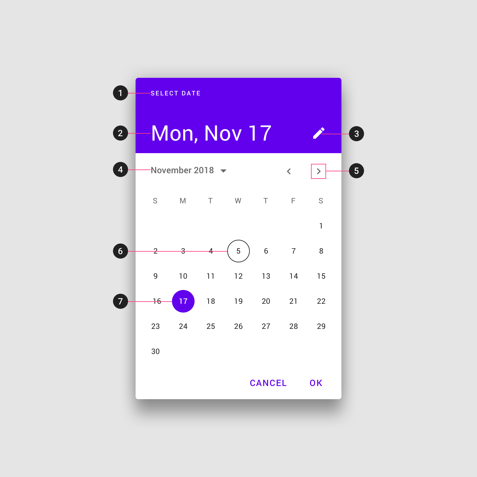
- Title
- Selected date
- Switch-to-keyboard input icon
- Year selection menu
- Month pagination
- Current date
- Selected date
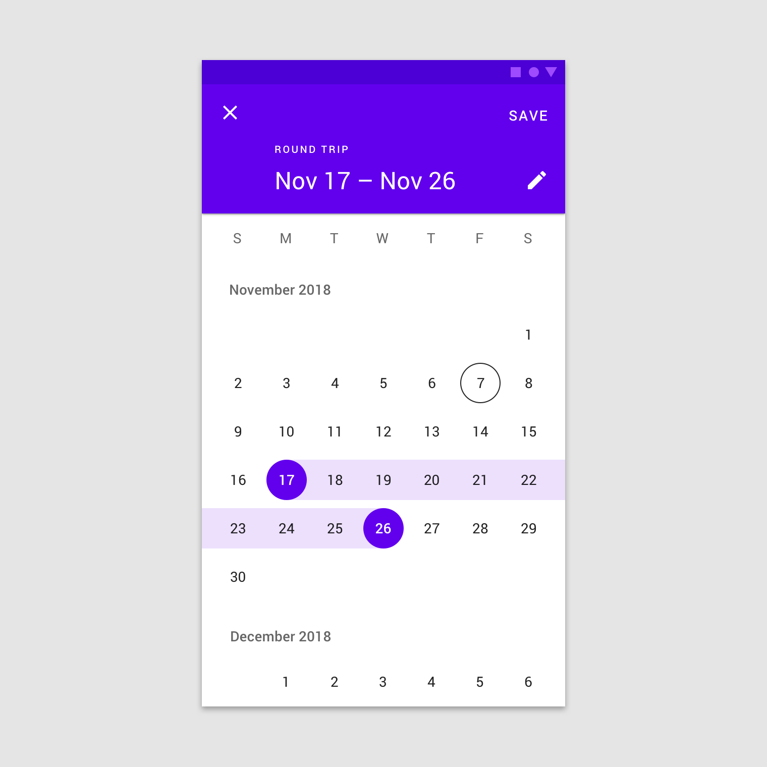
Mobile date range picker
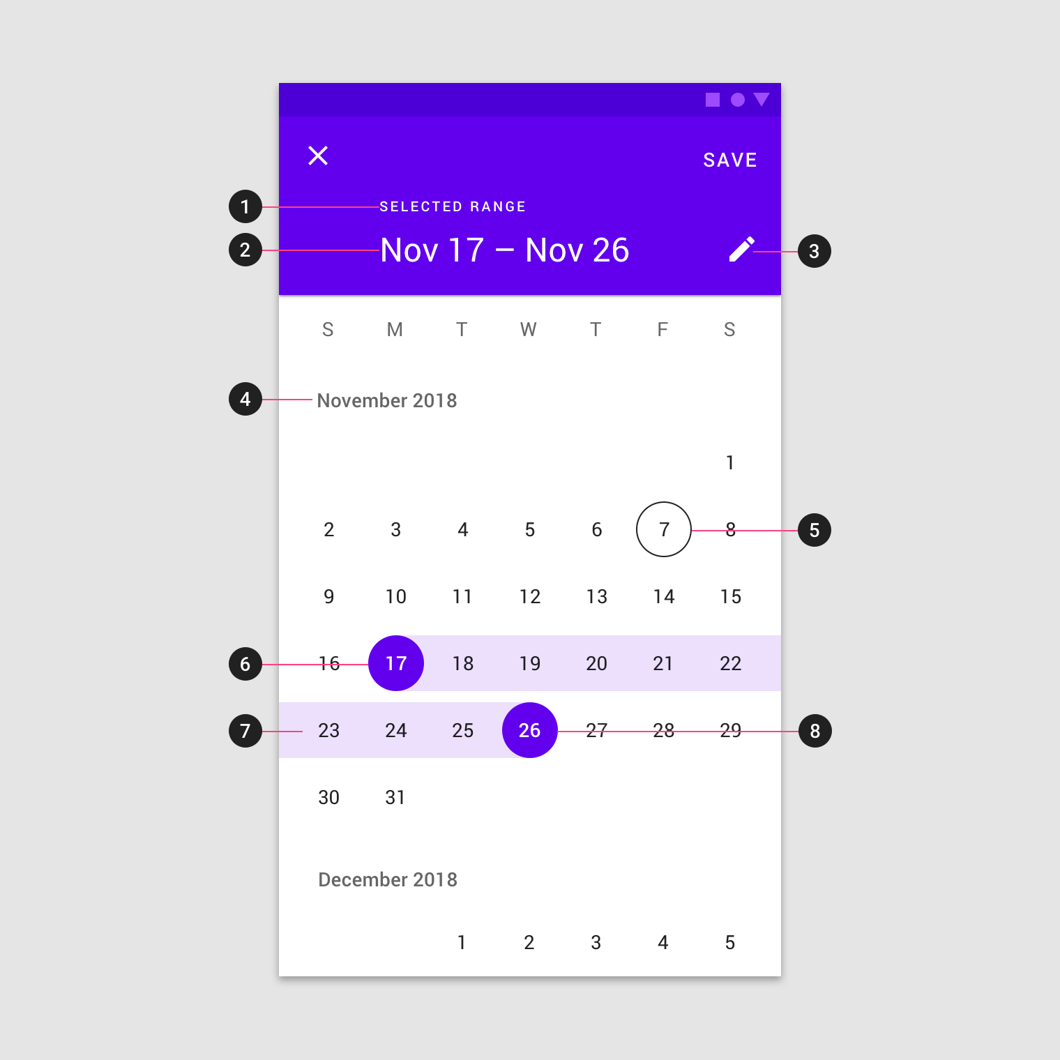
- Title
- Selected date
- Switch-to-keyboard input icon
- Month and year label
- Current date
- Start date
- Selected range
- End date
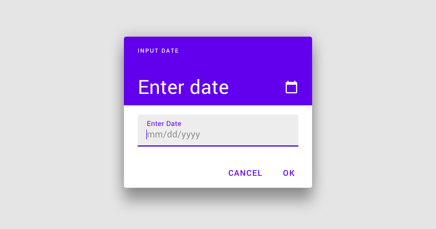
Mobile input picker
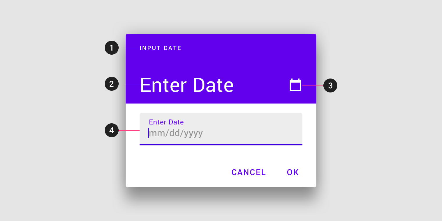
- Title
- Selected date
- Switch-to-calendar view icon
- Text field
Desktop date picker
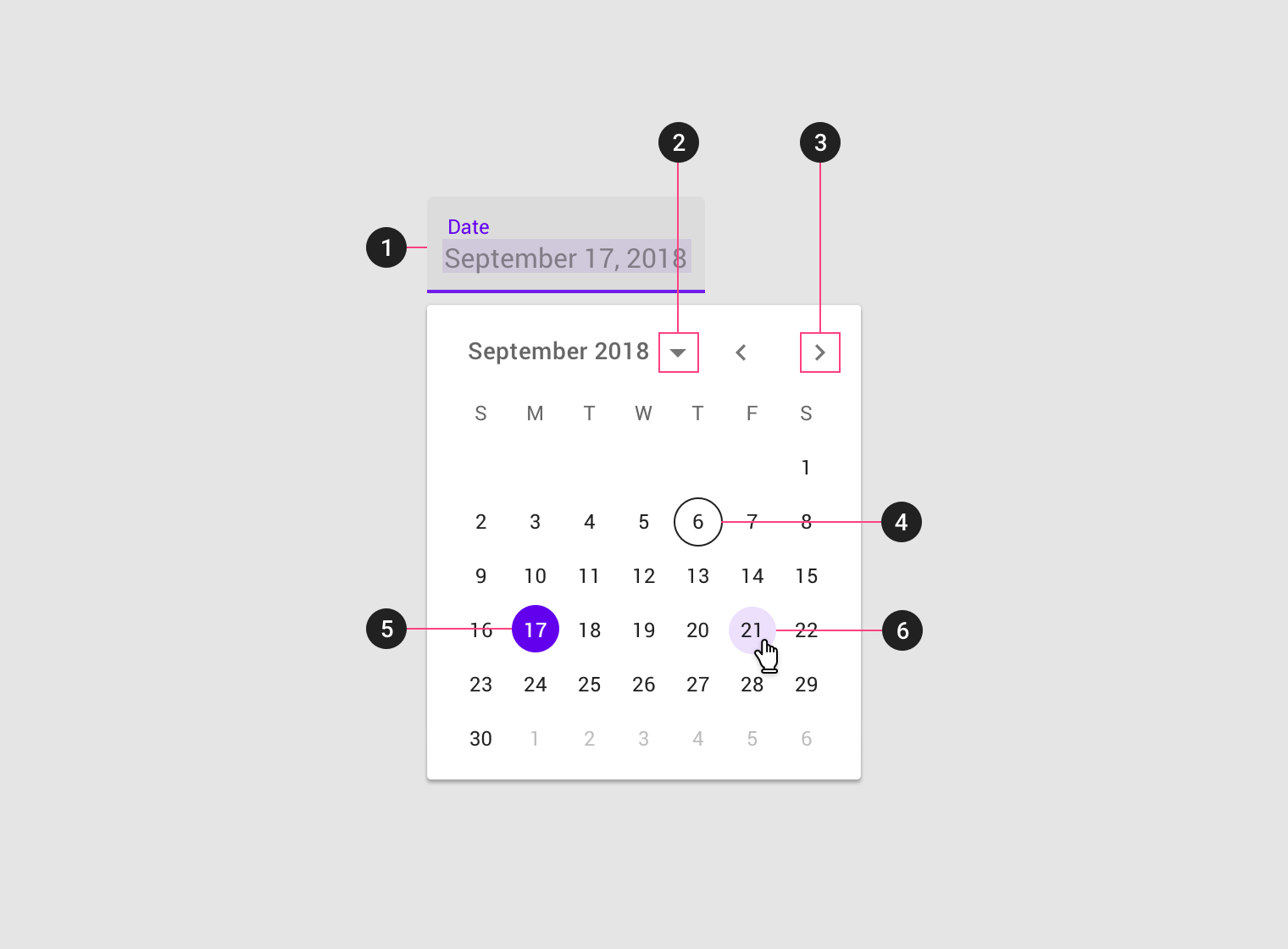
- Text field
- Year and month selection
- Month pagination
- Today’s date
- Selected day
- Hover state
Mobile pickers
Mobile calendar pickers
Usage
Mobile calendar pickers can be used to select dates in the near future or past, when it’s useful to see them in a calendar month format. They are displayed in a dialog.
Common use cases include:
- Making a restaurant reservation
- Scheduling a meeting
They aren’t ideal for selecting dates in the distant past or future that require more navigation, such as entering a birth date or expiration date.
Mobile calendar pickers allow selection of a single date and year.
Mobile calendar picker
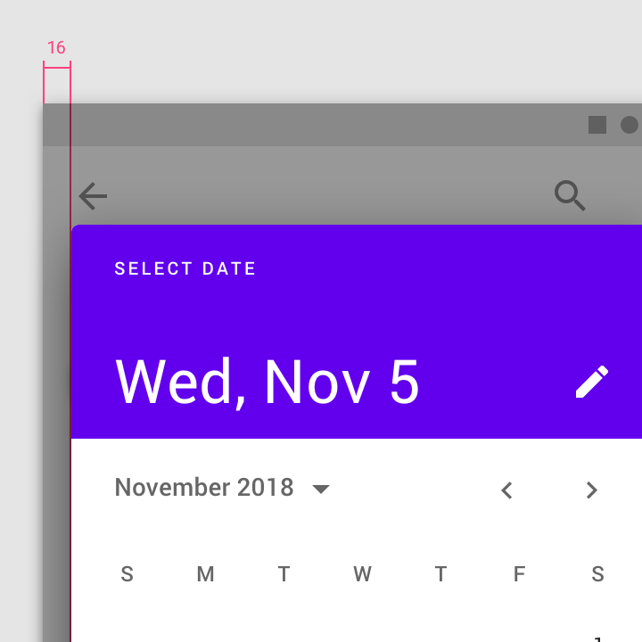
Maintain 16dp left and right padding from the edge of the screen. The top and bottom of the picker should be vertically centered in the screen.
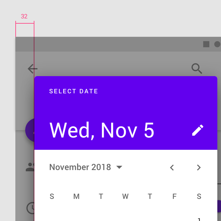
Don’t use more than 16dp from the left and right screen edges, as it creates smaller touch targets.
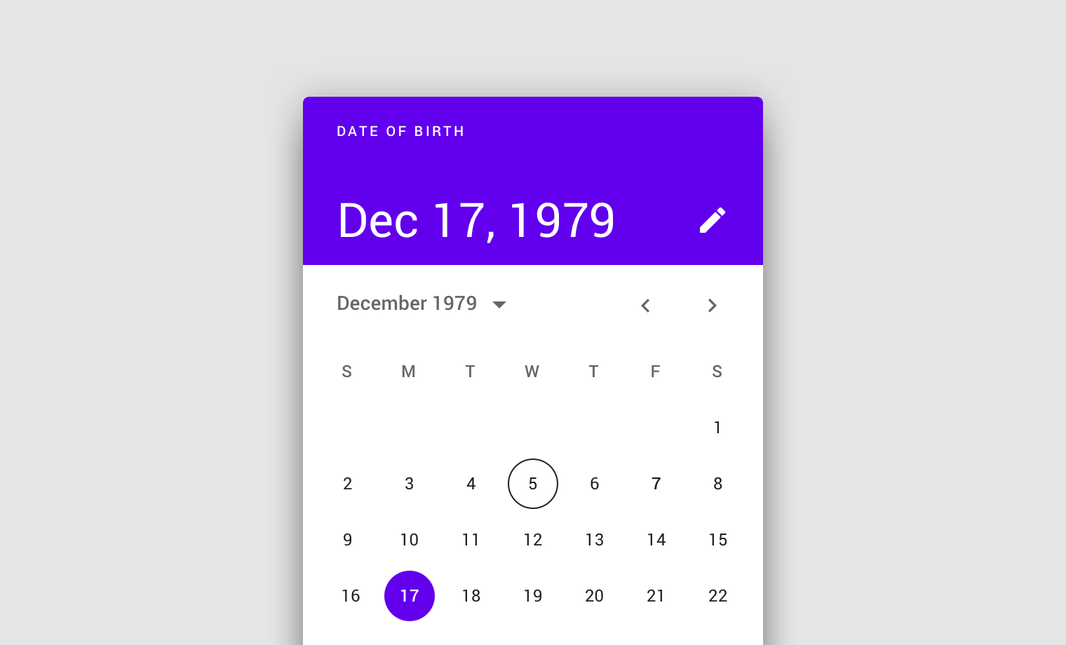
Don’t use a calendar picker to prompt for dates in the distant past or future, such as a date of birth. In these cases, use a mobile input picker or a text field instead.
Behavior
Mobile calendar pickers navigate across dates in several ways:
- To navigate across months, swipe horizontally
- To navigate across years, scroll vertically
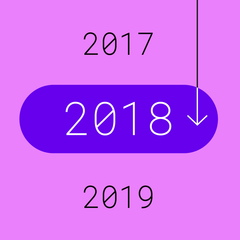
- To access the year picker, tap the year
Mobile calendar pickers adapt to a device’s orientation.
Mobile date range pickers
Usage
Mobile date range pickers allow selection of a range of dates. They cover the entire screen.
Common use cases include:
- Booking a flight
- Reserving a hotel
They aren’t ideal for selecting dates in the distant past or future that require more navigation, such as entering a birth date or expiration date.
Mobile date range picker
Behavior
Mobile date range pickers navigate across dates in several ways:
- To select a range of dates, tap the start and end dates on the calendar
- To navigate across months, scroll vertically
Mobile date input pickers
Usage
Mobile date input pickers allow the manual entry of dates using the numbers on a keyboard. Users can input a date or a range of dates in a dialog.
Mobile date input picker
Mobile date input pickers allow for keyboard input to select a date or range of dates.
Mobile date input picker
For dates that don’t require a calendar view, make the mobile date input picker as the default prompt.
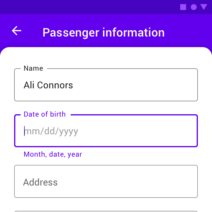
Alternatively, a text field with appropriate hint text can prompt for dates, such as in a form.
Behavior
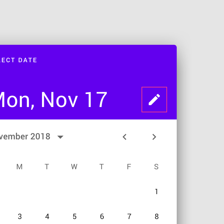
The mobile date input picker can be accessed from any other mobile date picker, via the edit icon.
Desktop pickers
Desktop date pickers
Usage
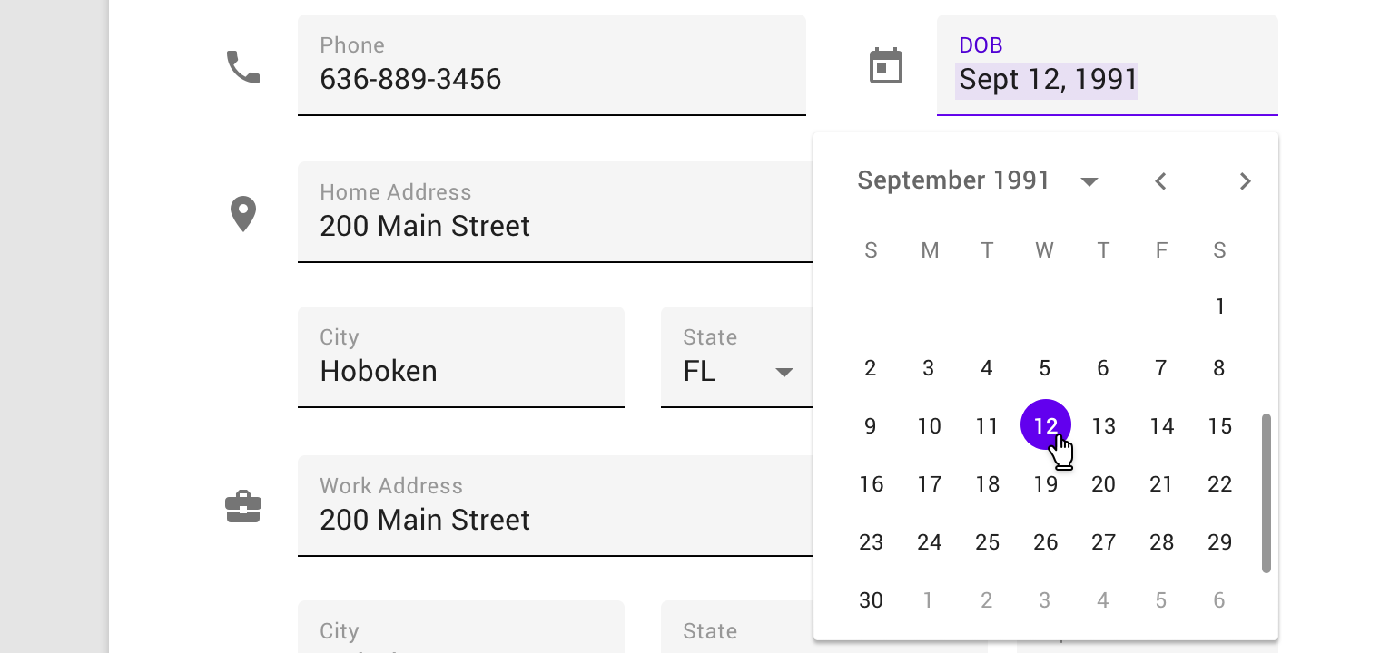
Desktop date pickers allow the selection of a specific date and year. The desktop date picker displays a date input field by default, and a dropdown calendar appears when the user taps on the input field. The user can interact with either form of date entry.
Desktop date pickers are ideal for navigating dates in both the near future (or past) and the distant future (or past), as they provide multiple ways to select dates.
Desktop date picker
Behavior
Users can input dates either using a keyboard or by navigating the calendar UI; both options are immediately available when the desktop date picker is accessed.
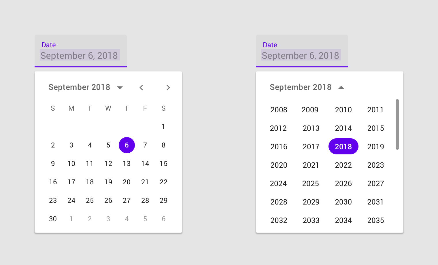
Desktop date picker
Desktop date range pickers
Desktop date range pickers allow a range of days to be selected. They display both calendar and date input fields.
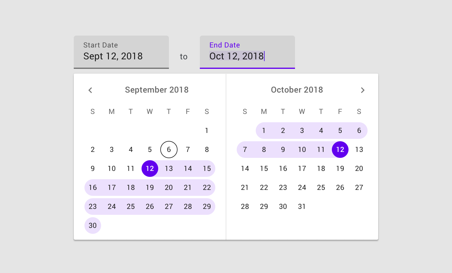
Desktop date range picker
Tooltips can help explain how to use date picker controls.
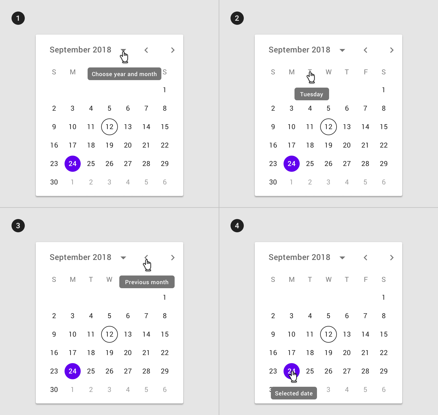
- Tooltip used on month and year selector
- Tooltip on day selector
- Tooltip used on month pagination control
- Tooltip used on selected date
Specs
Accessibility
On mobile, a date picker should allow users to enter dates manually by inputting text, without using the picker. This interaction allows multiple input methods and makes it accessible to those using assistive technology.
- On desktop, the text field can be used for input.
- On mobile, the input picker should be available from the calendar pickers via the edit icon.
Touch targets
Touch targets for mobile date pickers should be as large as possible, filling the available space. The minimum touch target size for a date picker is 32 x 32dp.
The edit icon indicates the ability to switch to the mobile input picker.
On the mobile date range picker, touch targets are maximized at 48 x 48dp.
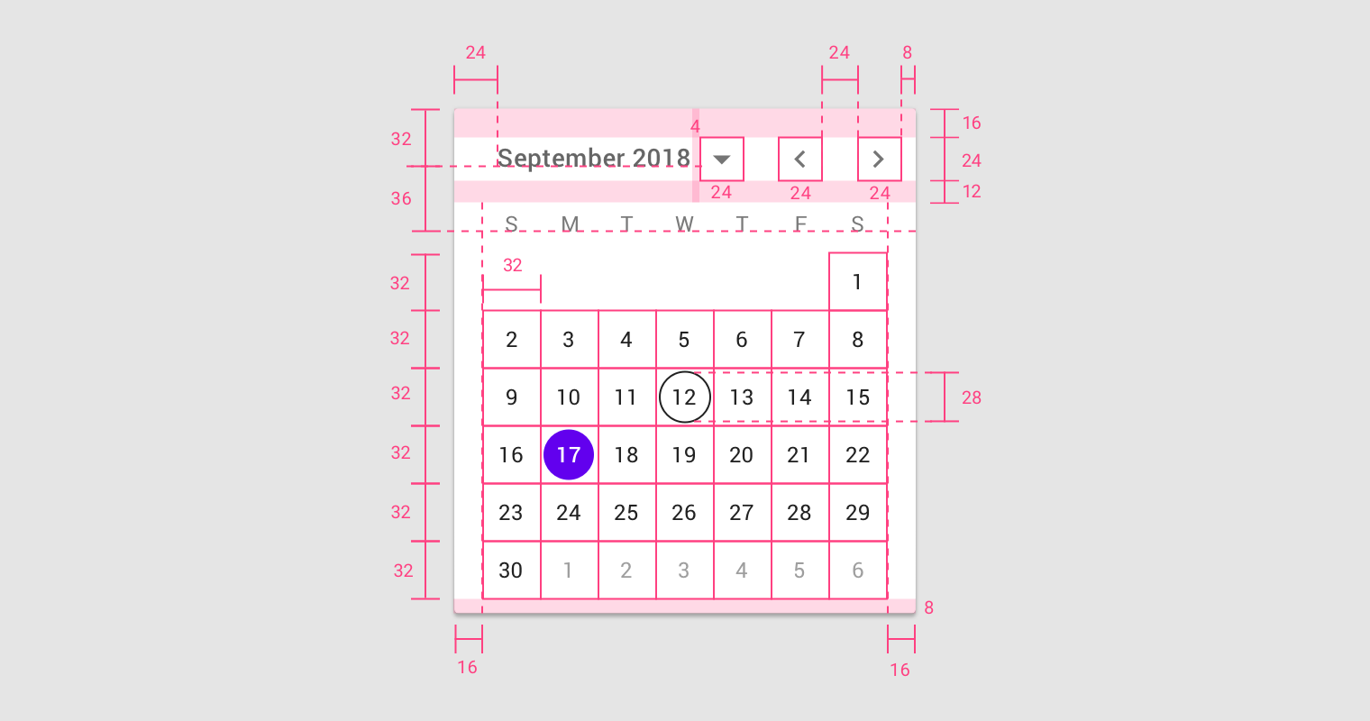
Mobile calendar picker
Calendar header
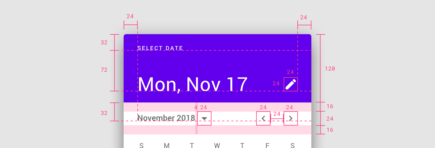
The mobile calendar picker is a a standard dialog.
- Left and right padding: 24dp
- Menu bar top and bottom padding: 16dp
- Edit icon: 24 x 24dp
- First baseline: 32dp from top
- Second baseline: 72dp from first baseline
- Third baseline: 32 dp from bottom of header
- Padding between month name and button: 4dp
- Month dropdown button: 24 x 24dp
- Month pagination: 24 x 24dp
- Padding between month pagination: 24dp
Calendar view
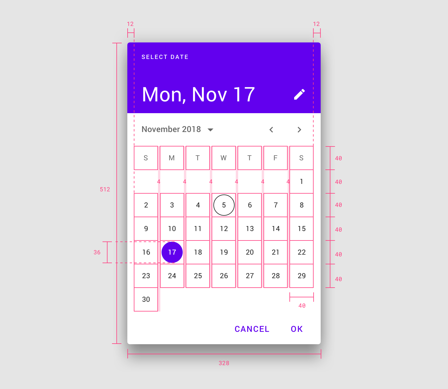
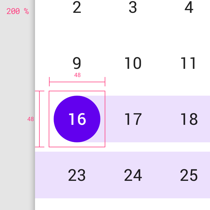
- Dimensions: 328 x 512dp
- Left and right padding: 12dp
- Date bounding box: 40 x 40dp
- Selected date: 36 x 36dp
- Padding between dates: 4dp
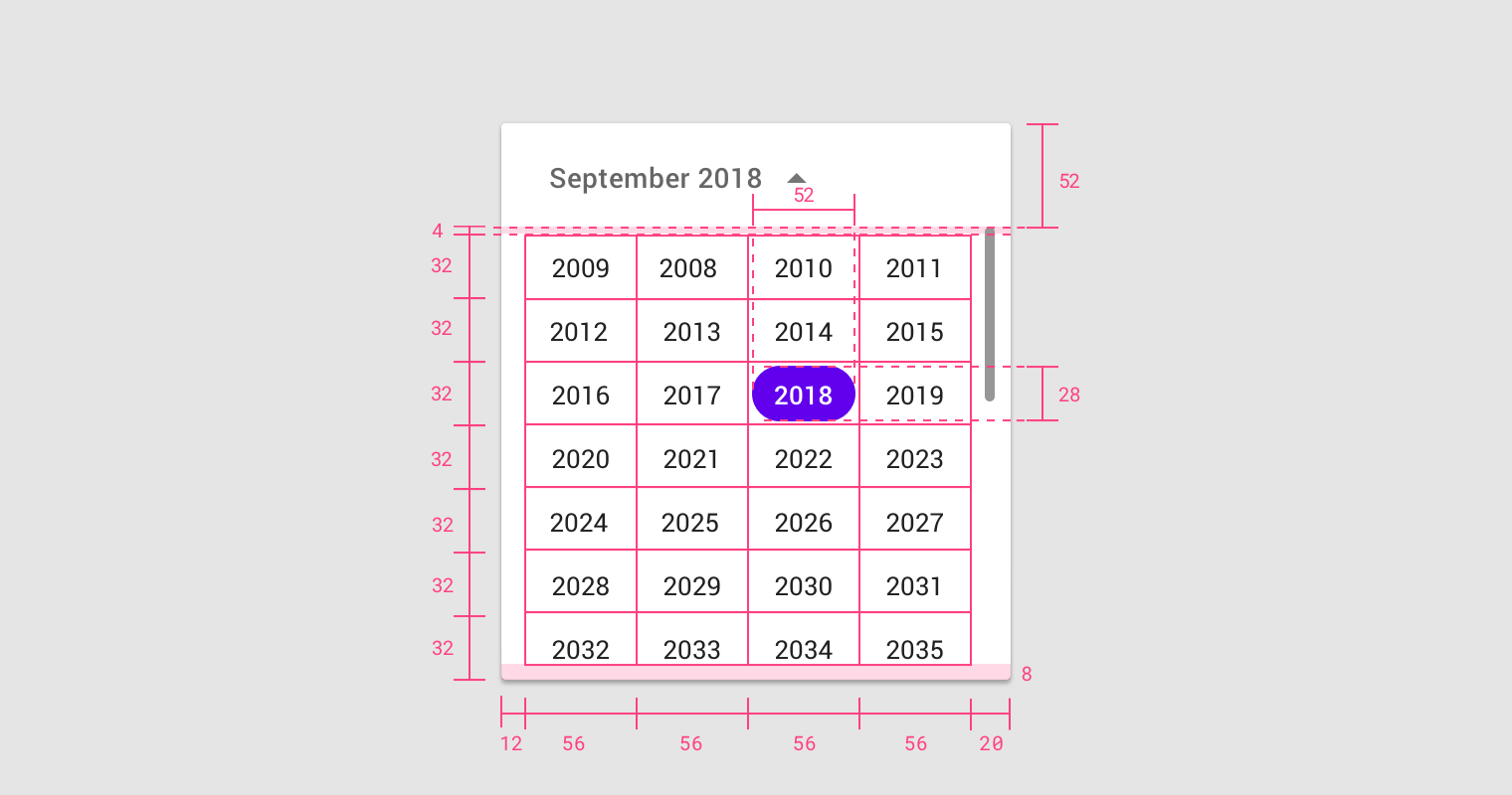
Year selection view
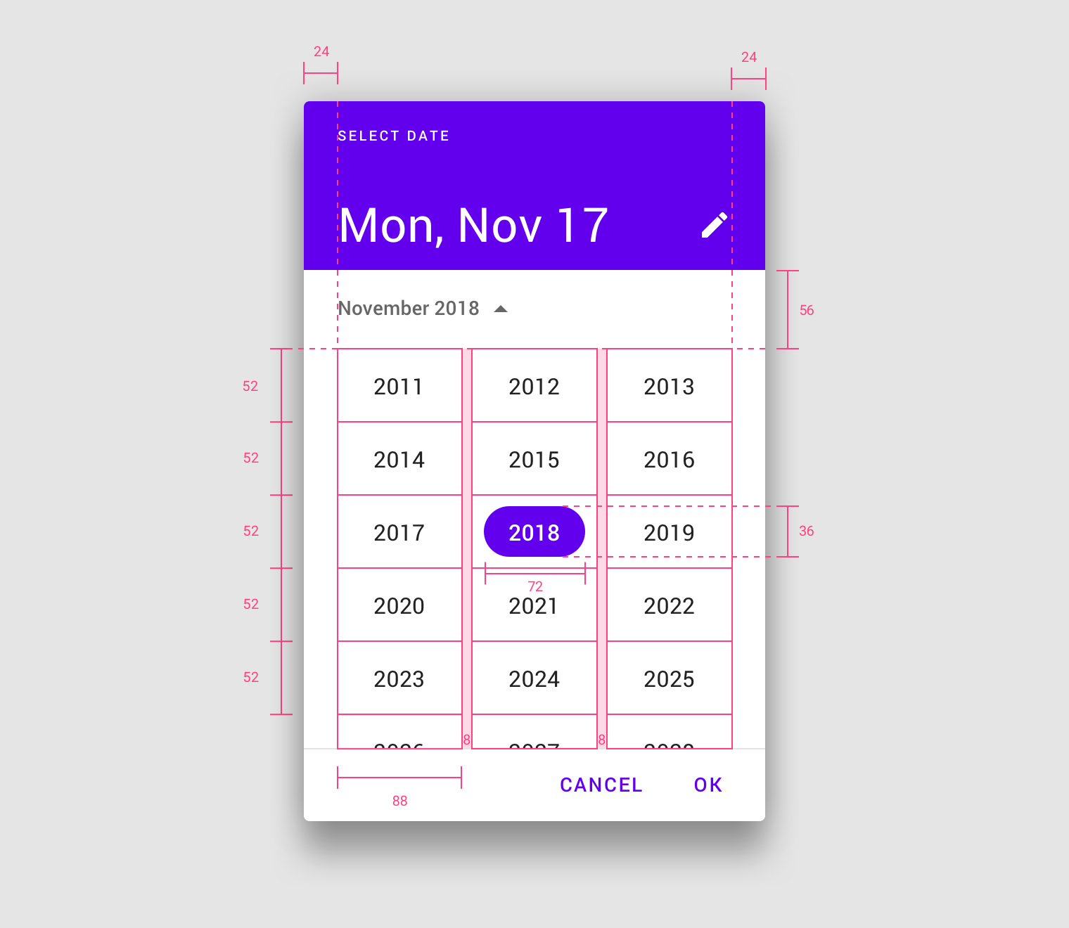
The mobile calendar picker contains an exposed dropdown menu that enables year selection.
- Left and right margins: 24dp
- Year bounding box: 88 x 52 dp
- Selected year: 72 x 36dp
Mobile range picker
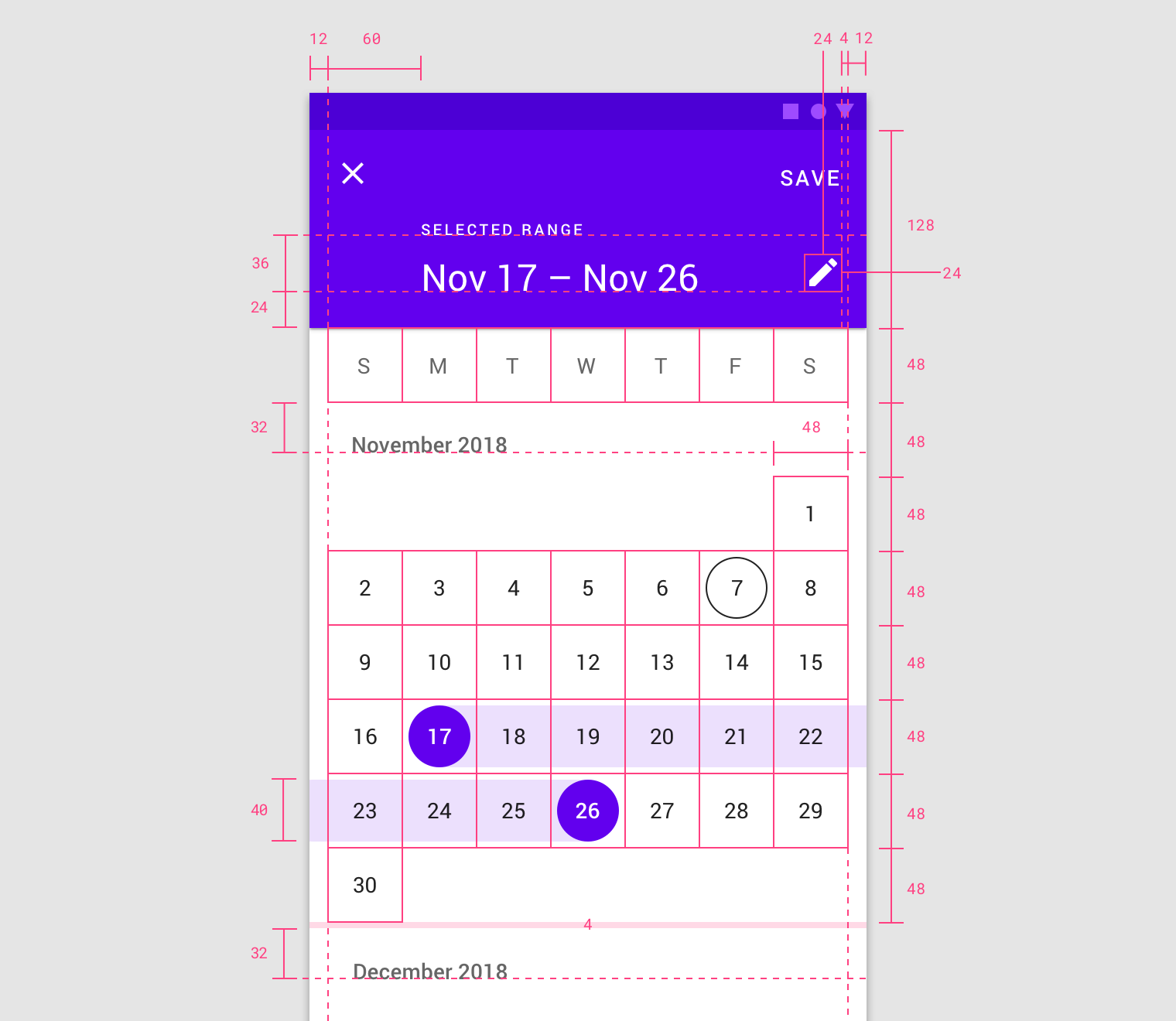
The mobile calendar picker is a full-screen dialog.
- Left and right margins: 12dp
- Header height: 128dp
- Header text inset: 60dp from left margin
- First baseline: 36dp from second baseline
- Second baseline: 24dp from bottom of header
- Third baseline (month name): 32dp from days of week
- Edit icon: 24 x 24dp
- Edit icon padding: 16dp from right
- Date bounding box: 48 x 48dp
- Selected date: 40 x 40dp
- Padding between months: 4dp
Mobile input picker
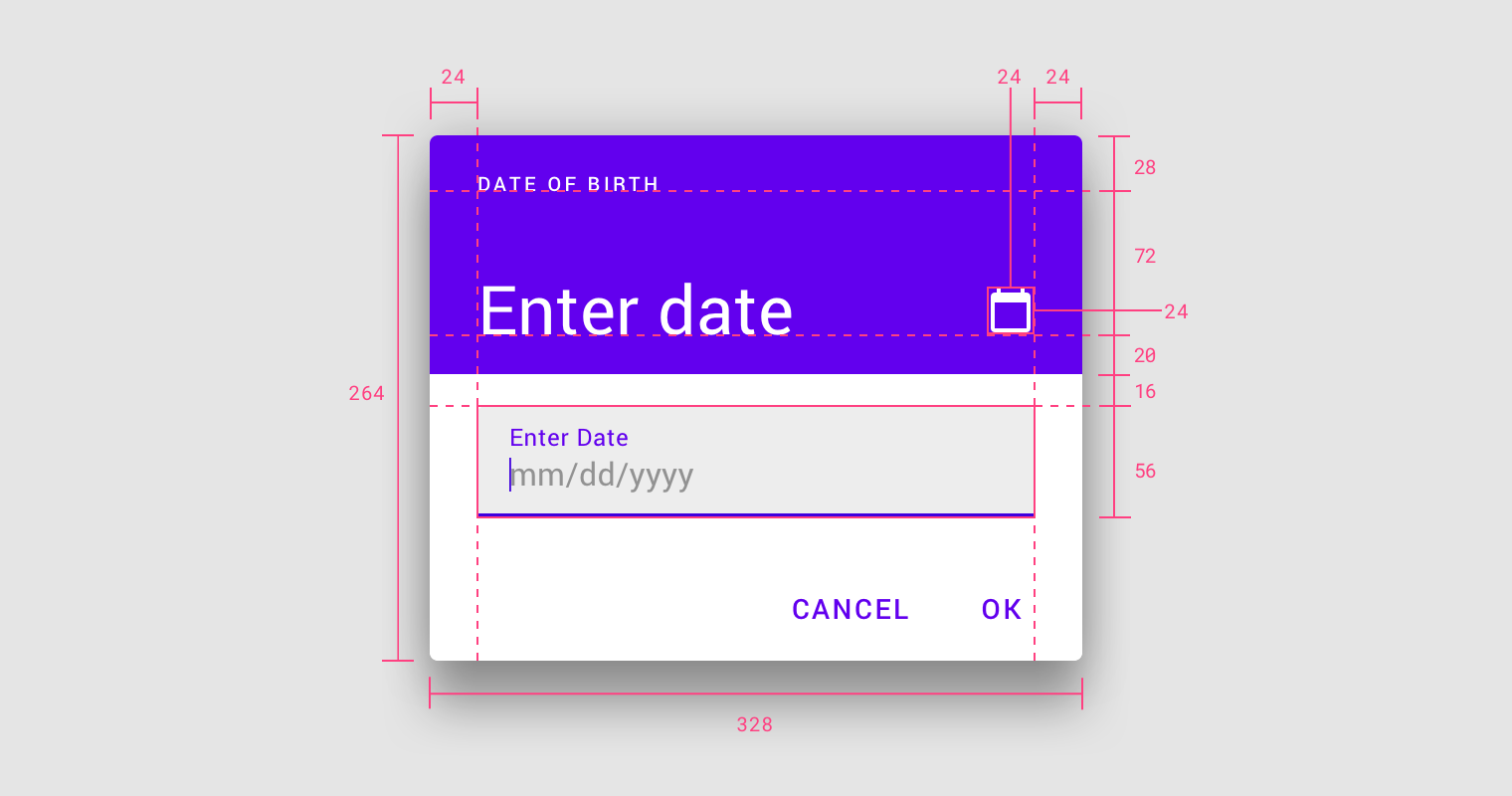
The mobile calendar picker is a standard dialog.
- Dimensions: 264 x 328dp
- Left and right padding: 24dp
- First baseline: 28dp from top
- Second baseline: 72dp from first baseline
- Edit icon: 24 x 24 dp
- Text field: 16dp from bottom of header
- Text field height: 56dp
Desktop date picker
Calendar view
- Menu left padding: 24dp
- Menu right padding: 8dp
- Menu top padding: 16dp
- Menu bottom padding: 12dp
- Month dropdown button: 24 x 24dp
- Month pagination: 24 x 24dp
- Padding between month name and button: 4dp
- Padding between month pagination: 24dp
- Left and right padding of calendar area: 16dp
- Bottom padding: 8dp
- First baseline: 32dp from top
- Second baseline: 36dp from first baseline
- Date bounding box: 32 x 32 dp
- Selected date: 28 x 28dp
Year selection view
- Left padding: 12dp
- Right padding: 20dp
- Bottom padding: 8dp
- Menu height: 52dp
- Padding between menu and years: 4dp
- Year bounding box: 56 x 32dp
- Selected year: 52 x 28dp
Desktop date range picker
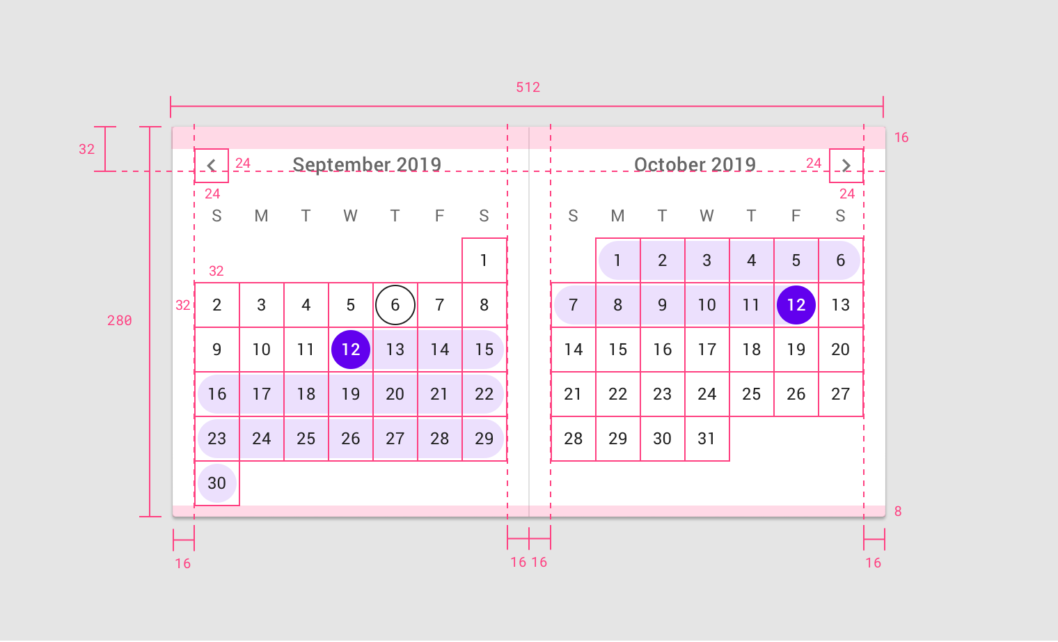
The desktop date range picker consists of two single pickers displaying consecutive months.
- Left, right, and inside padding: 16dp
- Bottom padding: 8dp
- Month title baselines from top: 32dp
- Pagination arrows: 24 x 24dp
Implementation
Related components:
Javascript methods:
| $(container).mdcDatePicker(options) | ||
|---|---|---|
| A plugin to add date picker to an input container. | ||
| container | String | jQuery | Element | The input container. can be either a css selector string or a jQuery object or an element. date picker will be added by default to any container with .has-datepicker class. |
| options | object | The picker configuration options. can also be set using html data attributes on the container. |
| Options list: | ||
| Javascript | HTML attribute | Description |
startDate |
data-start-date |
The earliest date that may be selected; all earlier dates will be disabled. yyyy-MM-dd format is recommended. |
endDate |
data-end-date |
The latest date that may be selected; all later dates will be disabled. yyyy-MM-dd format is recommended. |
selectedDate |
data-selected-date |
The selected date in the picker. defaults to the current date or endDate if not in the range. yyyy-MM-dd format is recommended. |
dateFormat |
data-date-format |
A string representing the date format that will be used for the input. defaults to dd/MM/yyyy.
|
color |
data-color |
The primary color the picker. defualts to purple-900. see The color system |
label |
data-label |
A label to be used inside the picker. defualts to Select a date |
| $(container).mdcDatePicker("open") | ||
| A method to open the date picker. will be fired on input focus. | ||
| container | String | jQuery | Element | The input container. can be either a css selector string or a jQuery object or an element. |
| $(container).mdcDatePicker("close") | ||
| A method to close the date picker. | ||
| container | String | jQuery | Element | The input container. can be either a css selector string or a jQuery object or an element. |
| $(container).mdcDatePicker("setYear", year) | ||
| A method to set the currently selected year in the picker. | ||
| container | String | jQuery | Element | The input container. can be either a css selector string or a jQuery object or an element. |
| year | String | integer | The year to be set. cannot be less than startDate year or greater than endDate year. |
| $(container).mdcDatePicker("changeMonth", x) | ||
| A method to change the currently selected month in the picker. | ||
| container | String | jQuery | Element | The input container. can be either a css selector string or a jQuery object or an element. |
| x | integer | Number of months to be added to the currently selected month. can be positive or negative number. |
| $(container).mdcDatePicker("selectDate", date) | ||
| A method to change the currently selected date in the picker without updating the input. | ||
| container | String | jQuery | Element | The input container. can be either a css selector string or a jQuery object or an element. |
| date | String | A string representing the new date to be selected. yyyy-MM-dd format is recommended. |
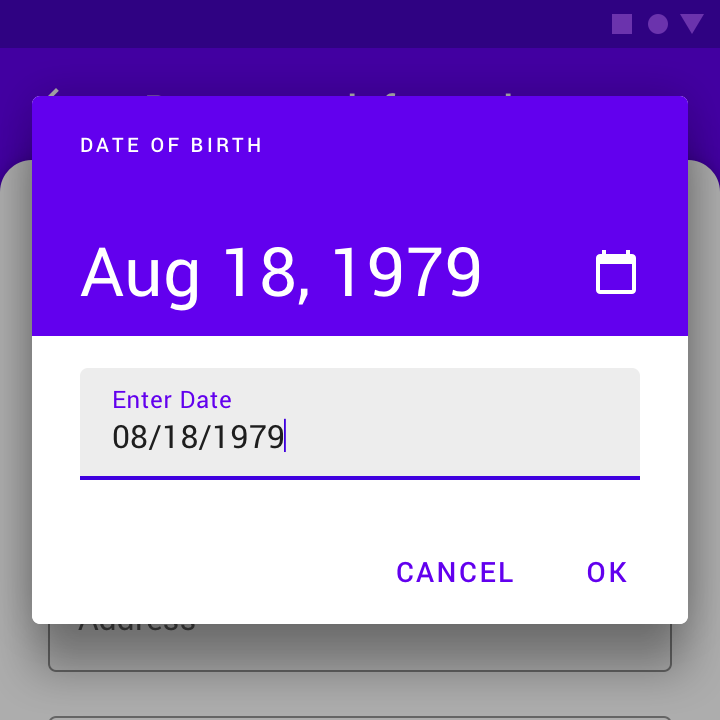
Date picker
<div class="mdc-text-field has-datepicker purple-900"
    data-start-date="1985-01-01"
    data-end-date="2015-12-31"
    data-date-format="MMMM d, yyyy"
    data-color="purple-900"
    data-label="Date of birth"
>
    <div class="icon material-icon">calendar_today</div>
    <div class="input"><input class="input-element" type="text"></div>
    <label class="label">DOB</label>
</div>