almoamen.net
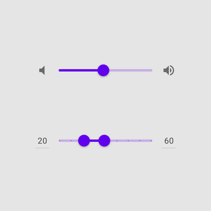
Sliders
Sliders allow users to make selections from a range of values.
Usage
Sliders reflect a range of values along a bar, from which users may select a single value. They are ideal for adjusting settings such as volume, brightness, or applying image filters.
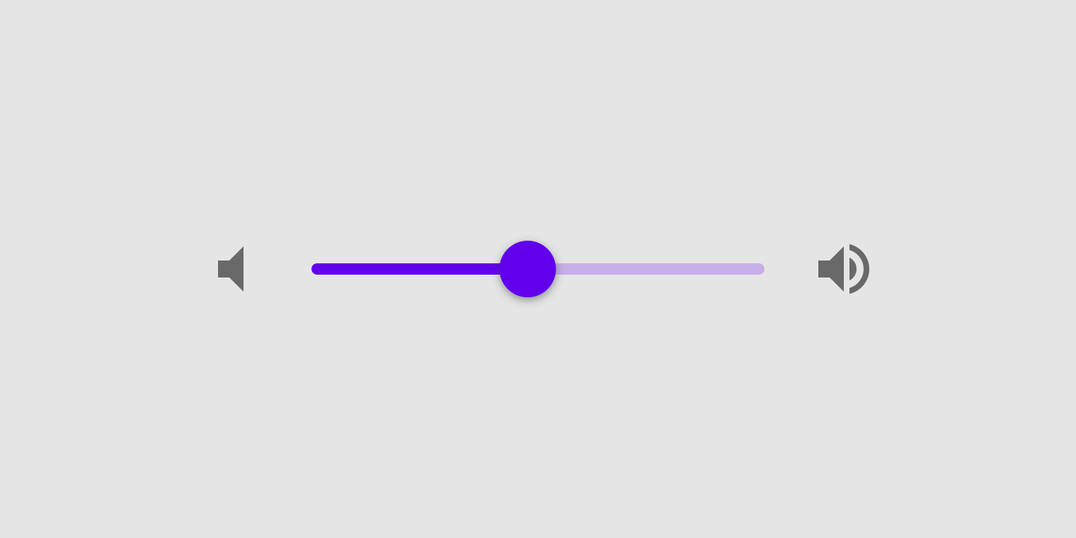
Sliders can have icons on both ends of the bar that reflect a range of values.
Immediate effects
Changes made with sliders are immediate, allowing a user to make slider adjustments until finding their preference. They shouldn’t be paired with settings that have even minor delays in providing user feedback.
Current state
Sliders reflect the current state of the settings they control.
Values
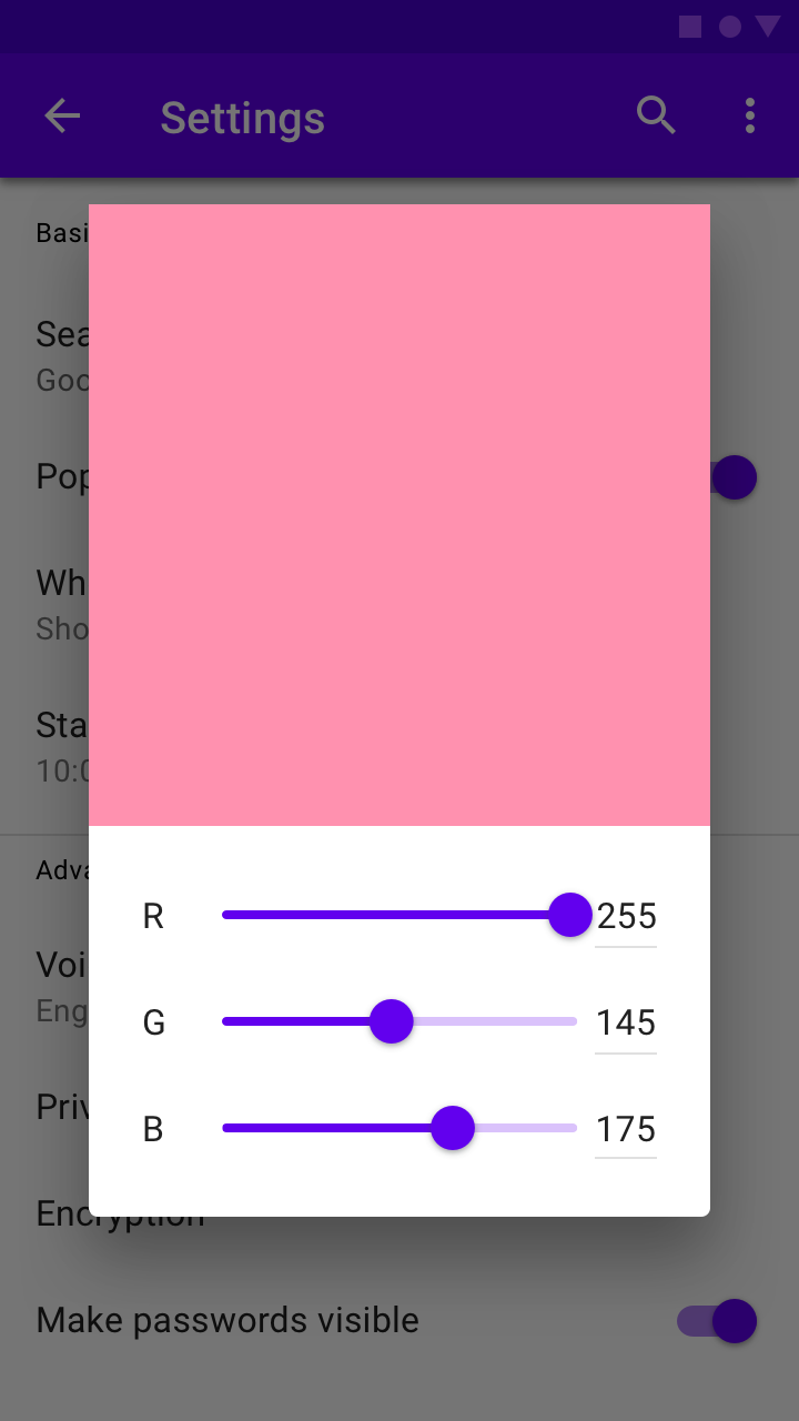
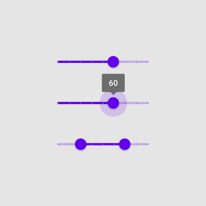
Editable numeric values
Editable numeric values allow users to set the exact value of a slider.
Upon pressing the thumb or the value indicator field, the value indicator input becomes editable for text entry. The thumb position immediately is updated to match any change in value..
Order of values
For languages that are displayed from left-to-right, such as English, the smallest value for the range appears on the left and the largest value appears on the right.
For right-to-left languages, like Arabic, this placement would be switched (with the largest value on the left, and the smallest on the right).
A slider with an editable numeric value
Principles
Adjustable
Sliders should only be used for choosing selections from a range of values.

Immediate
When interacting with a slider, changes should be represented immediately.

Accessible
Sliders should provide the full range of choices available for the user to select from.
Types
Continuous sliders
Continuous sliders allow users to select a value along a subjective range.
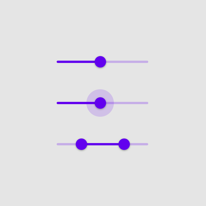
Continuous slider
Discrete sliders
Discrete sliders can be adjusted to a specific value by referencing its value indicator.
Discrete slider
Anatomy
A slider can contain the following elements:
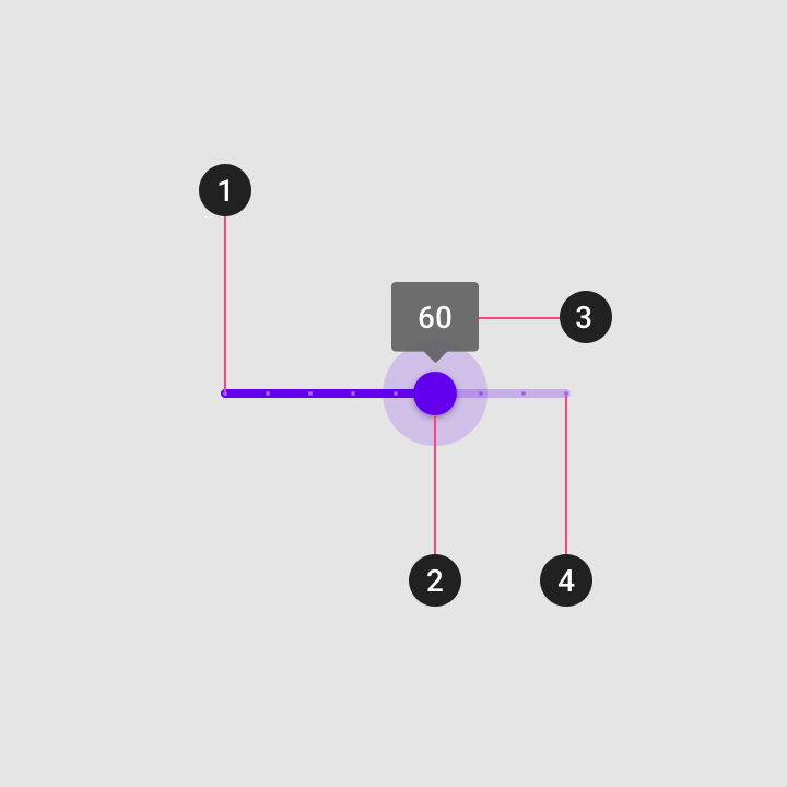
1. Track
The track shows the range available for user selection. For left-to-right (LTR) languages, the smallest value appears on the far left, and the largest value on the far right. For right-to-left (RTL) languages this orientation is reversed, with the smallest value on the far right and the largest value on the far left.
2. Thumb
The thumb slides along the track, displaying the selected value through its position.
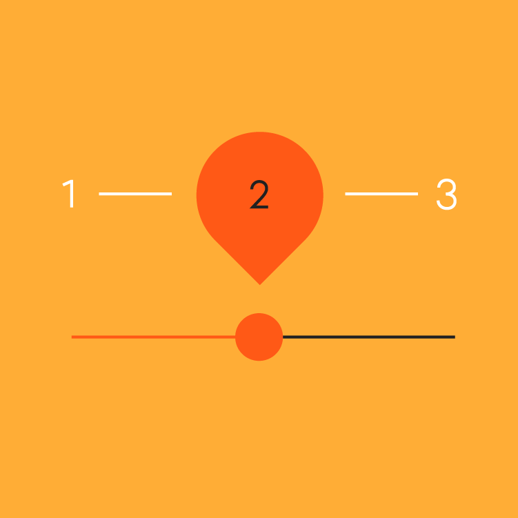
3. Value label (optional)
A value label displays the currently selected, specific numerical value.
4. Tick mark (optional)
Tick marks represent predetermined values to which the user can move the slider.
Continuous slider
Use continuous sliders allow users to make meaningful selections that don’t require a specific value.
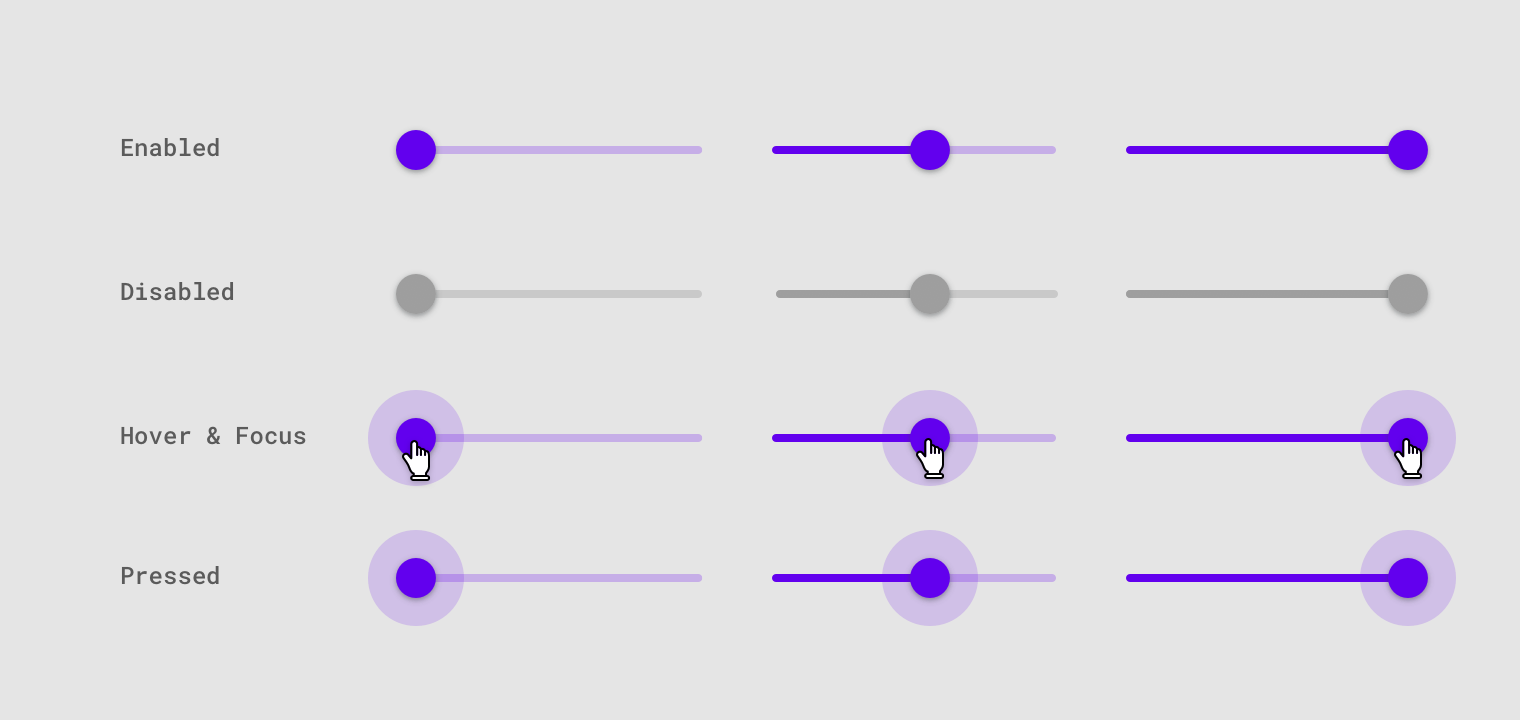
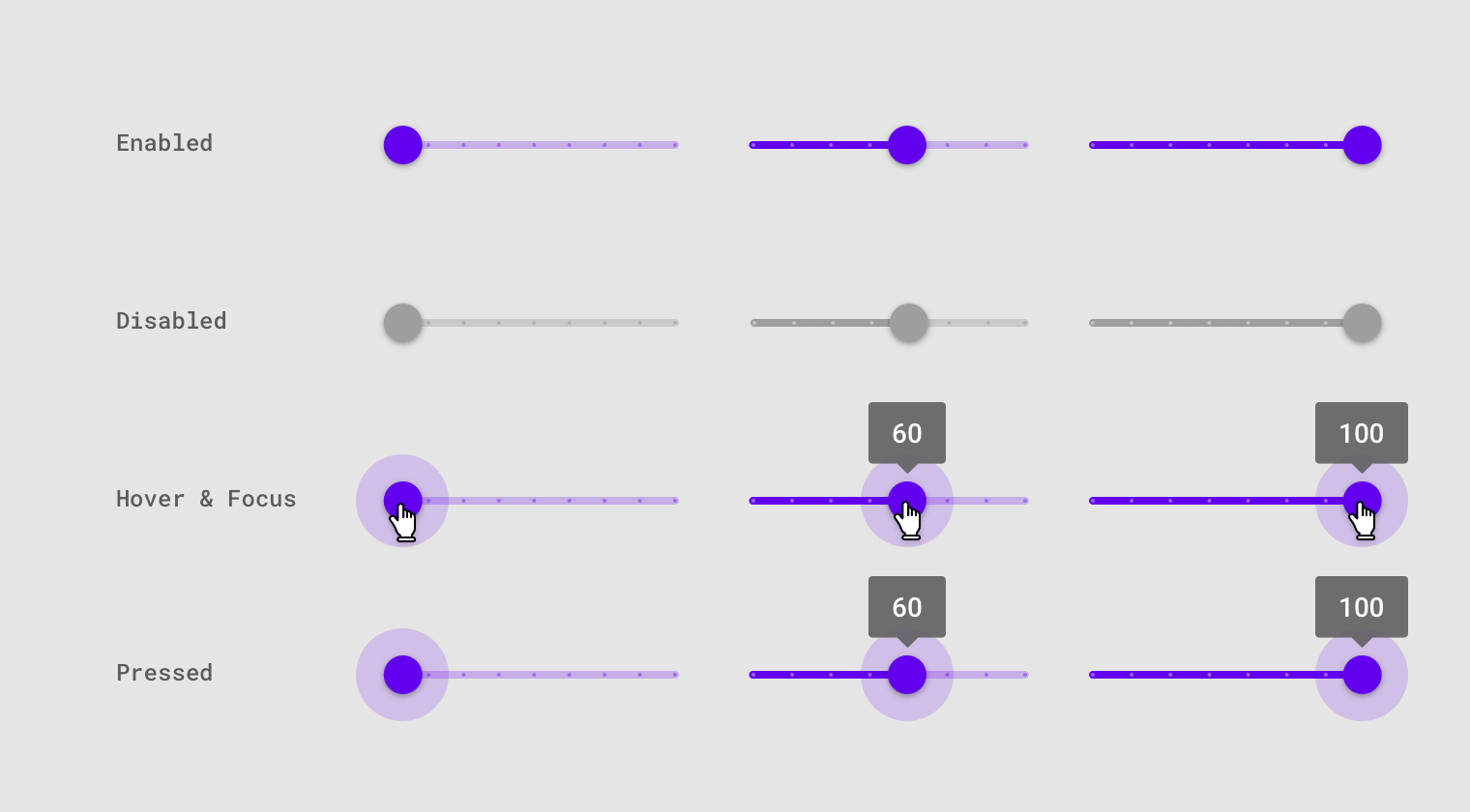
States
Continuous sliders have normal, focused, click, and disabled states.
Slider states
Discrete slider
Discrete sliders display a numeric value label upon pressing the thumb, which allows a user to input an exact value.
States
Discrete sliders have normal, focused, click, and disabled states.
Discrete slider states
Implementation
Javascript methods:
| void MDC.sliderEnable(container) | ||
|---|---|---|
| A method to enable slider input. | ||
| container | String | jQuery | Element | The slider container. can be either a css selector string or a jQuery object or an element. |
| void MDC.sliderDisable(container) | ||
| A method to disable slider input. | ||
| container | String | jQuery | Element | The slider container. can be either a css selector string or a jQuery object or an element. |
Continuous slider
<div class="mdc-slider lime-800">
    <input type="range" min="50" max="150">
    <div class="highlight"></div>
</div>

<div class="mdc-slider lime-800">
<input type="range" min="50" max="150" disabled>
<div class="highlight"></div>
</div>

<div class="mdc-slider full-width lime-800">
    <input type="range" min="50" max="150">
    <div class="highlight"></div>
</div>

<div class="mdc-slider full-width lime-800">
<input type="range" min="50" max="150" disabled>
<div class="highlight"></div>
</div>
Discrete slider
<div class="mdc-slider discrete lime-800">
    <input type="range" min="50" max="150" step="10">
    <div class="highlight"></div>
</div>

<div class="mdc-slider discrete lime-800">
    <input type="range" min="50" max="150" step="10" disabled>
    <div class="highlight"></div>
</div>

<div class="mdc-slider discrete full-width lime-800">
    <input type="range" min="50" max="150" step="10">
    <div class="highlight"></div>
</div>

<div class="mdc-slider discrete full-width lime-800">
    <input type="range" min="50" max="150" step="10" disabled>
    <div class="highlight"></div>
</div>