almoamen.net
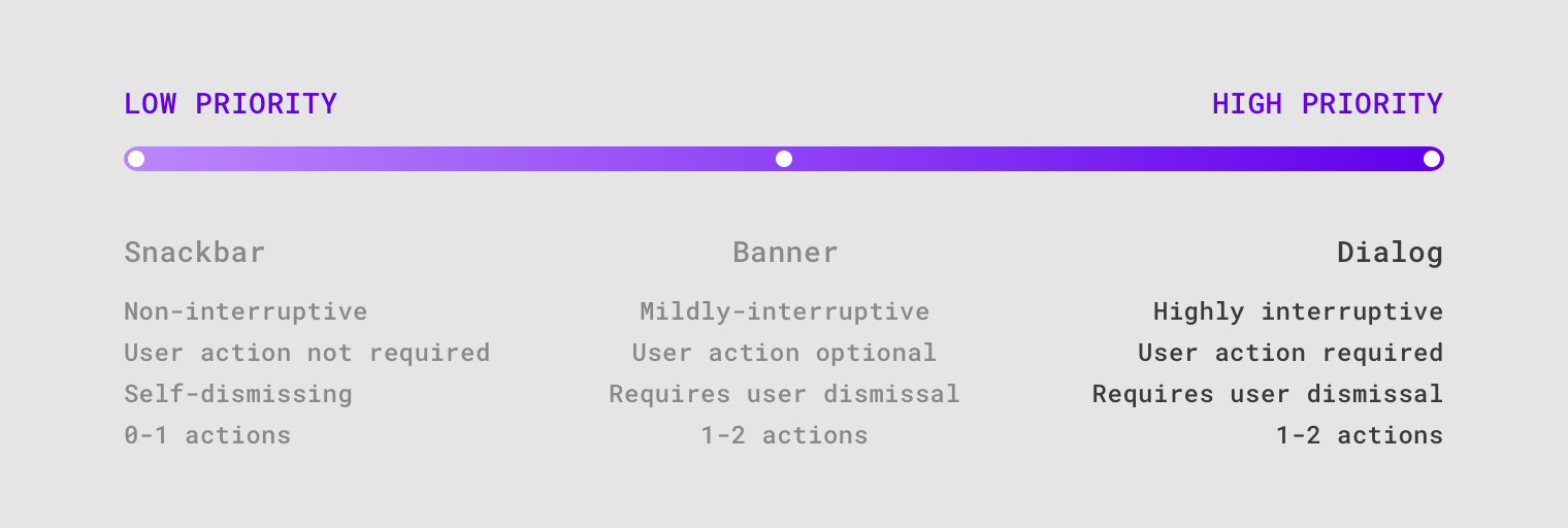
Dialogs
Dialogs inform users about a task and can contain critical information, require decisions, or involve multiple tasks.
Usage
A dialog is a type of modal window that appears in front of app content to provide critical information or ask for a decision. Dialogs disable all app functionality when they appear, and remain on screen until confirmed, dismissed, or a required action has been taken.
Dialogs are purposefully interruptive, so they should be used sparingly.
Principles
Focused
Dialogs focus user attention to ensure their content is addressed.
Direct
Dialogs should be direct in communicating information and dedicated to completing a task.
Helpful
Dialogs should appear in response to a user task or an action, with relevant or contextual information.
When to use
Dialogs should be used for:
- Errors that block an app’s normal operation
- Critical information that requires a specific user task, decision, or acknowledgement
Types
Alert dialog
Alert dialogs interrupt users with urgent information, details, or actions.
Simple dialog
Simple dialogs display a list of items that take immediate effect when selected.
Confirmation dialog
Confirmation dialogs require users to confirm a choice before the dialog is dismissed.
Full-screen dialog
Full-screen dialogs fill the entire screen, containing actions that require a series of tasks to complete.
Anatomy
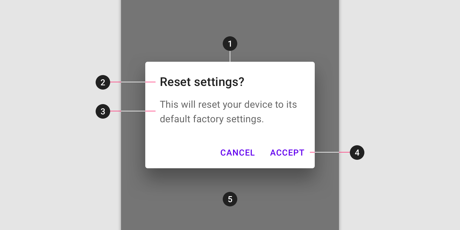
- Container
- Title (optional)
- Supporting text
- Buttons
- Scrim
Dialog box and scrim
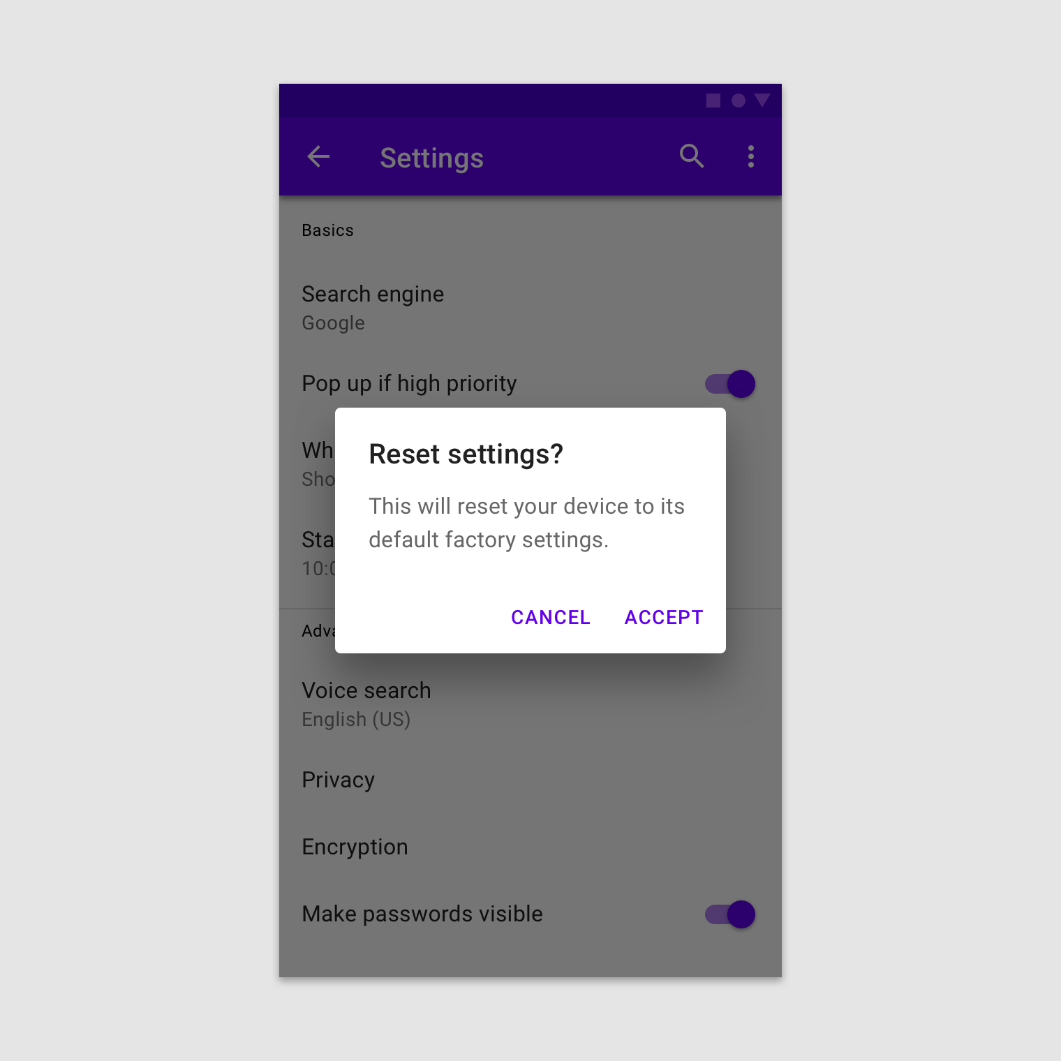
A dialog is a type of modal window. Access to the rest of the UI is disabled until the modal is addressed. All modal surfaces are interruptive by design – their purpose is to have the user focus on content on a surface that appears in front of all other surfaces.
To express that the rest of the app is inaccessible, and to focus attention on the dialog, surfaces behind the dialog are scrimmed. A scrim is a temporary treatment that can be applied to Material surfaces for the purpose of making content on the surface less prominent.
Title
A dialog’s purpose should be communicated by its title and button text.
Titles should:
- Contain a brief, clear statement or question
- Avoid apologies (“Sorry for the interruption”), alarm (“Warning!”), or ambiguity (“Are you sure?”)
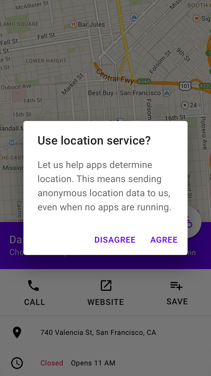
This dialog title poses a specific question, concisely explains what’s involved in the request, and provides clear actions.
Buttons
Side-by-side buttons (Recommended)
Side-by-side buttons display two text buttons next to one another.
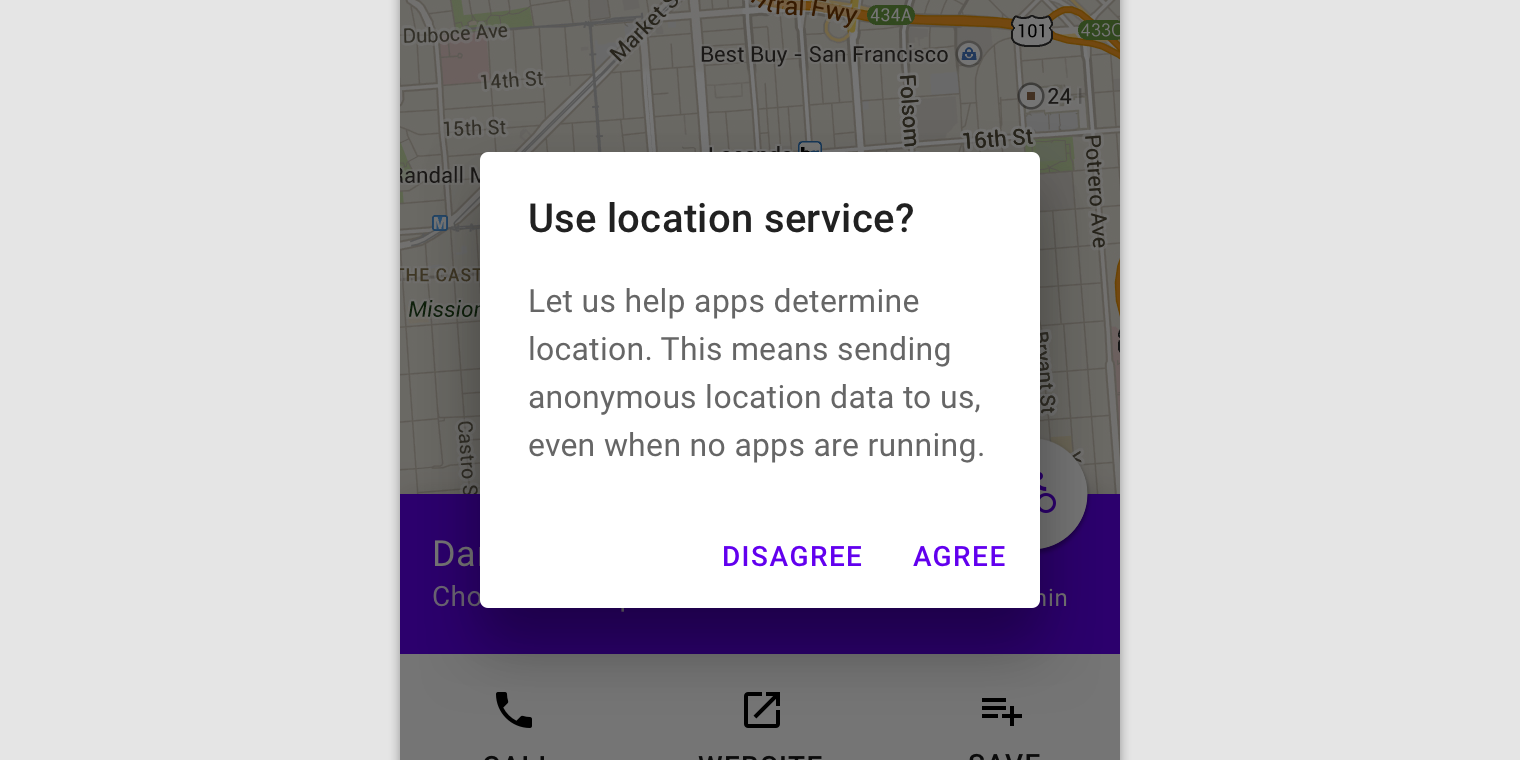
These side-by-side buttons display buttons provide the actions of “Disagree” and “Agree” as options.
Stacked full-width buttons
Stacked buttons accommodate longer button text. Confirming actions appear above dismissive actions.
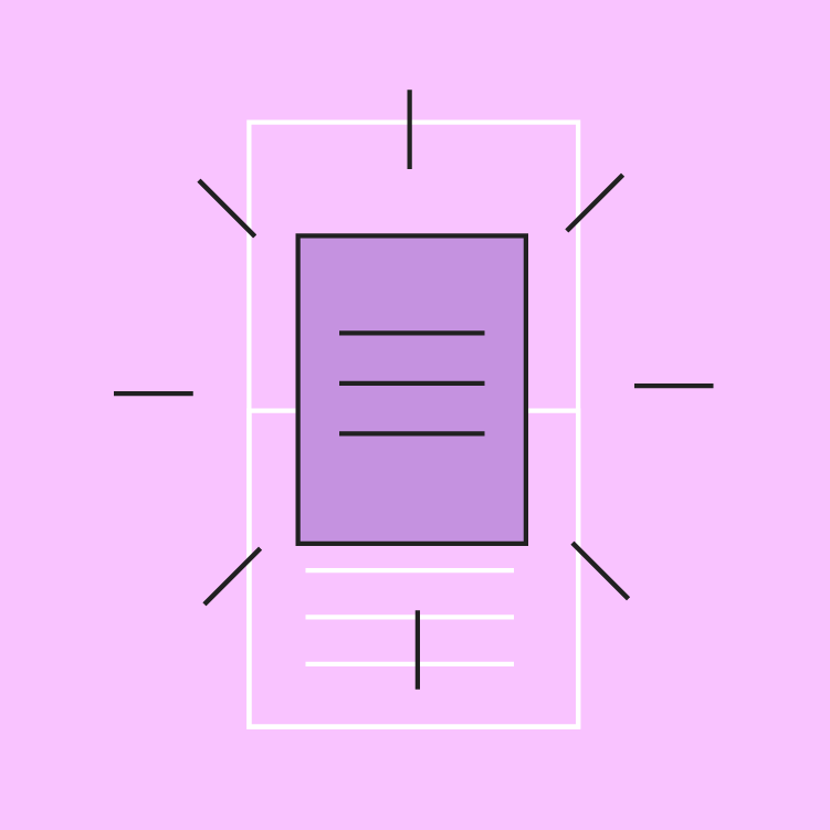
Elevation
Dialogs are displayed at 24dp elevation and can display a shadow. They appear above other content and typically have a scrim below them that covers all app content.
Behavior
Interaction
Dialogs appear without warning, requiring users to stop their current task. They should be used sparingly, as not every choice or setting warrants interruption.
Position
Dialogs retain focus until dismissed or an action has been taken, such as choosing a setting. They shouldn’t be obscured by other elements or appear partially on screen, with the exception of full-screen dialogs.
Scrolling
Most dialog content should avoid scrolling. When scrolling is required, the dialog title is pinned at the top, with buttons pinned at the bottom. This ensures selected content remains visible alongside the title and buttons, even upon scroll.
Dialogs don’t scroll with elements outside of the dialog, such as the background.
Dismissing dialogs
Dialogs may be dismissed by:
- Tapping outside of the dialog
- Tapping the “Cancel” button
- Tapping the system back button (Android only)
If the user’s ability to dismiss a dialog is disabled, the user must choose a dialog action to proceed.
Actions
Types of actions
Dialogs present a distinct choice to users through their title, content, and actions. Dialog actions are represented as buttons and allow users confirm or dismiss something.
There are three types of dialog actions:
Confirming actions
To resolve what triggered the dialog, confirming actions confirm a proposed action. These actions can involve removing something, such as “Delete” or “Remove,” if it suits the context. They are placed on the right side of the screen.
Dismissive actions
Dismissive actions dismiss a proposed action, and return the user to the originating screen or step. They are placed directly to the left of a confirming action.
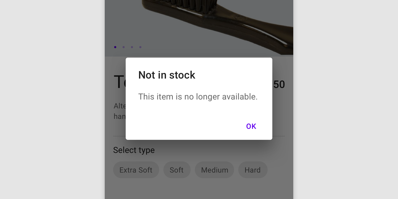
Acknowledgement actions
When user acknowledgement is required to proceed, a single action may be presented. Alternatively, use a snackbar to communicate this type of information.
Disable confirming actions (1) until a choice is made. Dismissive actions are never disabled.
Disable confirming actions (1) until a choice is made. Dismissive actions are never disabled.
Number of actions
Dialogs should contain a maximum of two actions.
- If a single action is provided, it must be an acknowledgement action.
- If two actions are provided, one must be a confirming action, and the other a dismissing action.
- Providing a third action such as “Learn more” is not recommended as it navigates the user away from the dialog, leaving the dialog task unfinished.
Rather than adding a third action, an inline expansion can display more information. If more extensive information is needed, provide it prior to entering the dialog.
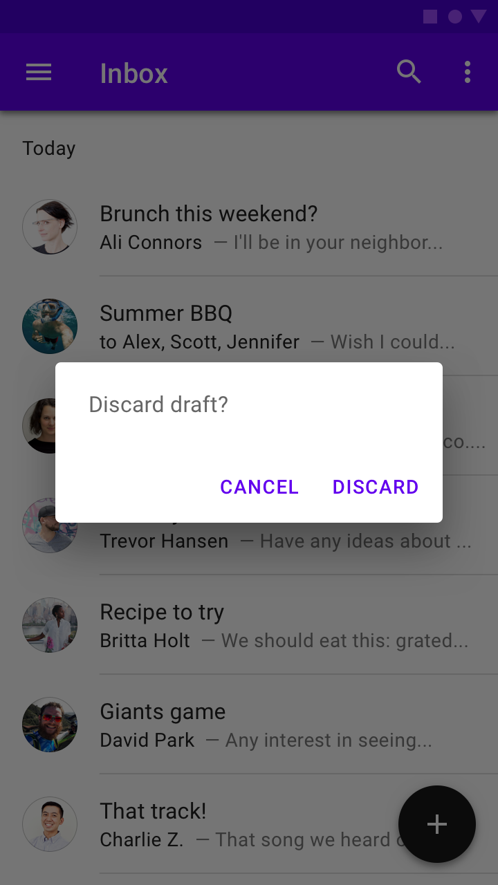
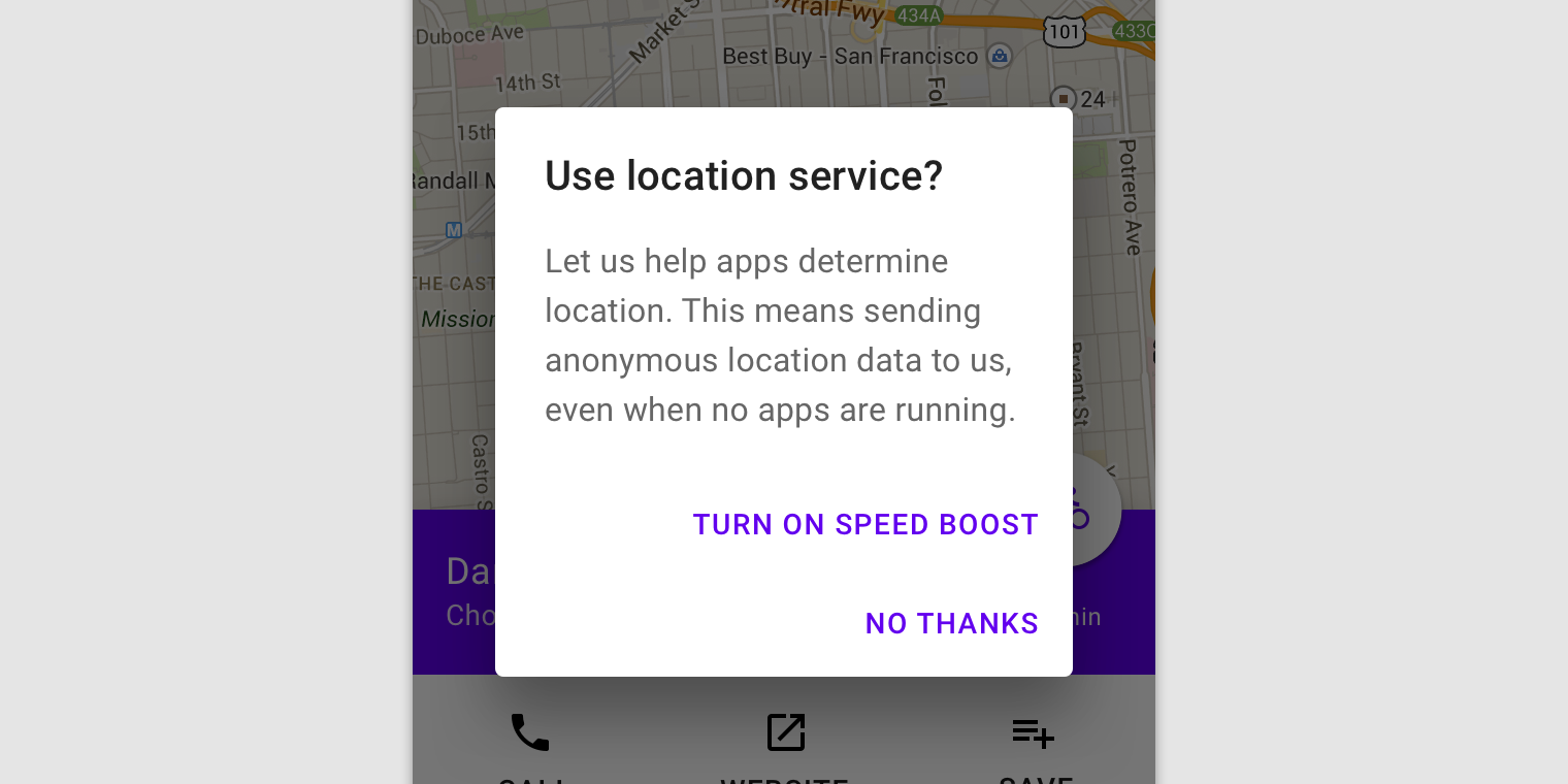
Alert dialog
Usage
Alert dialogs interrupt users with urgent information, details, or actions.
Behavior
To close an alert dialog, one of its actions must be selected.

The action “Discard” indicates the outcome of the decision.
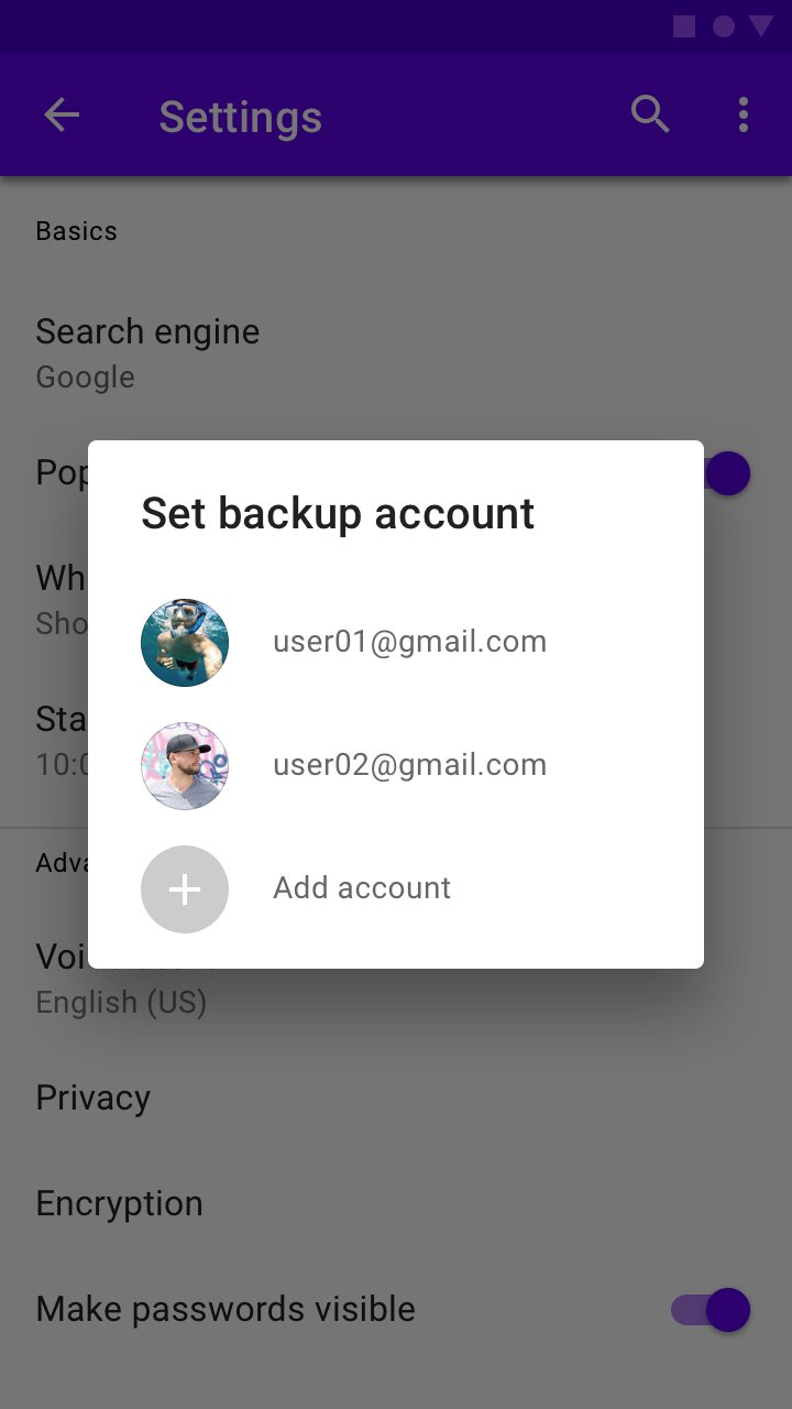
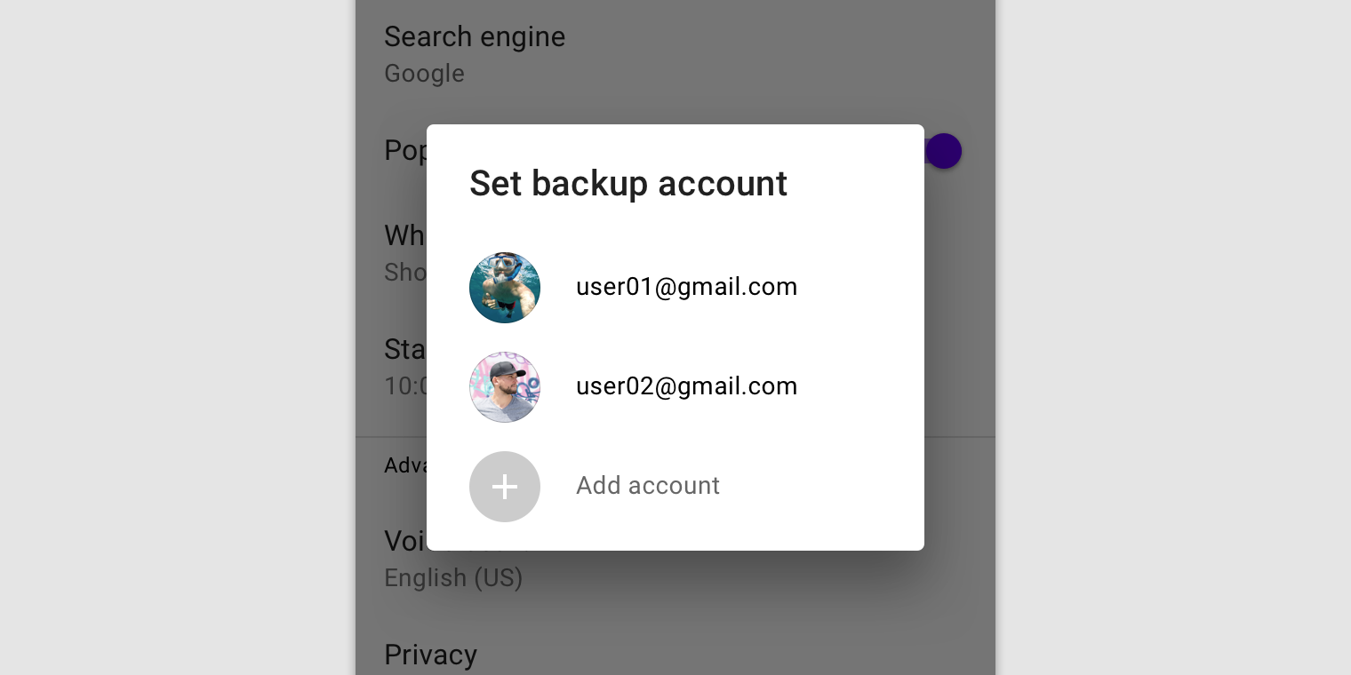
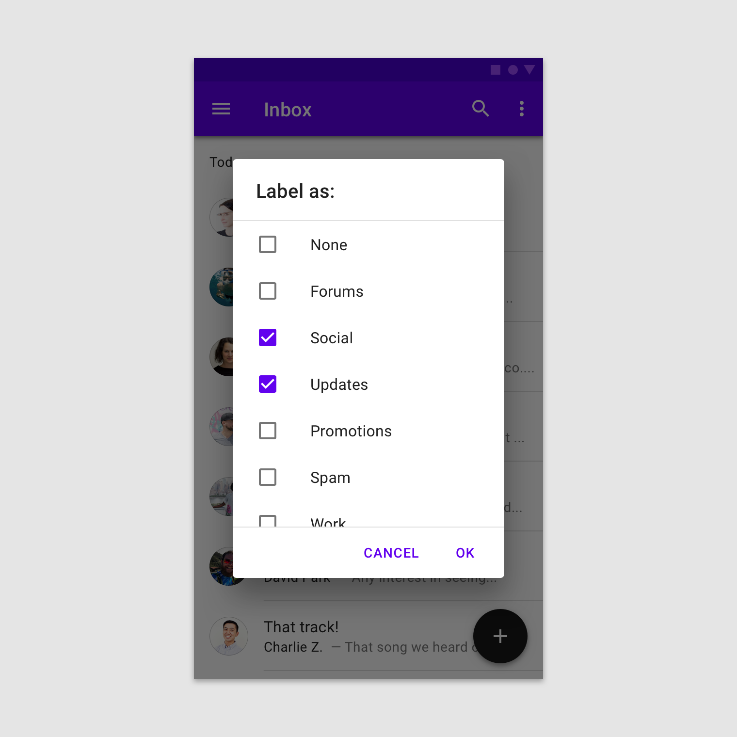
Simple dialog
Usage
Simple dialogs can display items that are immediately actionable when selected. They don’t have text buttons.
As simple dialogs are interruptive, they should be used sparingly. Alternatively, dropdown menus provide options in a non-modal, less disruptive way.
Behavior
A simple dialog allows the following interactions:
- Tap an action to choose it and close the dialog
- Tap outside the dialog to close the dialog without taking an action
A simple dialog
Simple dialogs without actions
Simple dialogs allow users to act on selected elements, without action text. For example, users can simply select a list item to take action on it.
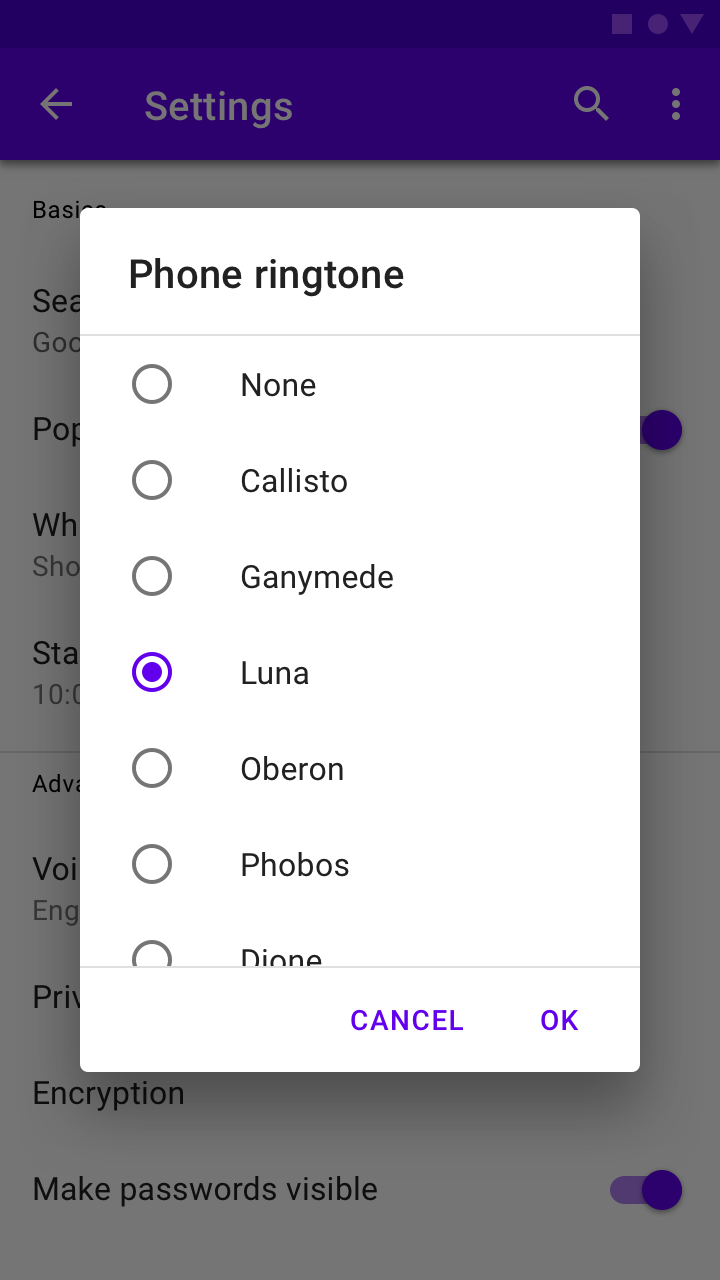
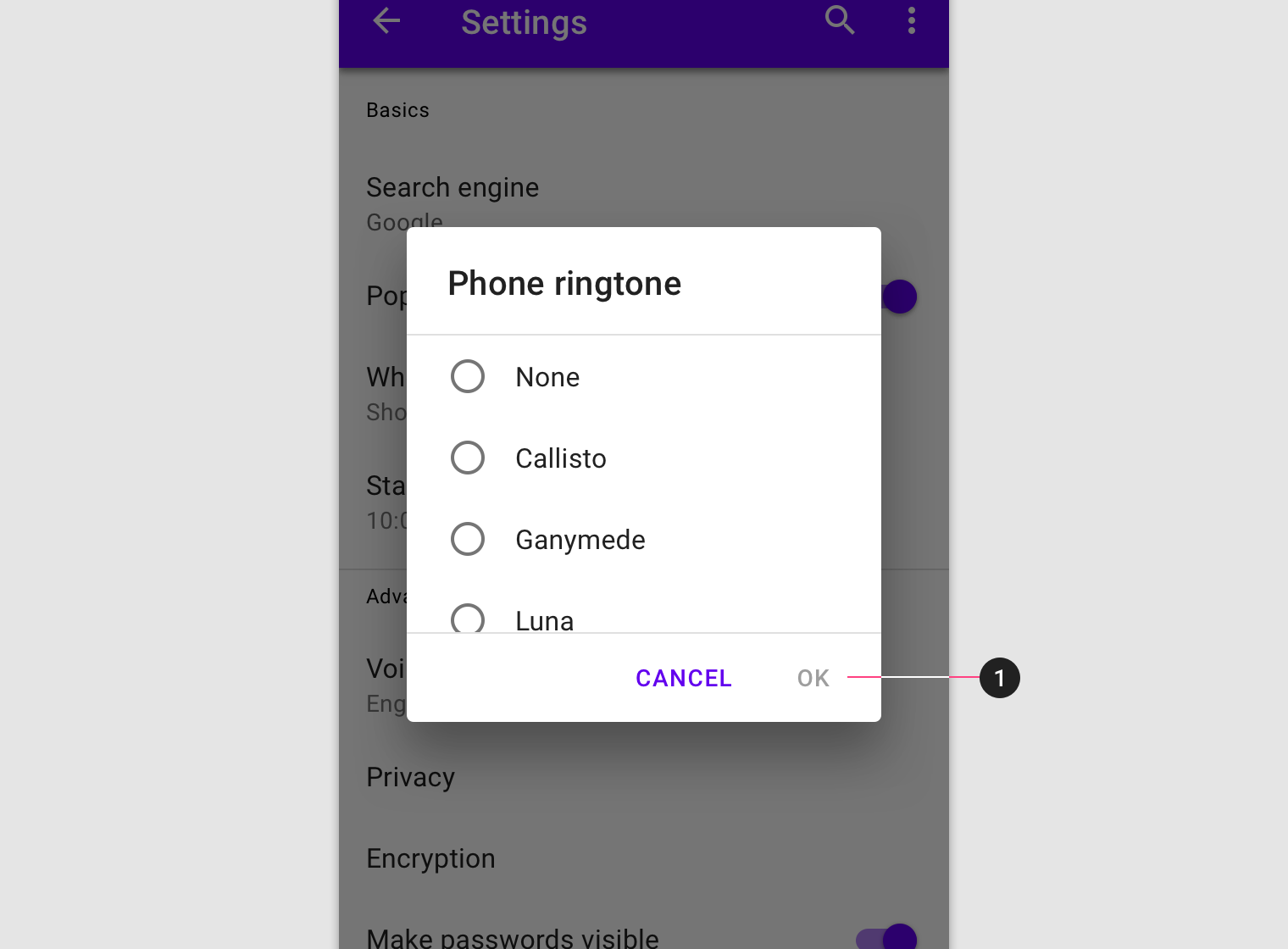
Confirmation dialog
Usage
Confirmation dialogs give users the ability to provide final confirmation of a choice before committing to it, so they have a chance to change their minds if necessary.
If the user confirms a choice, it’s carried out. Otherwise, the user can dismiss the dialog. For example, users can listen to multiple ringtones but only make a final selection upon touching “OK”.
Behavior
To confirm a choice, the user taps a confirmation action. To cancel, the user taps a dismissive action.
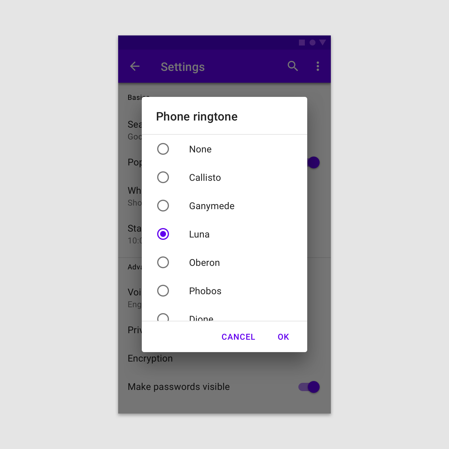
The user must either confirm a choice or dismiss the dialog before proceeding.
Buttons
Confirmation dialogs provide both confirmation and cancel buttons. After a confirmation button is tapped, a selection is confirmed. If the cancel button is tapped, or the area outside the dialog, the action is cancelled.
Provide confirmation and dismissive buttons.
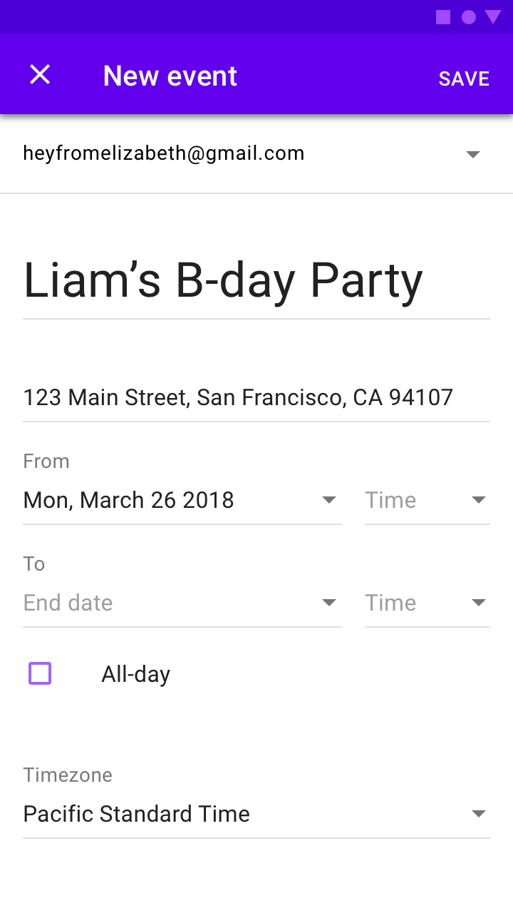
Full-screen dialog
Usage
Full-screen dialogs group a series of tasks, such as creating a calendar entry with the event title, date, location, and time. Because they take up the entire screen, full-screen dialogs are the only dialogs over which other dialogs can appear.
Full-screen dialogs may be used for content or tasks that meet any of these criteria:
- Dialogs that include components which require keyboard input, such as form fields
- When changes aren’t saved instantly
- When components within the dialog open additional dialogs
Full-screen dialogs are for mobile devices only. For tablet or desktop, use a modal dialog.
Behavior
Saving selections
To save a selection in a full-screen dialog, the user taps “Save.” To discard all changes and exit, the user taps the “X” icon or “Back” button.
Confirmation
The confirmation action is disabled until all mandatory fields are filled. Use descriptive verbs such as “Save,” “Send,” “Share,” “Update,” or “Create.” Don’t use vague terms such as “Done,” “OK” or “Close”.
- If no changes have been made, the dialog closes and no discard confirmation is required
- If the user has made changes, the user is prompted to confirm the discard action
Dialog windows
Launching a full-screen dialog temporarily resets the app’s perceived elevation, allowing simple menus or dialogs to appear above the full-screen dialog.
Layout
Full-screen dialogs cover the screen and don’t appear as a floating modal window.
Actions
Place confirmation and dismissive actions in the top app bar.
Navigation
Because full-screen dialogs can only be completed, dismissed, or closed, only use the close “X” navigation button.
Titles
Titles should be succinct. They can wrap to a second line if necessary, and be truncated. If there are long titles, or titles of variable lengths (such as translations), place them in the content area instead of the app bar.
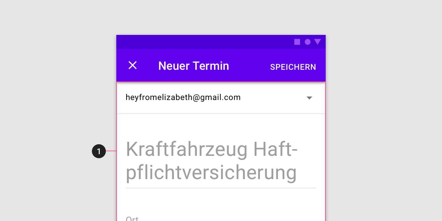
Find ways to shorten app bar text, and place longer titles into the content area (1) of a full-screen dialog.
Implementation
Related components:
Javascript methods:
| void MDC.dialogOpen(dialog_container) | ||
|---|---|---|
| A method to open the dialog. note that this method wont create a new dialog. | ||
| dialog_container | String | jQuery | Element | The dialog container. can be either a css selector string or a jQuery object or an element. |
| void MDC.dialogClose(dialog_container) | ||
| A method to close the dialog. | ||
| dialog_container | String | jQuery | Element | The dialog container. can be either a css selector string or a jQuery object or an element. |
Alert dialog
Dialog header
Lorem ipsum dolor sit amet, consectetur adipiscing elit, sed do eiusmod tempor incididunt ut labore et dolore magna aliqua. Ut enim.
<div id="dialog-1" class="mdc-dialog-container">
    <div class="mdc-dialog">
        <div class="header">
            <div class="title">Dialog header</div>
        </div>
        <div class="body">...</div>
        <div class="mdc-button-group">
            <button class="mdc-button lime-800">Action 1</button>
            <button class="mdc-button lime-800">Action 2</button>
        </div>
    </div>
</div>