almoamen.net
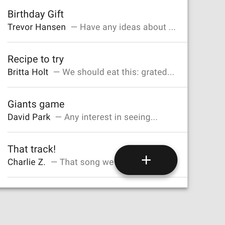
Buttons: floating action button
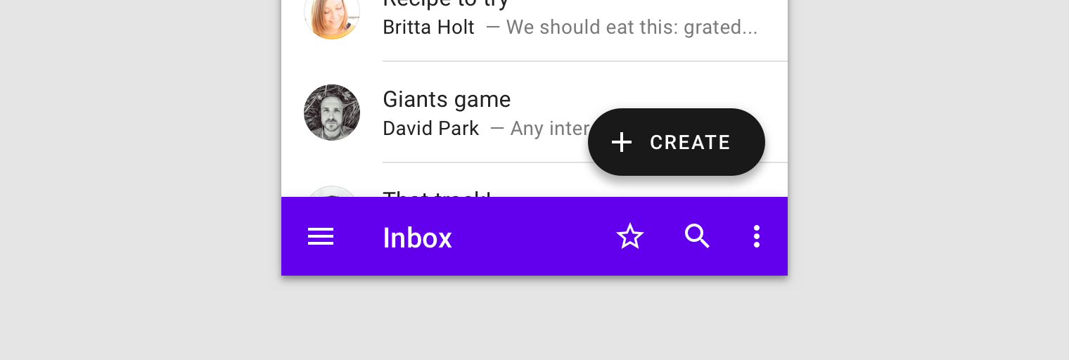
A floating action button (FAB) represents the primary action of a screen.
Usage
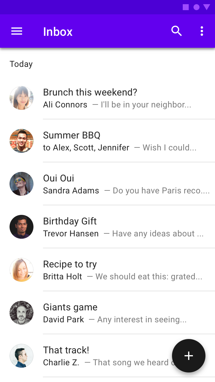
A floating action button (FAB) performs the primary, or most common, action on a screen. It appears in front of all screen content, typically as a circular shape with an icon in its center. FABs come in three types: regular, mini, and extended.
Only use a FAB if it is the most suitable way to present a screen’s primary action.
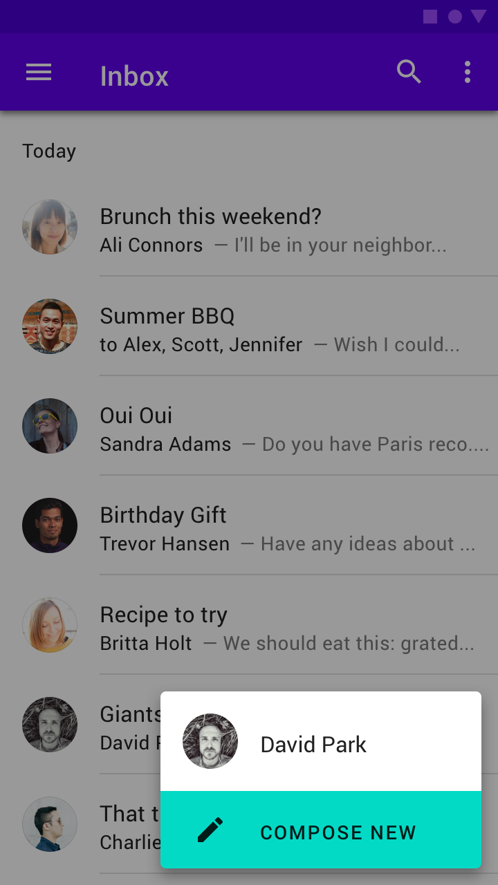
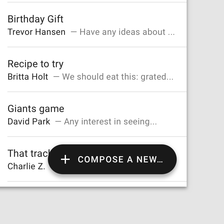
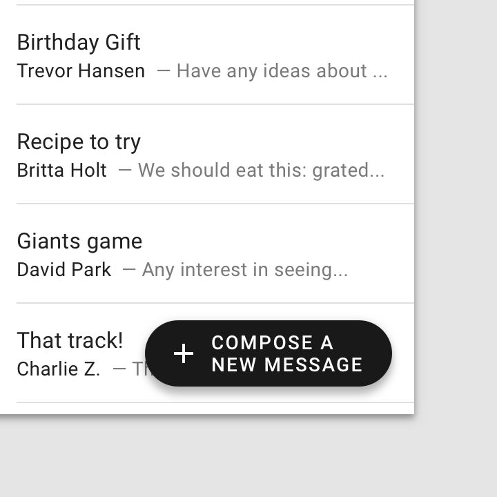
Represent the most common primary action with a floating action button, such as drafting a new email.

FABs are not needed on every screen, such as when images represent primary actions.
Don’t display multiple FABs on a single screen.
Occasionally two FABs can be used, if they perform distinct, yet equally important, actions.
Principles

Primary
An FAB represents the primary action on a screen.

Constructive
A FAB should perform a constructive action (such as create, share, or explore).
Contextual
A FAB should be relevant to the screen on which it appears.
Anatomy
- Container
- Icon
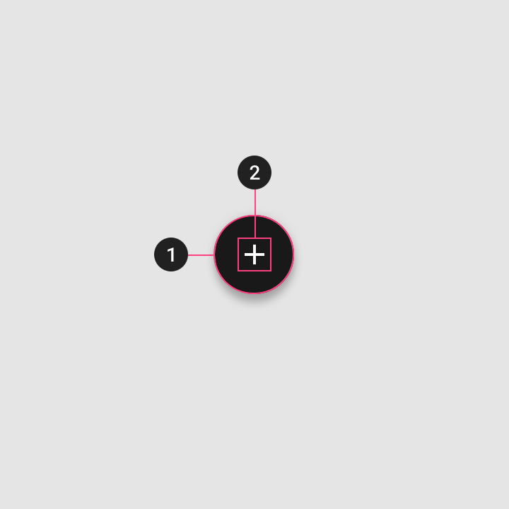
Container
The FAB is typically displayed in a circular container. An app’s color scheme determines its color fill, which should contrast with the area behind the FAB.

FAB containers come in two sizes:
- Default (56 x 56dp)
- Mini (40 x 40dp)
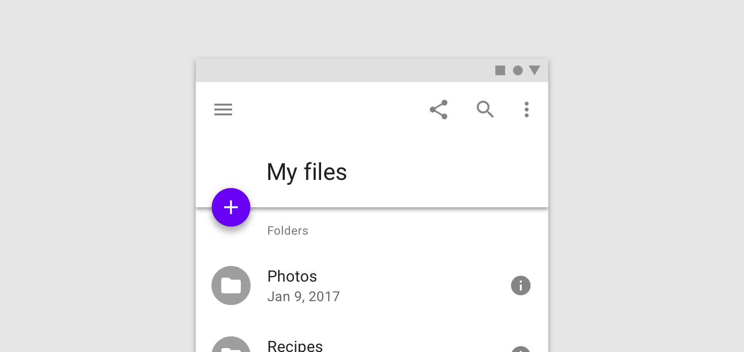
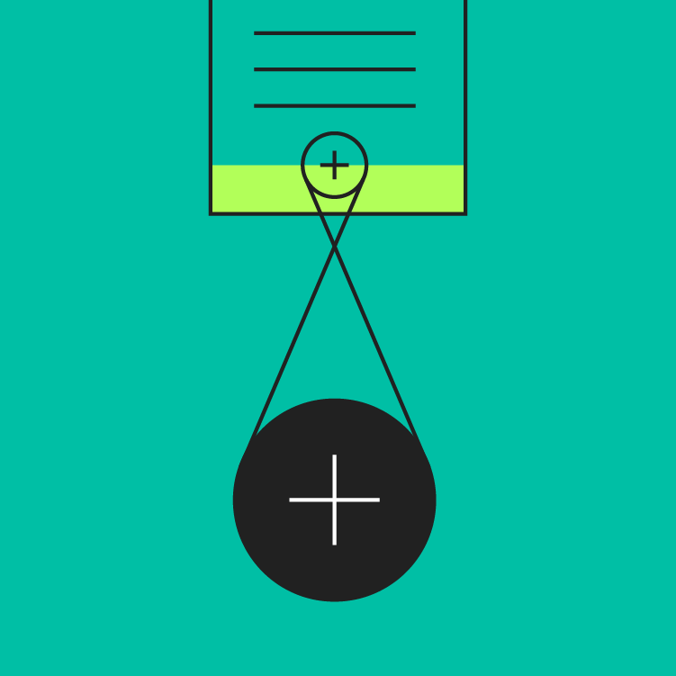
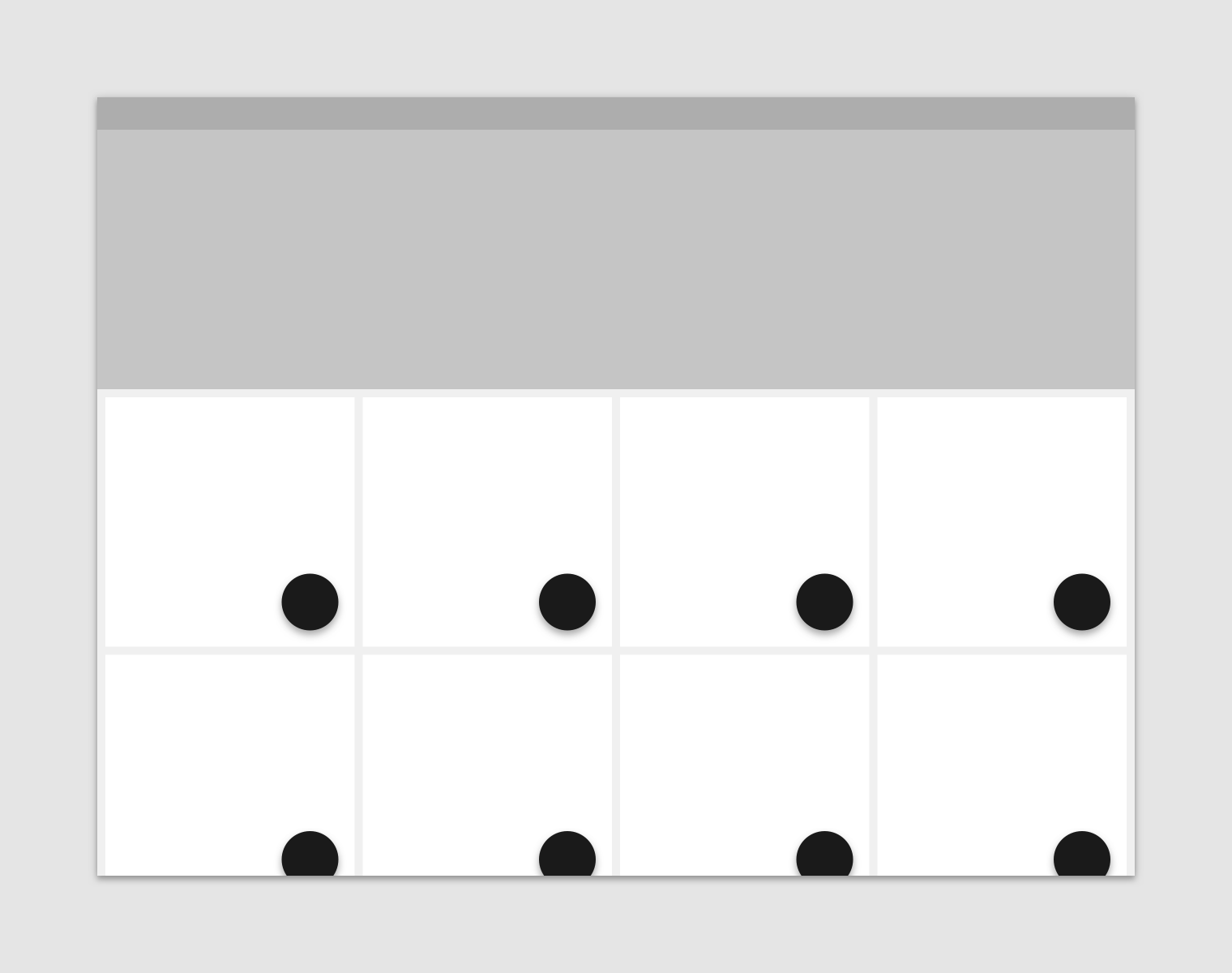
A mini FAB should be used on smaller screens. When a screen width is 460dp or less, the container of a default FAB (56dp) should transform into the mini size (40dp).
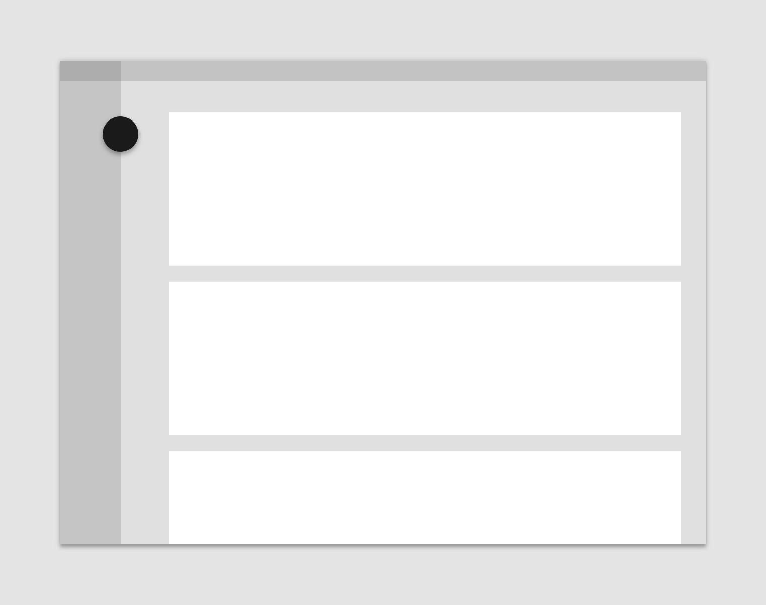
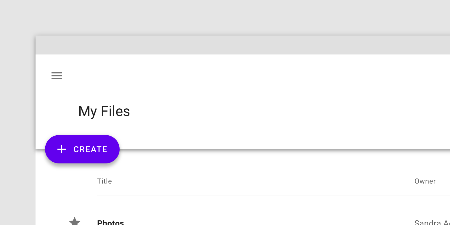
Mini FABs can also be used to create visual continuity with other screen elements.
This mini FAB creates visual continuity by having a related size, shape, and placement to the folder icons below it.
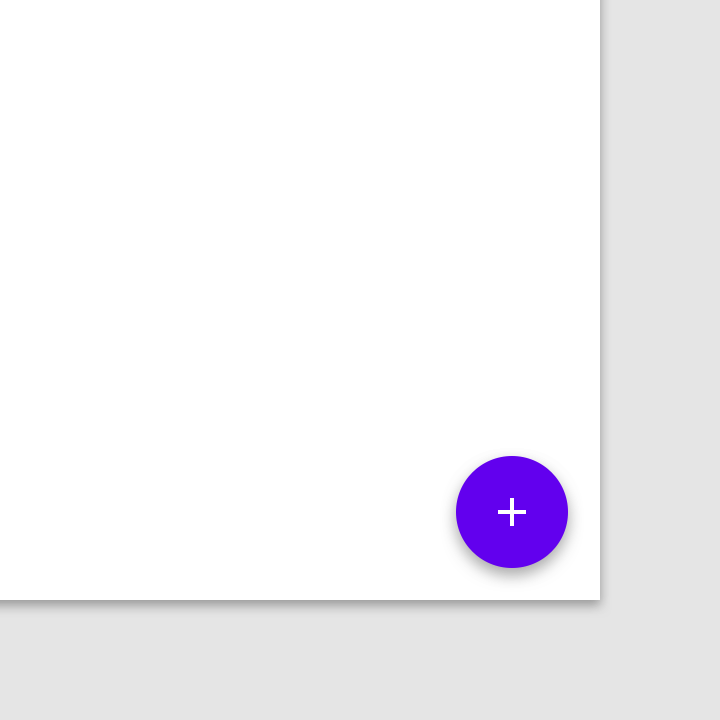
FAB containers adopt a color from an app’s palette.
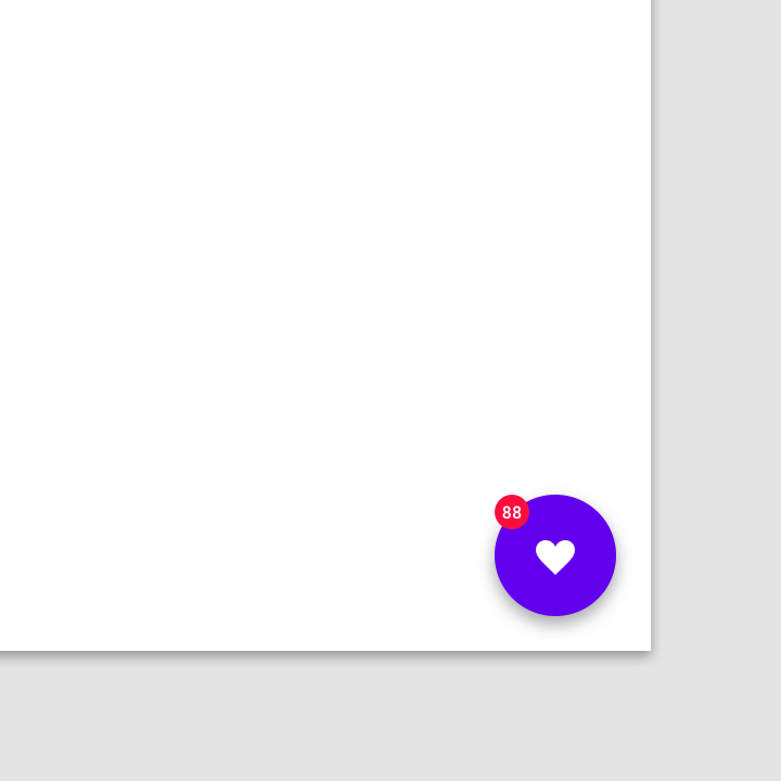
Don’t layer badges or other elements in front of a FAB.
Icon
A FAB’s icon should clearly illustrate its action. A FAB shouldn’t contain notifications or actions found elsewhere on a screen.
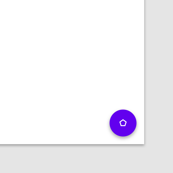
Don’t use ambiguous iconography.
Don’t place text in a regular FAB.
Placement
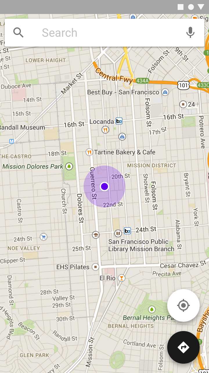
FABs can attach to top app bars and the edge of some components.
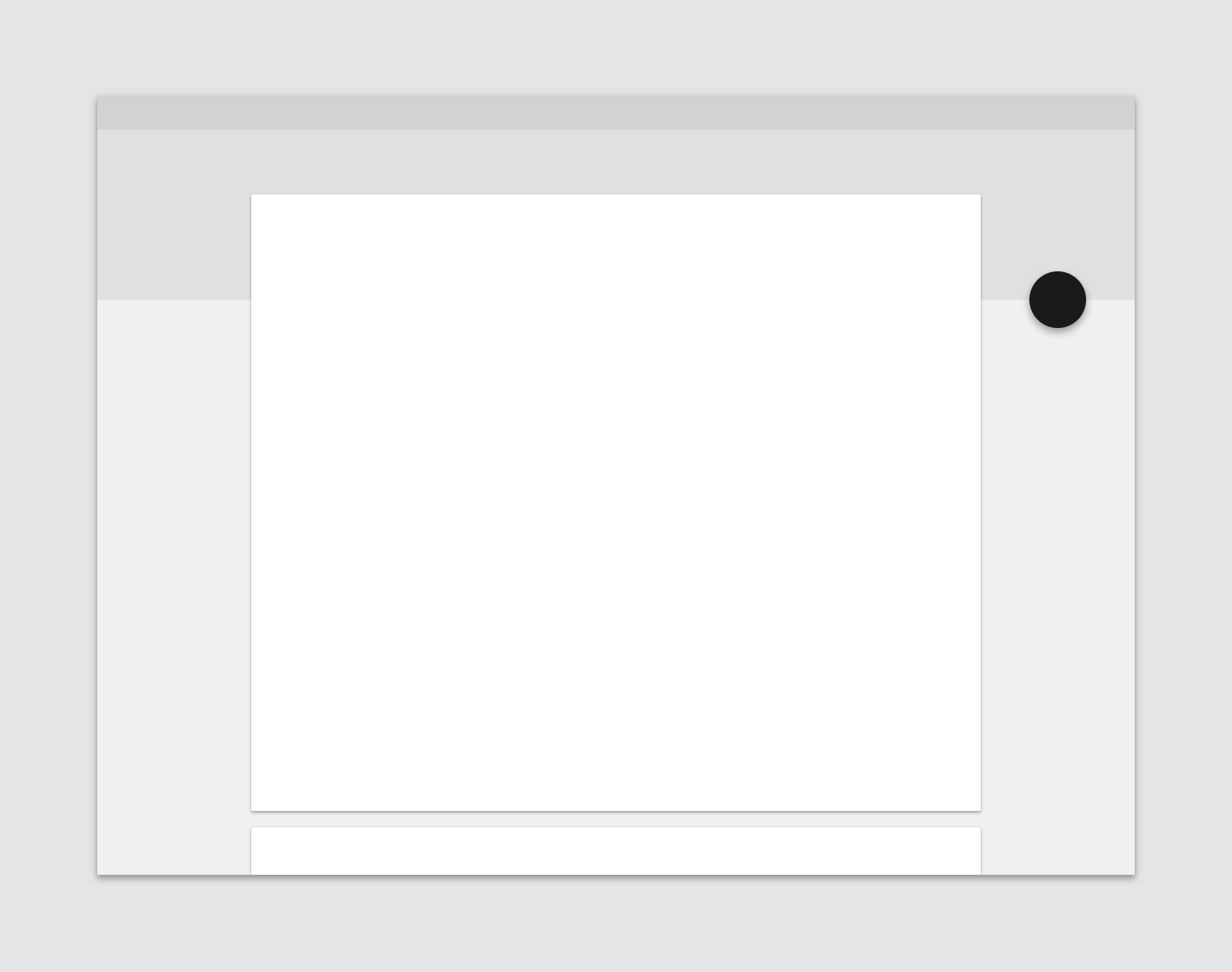
A floating action button (FAB) can attach to a top app bar.
A FAB can be attached to the edge of a component.
Individual components, such as cards, cannot each have their own FAB.
Behavior
Actions
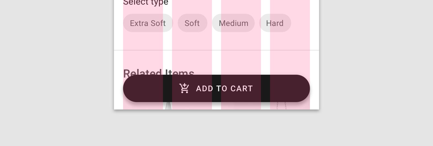
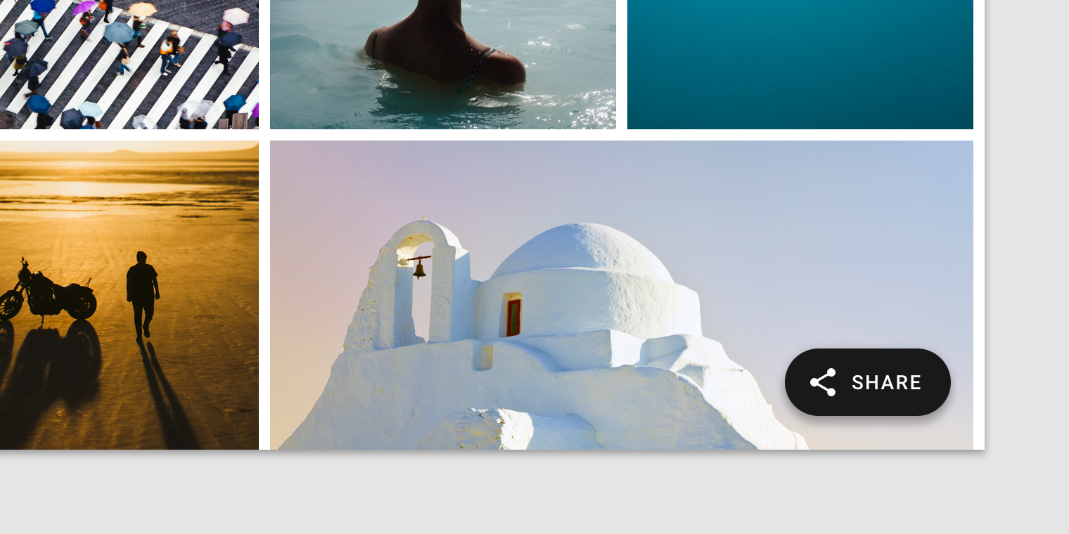
A floating action button (FAB) can trigger an action either on the current screen, or it can perform an action that creates a new screen.
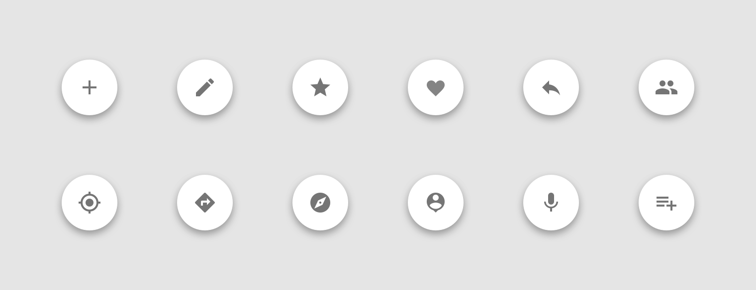
A FAB promotes an important, constructive action such as:
- Create
- Favorite
- Share
- Start a process
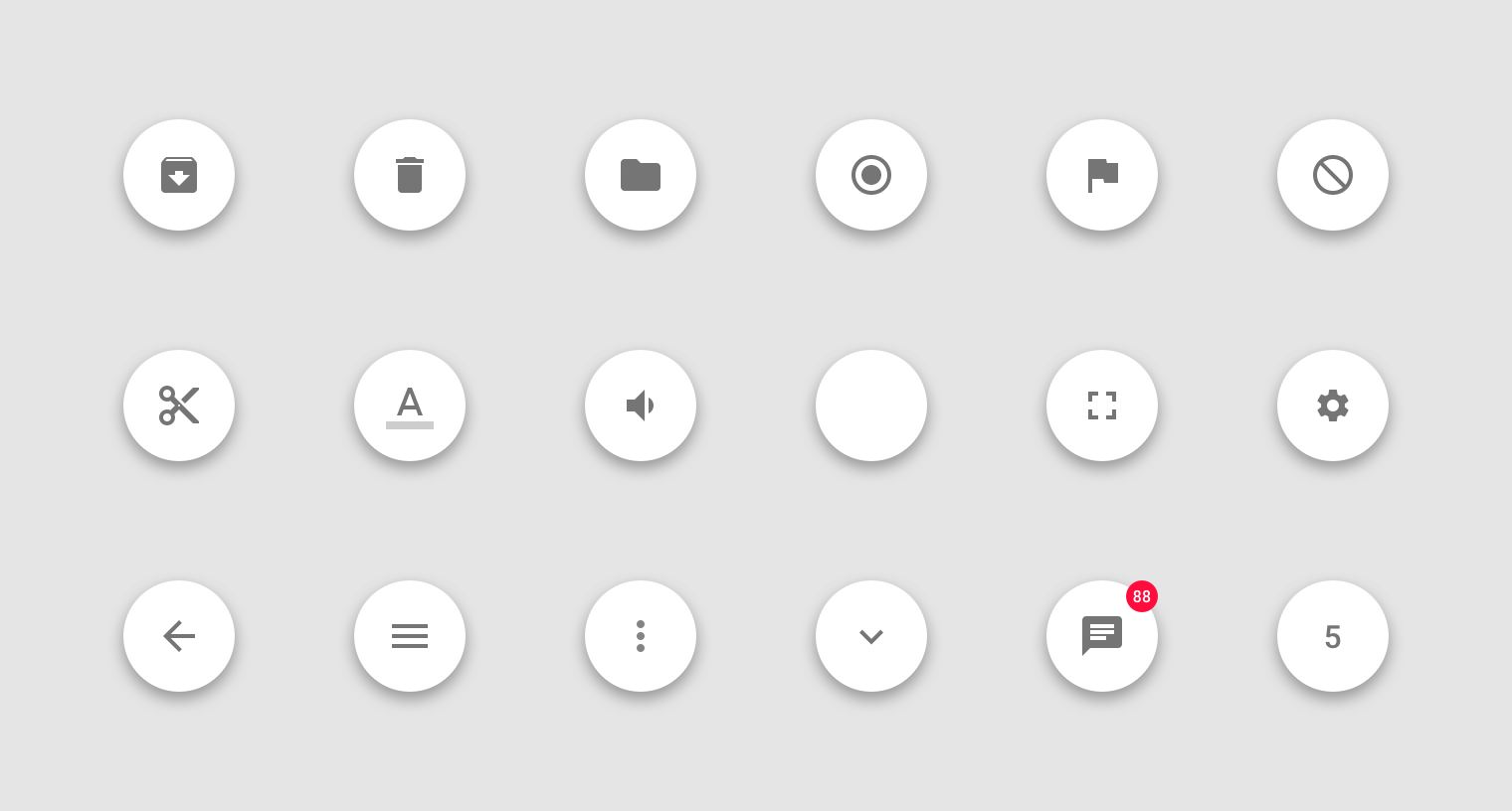
Avoid using a FAB for minor or destructive actions, such as:
- Archive or trash
- Alerts or errors
- Limited tasks like cutting text
- Controls better suited to a toolbar (like controls to adjust volume or font color)
Use FABs for primary, positive actions.
Do not use FABs for minor, overflow, unclear, or destructive actions.
Types of transitions
Speed dial
When pressed, a FAB can display three to six related actions in the form of a speed dial. This transition can occur in one of the following ways:
- Upon press, the FAB can emit related actions
- Upon press, the FAB can transform into a menu containing related actions (Android only)
If more than six actions are needed, something other than a FAB should be used to present them.
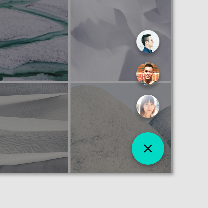
Emit related actions
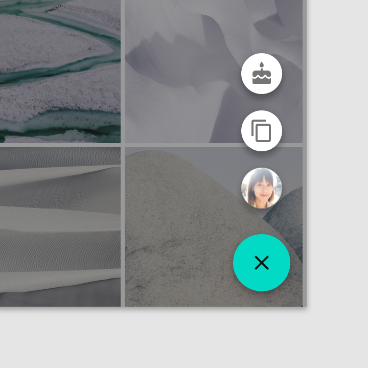
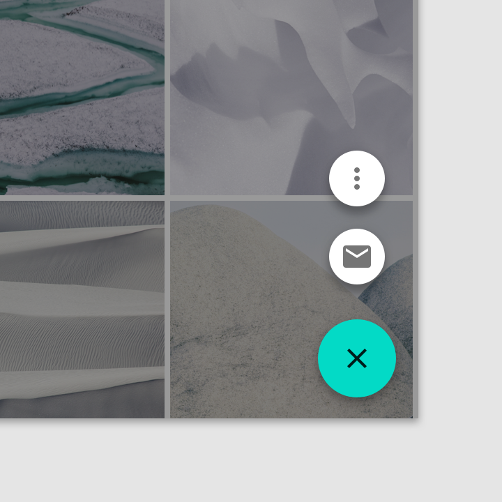
Upon press, the FAB remains visible and emits a stack of related actions. If the FAB is tapped is pressed in this state, it should either initiate its default action or close the speed dial actions.
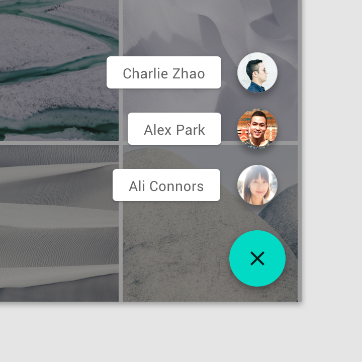
A FAB can contain a list of contacts.
Related actions can have text labels.
A FAB shouldn’t transform into unrelated actions.
Speed dial options shouldn’t include an overflow menu.
Transform into a menu with the related actions
Upon press on Android, the FAB can transform into a menu containing related actions. A scrim indicates that functionality outside of the action menu is temporarily disabled. The menu remains on-screen until an action, or the scrim, is tapped.
Don’t use an action menu with fewer than three options.
An action menu shouldn’t include more than six options, as action menus don’t support scrolling.
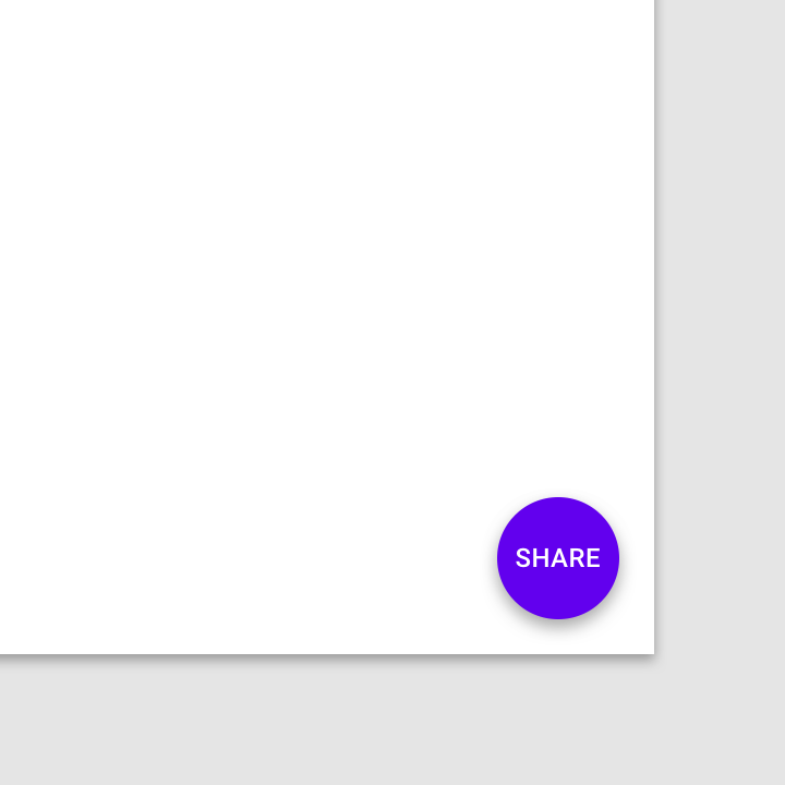
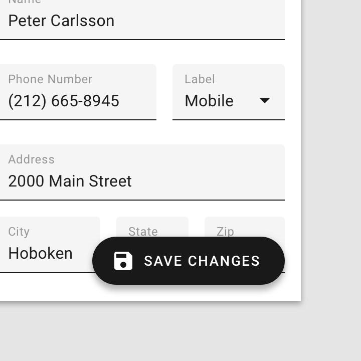
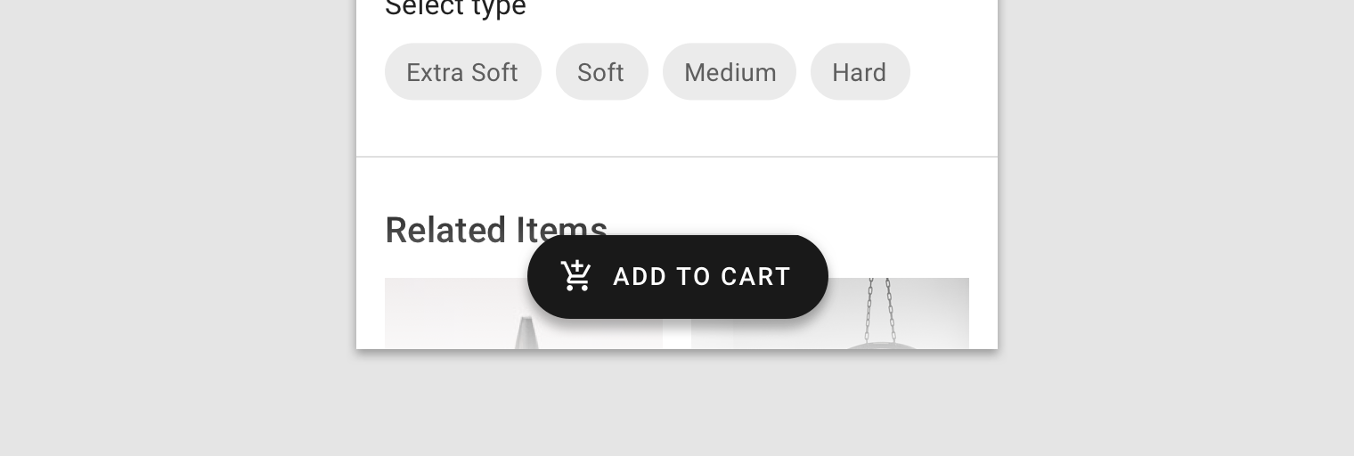
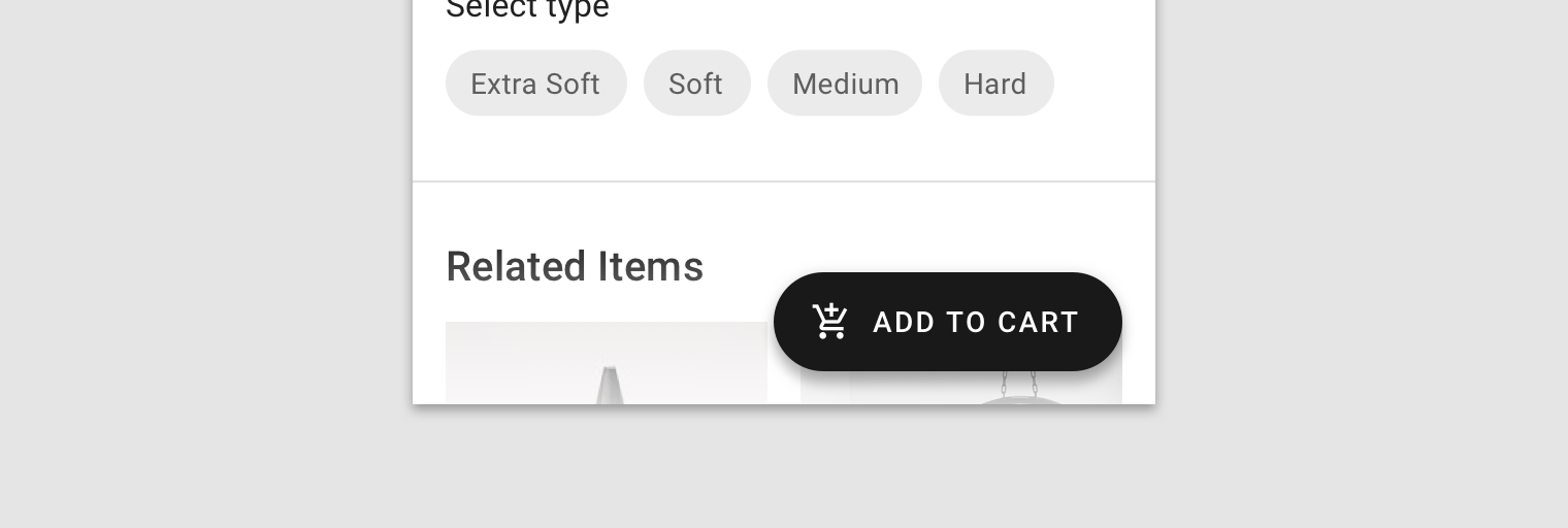
Extended FAB
The extended FAB is wider, and it includes a text label.
Extended FAB
Anatomy
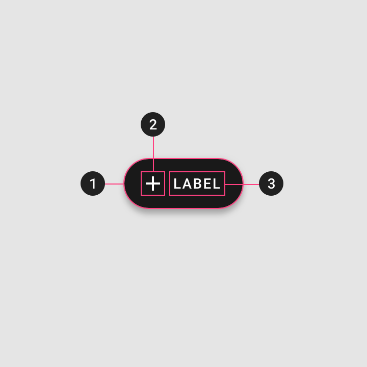
- Container
- Icon (optional)
- Text label
Container
The width of a extended FAB’s container can be fixed or fluid.
- A fixed width container is defined by the cumulative width of the icon, text label, and padding.
- A fluid width container is defined by its relationship to something else on screen, such as screen width or the layout grid.
This fixed extended FAB’s width is defined by the cumulative width of the icon, text label, and container padding.
This extended FAB’s container width is defined by the layout grid columns.
Icon
The icon of an extended FAB should intuitively represent its action.
Icons should be placed to the left of text labels for left-to-right languages.
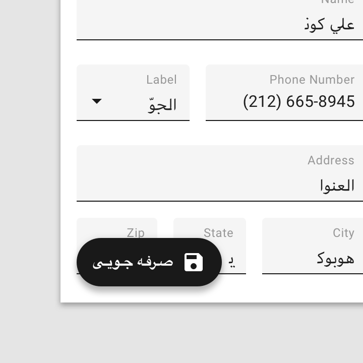
Icons should be placed to the right for right-to-left languages.

Unlike standard FABs, extended FABs don’t require an icon.
An extended FAB can’t have an icon without a text label.
Text label
The text label of an extended FAB should describe its action.
Only truncate text if shorter text isn’t an option.
Avoid wrapping text.
Placement
The extended FAB can be positioned in the center, left, or right side of a screen.
Desktop and tablet
For UIs larger than 840dp, such as desktop, the extended FAB should be placed at the top left of the screen, or at the bottom right of the screen.
On desktop, the extended FAB placed at the top left
On desktop, the extended FAB placed at the bottom right
Mobile
On mobile, the extended FAB should be placed at the bottom right or bottom center.
On mobile, the extended FAB placed at the bottom center
On mobile, the extended FAB placed at the bottom right
Avoid using an extended FAB above a bottom app bar, as the combination takes up a lot of screen space. If they are paired, the extended FAB should collapse on scroll.
Implementation
Floating action button
<!-- Regular FAB -->
<div class="mdc-fab">
    <button class="mdc-fab-button bg-lime-800">
        <div class="icon material-icon">add</div>
    </button>
</div>

<!-- Mini FAB -->
<div class="mdc-fab">
    <button class="mdc-fab-button mini bg-lime-800">
        <div class="icon material-icon">add</div>
    </button>
</div>

<!-- Extended FAB -->
<div class="mdc-fab">
    <button class="mdc-fab-button extended bg-lime-800">
        <div class="icon material-icon">add</div>
        <div class="label">New item</div>
    </button>
</div>