almoamen.net
Cards
Cards contain content and actions about a single subject.
Usage
Cards are surfaces that display content and actions on a single topic.
They should be easy to scan for relevant and actionable information. Elements, like text and images, should be placed on them in a way that clearly indicates hierarchy.
Principles

Contained
A card is identifiable as a single, contained unit.

Independent
A card can stand alone, without relying on surrounding elements for context.

Individual
A card cannot merge with another card, or divide into multiple cards.
Anatomy
The card container is the only required element in a card. All other elements shown here are optional.
Card layouts can vary to support the types of content they contain. The following elements are commonly found among that variety.
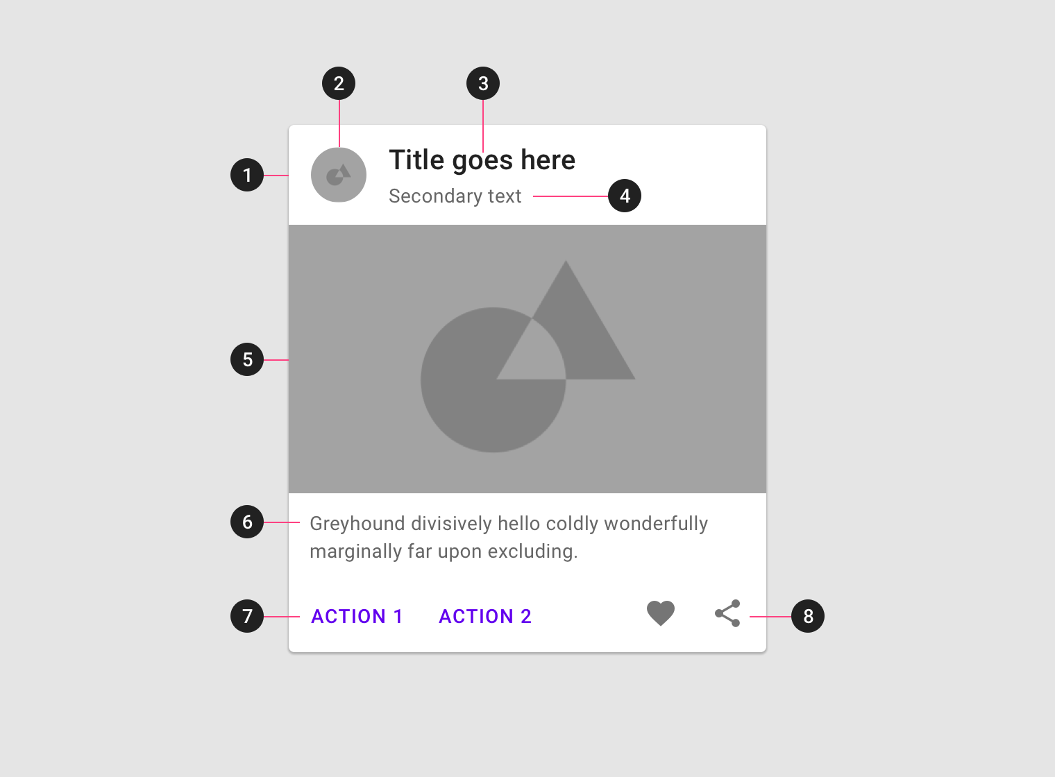
1. Container
Card containers hold all card elements, and their size is determined by the space those elements occupy. Card elevation is expressed by the container.
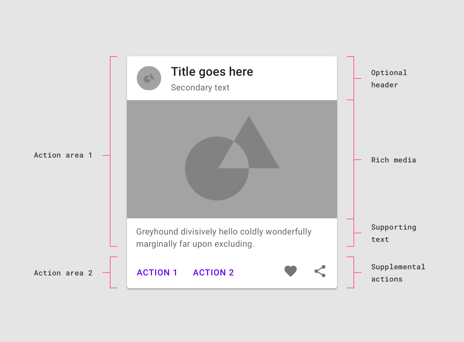
2. Thumbnail [optional]
Cards can include thumbnails to display an avatar, logo, or icon.
3. Header text [optional]
Header text can include things like the name of a photo album or article.
4. Subhead [optional]
Subhead text can include text elements such as an article byline or a tagged location.
5. Media [optional]
Cards can include a variety of media, including photos, and graphics, such as weather icons.
6. Supporting text [optional]
Supporting text include text like an article summary or a restaurant description.
7. Buttons [optional]
Cards can include buttons for actions.
8. Icons [optional]
Cards can include icons for actions.
Each card is made up of content blocks. All of the blocks, as a whole, are related to a single subject or destination. Content can receive different levels of emphasis, depending on its level of hierarchy.
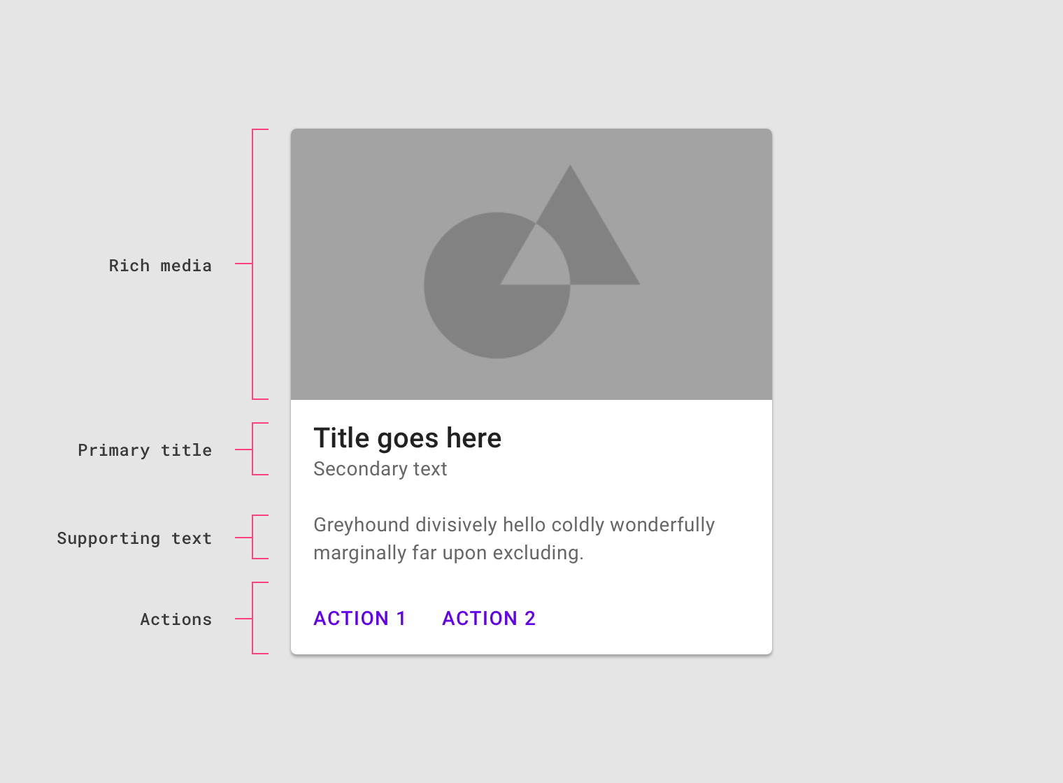
Cards contain rich media, primary title, supporting text, and actions.
Dividers
Dividers can be used to separate regions in cards or to indicate areas of a card that can expand.
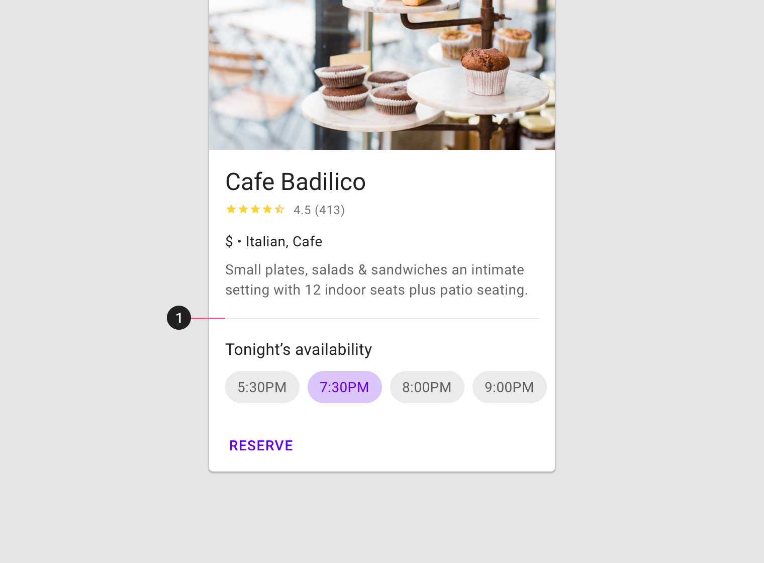
Use inset dividers (1), dividers that do not run the full length of a card, to separate related content.
Behavior
Transitions
Cards can transform to reveal additional content.
Elevation
On mobile, a card’s default elevation is 1dp, with a raised elevation of 8dp.
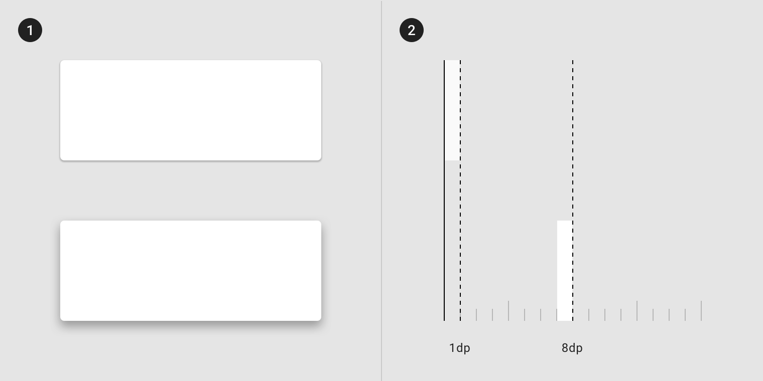
A shadow helps indicate a card.
On desktop and mobile, cards can have a resting elevation of 0dp. They elevate to 8dp on hover.
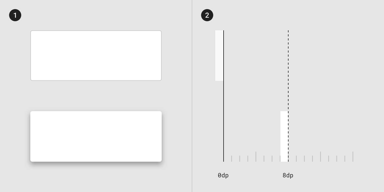
A stroke of 0dp helps indicate a card.
Gestures
Gestures should be implemented consistently within a card collection. Frequently used gestures on cards include swipe, pick up and move, and scrolling.
Swipe
A swipe gesture can be performed on a single card at a time, anywhere on that card.
It can be used to:
- Dismiss a card
- Change the state of a card (such as flagging or archiving it)
Pick up and move
The pick up and move gesture allows users to move and re-order cards in a collection.
Scrolling
Card content that is taller than the maximum card height is truncated and does not scroll, but can be displayed by expanding the height of a card. A card can expand beyond the maximum height of the screen, in which case the card scrolls within the screen.
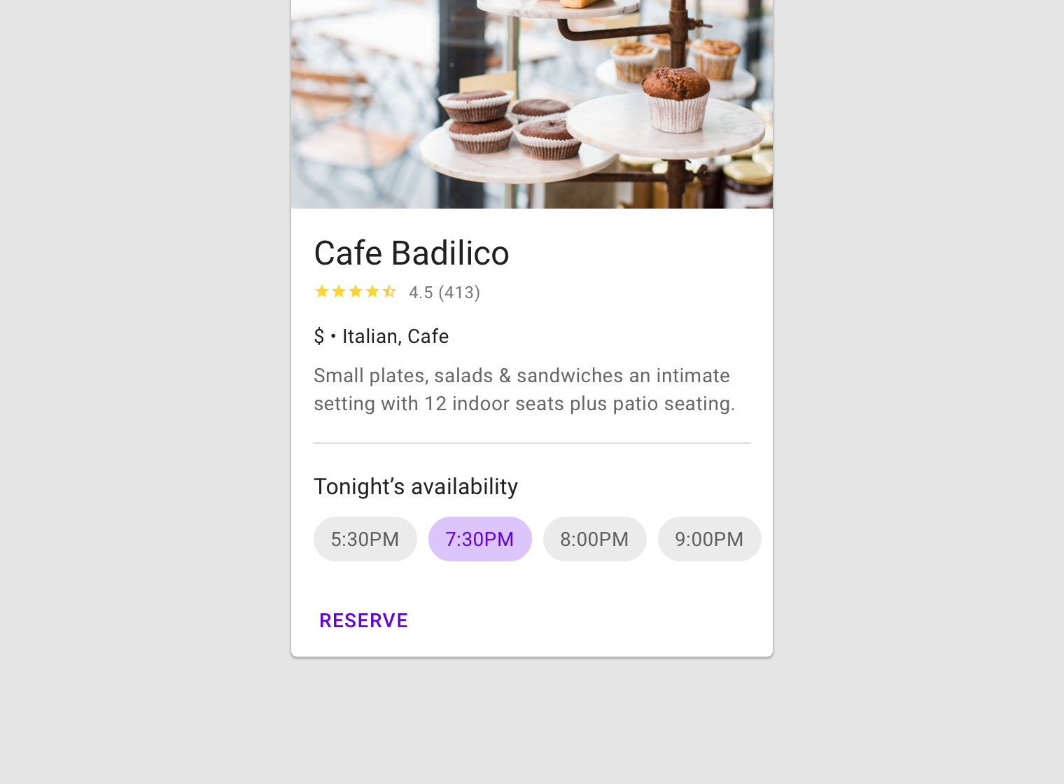
Actions
Primary action
The primary action area of a card is typically the card itself. Often cards are one large touch target to a detail screen on a subject.
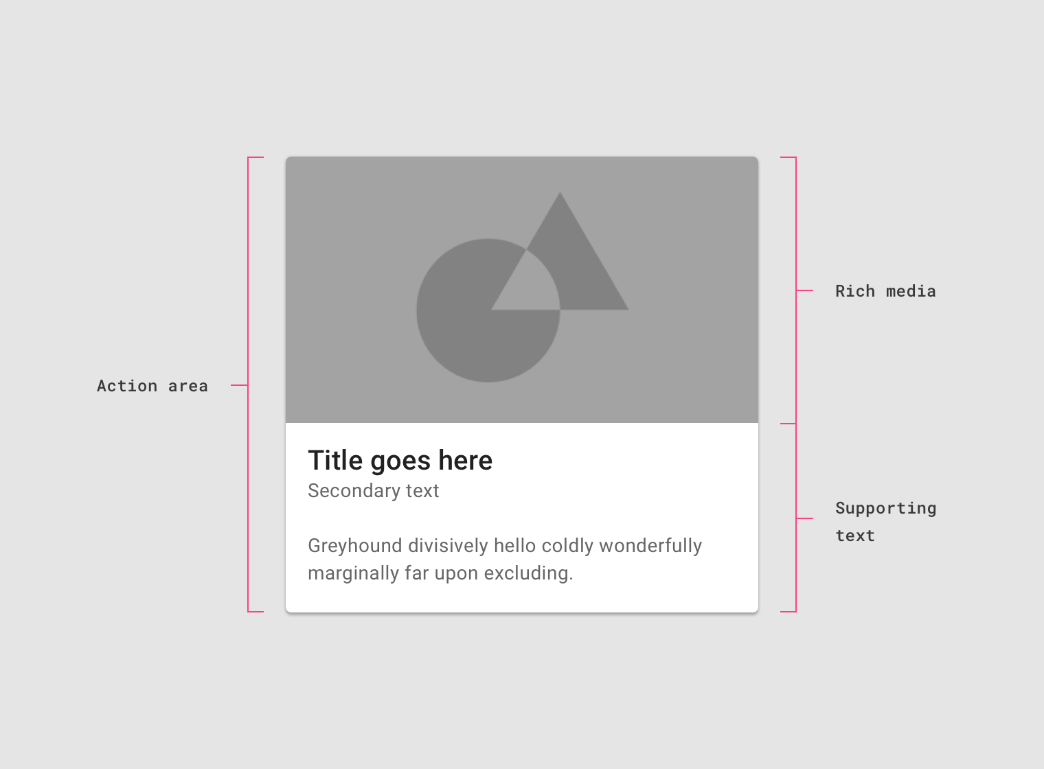
The action area of a card contains rich media and supporting text.
Supplemental actions
Supplemental actions are represented by icons, text, and UI controls on cards. They are typically placed at the bottom of the card.
For more than two supplemental actions, use an overflow menu instead.
Supplemental text and actions at the bottom of the card.
Overflow menu
Overflow menus contain related actions. They are typically placed in the upper-right or lower-right corner of a card.
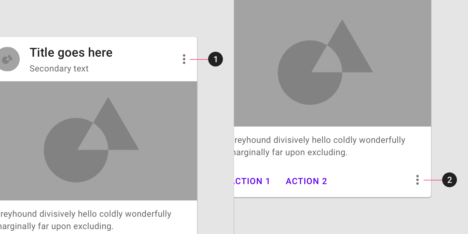
Overflow menus are usually located in the upper-right or lower-right corner of a card.
UI controls
UI controls can be included within a card to allow the user to interact with a card’s content. UI controls may be in the form of a slider, stars to rate content, chips, or buttons.
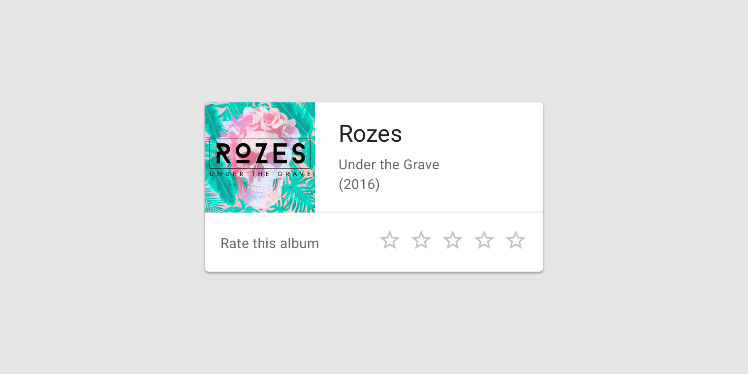
This card contains stars to rate content.
This card contains choice chips within the action area.
Additional actions
Cards can support multiple actions, such as UI controls and an overflow menu. Because cards are entry points to more detailed information, they should contain a limited number of actions.
Cards provide entry to more robust information. Be cautious not to overload cards with extraneous information or actions.
Focus
When traversing through focus points on a card, visit each focused element before moving to the next card.
For users that navigate solely using focus traversal (using a D-pad and keyboard), cards should have either a primary action or open a new screen containing primary and supplemental actions.
Card collections
Usage
When multiple cards are present, they are grouped together into one or more collections. By default, cards in a collection are coplanar, sharing the same resting elevation unless they are picked up or dragged.
Layout
Organize card collections so that they are easy to use. Their layout affects how they are perceived.
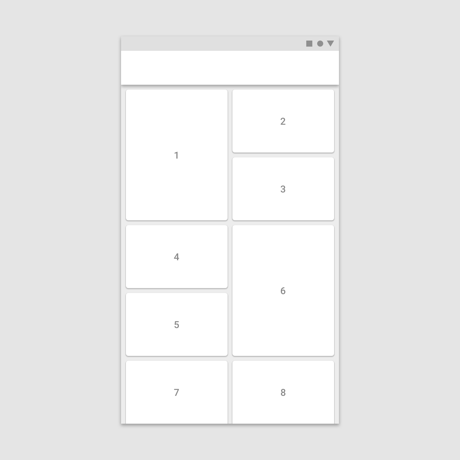
When adding cards to a collection, the first item is automatically positioned on the top left. Subsequent cards are laid out left to right, top to bottom.
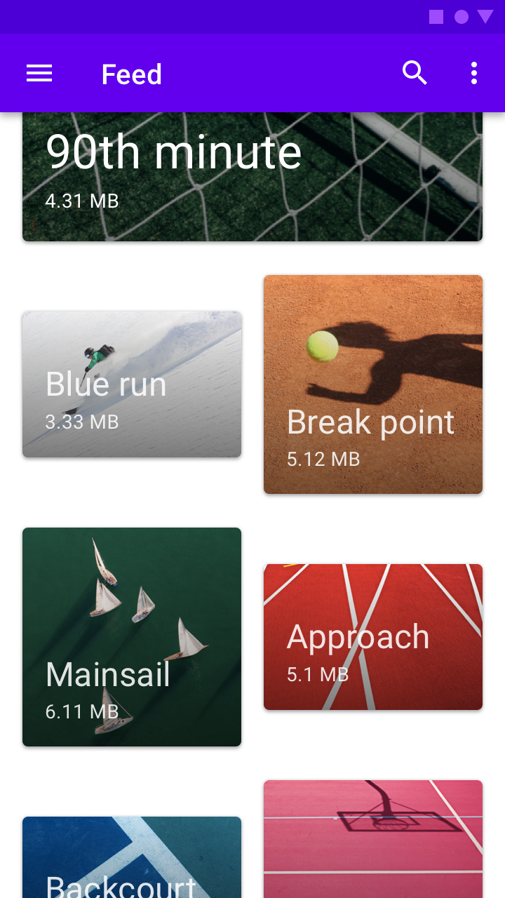
Scannable
To make a collection of cards scannable, place them in a consistent pattern.
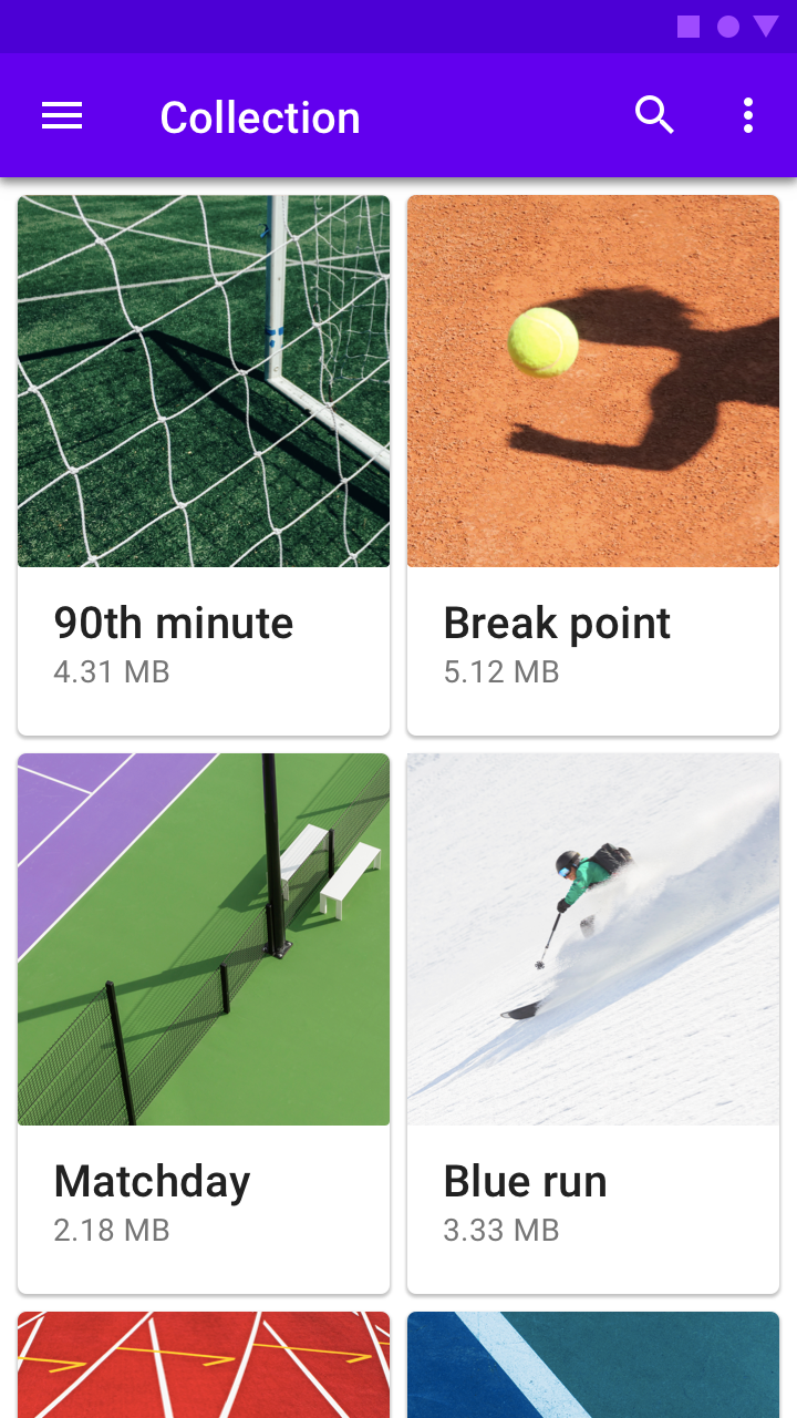
Scannable cards
Dashboard
To display multiple subject matters and functions on a screen, use a dashboard-style card collection.
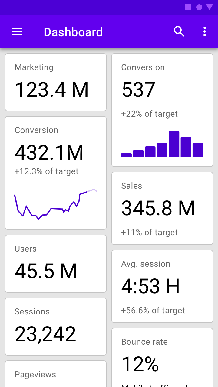
Dashboard-style card collection
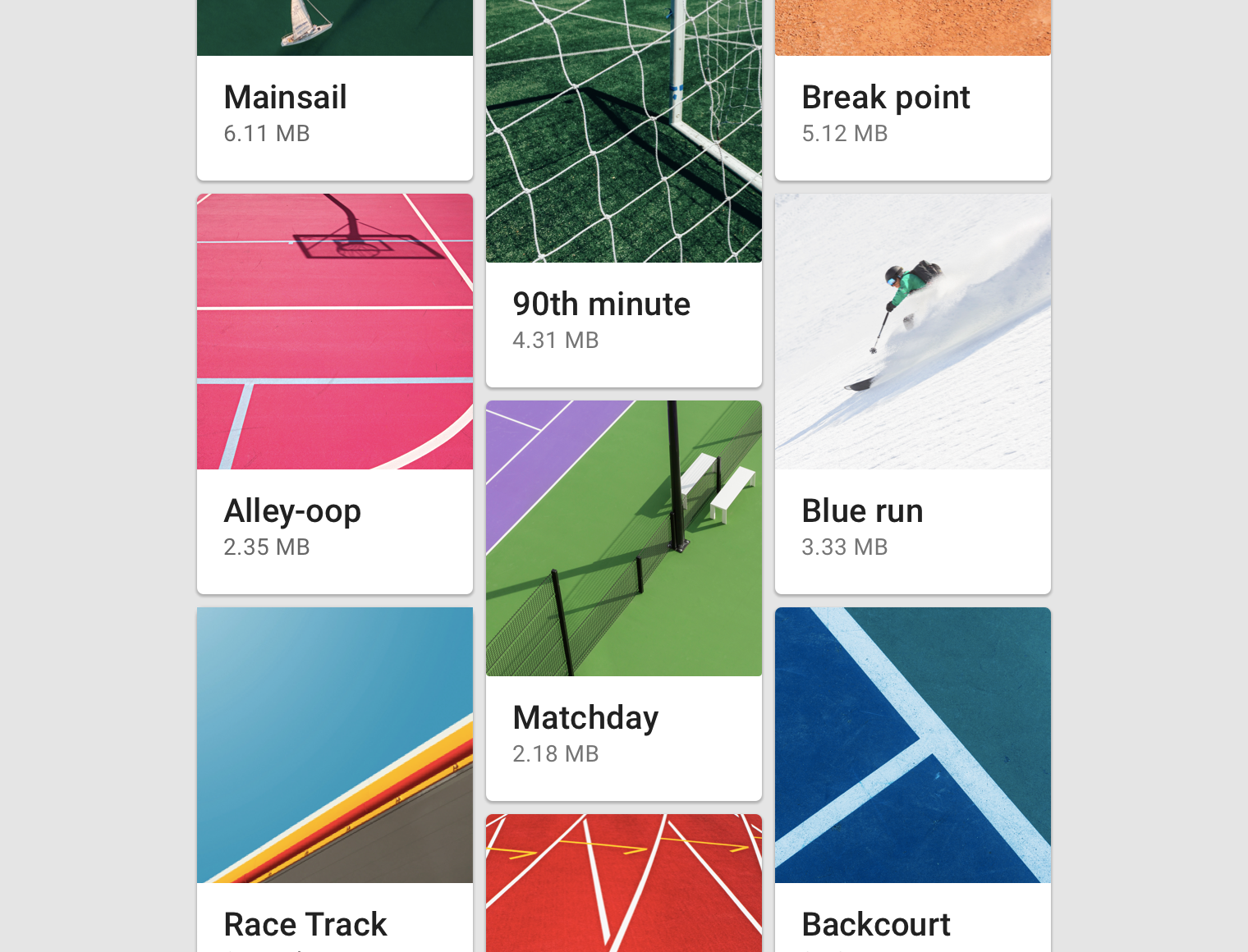
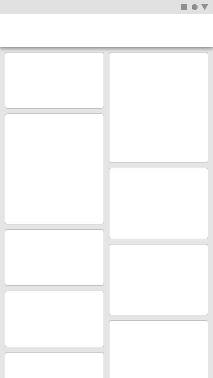
Distinction
To highlight each card’s individuality, style, or novelty, use a card collection with an asymmetric grid.
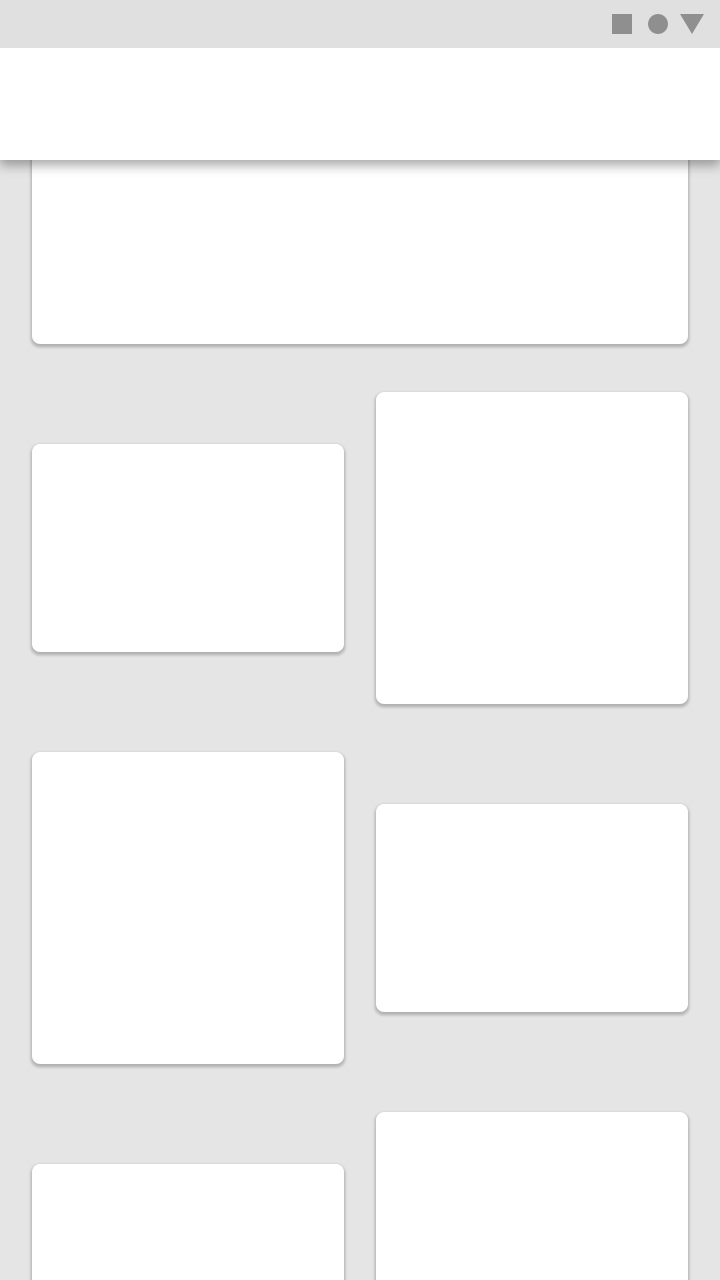
Cards in an asymmetric grid
Contained collections
Card collections can be placed within a container, and be scrolled within it.
Filtering and sorting
Card collections can be filtered in a variety of ways, including by date or alphabetical order. If a collection can be filtered, the filter must apply to each card in the collection.
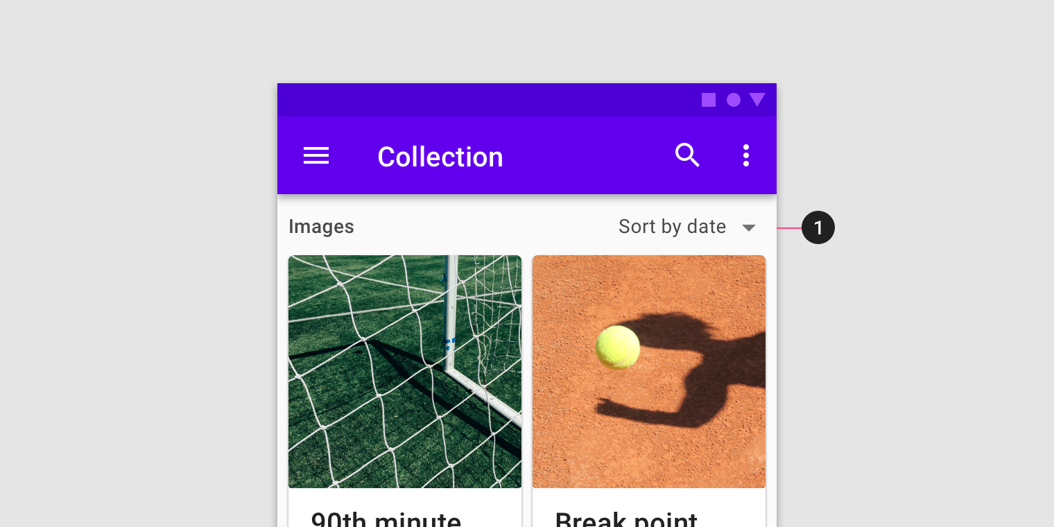
Filter or sorting options should be placed outside of the card collection.
Implementation
This section should not be read as prescriptive or exhaustive. Cards have no singular layout, typographic, or image size. All cards should be designed to meet the needs of the content they present. This section shows a general variety of card layouts to help showcase that variety. However, these layouts are implemented and can be used without customization.
Related components:
Title goes here
Lorem ipsum dolor sit amet, consectetur adipiscing elit.
Thumbnail has 3 optional sizes:
- 80x80: css class
.thumbnail.md-80 - 120x120: css class
.thumbnail.md-120 - 160x160: css class
.thumbnail.md-160
<div class="mdc-card">
    <div class="mdc-card-primary">
        <div class="card-header">
            <div class="title">
                <h5>Title goes here</h5>
                <div class="mdt-subtitle-2">Lorem ipsum ...</div>
            </div>
            <div class="thumbnail md-80" style="background-image: url('...');"></div>
        </div>
    </div>
    <div class="mdc-button-group">
        <button class="mdc-button lime-800">Action 1</button>
        <button class="mdc-button lime-800">Action 2</button>
    </div>
</div>
Card with primary action
<div class="mdc-card">
    <button class="mdc-card-primary">
        .
        .
        .
    </button>
    <div class="mdc-button-group">
        <button class="mdc-button lime-800">Action 1</button>
        <button class="mdc-button lime-800">Action 2</button>
    </div>
</div>
Title goes here
Secondary line text
Lorem ipsum dolor sit amet, consectetur adipiscing elit, sed do eiusmod tempor.
Default media aspect ratio is 16:9, as an option it can be 1:1 by using the css class .media.md-1by1
<div class="mdc-card">
    <div class="mdc-card-primary">
        <div class="card-header">
            <div class="thumbnail" style="background-image: url('...');"></div>
            <div class="title">
                <h6>Title goes here</h6>
                <div class="mdt-subtitle-2">Secondary line text</div>
            </div>
        </div>
        <div class="media" style="background-image: url('...');"></div>
        <div class="supporting-text mdt-body-2">
            Lorem ipsum ...
        </div>
    </div>
    <div class="mdc-button-group">
        <button class="mdc-button lime-800">Action 1</button>
        <button class="mdc-button lime-800">Action 2</button>
    </div>
</div>