almoamen.net
Elevation
Elevation is the relative distance between two surfaces along the z-axis.
Elevation in Material Design
Measuring elevation
Elevation in Material Design is measured as the distance between Material surfaces. The distance from the front of one Material surface to the front of another is measured along the z-axis in density-independent pixels (dps) and depicted (by default) using shadows.
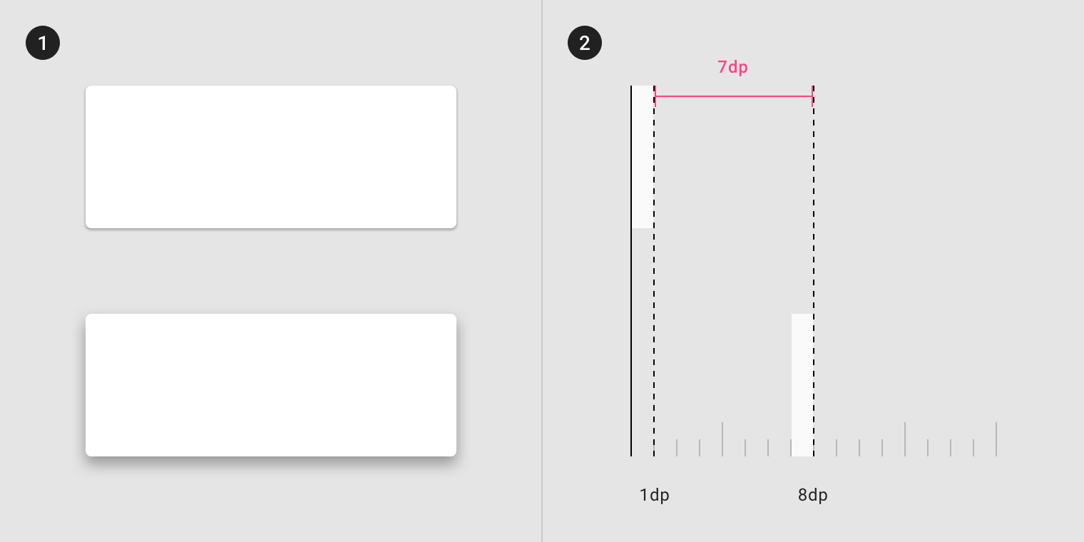
- One surface at 1dp elevation and another surface at 8dp elevation, as viewed from the front
- The difference in elevation between the two surfaces is 7dp, as viewed from the side
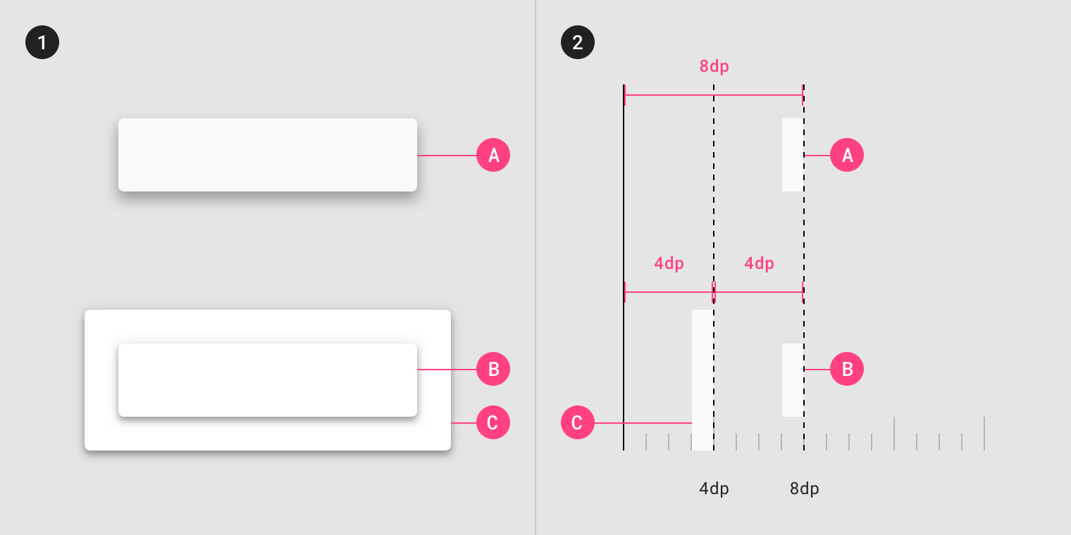
Surfaces at the same elevation can appear differently when other surfaces are behind them.
- One surface at 1dp elevation and another surface at 8dp elevation, as viewed from the front
- The difference in elevation between the two surfaces is 7dp, as viewed from the side
The elevation system
All Material Design surfaces, and components, have elevation values.
Surfaces at different elevations do the following:
- Allow surfaces to move in front of and behind other surfaces, such as content scrolling behind app bars
- Reflect spatial relationships, such as how a floating action button’s shadow indicates it is separate from a card collection
- Focus attention on the highest elevation, such as a dialog temporarily appearing in front of other surfaces
Elevation can be depicted using shadows or other visual cues, such as surface fills or opacities.

Material Design displays elevation using shadows.
Resting elevation
Resting elevations are starting elevation values given to components by default. Components move from resting elevations in response to the user or a system event. All Material components have resting elevations that are the same for each type of component. For example, all cards have the same resting elevations as each other, and a dialog has the same resting elevation as other dialogs.
Resting elevation and environment
Resting elevations vary based on the environment, platform, or app. The resting elevations on mobile are designed to provide visual cues, like shadows, to indicate when components are interactive. In contrast, resting elevations on desktop are shallower because other cues, like hover states, communicate when a component is interactive. For example, cards at 0dp elevation on desktop are outlined with a stroke.
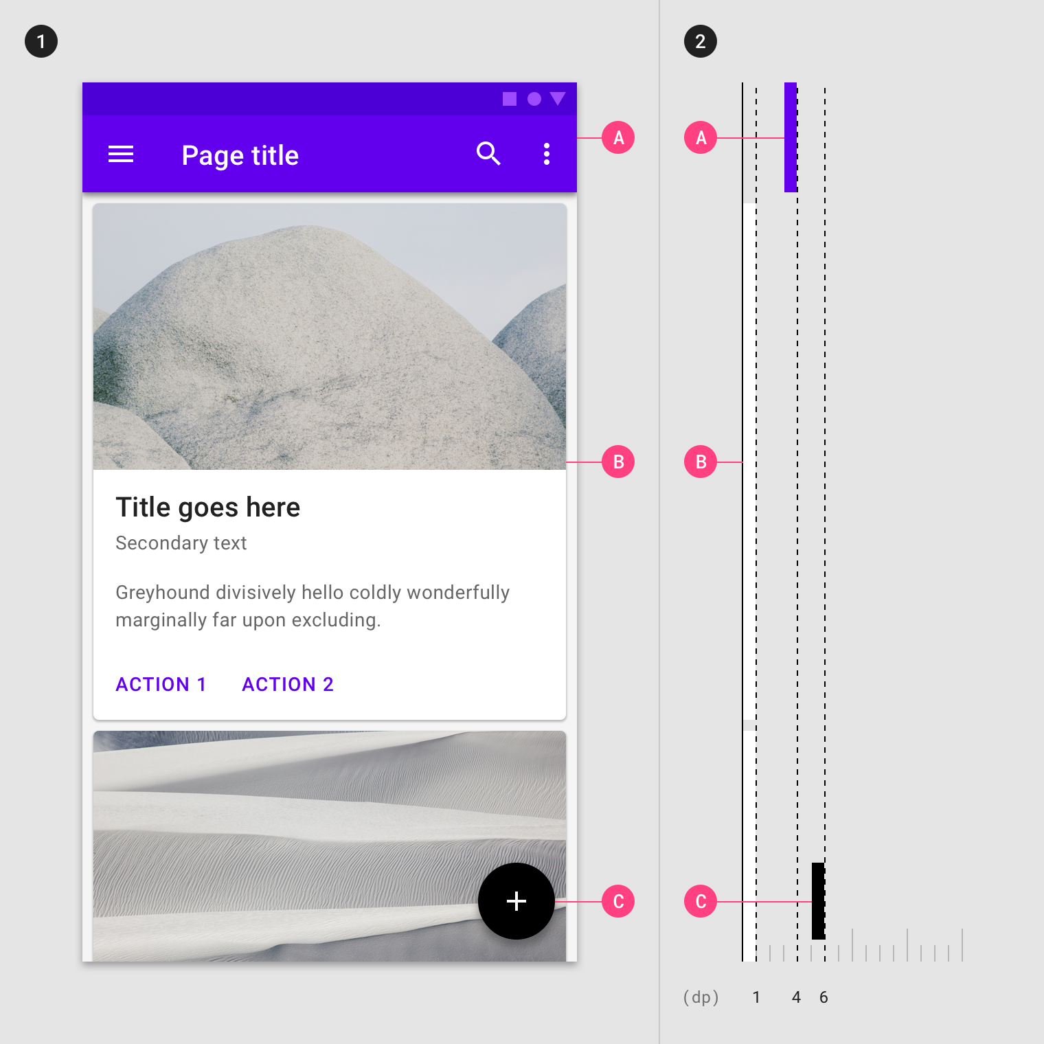
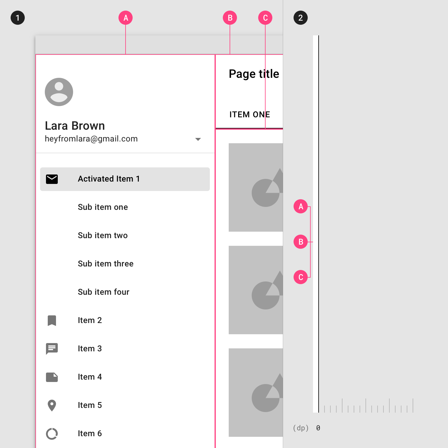
- Resting elevations on mobile for an app bar (A), cards (B), and a floating action button (C), as viewed from the front
- The same components, as viewed from the side
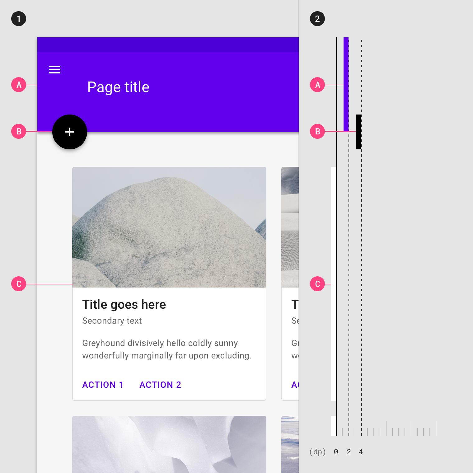
- Resting elevations on desktop for an app bar (A), floating action button (B), and cards (C), as viewed from the front
- The same components, as viewed from the side
Changing elevation
Components can change elevation in response to user input or system events. When this happens, components move to preset dynamic elevation offsets, which are the default elevations components move to when not resting.
Dynamic elevation offsets are the same across each type of component. For example, all cards use the same offset as other cards, and all floating action buttons use the same offset as other floating action buttons.
Once the user input (or system event) is completed or cancelled, the component swiftly returns to its resting elevation.
Elevation interference
When a component moves between its resting elevation and dynamic elevation offset, it shouldn’t collide with other components.
To avoid these kinds of collisions, components can move out of the way. For example, if increasing a card’s elevation positions it to pass through a floating action button, that button can disappear or move off-screen before the collision occurs.
You can also design your app’s layout to avoid collisions, such as placing a floating action button beside cards, instead of directly above them.
Depicting elevation
To successfully depict elevation, a surface must show:
- Surface edges, contrasting the surface from its surroundings
- Overlap with other surfaces, either at rest or in motion
- Distance from other surfaces
Surface edges
Edges help to express the tactile quality of Material surfaces. They show where one surface ends and another begins by separating different parts of a UI into identifiable components. For example, the edges of an app bar show that it is separate from a grid list, communicating to the user that the grid list scrolls independently of the app bar.
By default, Material surfaces use shadows to indicate edges. Other methods can be used to indicate edges, such as:
- Giving surfaces different colors
- Giving surfaces different opacities
Edges must create sufficient contrast between surfaces (by meeting or exceeding accessible contrast ratios) for them to be seen as separate from one another.

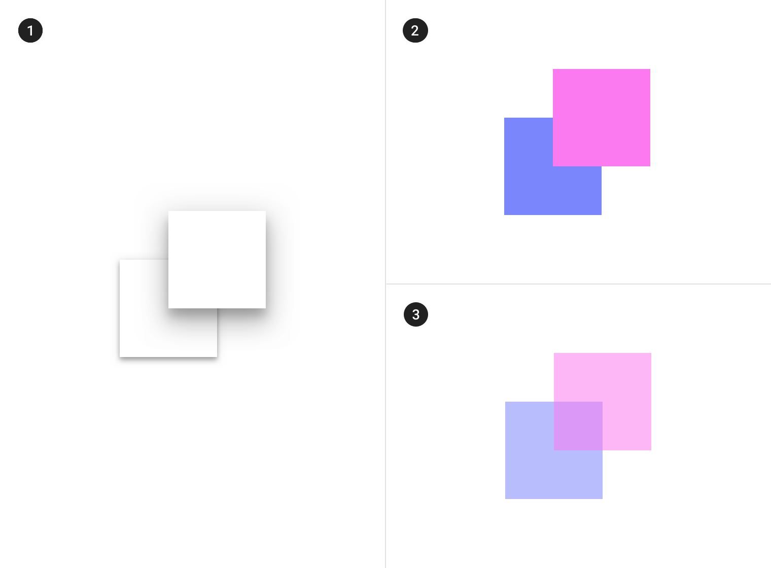
Without showing edges, it’s unclear if this image contains one or more surfaces.

Contrasting surface fills provide enough contrast to make it clear that this image has two surfaces.
Surface overlap
When a surface overlaps another surface, either partially or completely, it indicates that the two surfaces occupy different elevations (but not the degree, or amount, of difference between them). Surfaces at higher elevations appear in front of those at lower elevations, meaning they are positioned at different elevations along the z-axis. Surfaces may overlap one another by default, or become overlapped as a result of motion that changes their position in the UI.
When surfaces have different opacities or insufficient contrast from one another, it can make it difficult to tell which surface is in front of another. Avoid ambiguous overlap by ensuring surface edges are clearly defined.
- Shadows show surface edges, surface overlap, and the degree of elevation.
- Different surface colors show surface edges and overlap, but not the degree of elevation.
- Opacity shows surface edges and overlap, but not the degree of elevation.
Distance
The degree of elevation difference between surfaces can be expressed using scrimmed backgrounds, or using shadows.
Scrimmed backgrounds
When the background is scrimmed in a UI, it expresses that the content above it is at a higher elevation. Scrimmed backgrounds express large, but unspecified, amounts of elevation.
A scrimmed background can indicate surface overlap, but not the degree of elevation.
Shadows
Shadows can express the degree of elevation between surfaces in ways that other techniques cannot.
Both a shadow’s size and amount of softness or diffusion express the degree of distance between two surfaces. For example, a surface with a shadow that is small and sharp indicates a surface’s close proximity to the surface behind it. Larger, softer shadows express more distance.
Subtle differences in shadow size and diffusion communicate:
- A detailed degree of distance between two surfaces
- Elevation differences between non-overlapping surfaces

Shadows show the edges of a surface and its degree of elevation against the background. They also make differences in surface elevations perceptible between non-overlapping surfaces.
Elevation hierarchy
Content relates to other content depending on whether they are at similar or different elevations.
Content at different elevations
Surfaces in front of other surfaces typically:
- Contain more important content
- Focus attention, such as a dialog
- Control the surfaces behind it, such as actions in an app bar
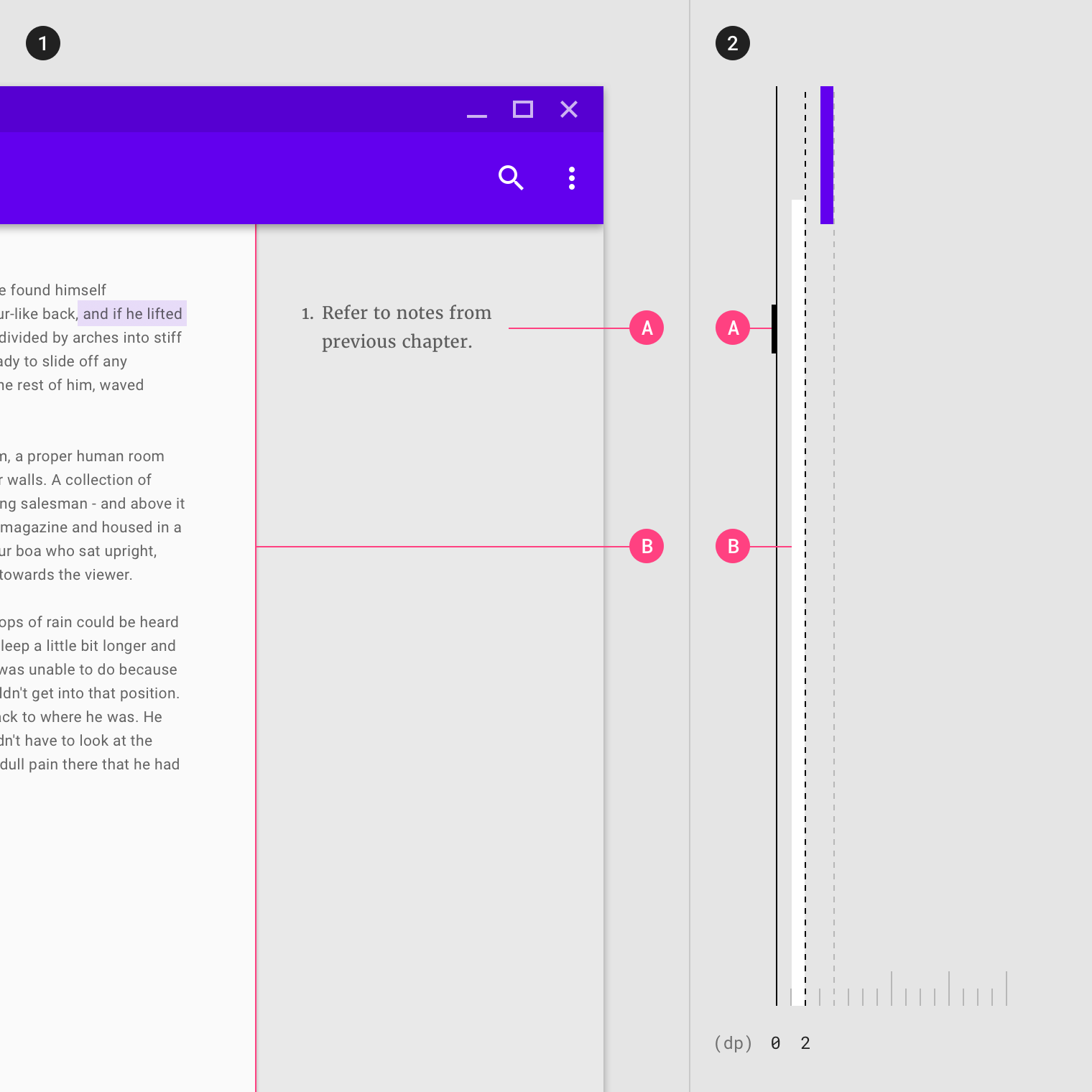
Front (1) and side (2) views of a desktop interface demonstrate how more important content that is of primary focus (B) appears in front of content that is of secondary focus, like footnotes (A).
Front (1) and side (2) views of a mobile interface demonstrate how placing content on a higher surface, like a bottom sheet (A), can focus attention while maintaining context.
Content on coplanar surfaces
Positioning surfaces at the same elevation makes them coplanar, and may indicate they contain content of equal importance as one another. For example, all cards in a collection have equal importance.
Surfaces that don’t express elevation can appear coplanar. For surfaces that don’t express elevation, you can communicate hierarchy differences through their content and by adjusting their horizontal and vertical layout position to suggest their relative hierarchy levels.
For example, on a dashboard with coplanar surfaces, detail content is placed next to parent content, based on the direction a language’s text is displayed.
- A desktop UI, as viewed from the front, demonstrates how the left-to-right positioning of surfaces at the same elevation (A, B, C) communicates hierarchy based on English language content.
- The same components, as viewed from the side
Default elevations
All elements have default values for resting elevation and dynamic elevation offsets. Certain components are positioned at higher elevations than others, establishing a consistent elevation order across all components. For example, dialogs always appear in front of all other components.
The following table lists default values for resting elevation and dynamic elevation offsets.
Table of default elevation values
| Component | Default elevation values (z-axis) |
|---|---|
| Dialog | 24 |
| Modal bottom sheet Modal side sheet |
16 |
| Navigation drawer | 16 |
| Floating action button (FAB - pressed) | 12 |
| Standard bottom sheet Standard side sheet |
8 |
| Bottom navigation bar | 8 |
| Bottom app bar | 8 |
| Menus and sub menus | 8 |
| Card (when picked up) | 8 |
| Contained button (pressed state) | 8 |
| Floating action button (FAB - resting elevation) Snackbar |
6 |
| Top app bar (scrolled state) | 4 |
| Top app bar (resting elevation) | 0 or 4 |
| Refresh indicator Search bar (scrolled state) |
3 |
| Contained button (resting elevation) | 2 |
| Search bar (resting elevation) | 1 |
| Card (resting elevation) | 1 |
| Switch | 1 |
| Text button | 0 |
| Standard side sheet | 0 |
Diagram of default elevation values
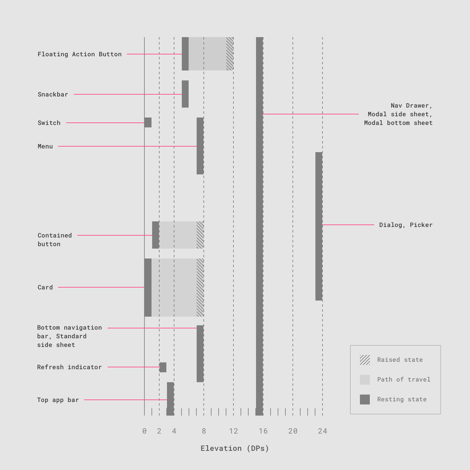
Cross-section diagram showing the resting elevation and dynamic elevation offsets for multiple components.